Bizness Apps (now Buildfire)
Bizness Apps: Mobile App Builder — Customize Homescreen

Bizness Apps (now Buildfire)
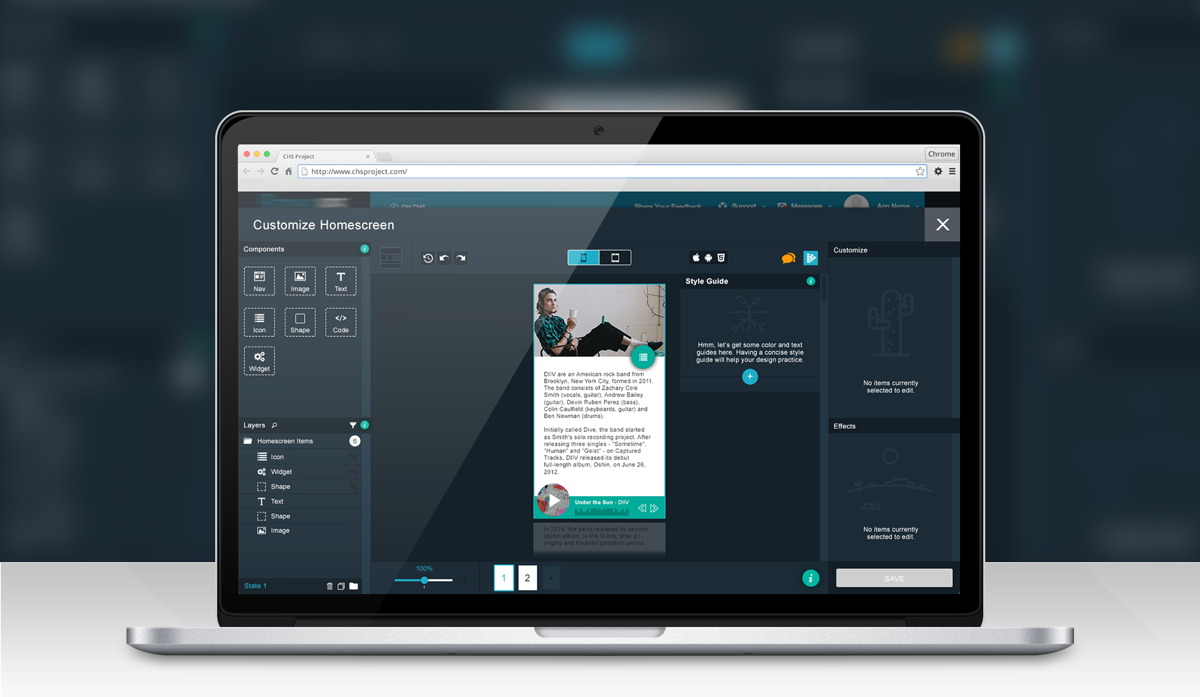
Bizness Apps (acquired by BuildFire) offers two core Base Subscription Plans. One is a single app user and the other is a White Label Reseller Program. As a Reseller of the software an Entrepreneur or Agency can start/grow their business by selling the software to small to medium-sized businesses. As a single app user, I can leverage the App Builder product to create a mobile app for my place of business.
MY ROLE: Sr. UI/UX Designer
CONCEPTS & IDEATION: This product was designed and derived out of the user need for customers of the intended Bizness Apps mobile app company wanting a more in-depth way to customize their mobile app home screen.
The Basics
The intended name for this additional feature was "Customize Homescreen." It was a literal translation to what this asset for the mobile app company was to actually do. Overall we, the company, valued our customers and wanted to give them a tool that they had wanted for years. Also, it was intended to compete with similar customization design tools other competitors had. I had been asked by the person I reported to essentially run with this intended concept and create a product that would blow the competition out of the water. With that in mind, I sought to create a design tool that had familiar editing queues related to prototyping and design software. I split the area into a canvas accompanied with four quadrants; objects, layers, specific customizations, and animations. As I began to create the product specifications, I knew that the product would come along as I was working through ideas of how the bits and pieces would interact with each other.
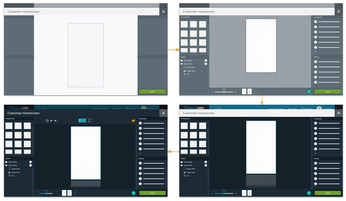
Here We Go!
To start, I laid down the foundation of the product's look and feel, the intended actions and core concepts. However, I knew in order to successfully showcase how the product would work I would have to mimic how the intended user would actually use the design tool. This process of interaction design would assist greatly once the product was to be engineered. I split the canvas into grid format, to allow components to be added and snapped easily.
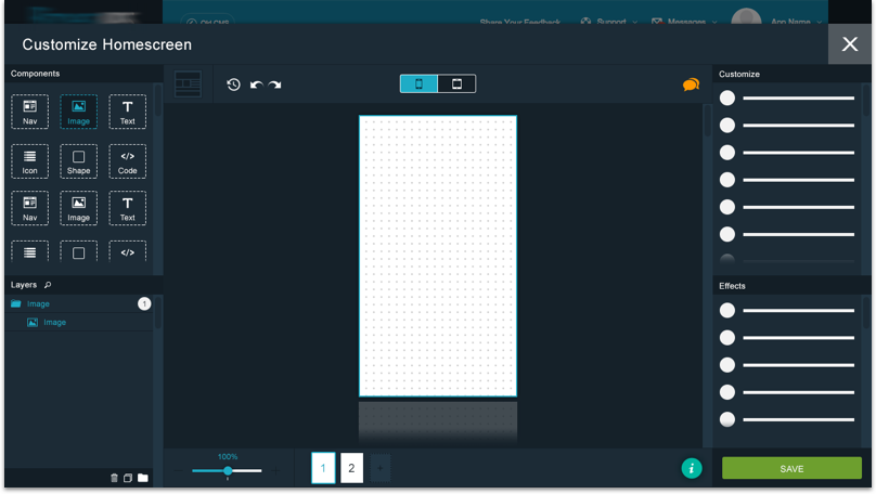
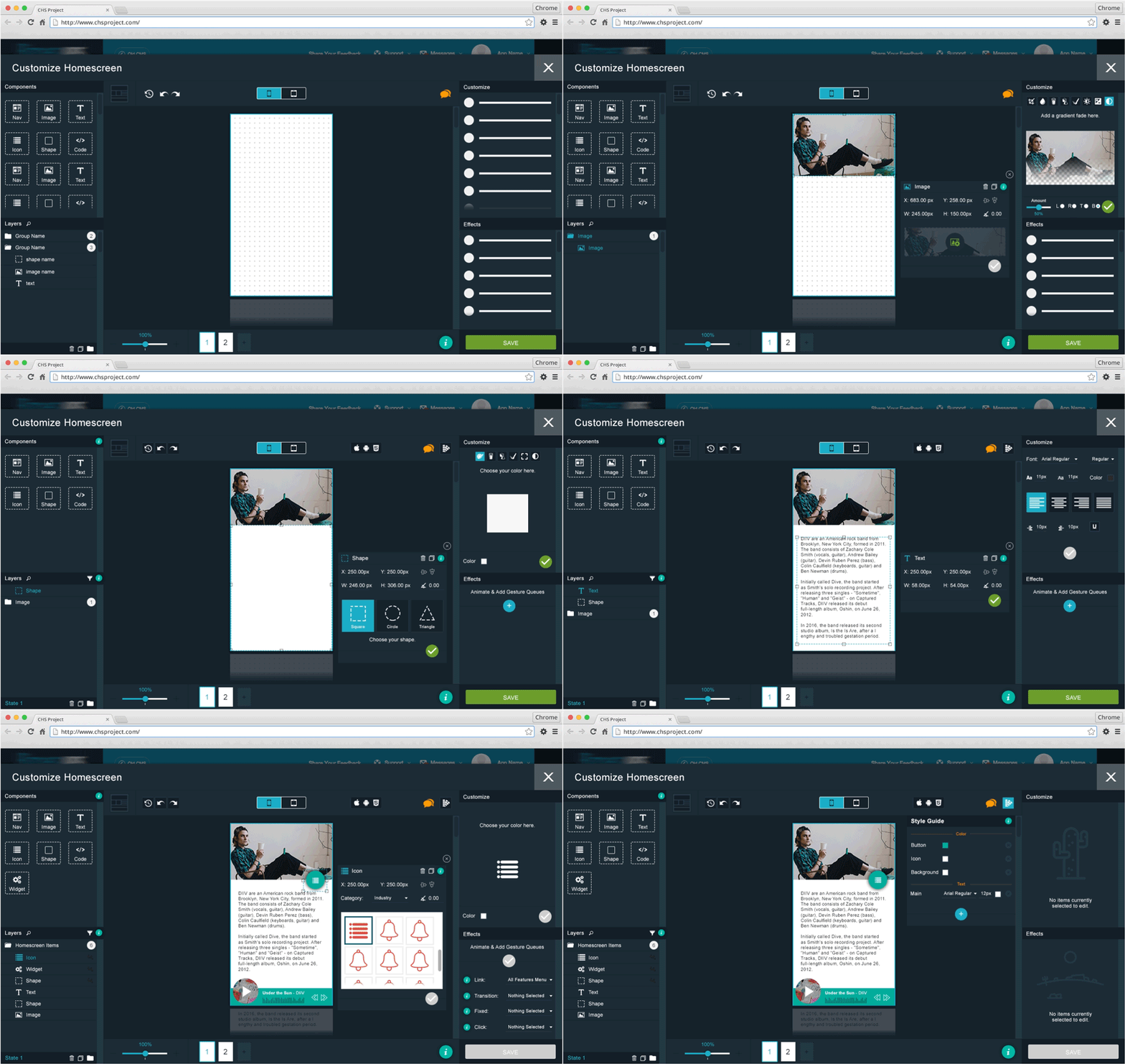
First things first, I started with the component section. I added some minimal generic options here that I had seen in other softwares. They included navigation layouts, images, text, icons, shapes, and code. Adding an image component was the first move, I felt a user would do.
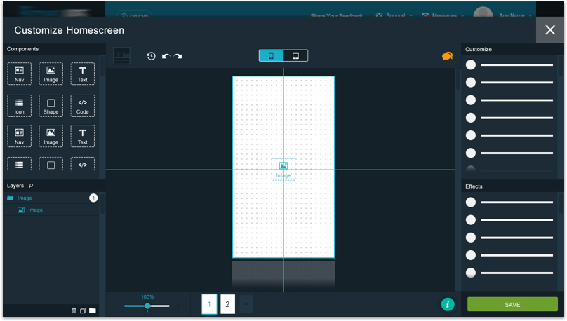
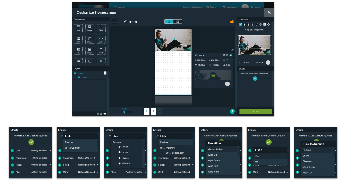
Once an image component is added a window displays that has options for placement, height, width, and the ability to upload any image.
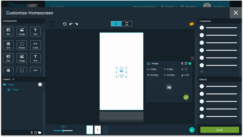
Image components can be resized before or after an image is uploaded.
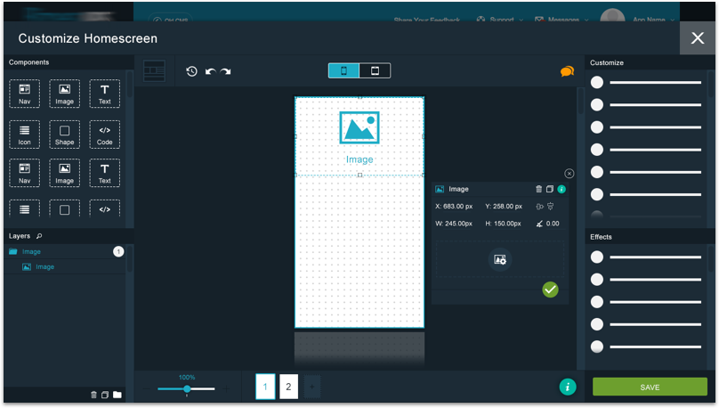
Once an image is uploaded, customizable options are available in the "Cusotmize" section
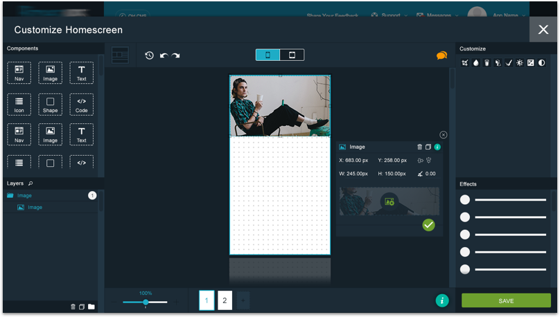
Adjusting Images
If an image is selected various basic customization options are shown. The options available include the following: Cropping, Color Overlay, Opacity, Drop Shadow, Stroke, Brightness & Contrast, Hue & Saturation, and a Gradient Fade. The options I added were intended to give the user a sense of personalization without overwhelming the user.
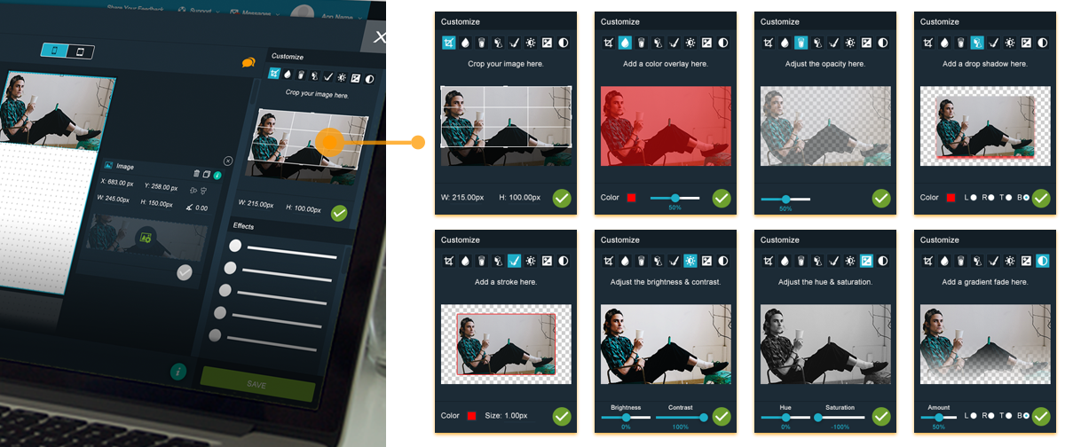
Adding Effects
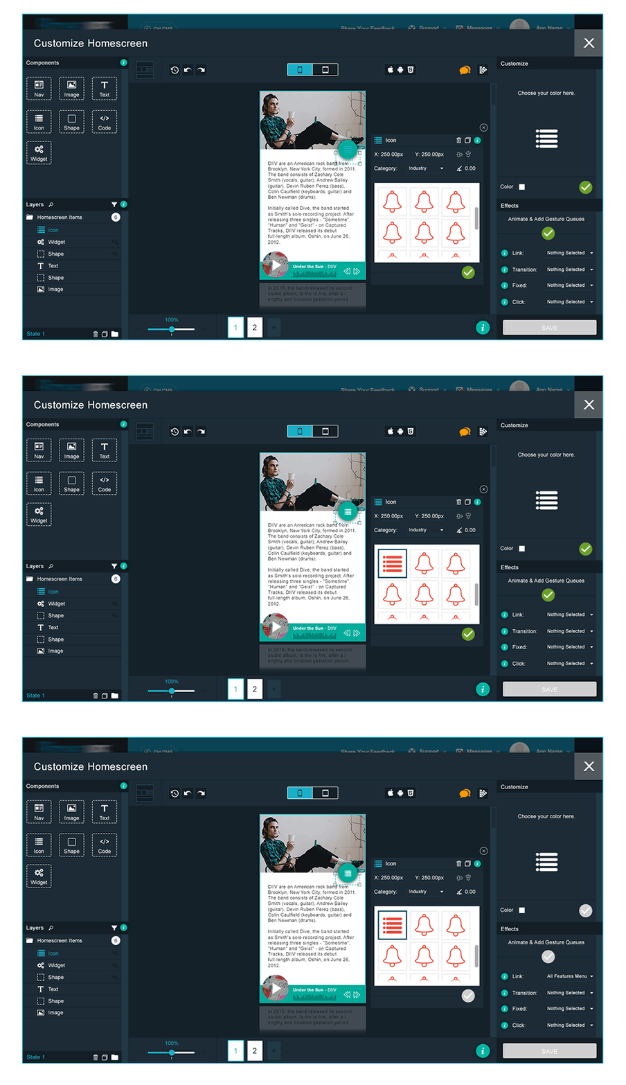
While working through the different factors that an end user would use, I felt some interesting effects that would help the user actualize an ideal homescreen were animations and gestures. The "Effects" I added were Deep Linking, Transitions, Fixed Option, and Click Animations.
Shape & Shake Up Your Screen
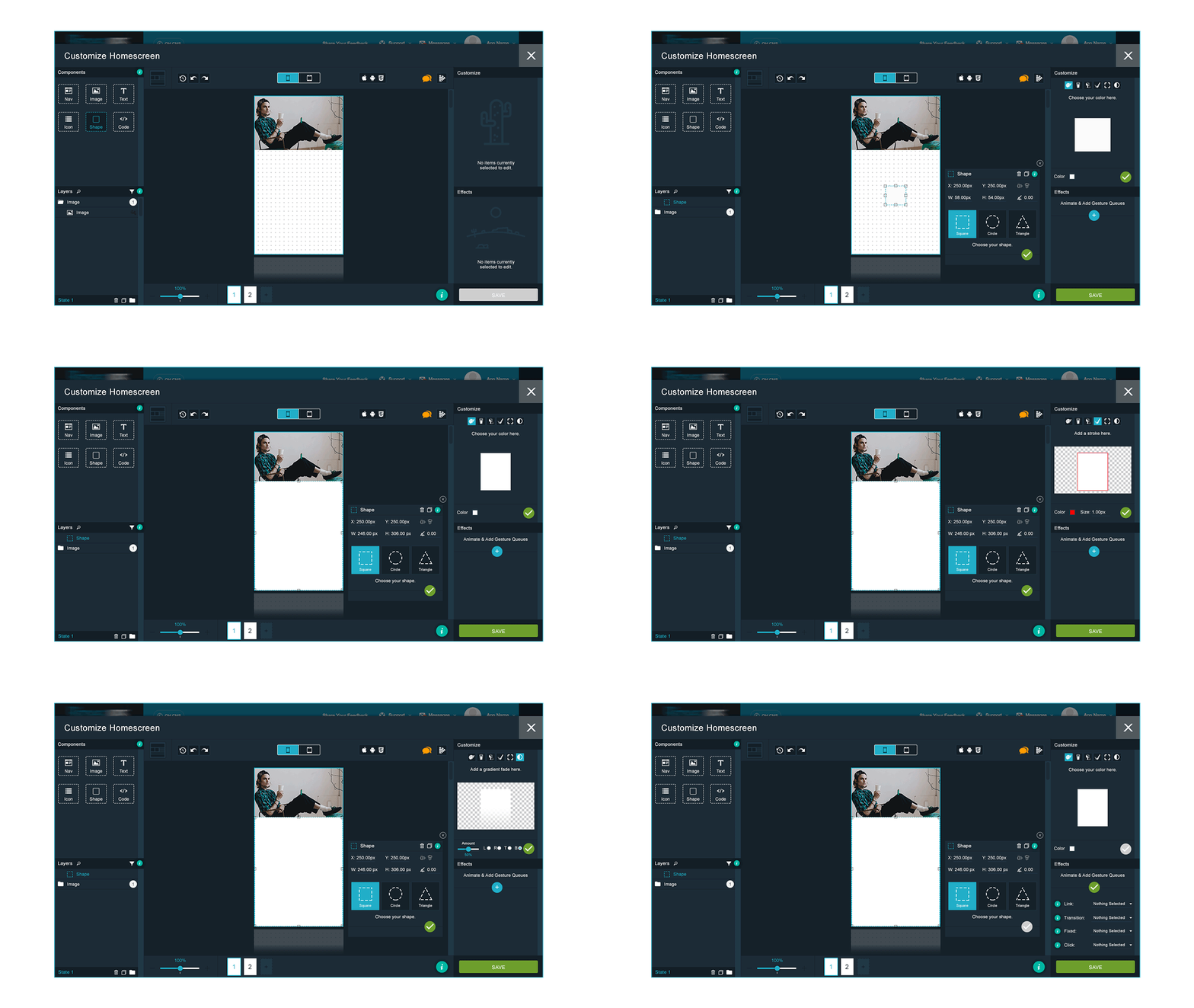
The animated image below shows the process of adding a shape component to the homescreen canvas. Basic shapes are provided and can be adjusted in height, width, and placement. Similar customization and effects options, as displayed in the image option, are provided.
Let's Add Some Text
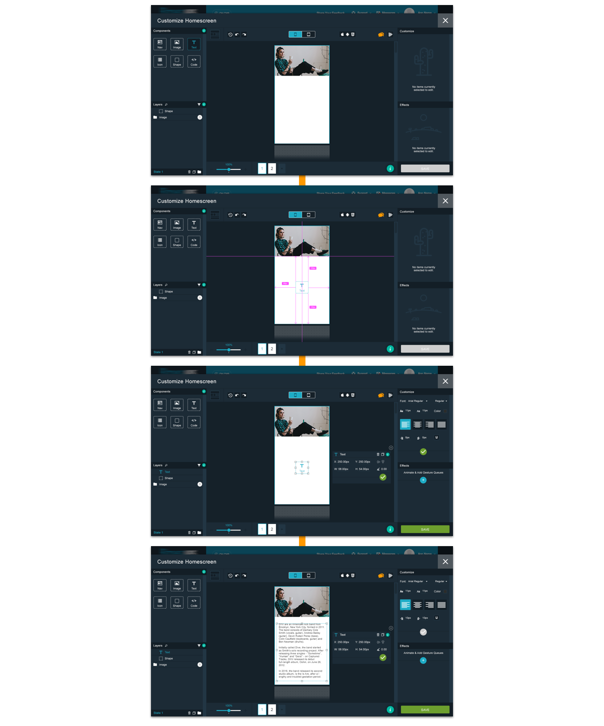
Adding text is simple and straight forward. Users have the option to add their personalized text and customize it to liking.
Shapes = Buttons, Buttons = Shapes
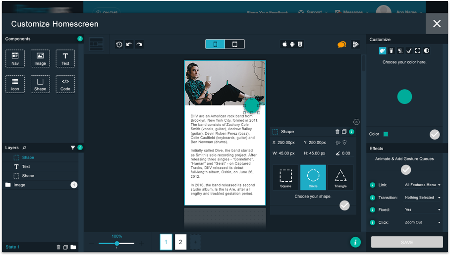
Adding any shape can be used as a button if the right customizations and effects are appended.
Widgets, Oh My!
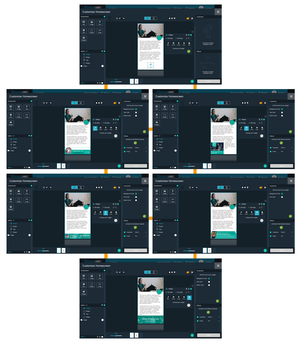
I added some widget components that would directly integrate with features the mobile app company had available. They included the following: Music, Event Calendar, User Account, Blog Feed, and RSS Feed,
Adding More Flair
But Wait, There's More
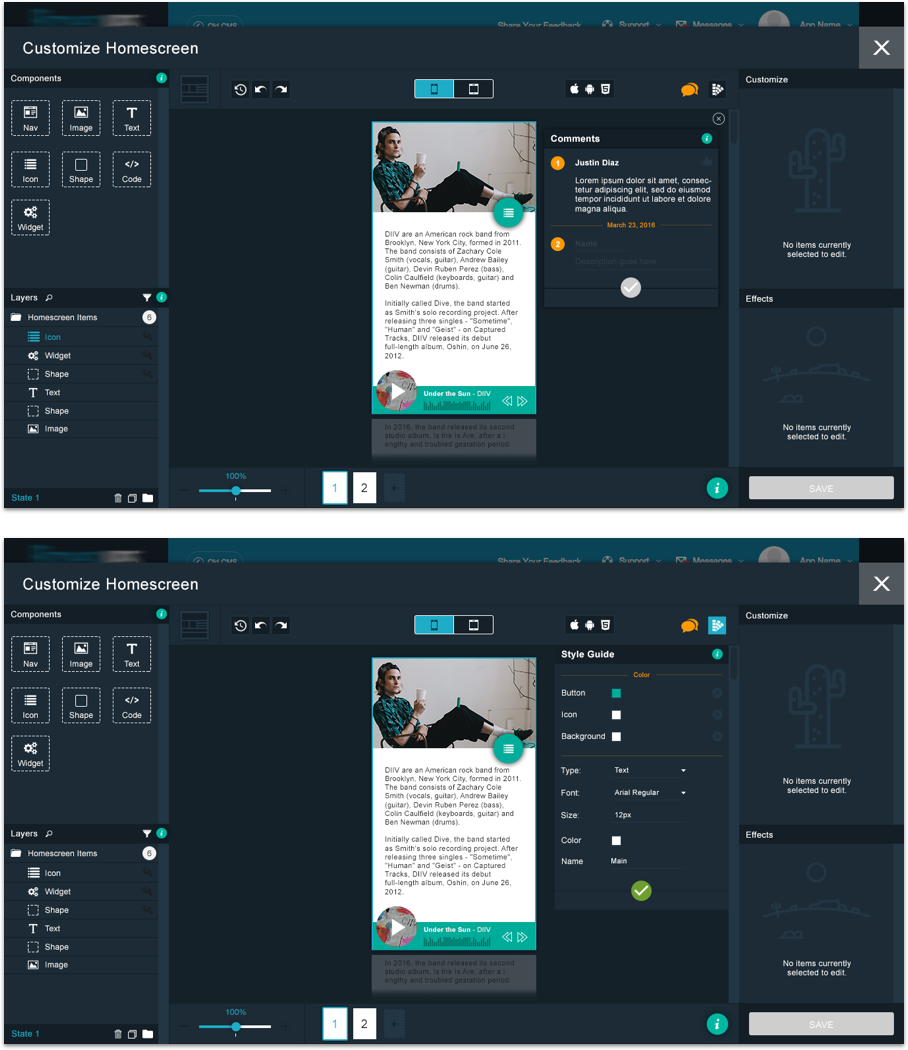
Adding the ability for users to add comments and a style guide was the next step in allowing users to design together.
From A to B to C and so on...
Let's see how it all comes together.
What came next?
Although the design exercise was placed under the concept ONLY umbrella, it was a wonderful method for the team to look beyond what features we had already accessible and ideate how our core product could evolve over time to accommodate power users in the future to drive more business/