 Smart Energy Water · 2025–2026
Redesigning the utility customer home around AI
- Role
- Senior Product Designer
- Company
- Smart Energy Water
- Timeline
- 2025–2026
- Location
- Irvine, CA
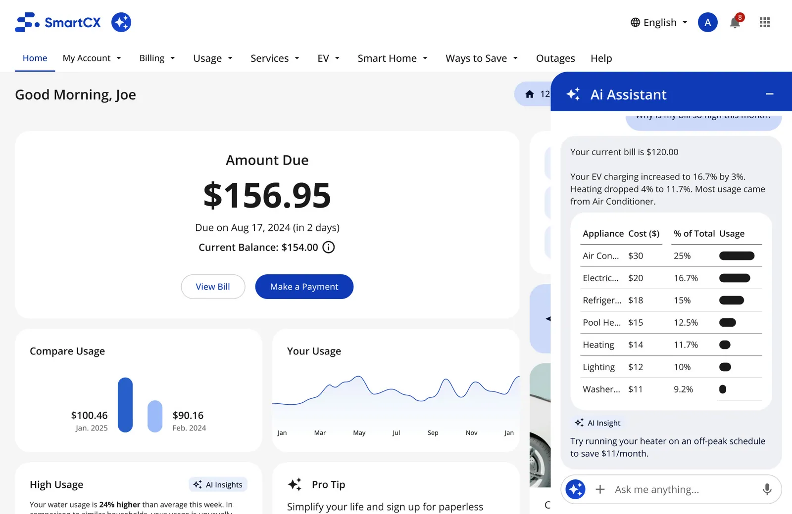
Contents
- The problem, and how I worked it
- A dashboard that told customers what they owed, never why
- Customers compare us to their bank, not to other utilities
- Art of the Possible: a vision, not a reskin
- Six decisions that reshaped the home
- AI that explains, inside the pages people already use
- Testing the new home with real people
- Hitting WE3 with product, engineering and the executive team
- Track 2: a home that knows where your energy goes
- What changed, and what it's worth
I led the design that took SmartCX's customer home from a dated, bill-first dashboard to a modular, AI-assisted home on web and mobile. It's the base experience utilities white-label for millions of their customers, and SEW showcased it at WE3 2025 under its COSMOS AI platform.
Timeline Research Apr 2025 → vision Jun–Aug → Track 1 Aug–Oct → shown at WE3, Nov 5–7, 2025 → Track 2 2026
Platforms Responsive web portal · iOS and Android app
Scope Home, pre-login, AI search, AI chat, AI insight cards, new card components
Team Product lead, engineering lead and developers
Tools Figma (variables, base 2.0), FigJam, Claude Code
The problem, and how I worked it
Problem: sales was hearing that SEW's product looked dated, and the customer home, the first screen every utility's customers see, told people what they owed but never why. The goal: a modern, AI-led home that SEW could demo at WE3 in November 2025, and that every utility could theme from one base.
- Problem Sep 2025 Sales flags the UI as dated on a client call. The home leads with the bill and explains nothing. Read more
- Research Apr–May 2025 Reviewed 8 utilities, banks and telecoms, scored on six criteria, and benchmarked against our current release. Read more
- Design Jun–Oct 2025 A 77-screen vision, then Track 1: what could ship for WE3. Read more
- Leadership Weekly Weekly reviews with the executive team and the CEO to hold the WE3 date and make calls fast. Read more
- Test Jan–Feb 2026 Current vs new home, plus layout variations: comparisons, a survey and recorded sessions. Read more
- Outcome Nov 2025 → A working build on stage at WE3, then demoed to 10+ utilitiesEST. (estimate). Its parts went into the shared library. Read more
Figures marked EST. are my estimates, not tracked numbers.
One home, shipped by many utilities
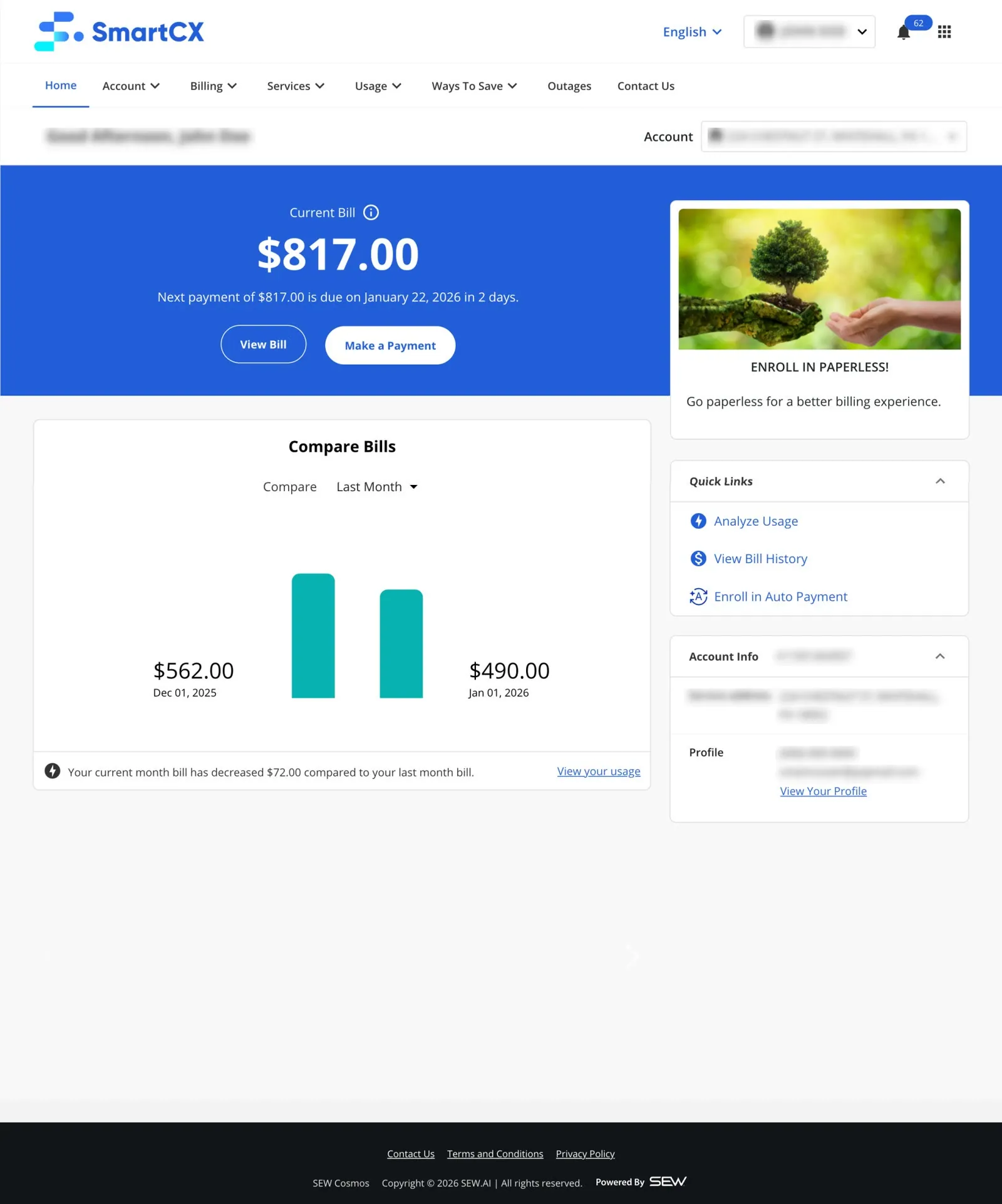
SEW builds one base product suite and white-labels it. Each utility ships its own branded version of the customer portal and app, while SEW keeps evolving the base. A change to the base home is a change for every utility that adopts it, so every decision had to work across client themes, meter types and customer segments.
Sales feedback that the UI "looks dated" made the update urgent (Sep 2025).
SEW was launching COSMOS, its AI platform, in 2025. The customer home was the most visible place for that story.
A dashboard that told customers what they owed, never why
When I joined SEW in November 2023, the product suite worked, but it looked dated next to the banking and telecom apps people use every day, and that was showing up in sales.
The product
It looked dated, and sales heard itBefore I joined, the dated UI was coming up in 2–3 lost or stalled deals a yearEST. (estimate). By September 2025 sales was still relaying it from clients: “UI looks dated” on a client call, and “urgency now to update stuff.”
My notes from a sales sync, Sep 2025
The business
No shared picture of what design should moveMy first questions to the team were basic ones: which business metrics we track, who our competitors are, and whether we track won and lost deals.
My onboarding notes, Dec 2023
Figures marked EST. are my estimates, not tracked numbers.
The constraints are what made this hard, and what make the result credible:
Everything had to theme per utility through base 2.0 tokens, and color was off-limits for this phase.
Residential and enterprise; smart and non-smart meters; electric, water and gas; homeowners, landlords and property managers. Every card needed a "no data" state.
The mobile release had to match web, and some patterns weren't possible yet (onboarding only as a bottom sheet).
A demoable build for WE3, refined through October 2025.
Customers compare us to their bank, not to other utilities
Before designing, I reviewed 8 utilities, banks and telecoms (Apr–May 2025): sign-in, registration, account and dashboard and presented the findings as a "Login, Register, Account, Dashboard" review.
-
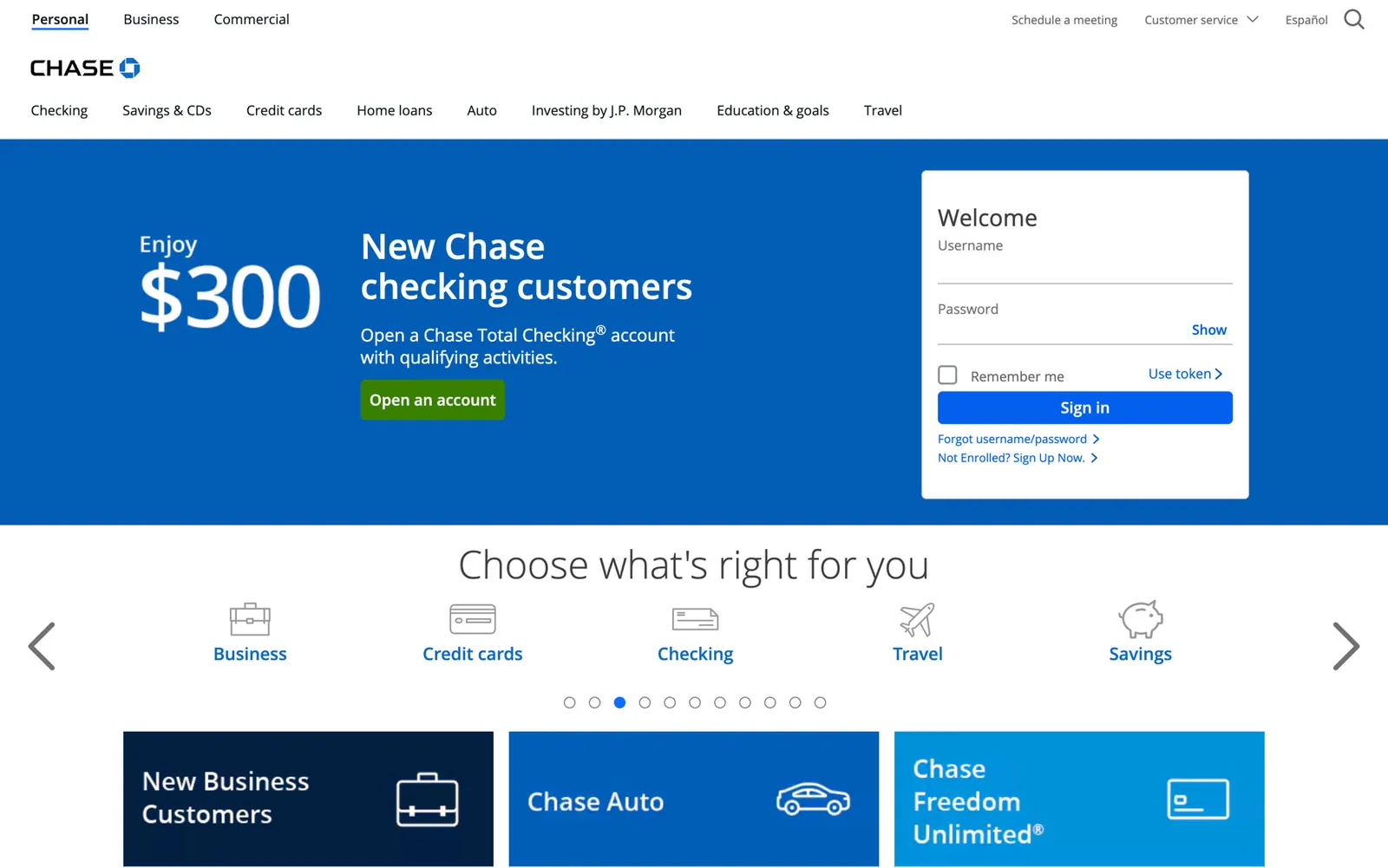
Banks · Chase: home, with sign-in on the page
-
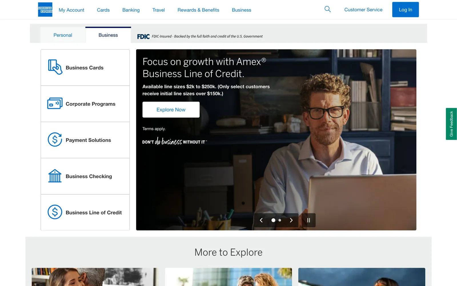
Banks · American Express: home
-
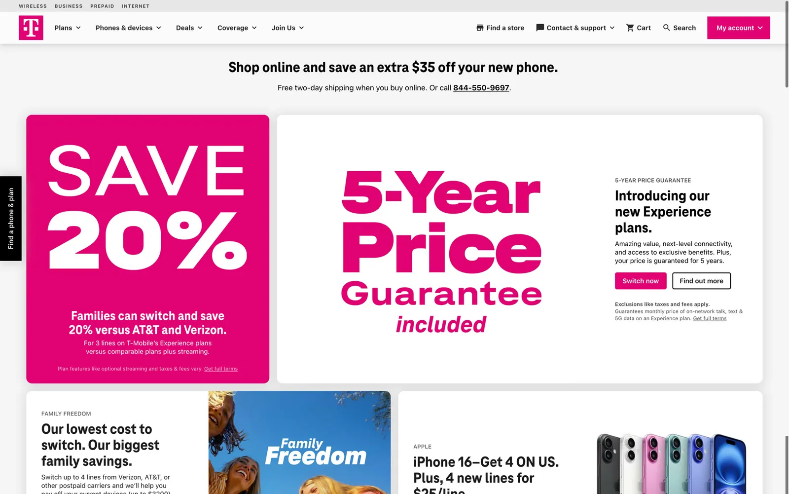
Telecoms · T-Mobile: home
-
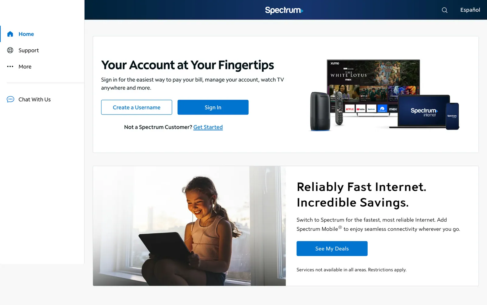
Telecoms · Spectrum: home
-
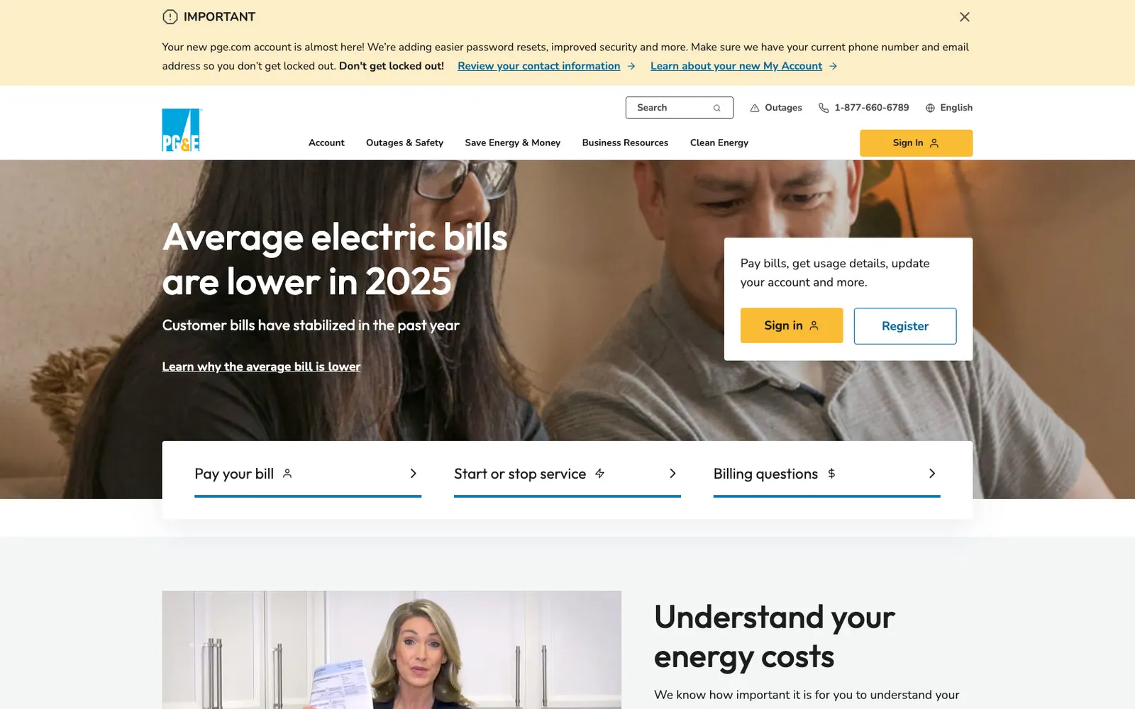
Utilities · PG&E: home
-
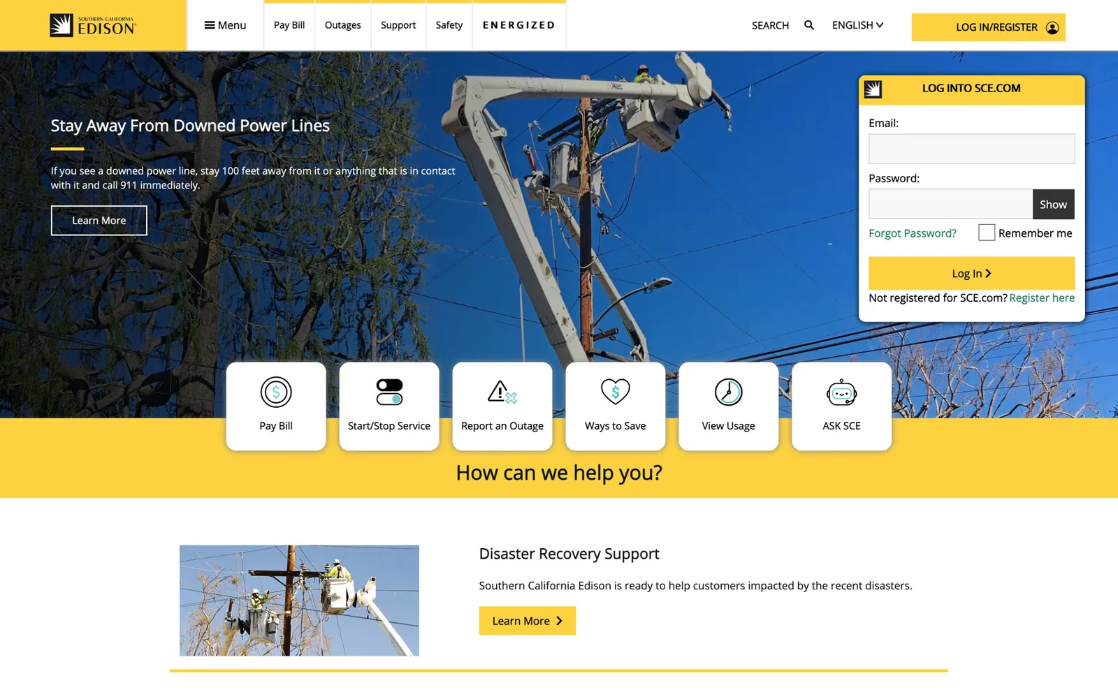
Utilities · SCE: home
How I ran the review
A short brief (Apr 30, 2025) set the method, so it was a comparison, not a mood board: 3–5 direct competitors plus the banks and telecoms customers actually compare us to, each scored on the same six things and benchmarked against our current release (v11.5).
Navigation Content Clarity Interaction flow Visual design Engagement hooks
I presented the findings to the core product team in May 2025, ending with three quick wins we could ship without waiting for the redesign.
Art of the Possible: a vision, not a reskin
A storyboard of how the product could grow: an AI prompt on every page, insights with a direct action (like a washing-machine upgrade worth $10 a month), a neighborhood comparison, and a service request tracked on the lock screen. Its AI emphasis set the direction for Track 1.
It started with a group of five designers. I then took over all the designs, built a small component library for them, and refined the explorations for the film below.
Proof: the file ran May 29 → Sep 15, 2025 and was marked ready for development on Aug 14. I made 236 of its 457 sessions.
-
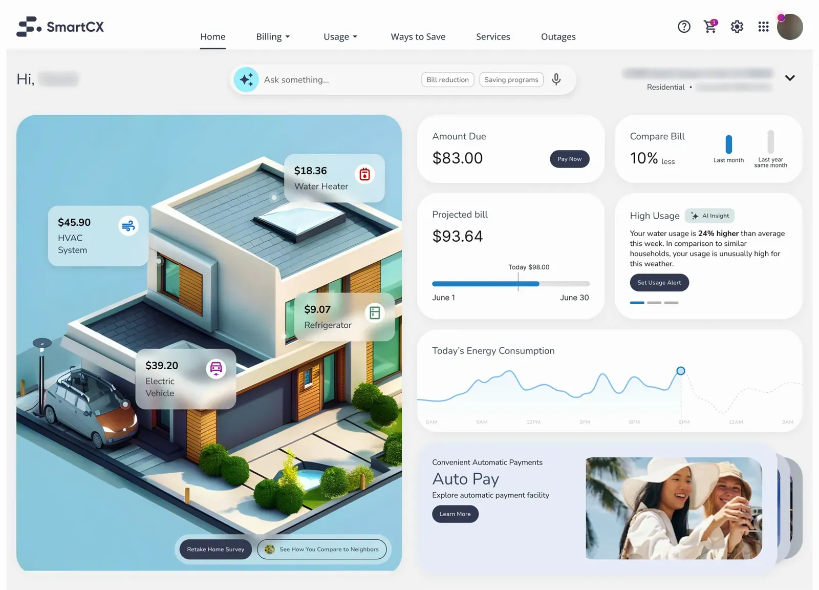
Unified dashboard · Concept
-
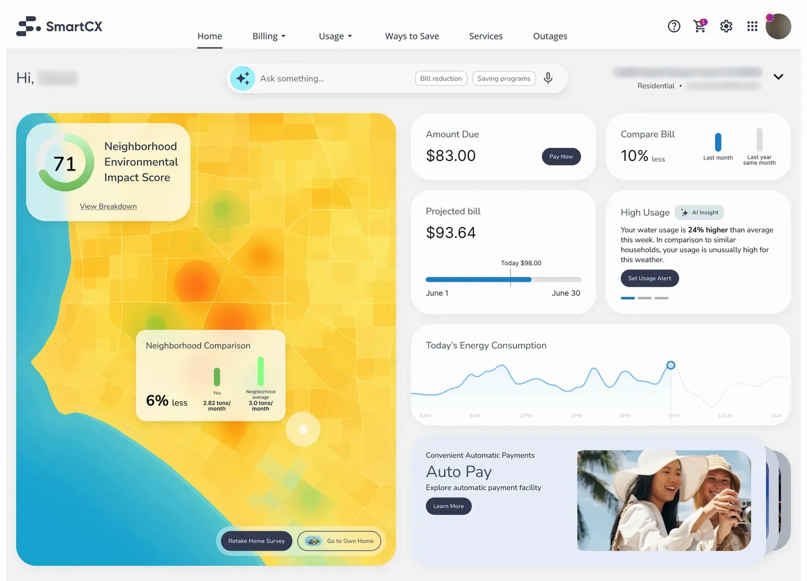
Unified dashboard · Concept neighborhood
-
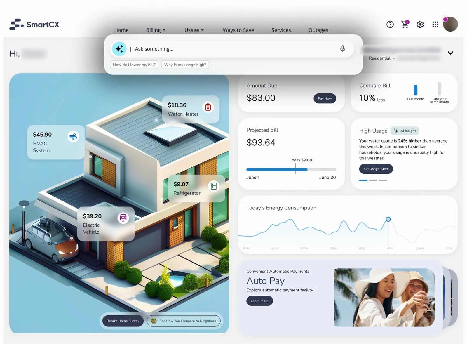
AI prompt · Prompt open 1
-
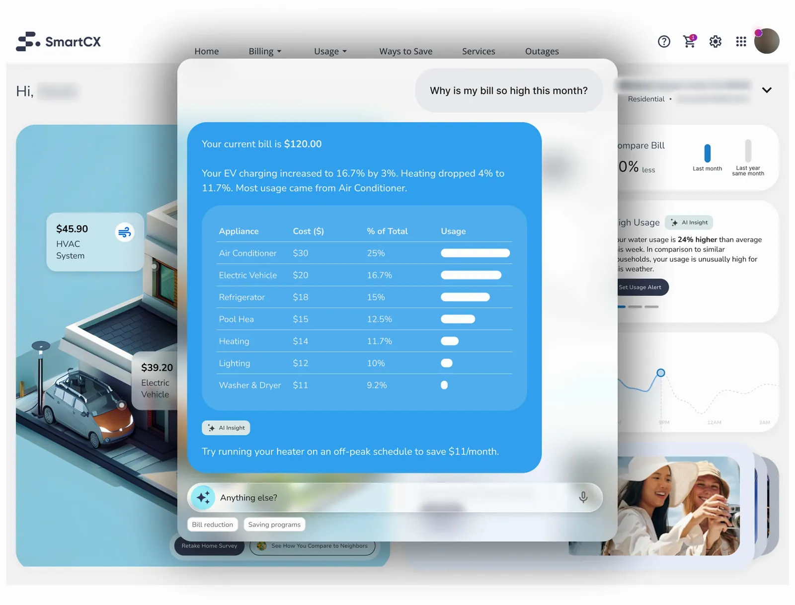
AI prompt · Prompt open 2
-
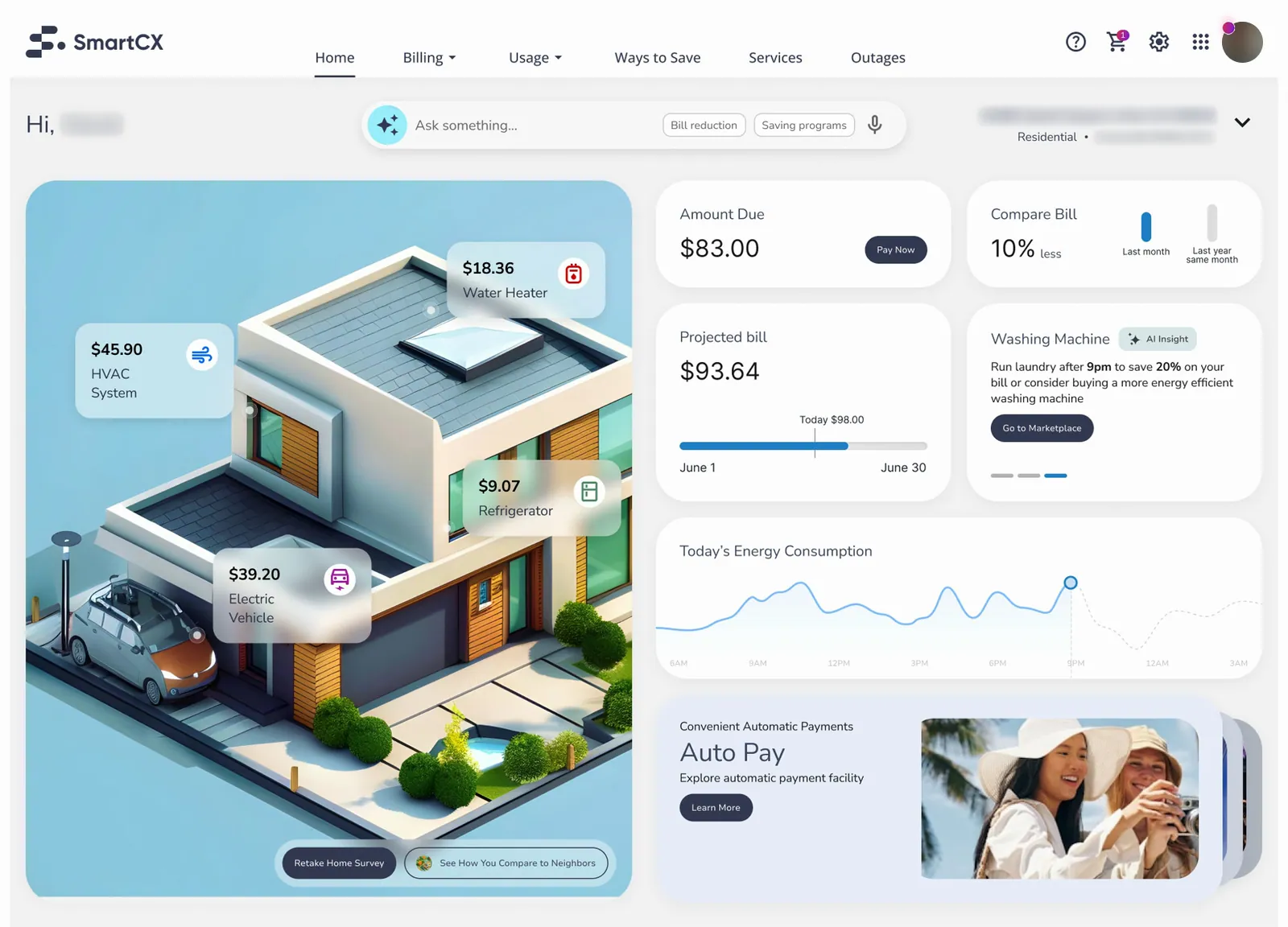
Insight to purchase · Dishwasher rec
-
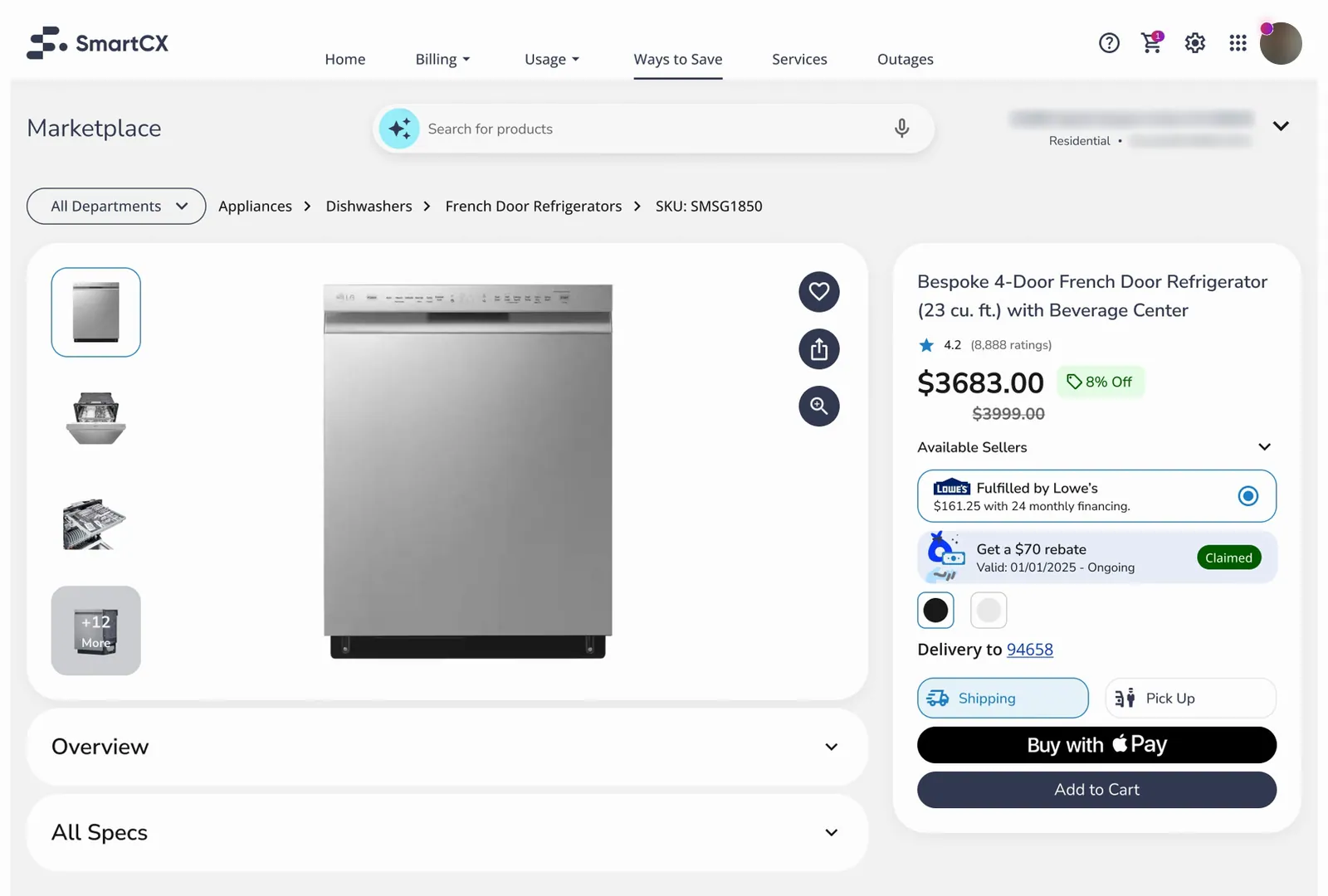
Insight to purchase · Dishwasher
-
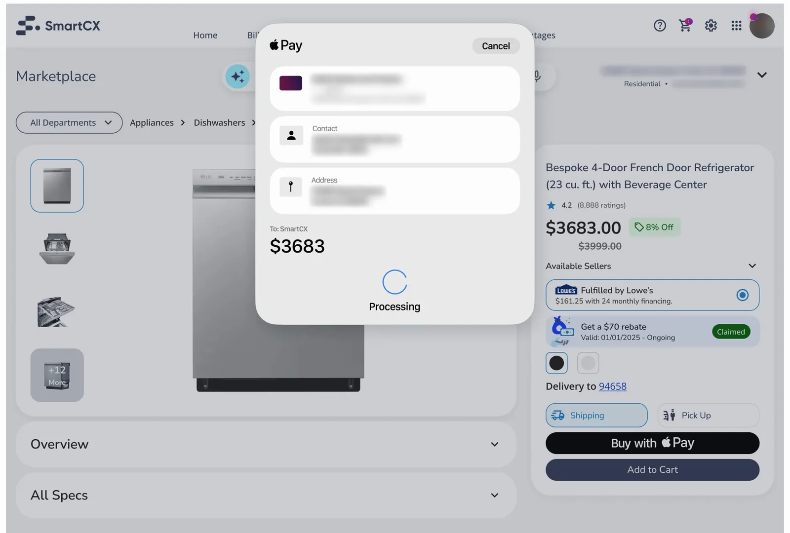
Insight to purchase · Dishwasher step 1
-
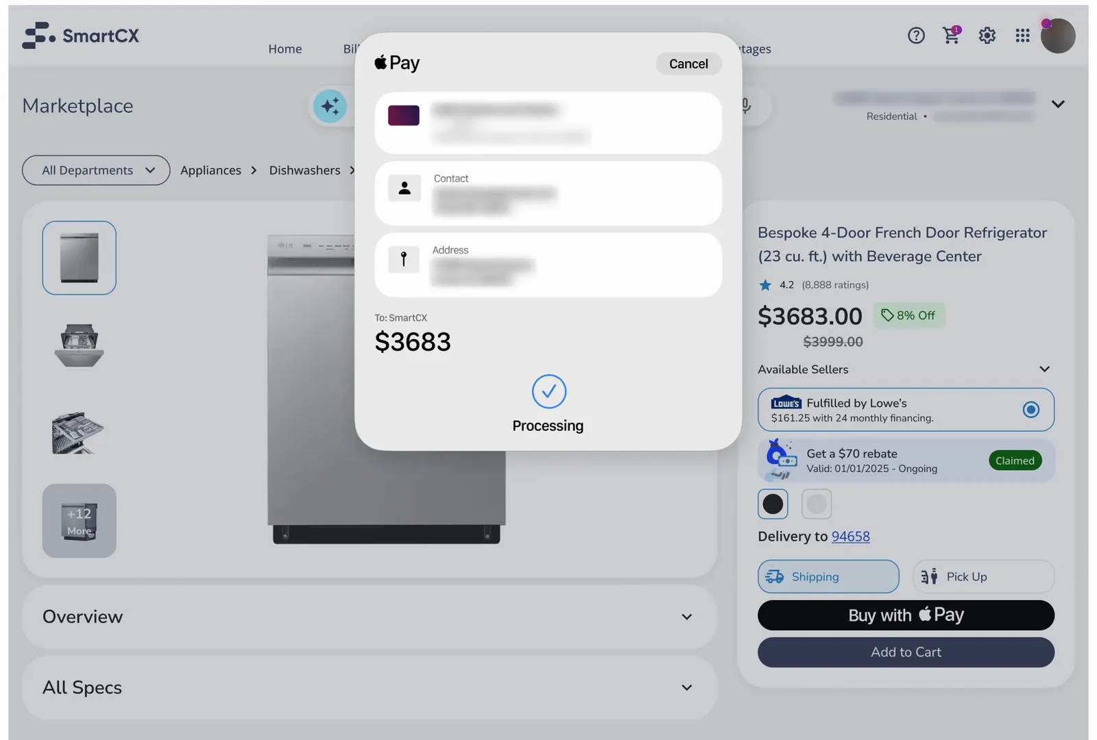
Insight to purchase · Dishwasher step 2
-
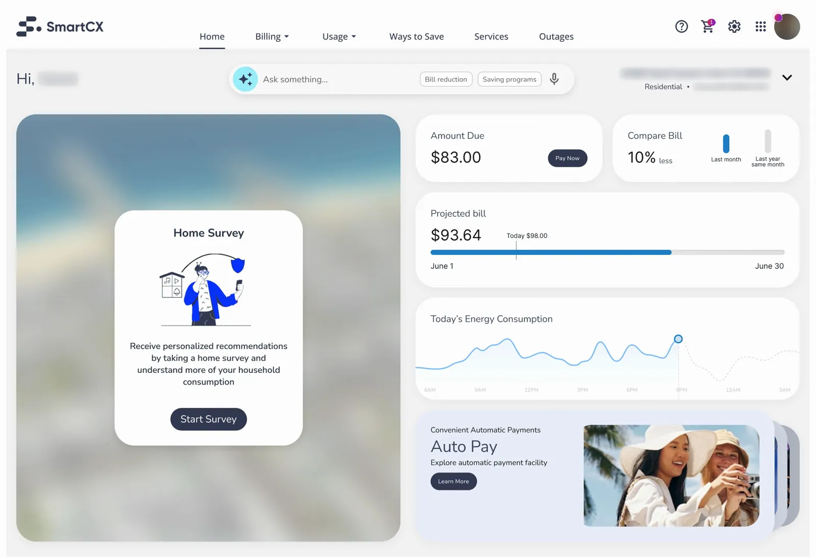
Home survey · Empty survey
-
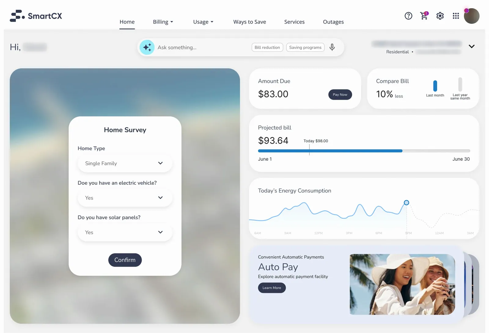
Home survey · Empty with survey
-
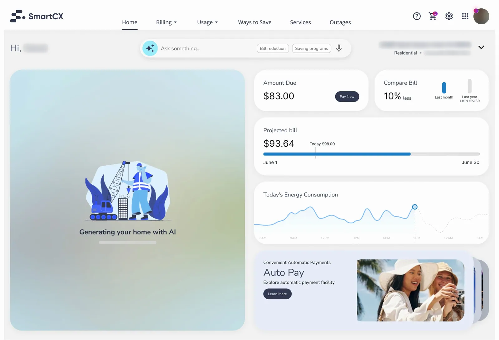
Home survey · Empty loading image
-
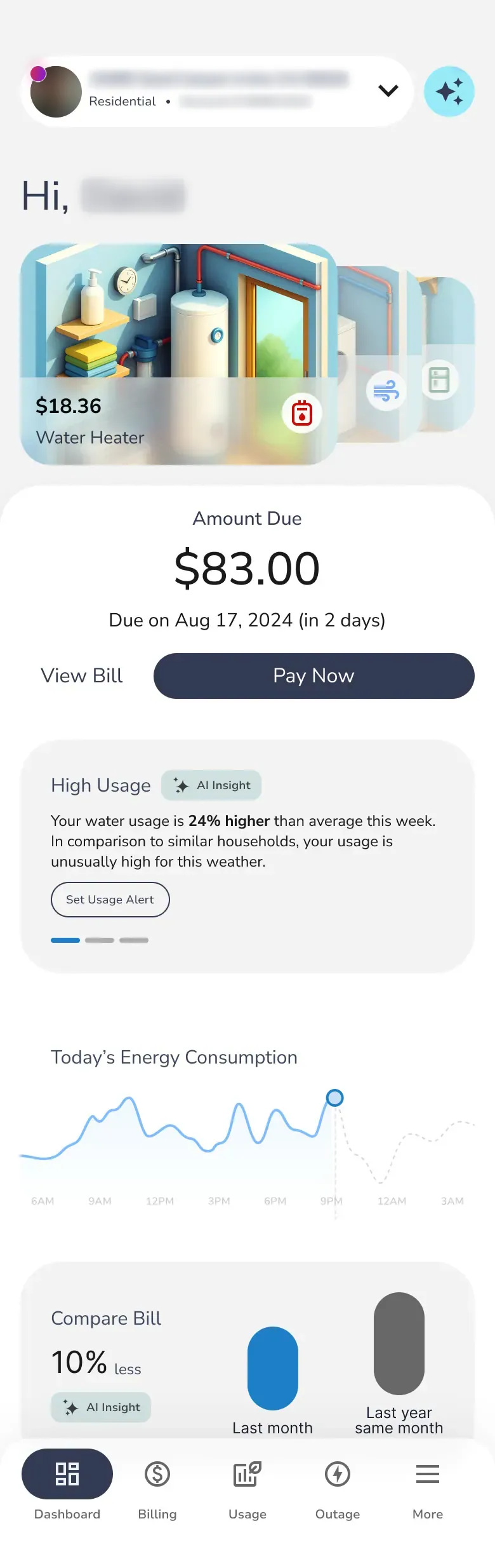
Unified dashboard · Home · scroll ↕
-
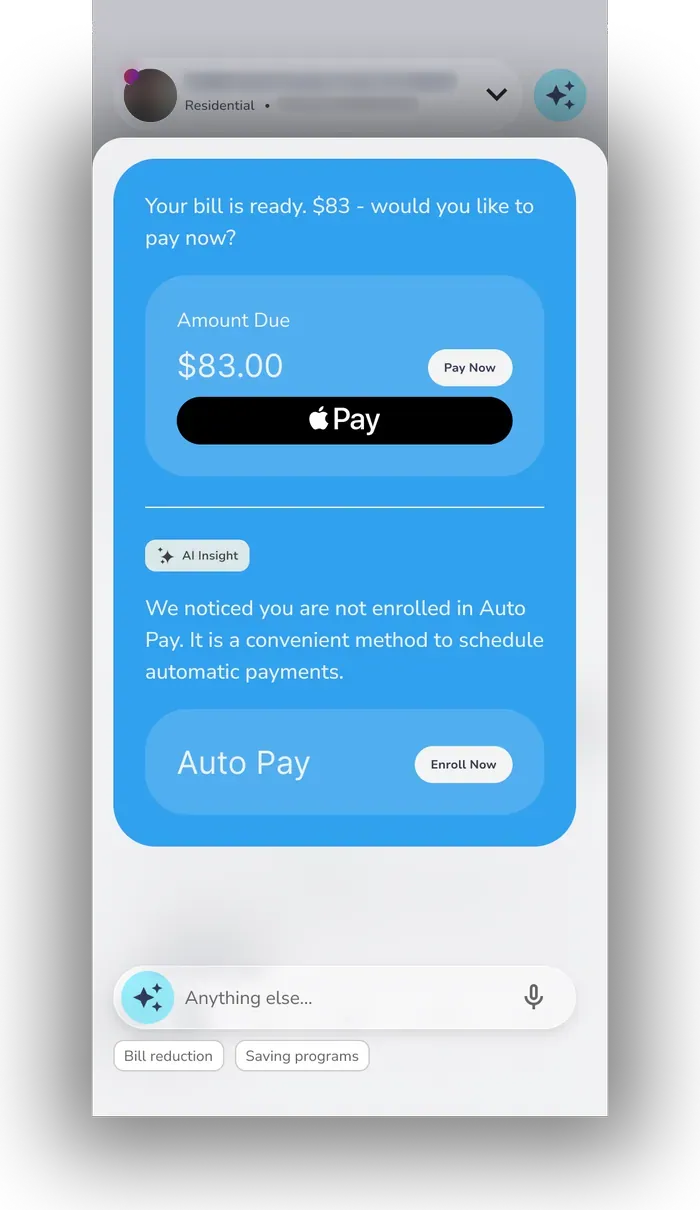
AI bill analysis · AI prompt 1
-
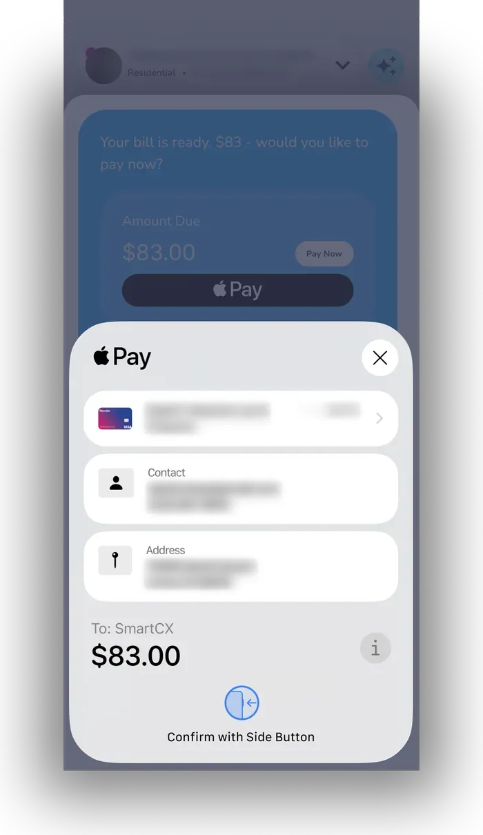
AI bill analysis · AI prompt, paying
-
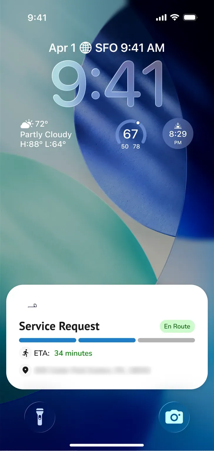
Outages · Live Activity: on the way
-
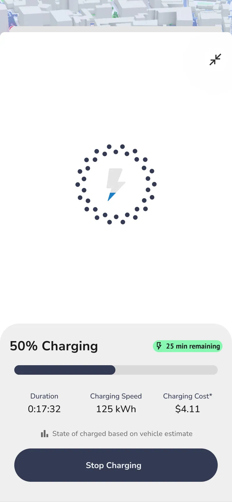
EV · EV: charging
-
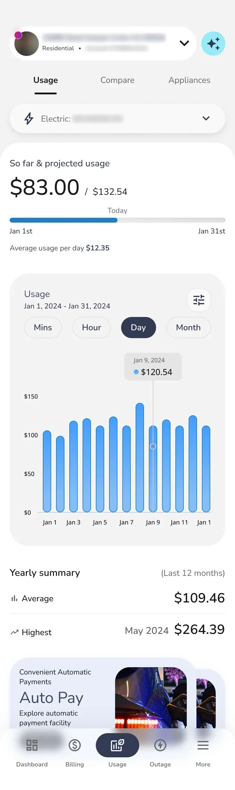
Usage · Usage · scroll ↕
Six decisions that reshaped the home
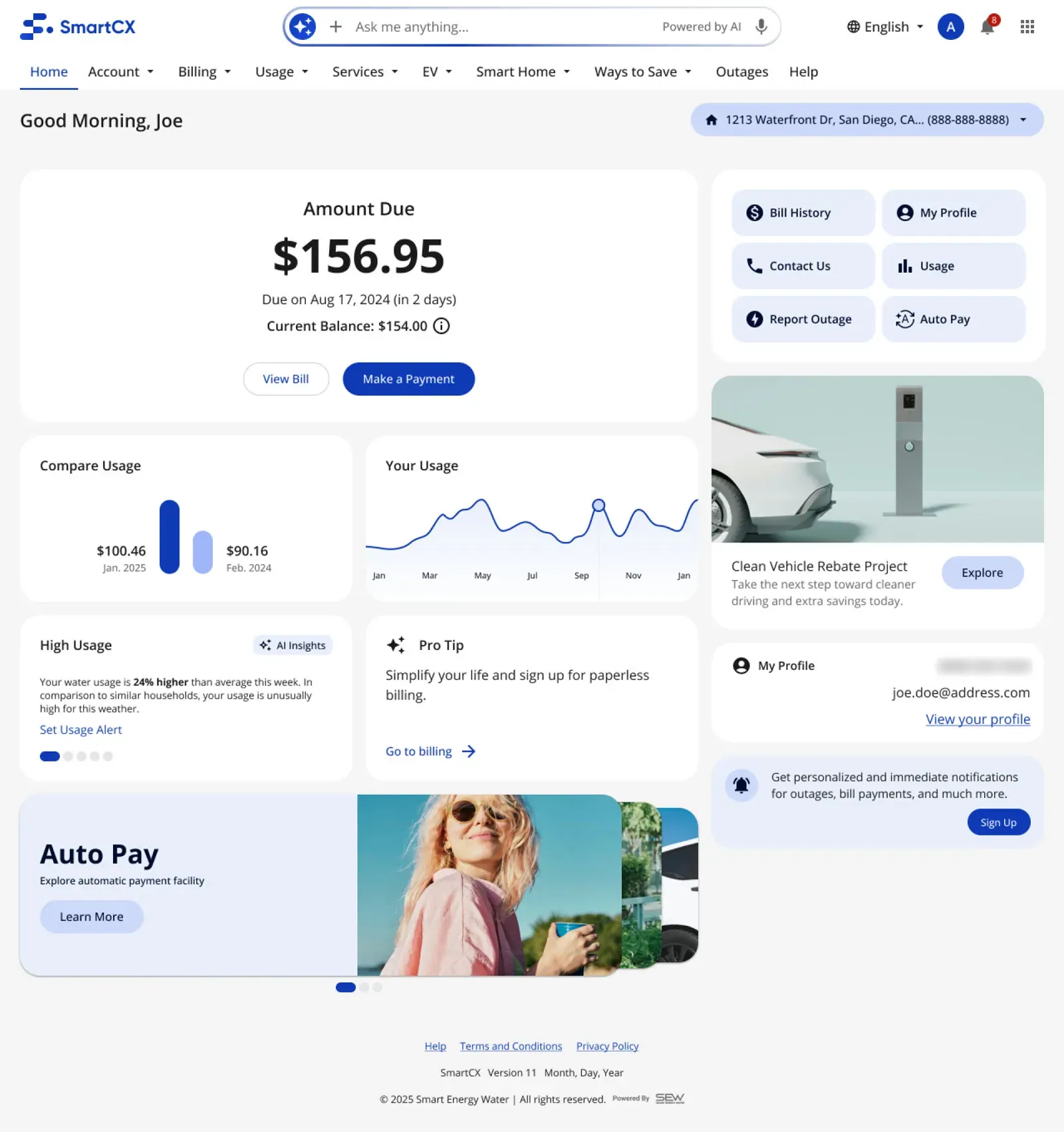
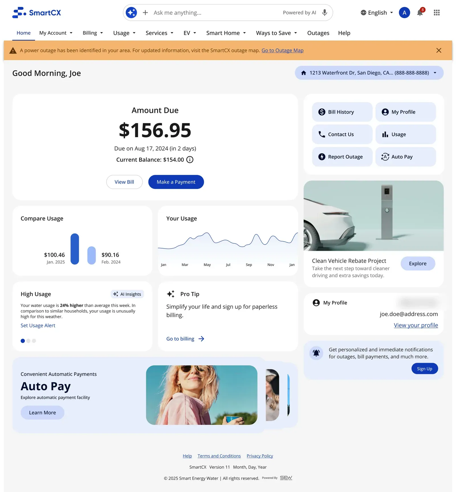
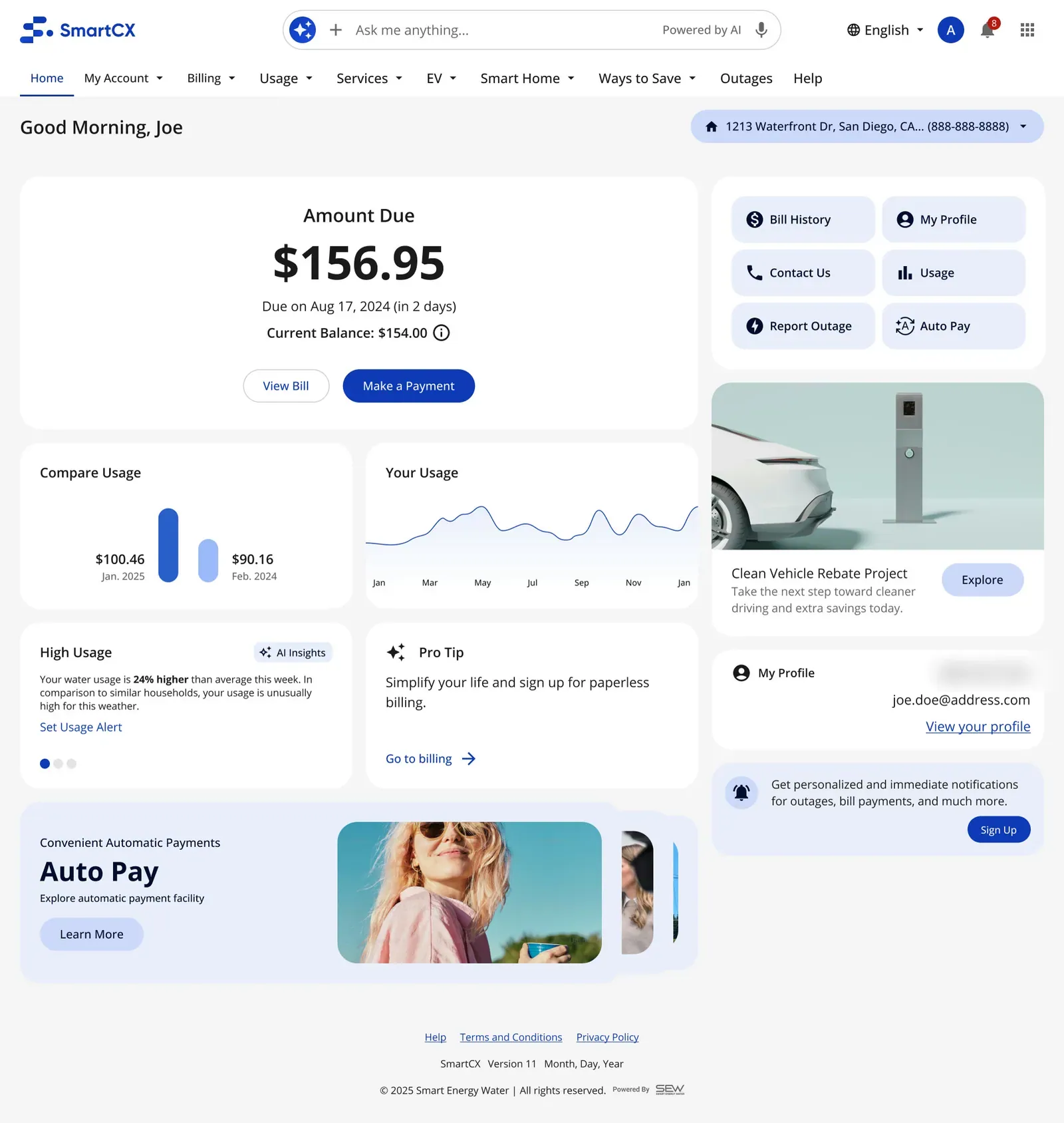
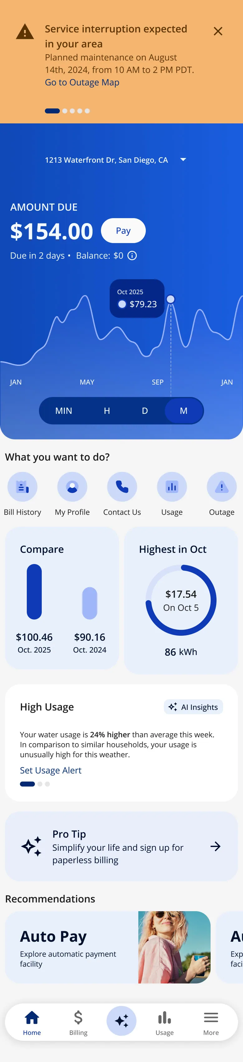
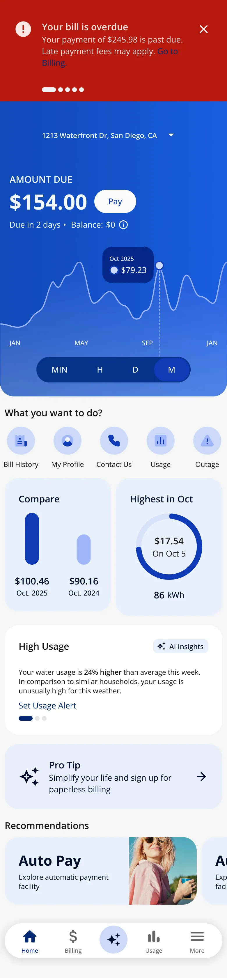
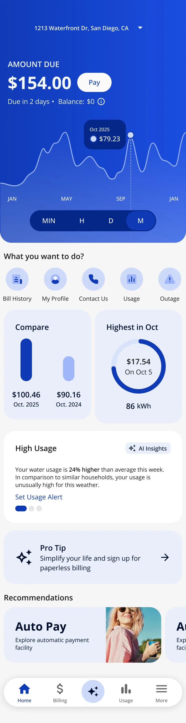
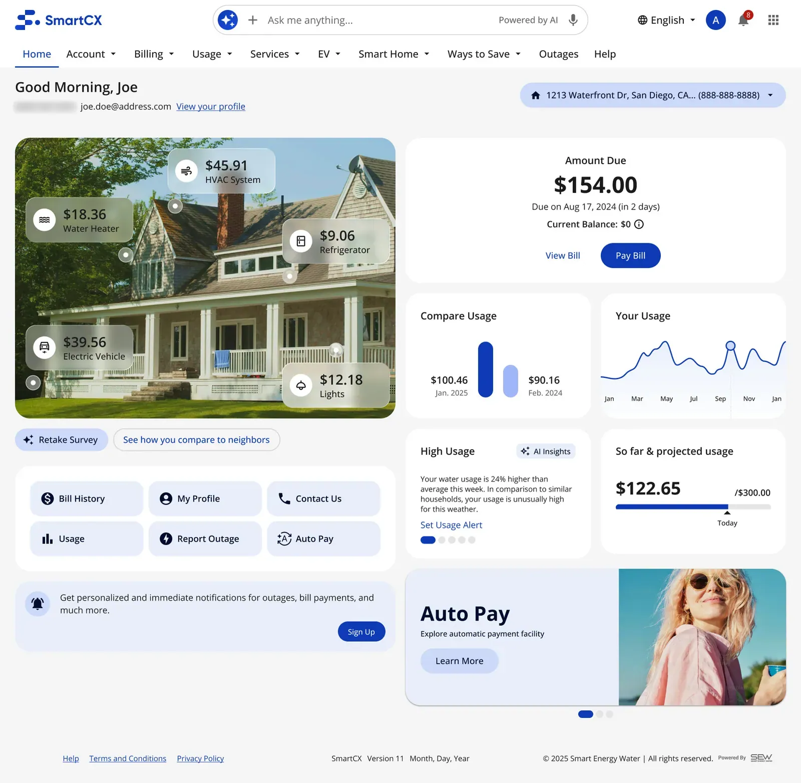
- Amount due and Pay first A clean card instead of a full-width banner.
- Usage in context Compare this period with last year next to the usage trend; on mobile the chart moved into the hero, with Min/H/D/M.
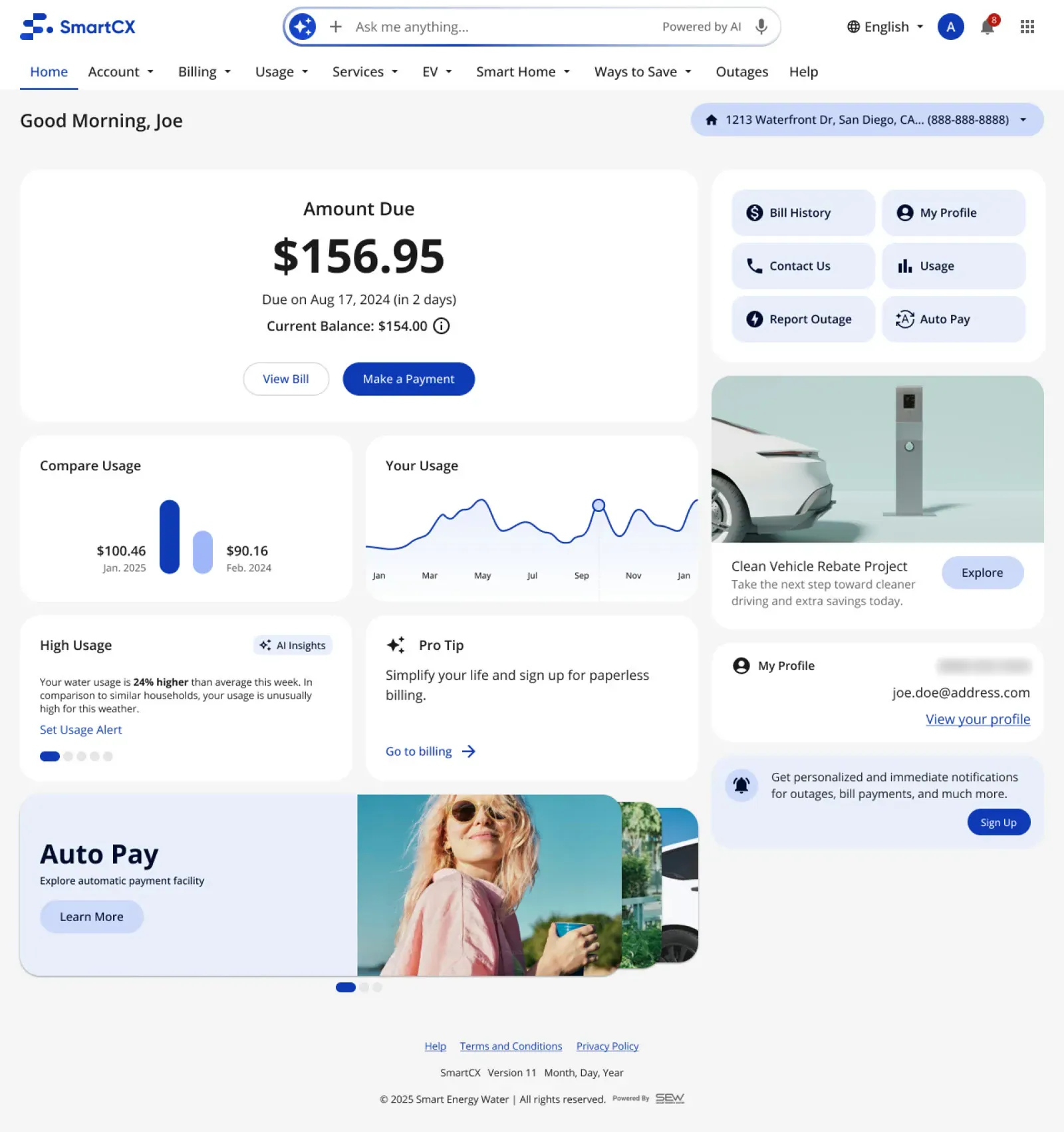
- AI insights explain the why "Your water usage is 24% higher than average this week… unusually high for this weather", with one action: Set Usage Alert.
- Quick actions An accordion of links became a grid of buttons (bill history, profile, contact, usage, outage, Auto Pay).
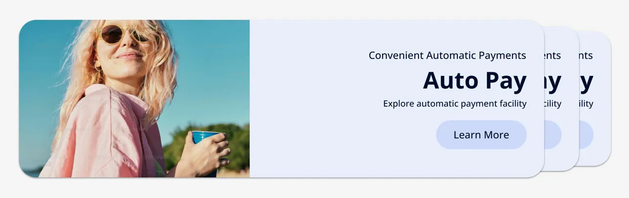
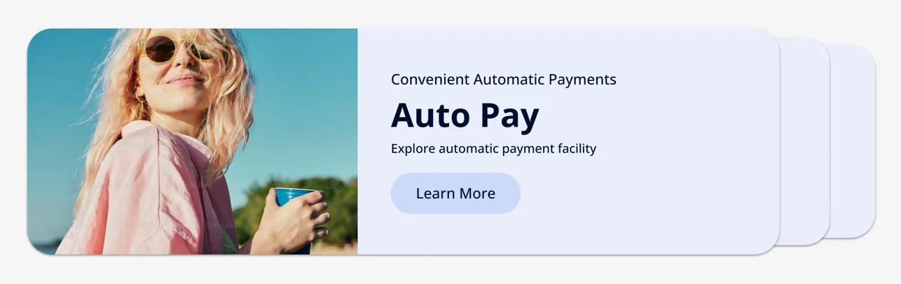
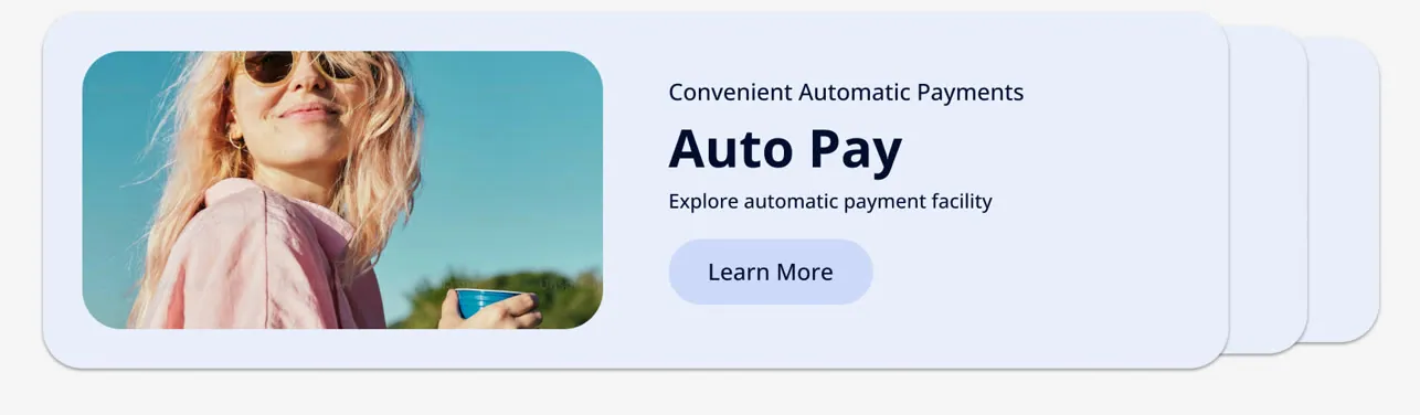
- Pro tips and recommendations A carousel for programs like Auto Pay, paperless and EV rebates.
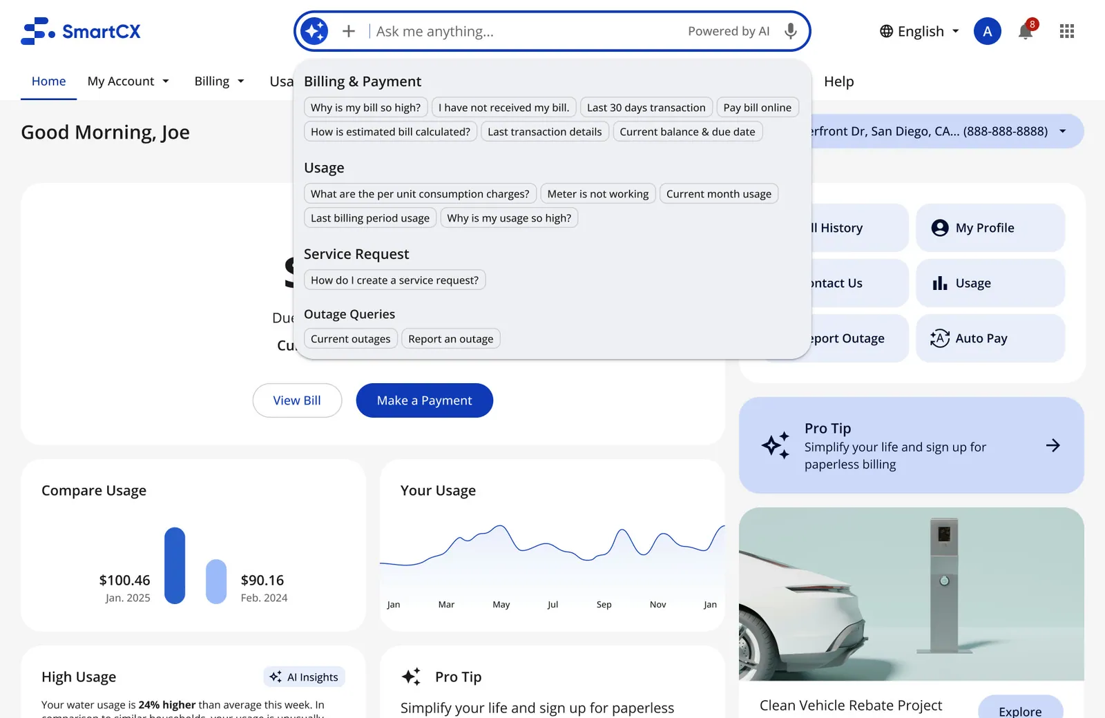
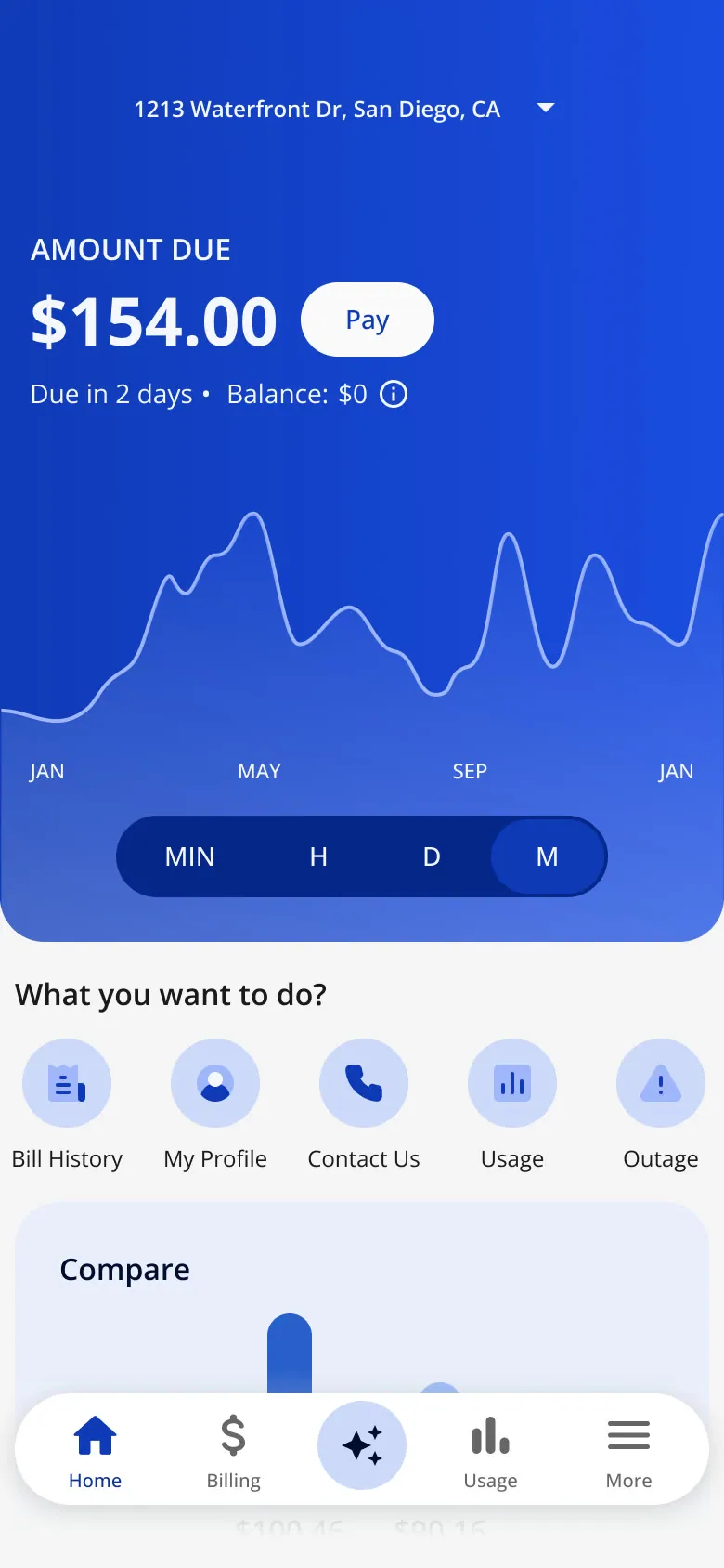
- "Ask me anything" An AI search bar in the header with a "Powered by AI" label; on mobile, AI became the center tab.
Every variant, kept and discarded
The six decisions came out of a lot of throwaway work. Web first, then the app; jump to a group with the buttons.
-
Built (MVP) · With a promo banner
-
Built (MVP) · With content
-
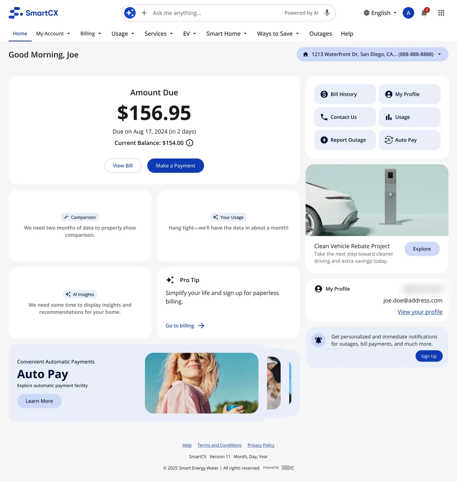
Built (MVP) · New customer, no history yet
-
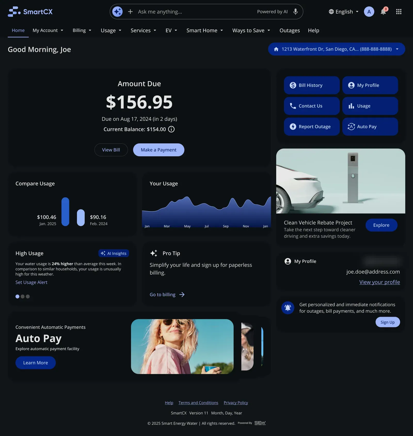
Built (MVP) · Dark theme
-
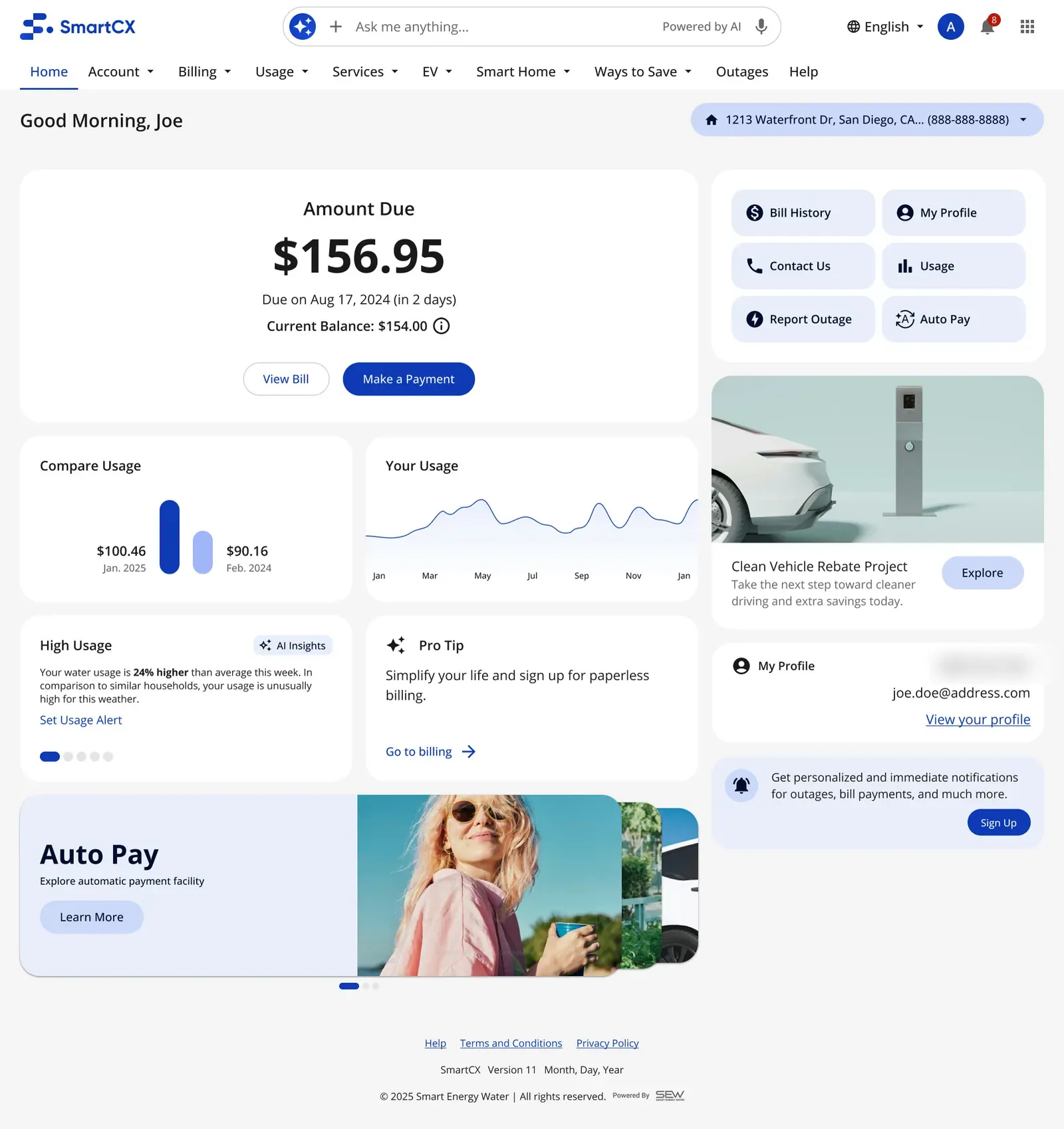
After MVP · After WE3: new banner and carousel dots
-
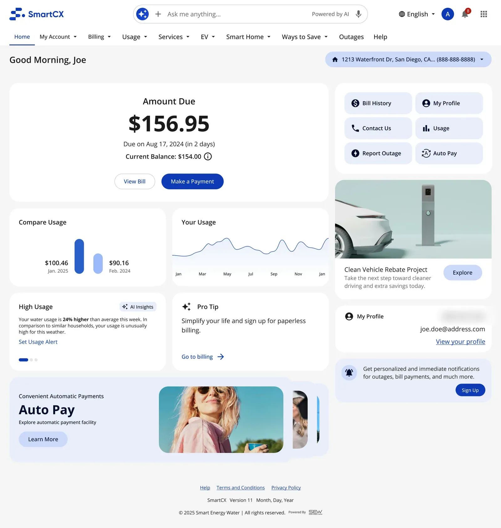
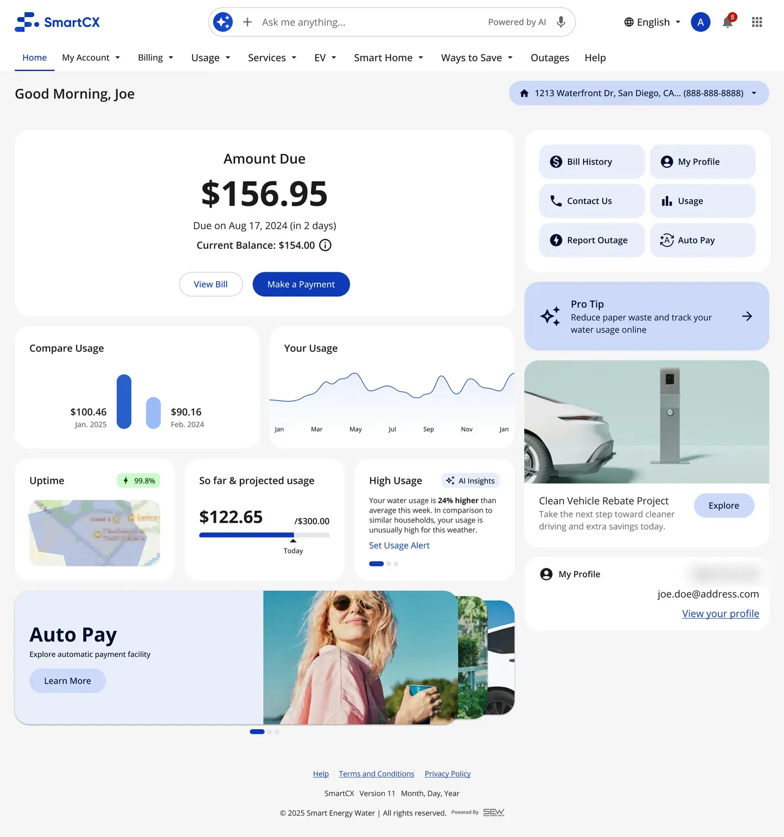
Card layouts · Current card layout
-
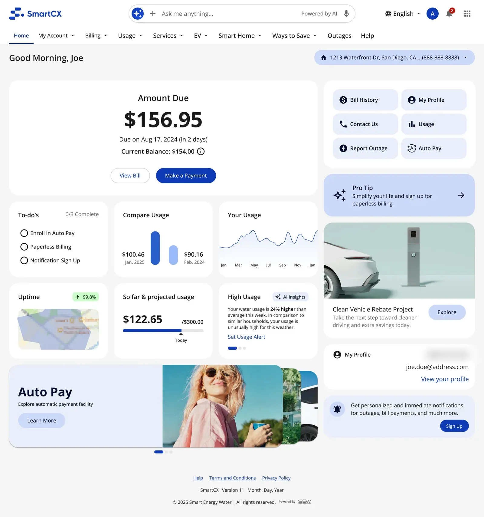
Card layouts · Six cards, 1.1
-
Card layouts · Six cards, 1.2: some setup steps done
-
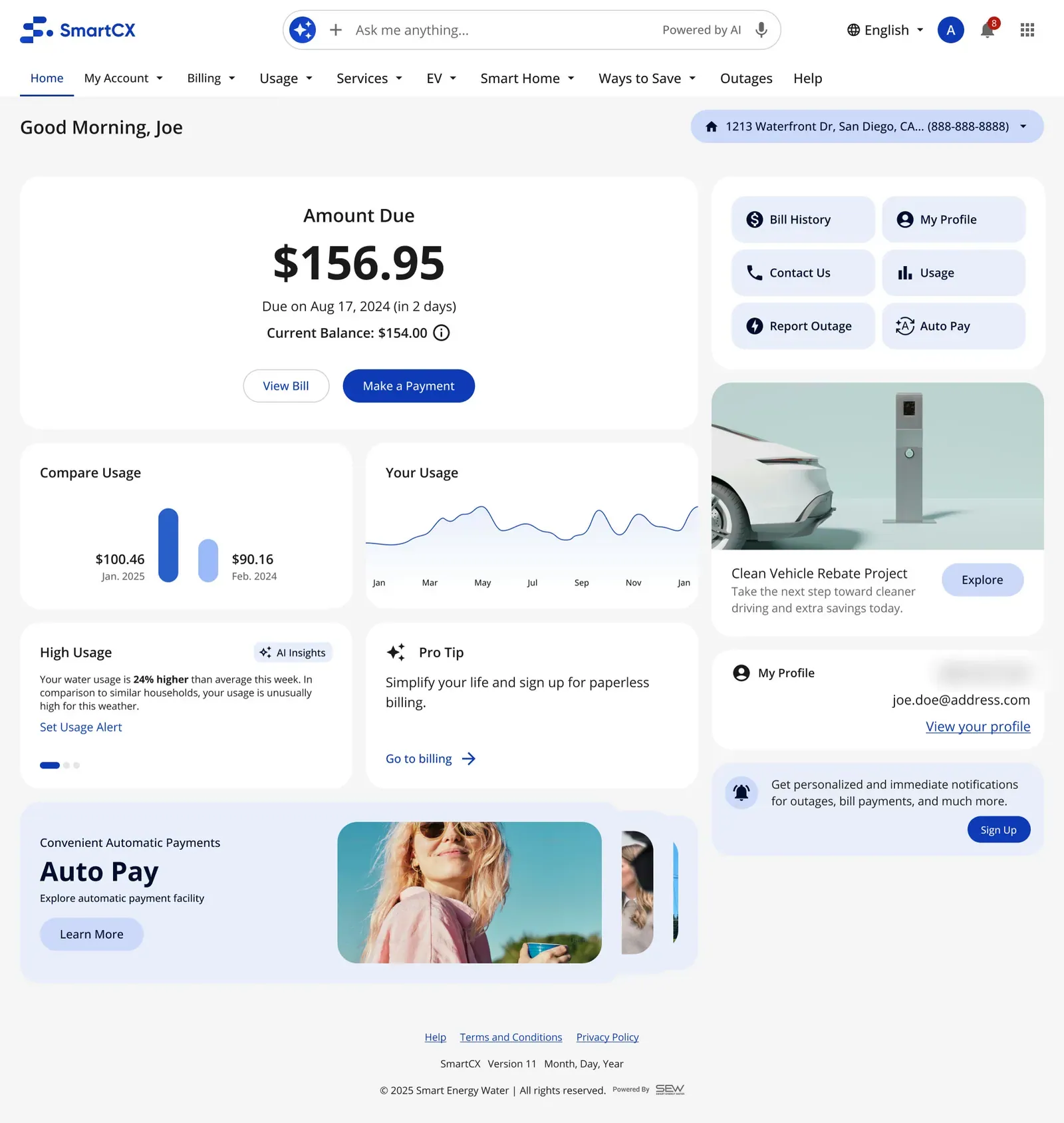
Promo, discarded · Current
-
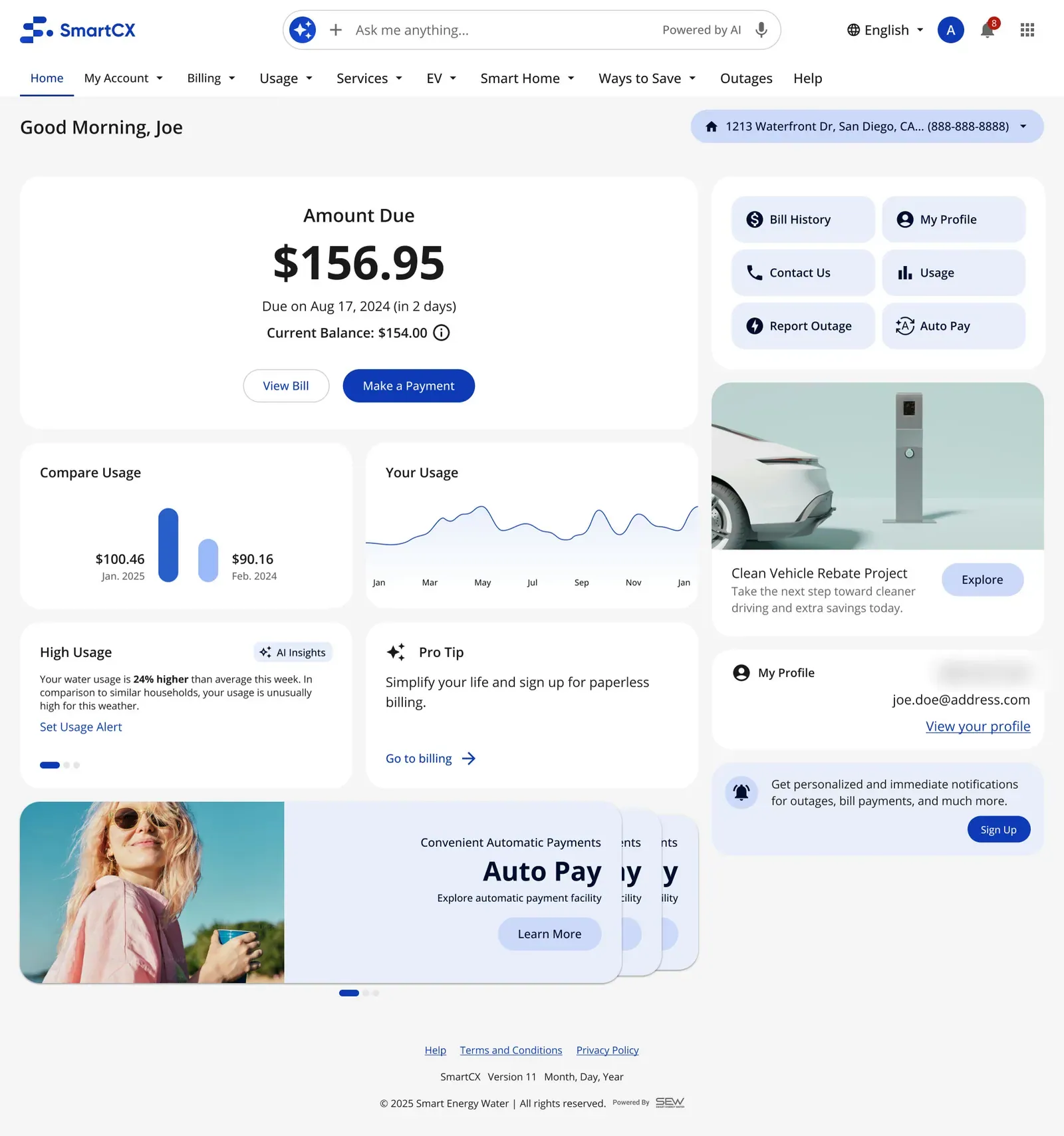
Promo, discarded · Variant 1
-
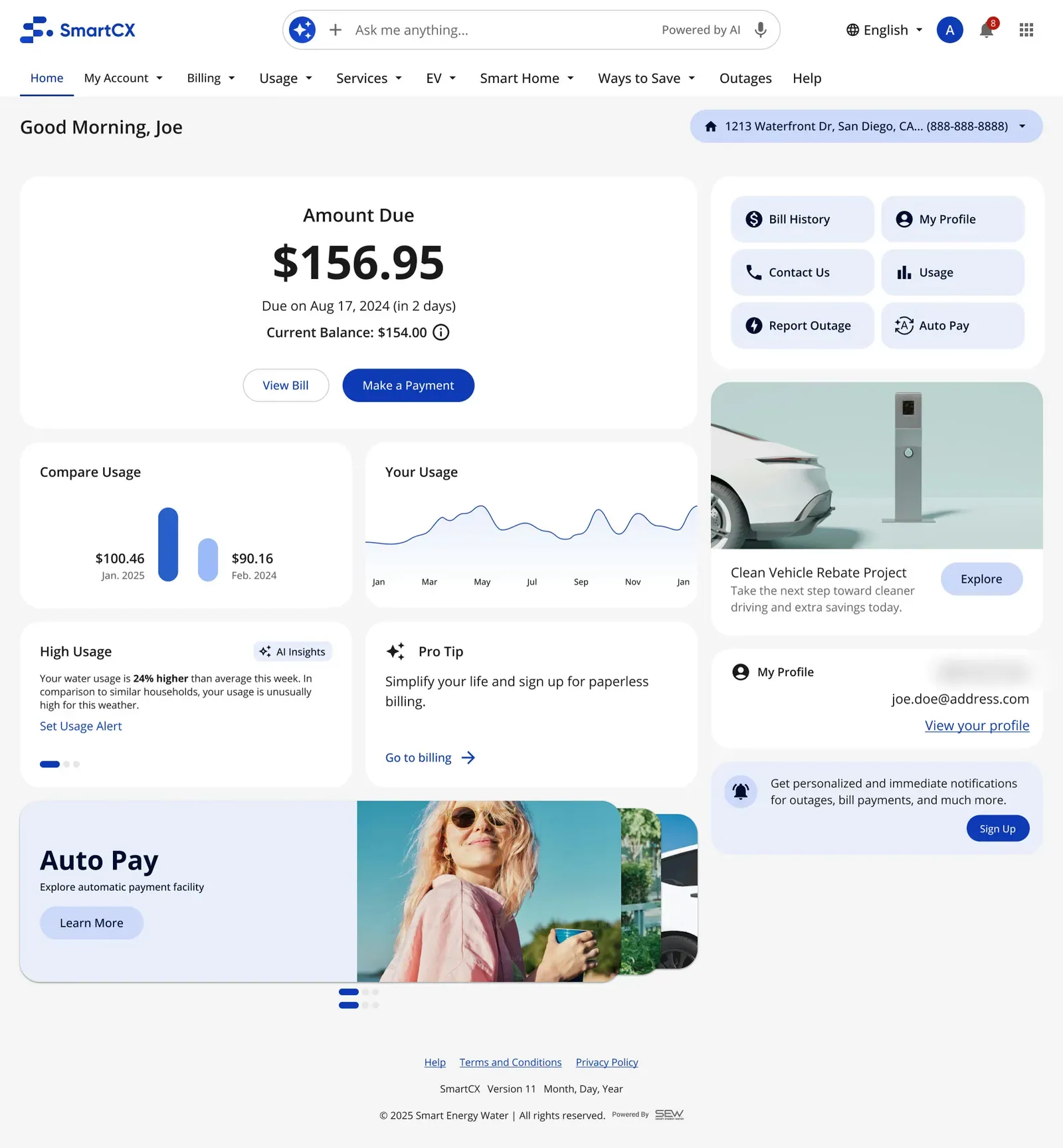
Promo, discarded · Variant 2
-
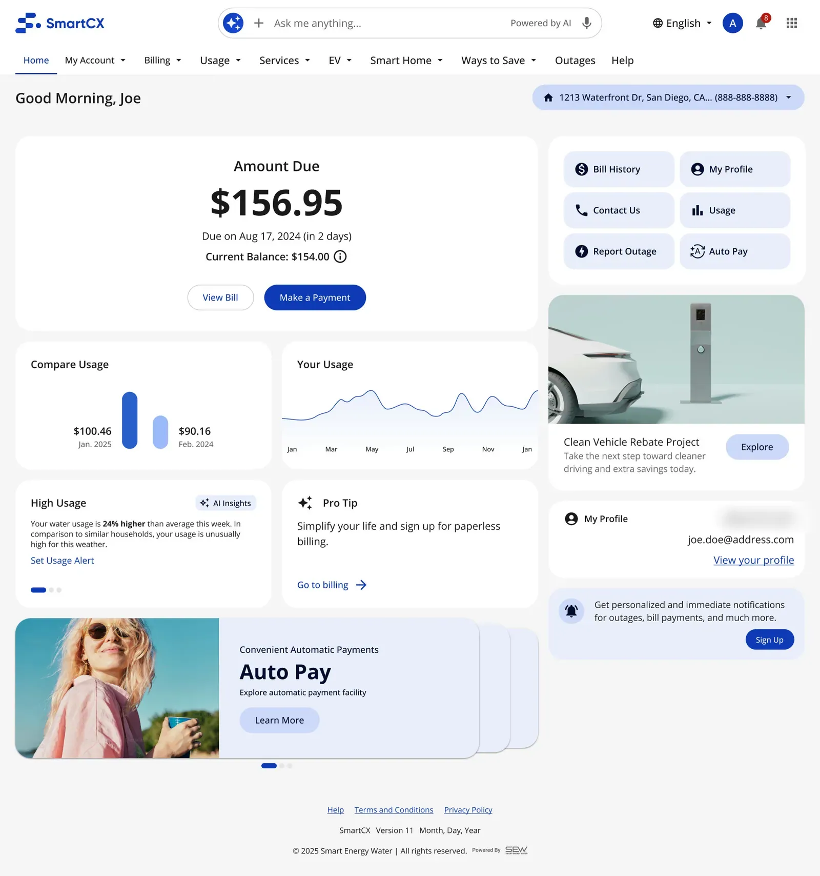
Promo, discarded · Variant 3
-
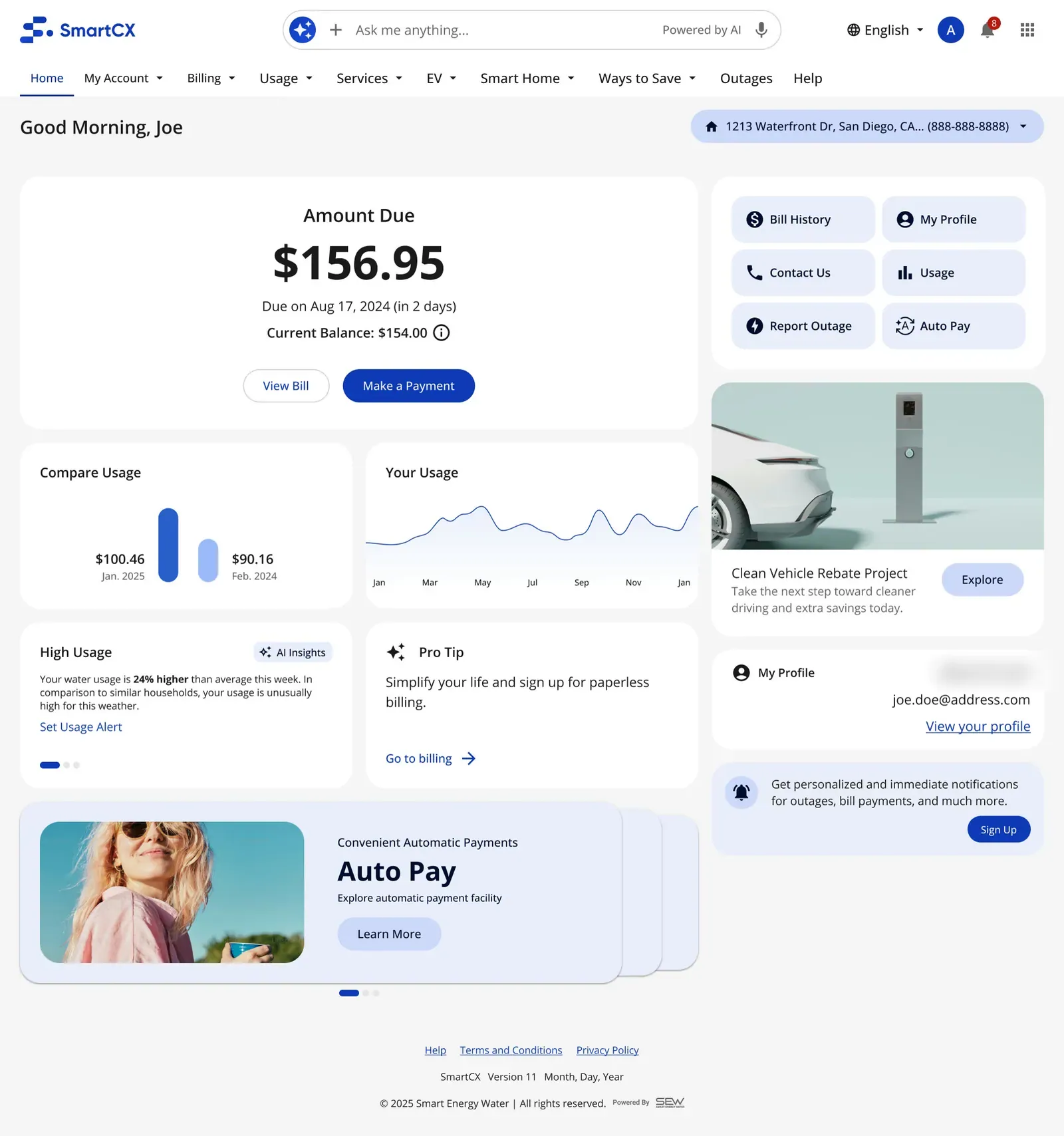
Promo, discarded · Variant 4
-
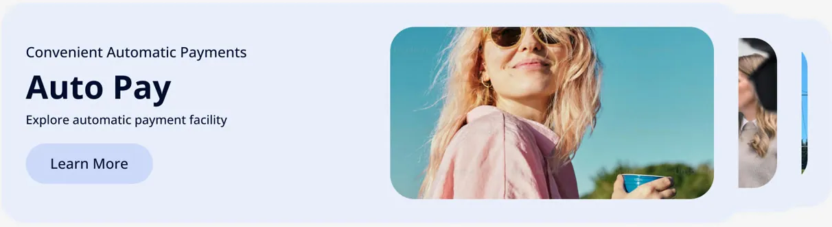
Banner · Current banner
-
Banner · Banner variant 1
-
Banner · Banner variant 3
-
Banner · Banner variant 4
-
AI search · Option A
-
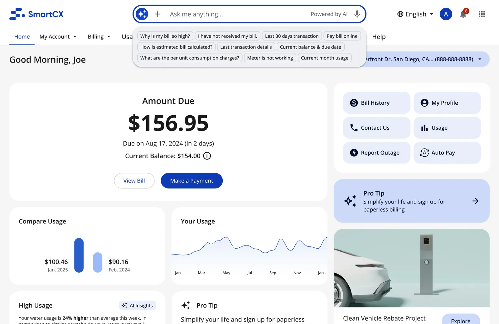
AI search · Option B
-
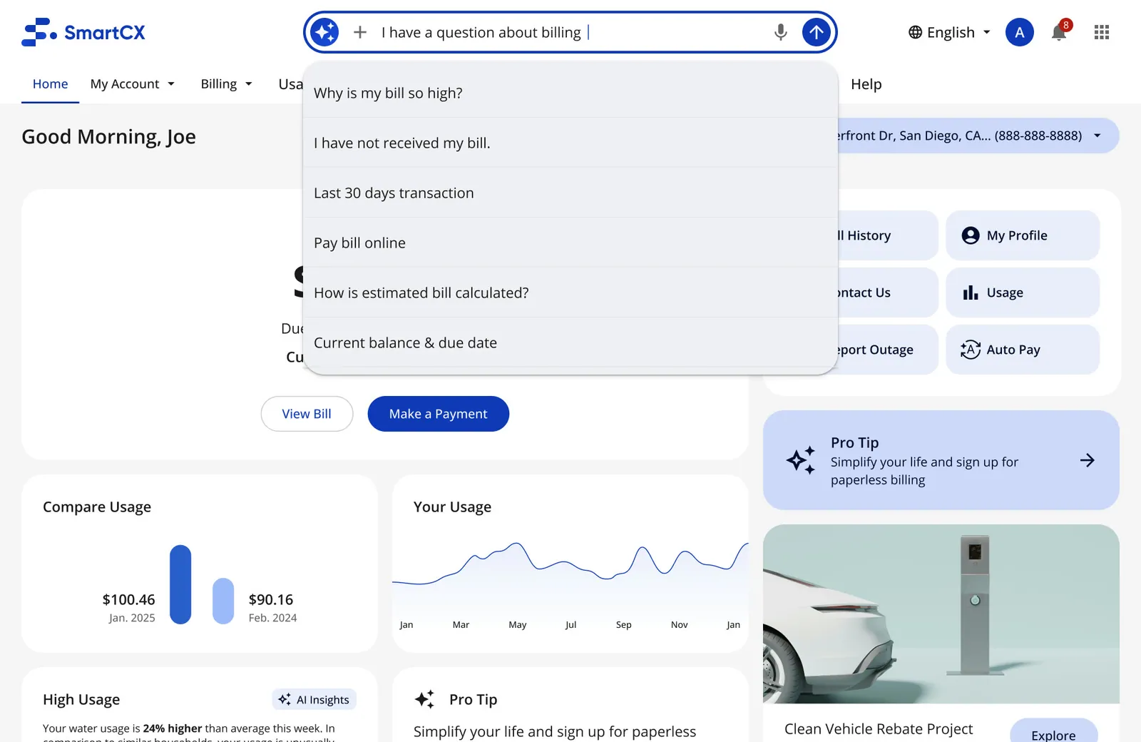
AI search · Option C
-
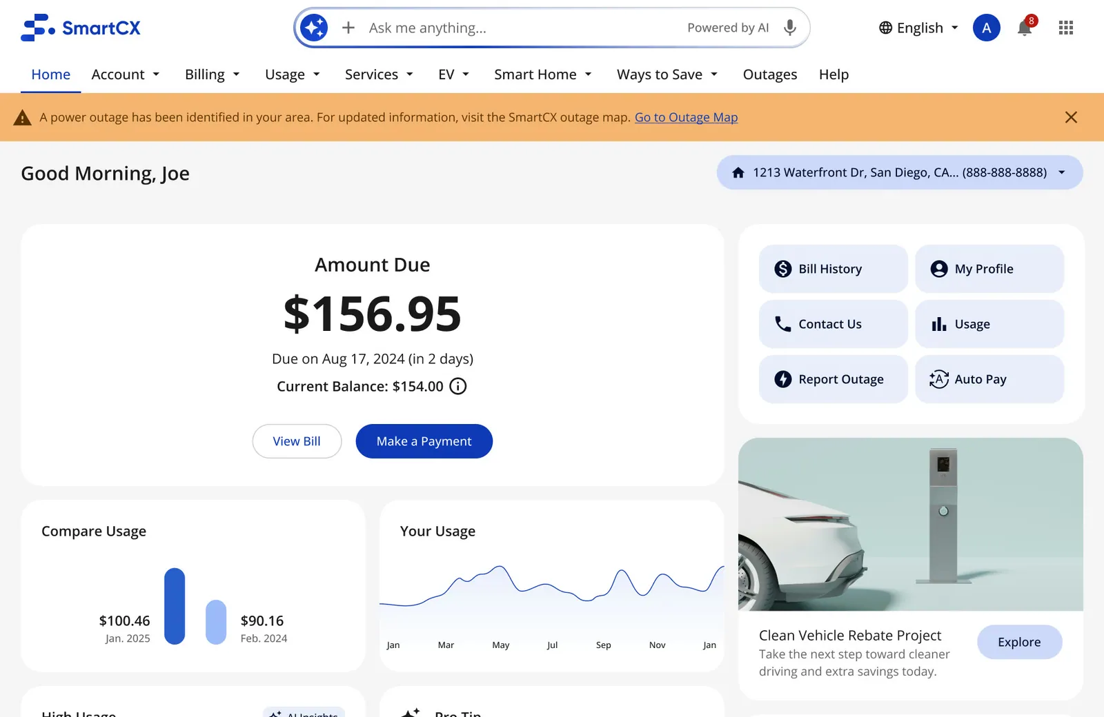
Loading · Loading shimmer, archived
-
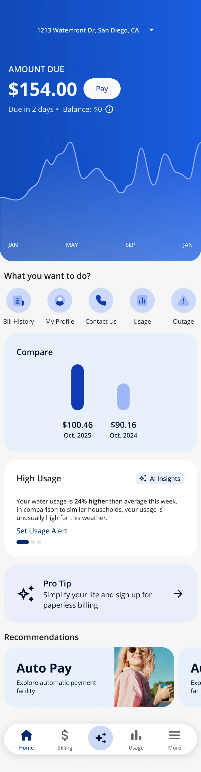
Built (MVP) · Month view · scroll ↕
-
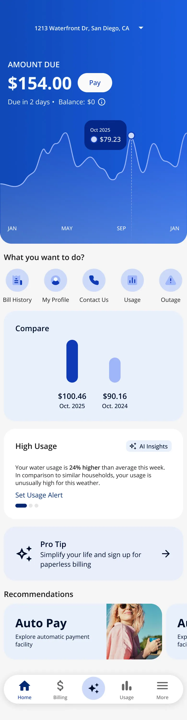
Built (MVP) · Chart tooltip · scroll ↕
-
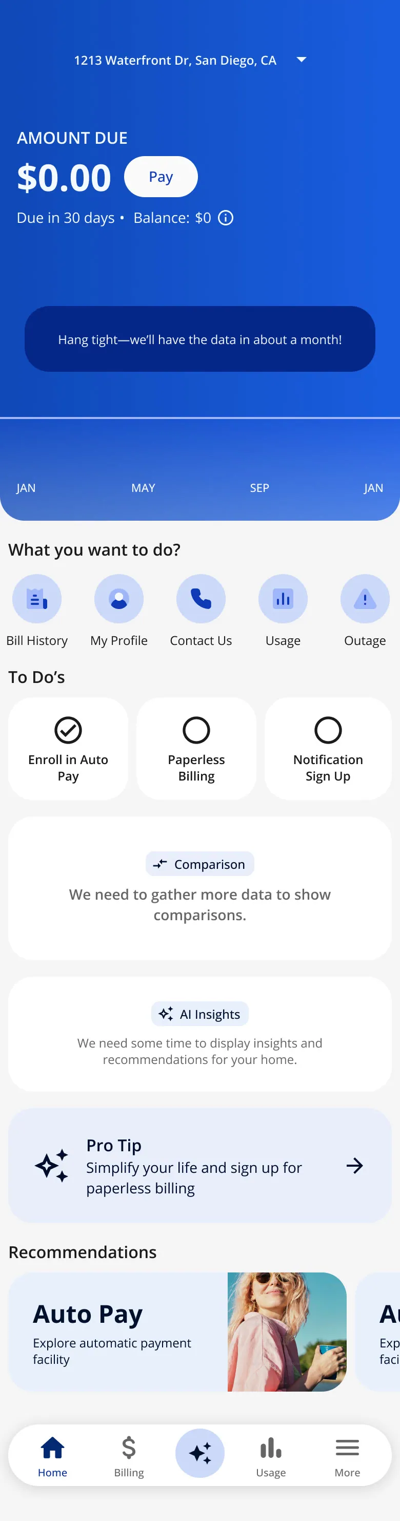
Built (MVP) · New customer · scroll ↕
-
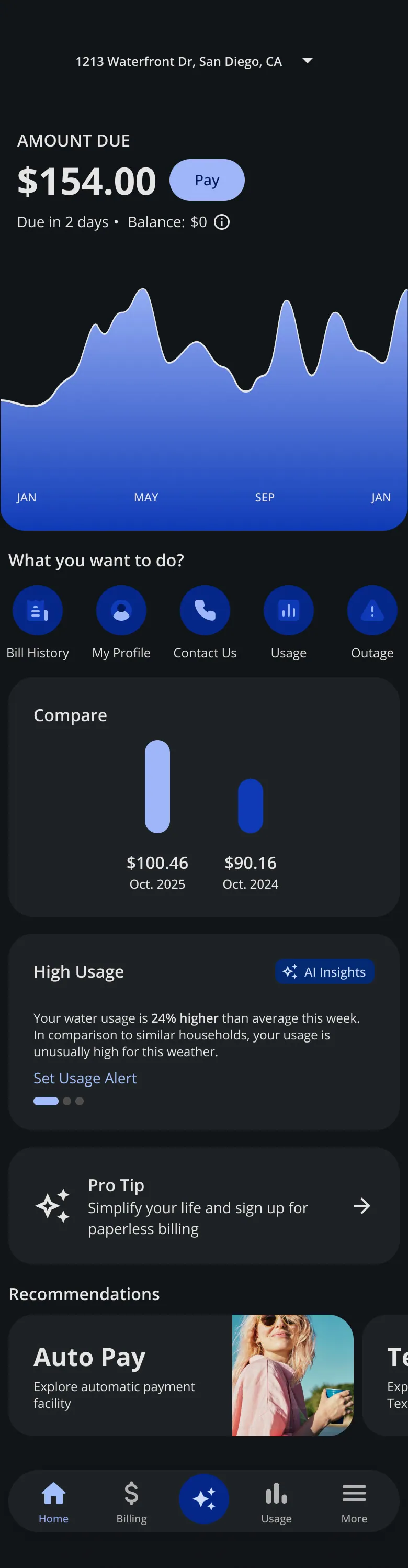
Built (MVP) · Dark theme · scroll ↕
-
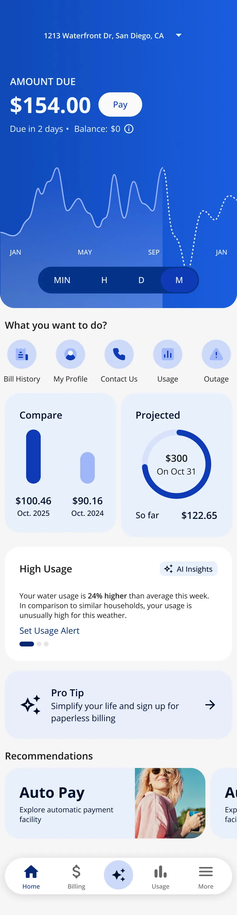
After MVP · Projected bill added · scroll ↕
-
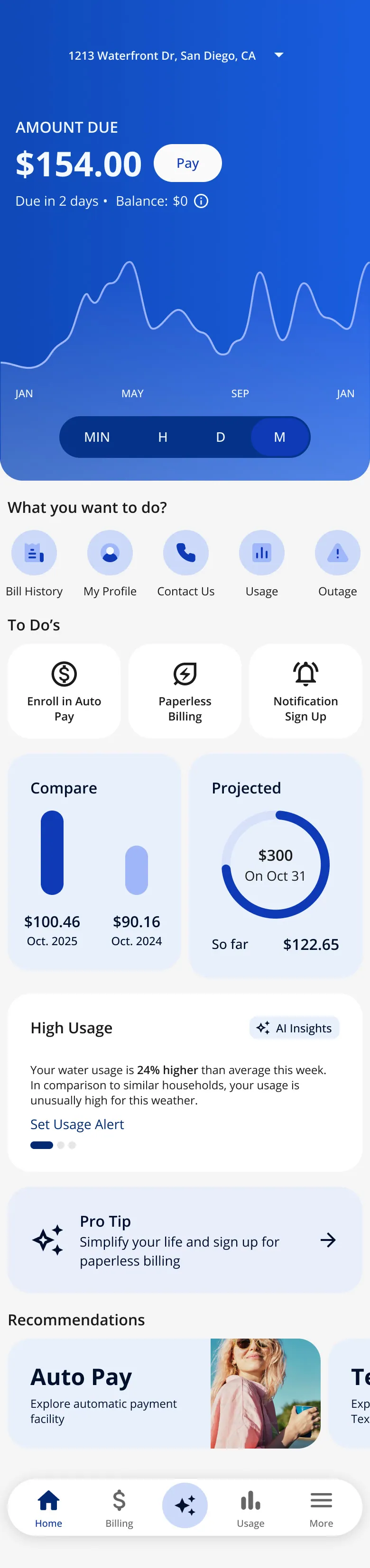
After MVP · To-dos, 1 · scroll ↕
-
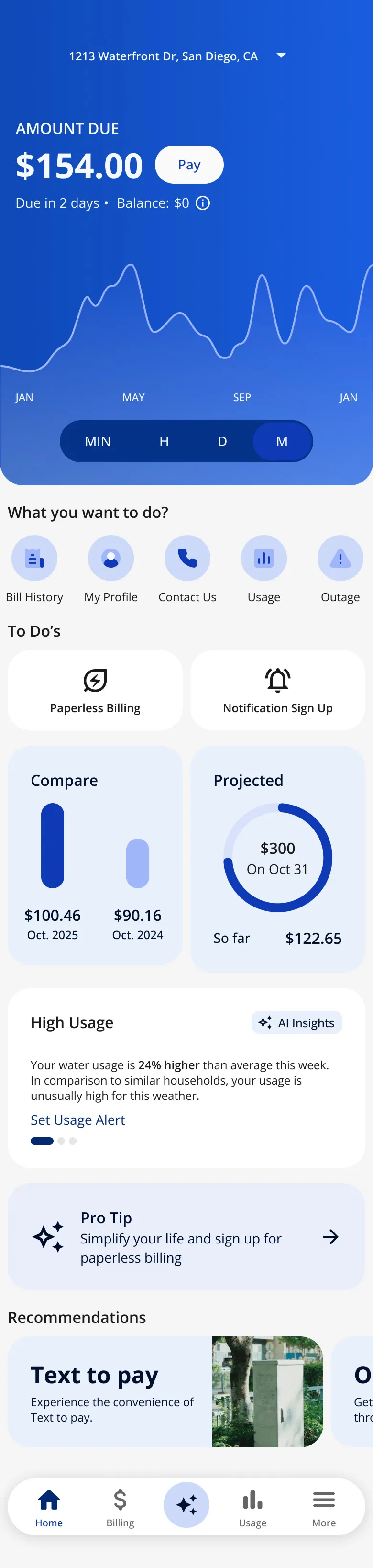
After MVP · To-dos, 2 · scroll ↕
-
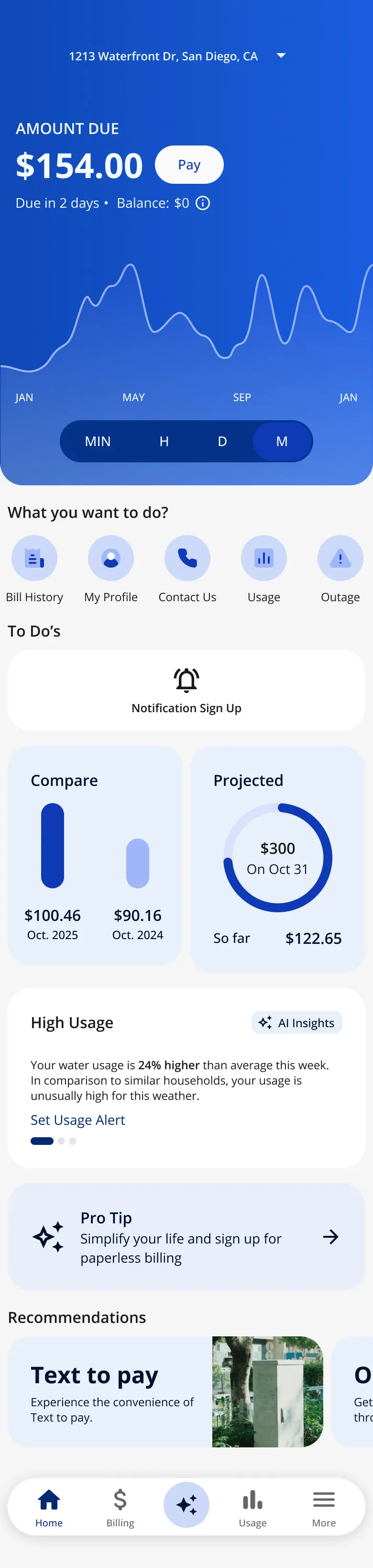
After MVP · To-dos, 3 · scroll ↕
-
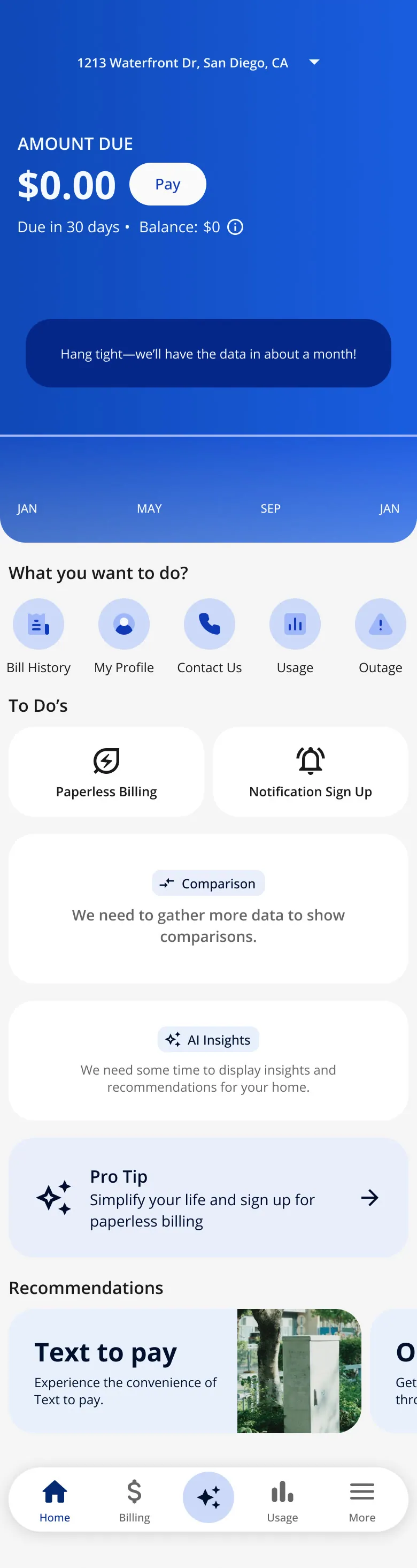
After MVP · To-dos for a new customer, 1 · scroll ↕
-
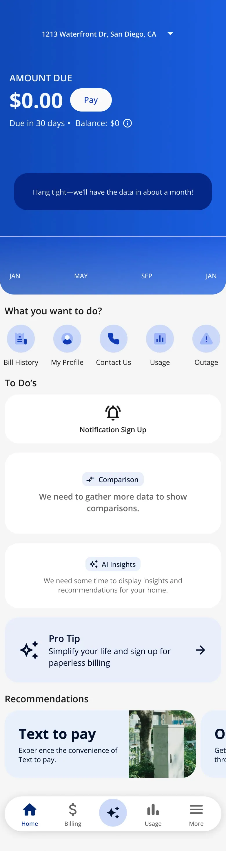
After MVP · To-dos for a new customer, 2 · scroll ↕
-
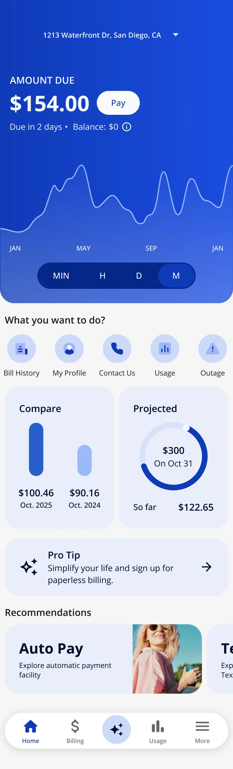
Meter types · Smart meter: month · scroll ↕
-
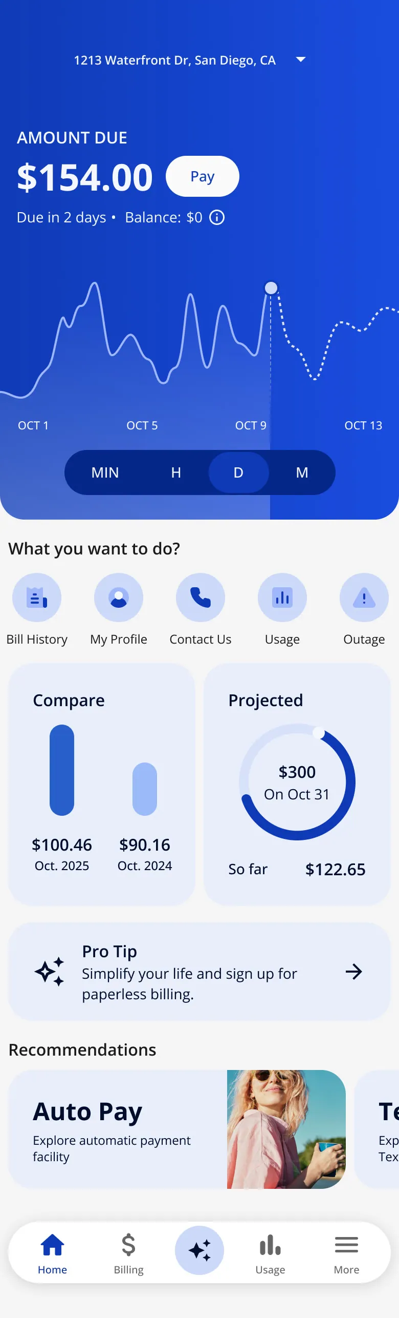
Meter types · Smart meter: day · scroll ↕
-
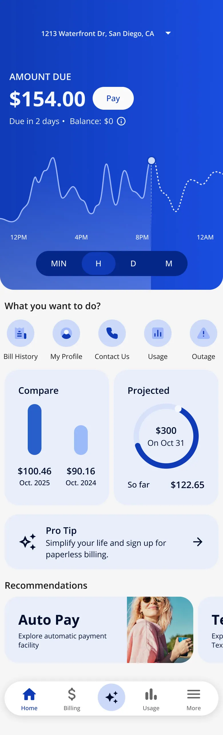
Meter types · Smart meter: hour · scroll ↕
-
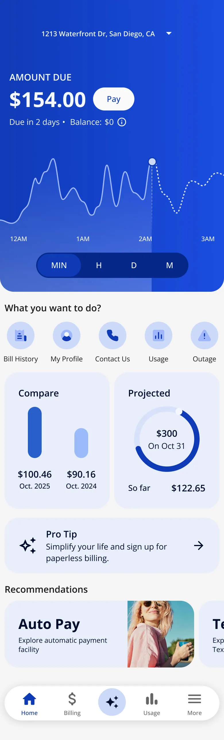
Meter types · Smart meter: 15 minutes · scroll ↕
-
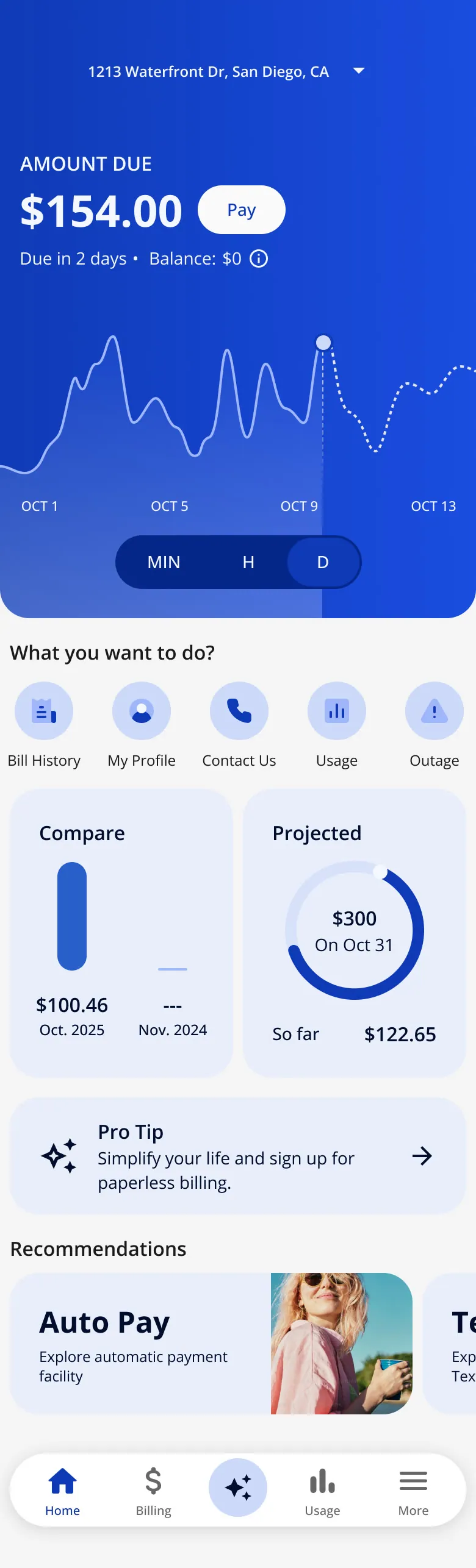
Meter types · Only one month so far · scroll ↕
-
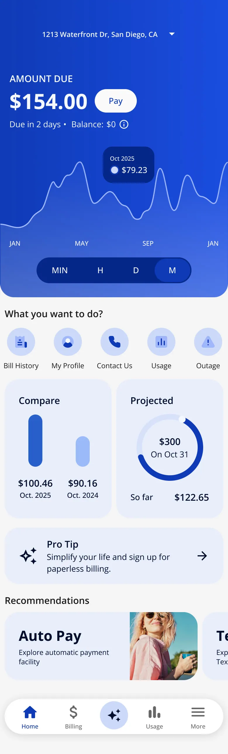
Meter types · Tooltip · scroll ↕
-
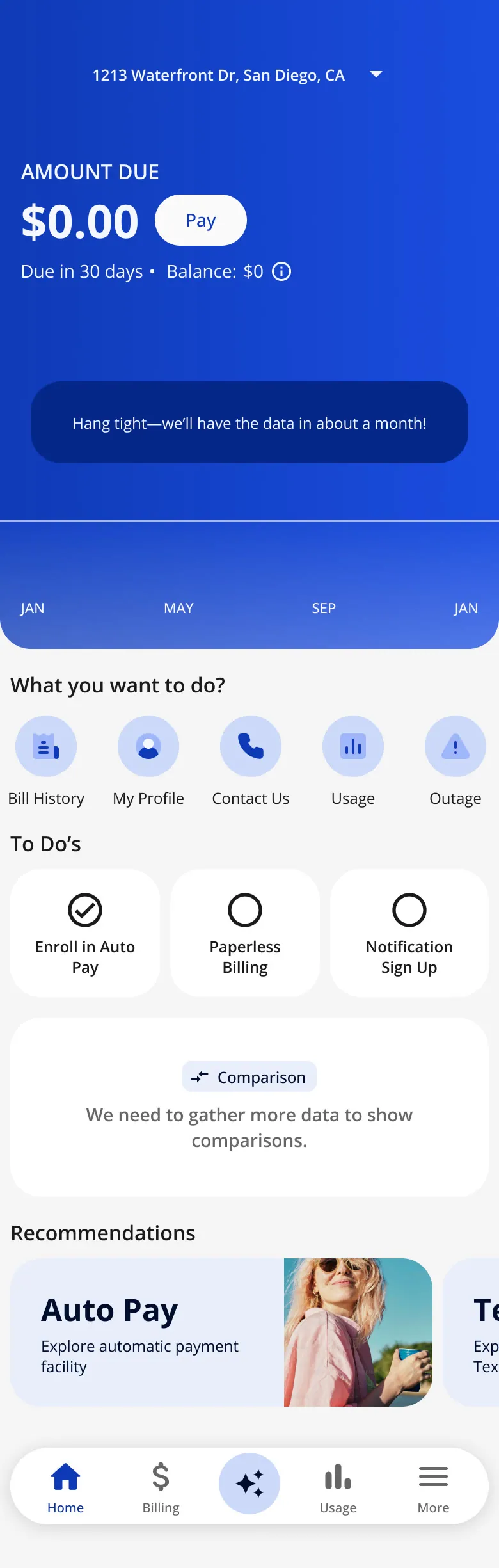
Meter types · No data yet · scroll ↕
-
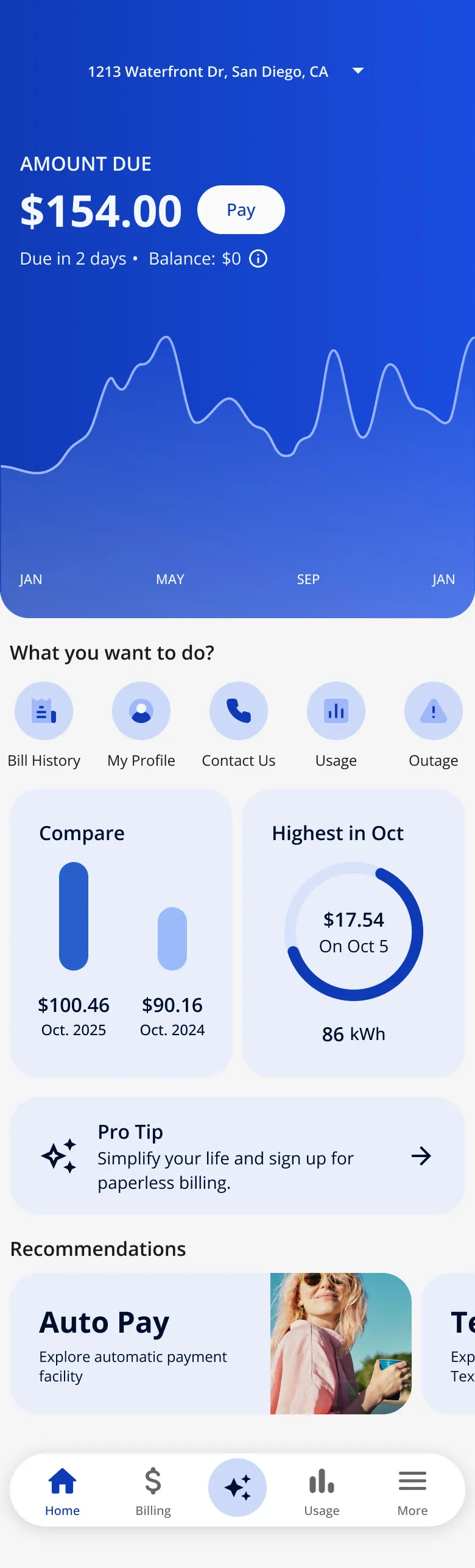
Meter types · Standard meter: monthly only · scroll ↕
-
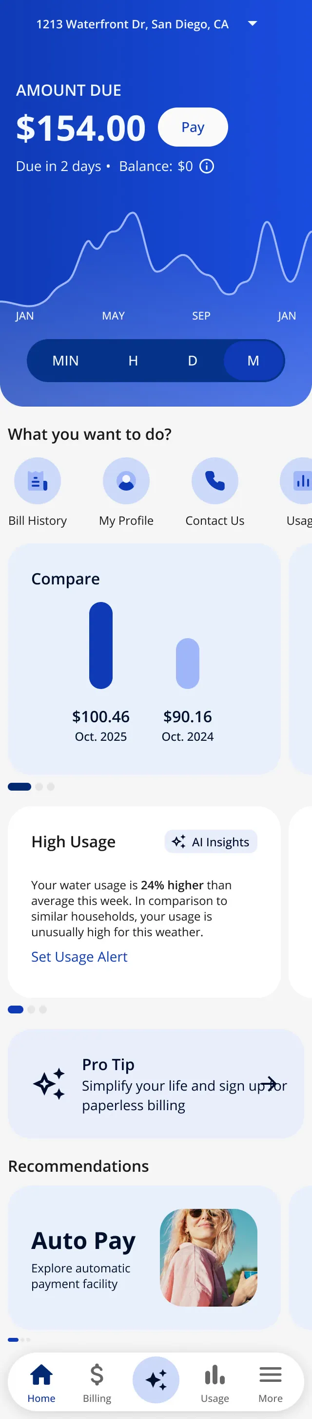
Small screens · 320 px wide · scroll ↕
-
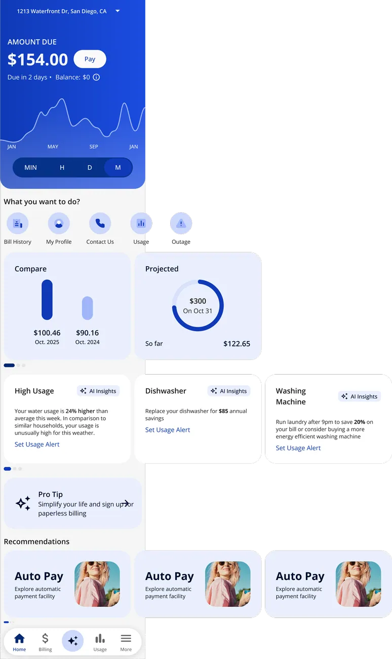
Small screens · Showing what falls below the fold
-
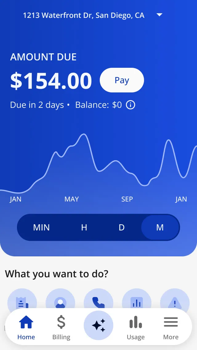
Small screens · Where the first screen cuts off · scroll ↕
-
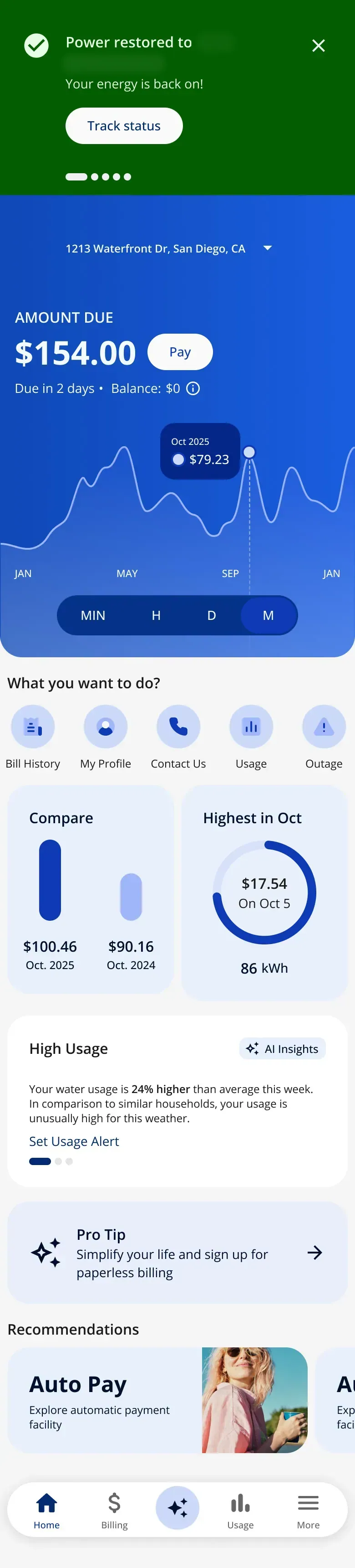
Banners · Banner 1 · scroll ↕
-
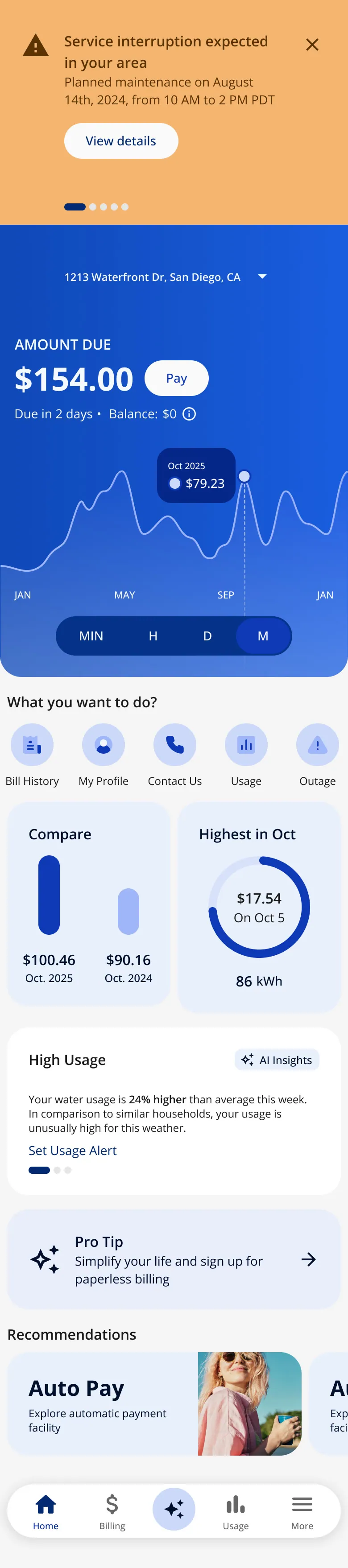
Banners · Banner 2 · scroll ↕
-
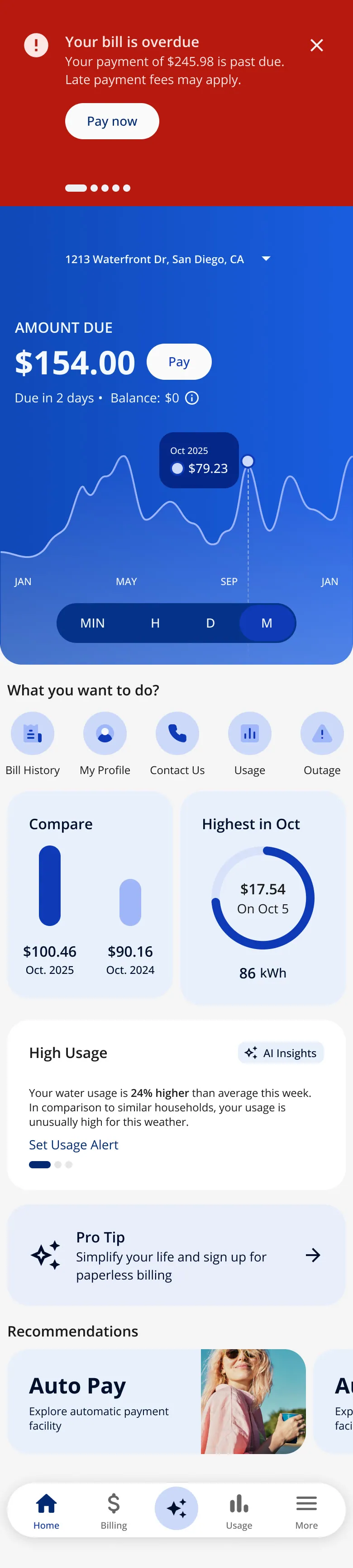
Banners · Banner 3 · scroll ↕
-
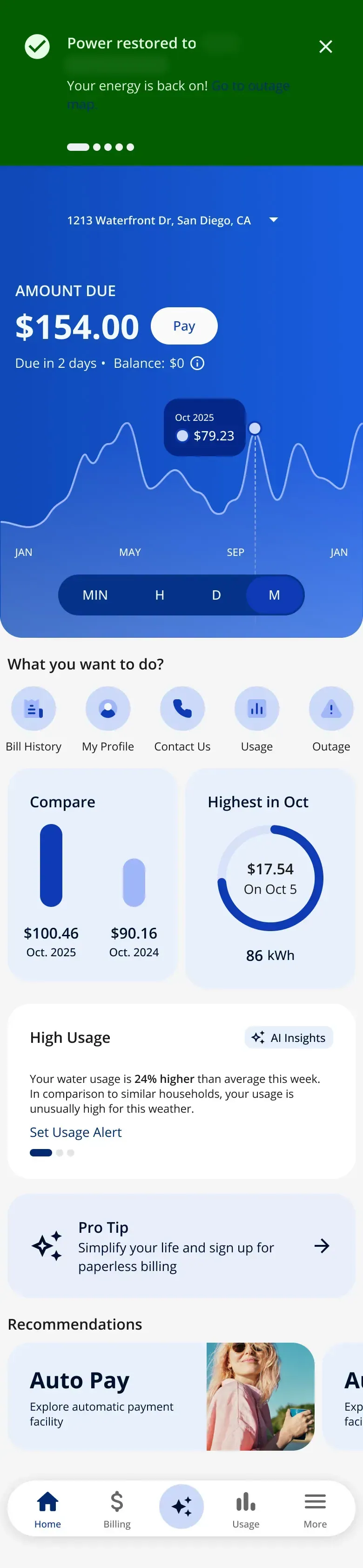
Banners · Banner 4 · scroll ↕
-
Banners · Banner 5 · scroll ↕
-
Banners · Banner 6 · scroll ↕
-
AI · AI search
-
AI · Answer in a bottom sheet
-
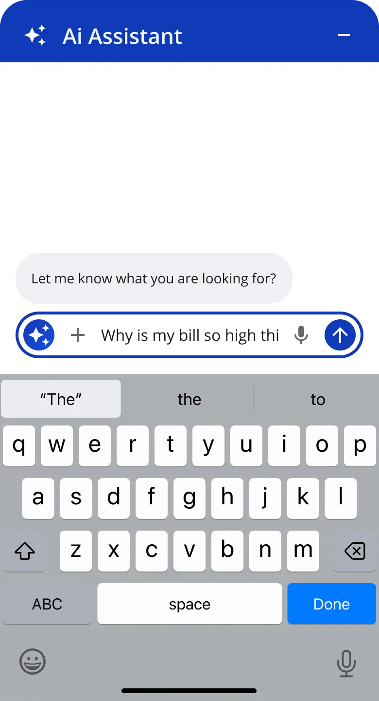
AI · Typing a question
-
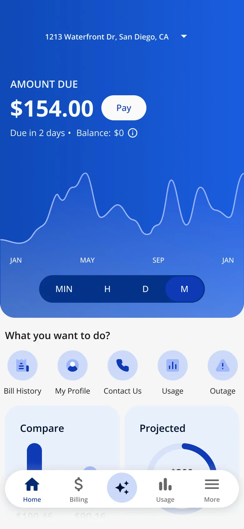
AI · AI chat
-

Responsive web · Responsive web with the AI button · scroll ↕
-
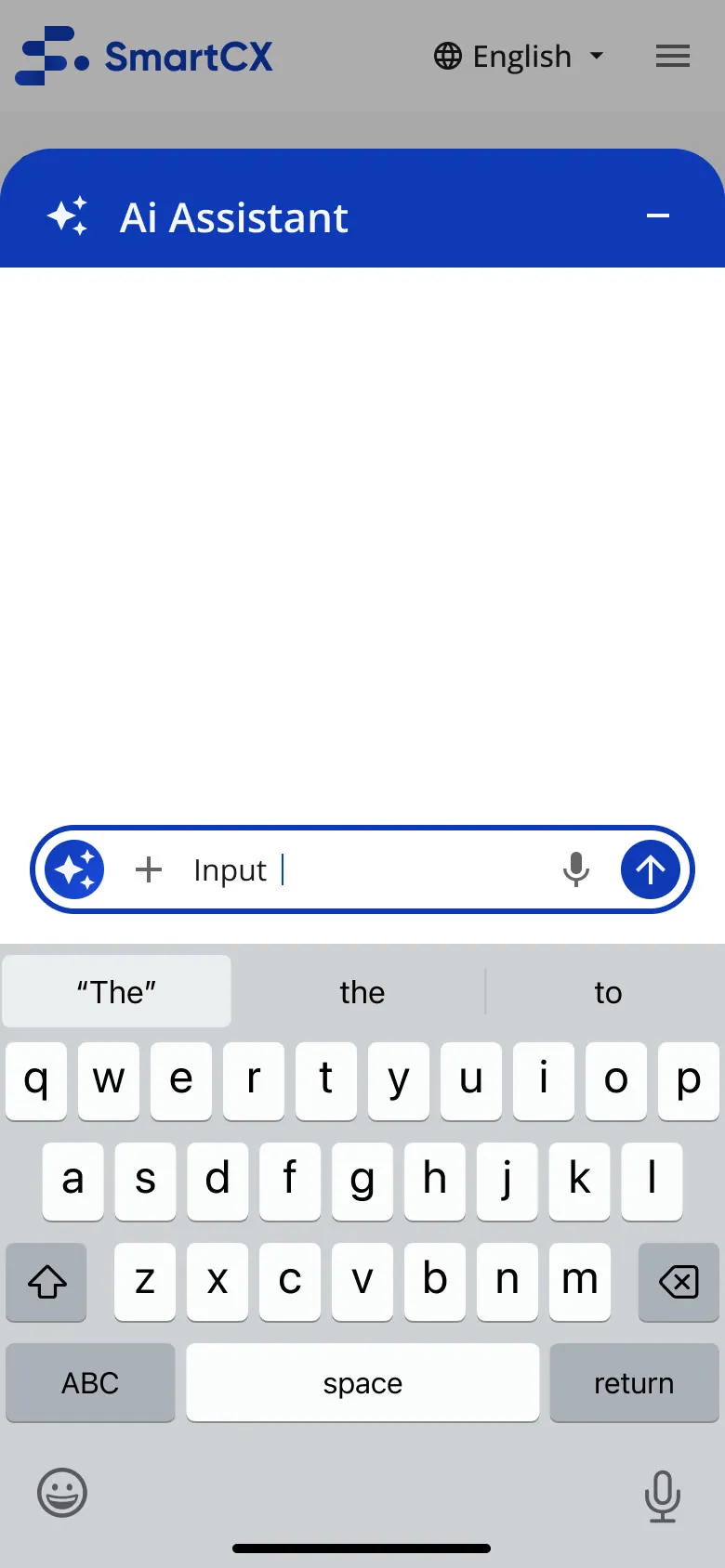
Responsive web · AI open, 1
-
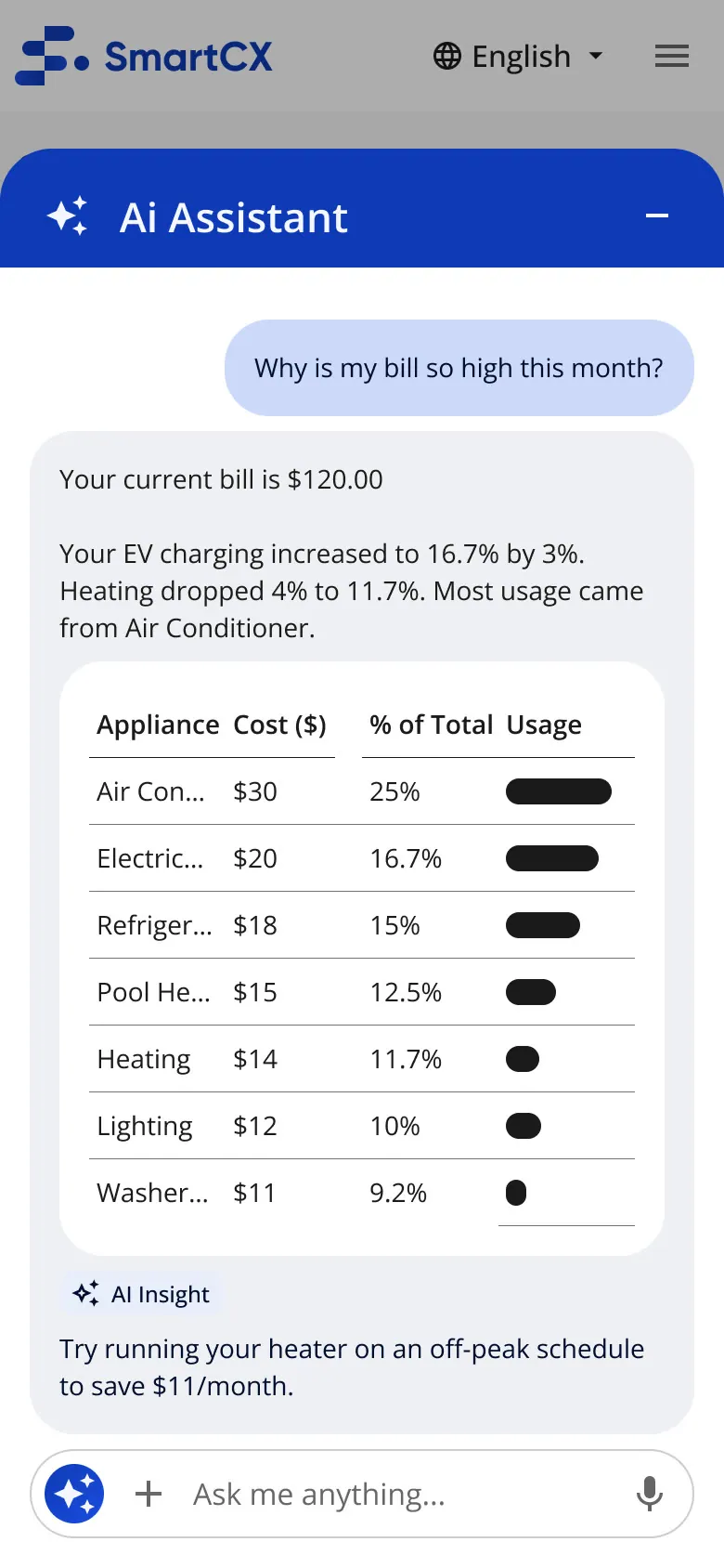
Responsive web · AI open, 2
-
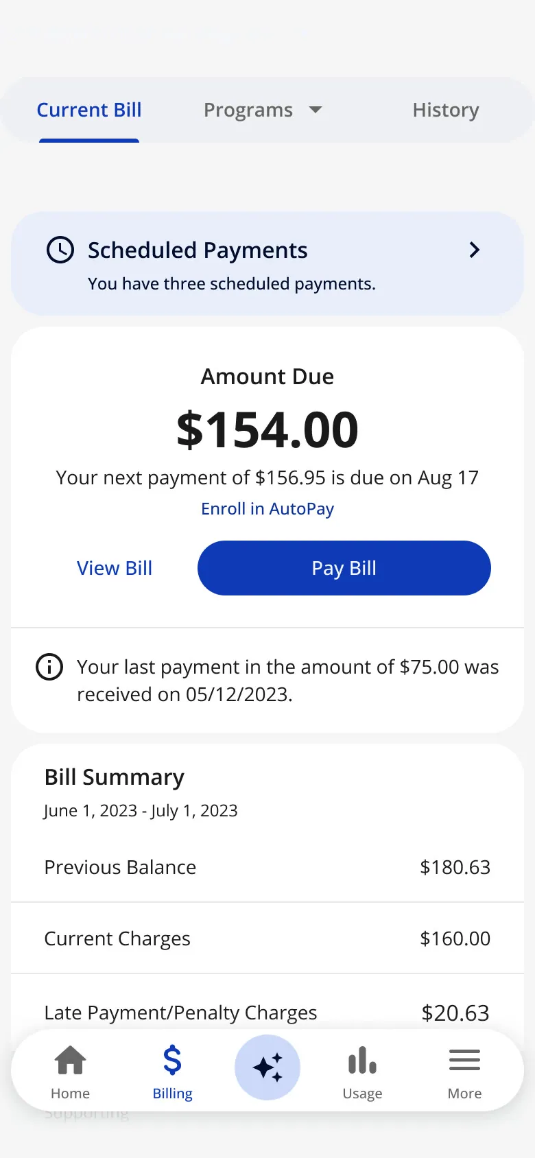
Archived ideas · Header on Billing, archived
-
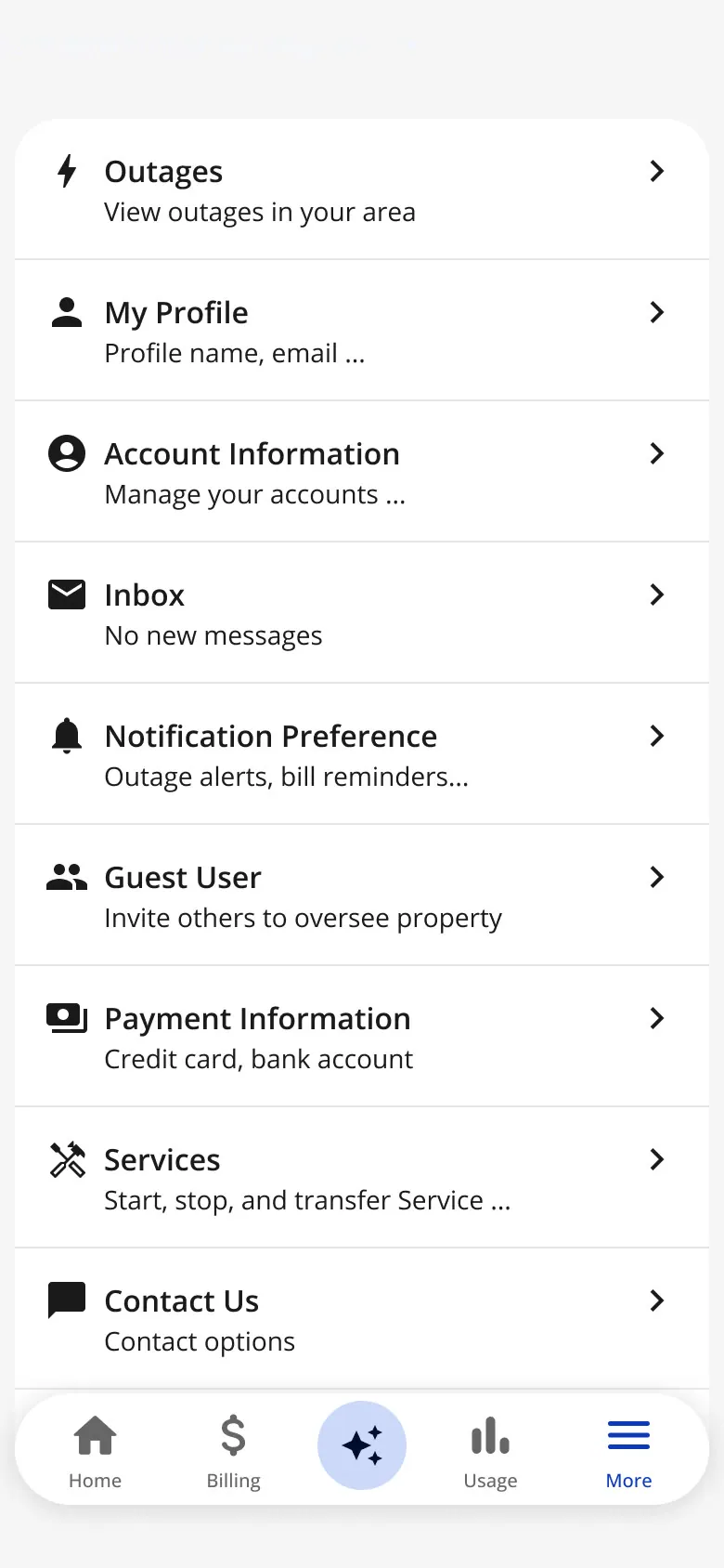
Archived ideas · More page option, archived
The key flows
Each flow below is assembled from the actual design frames, step by step.
-
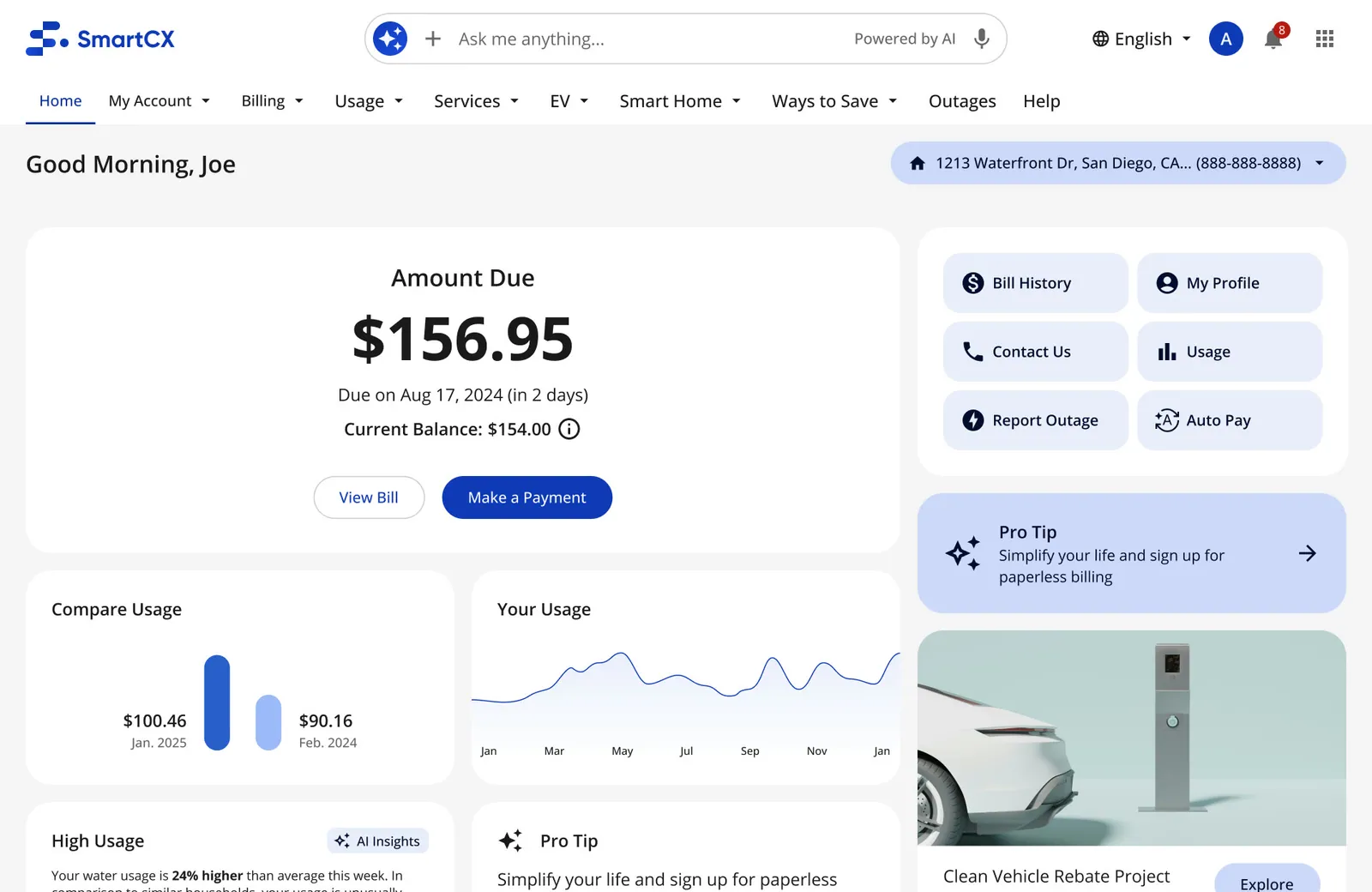
Ask me anything, in the header
-
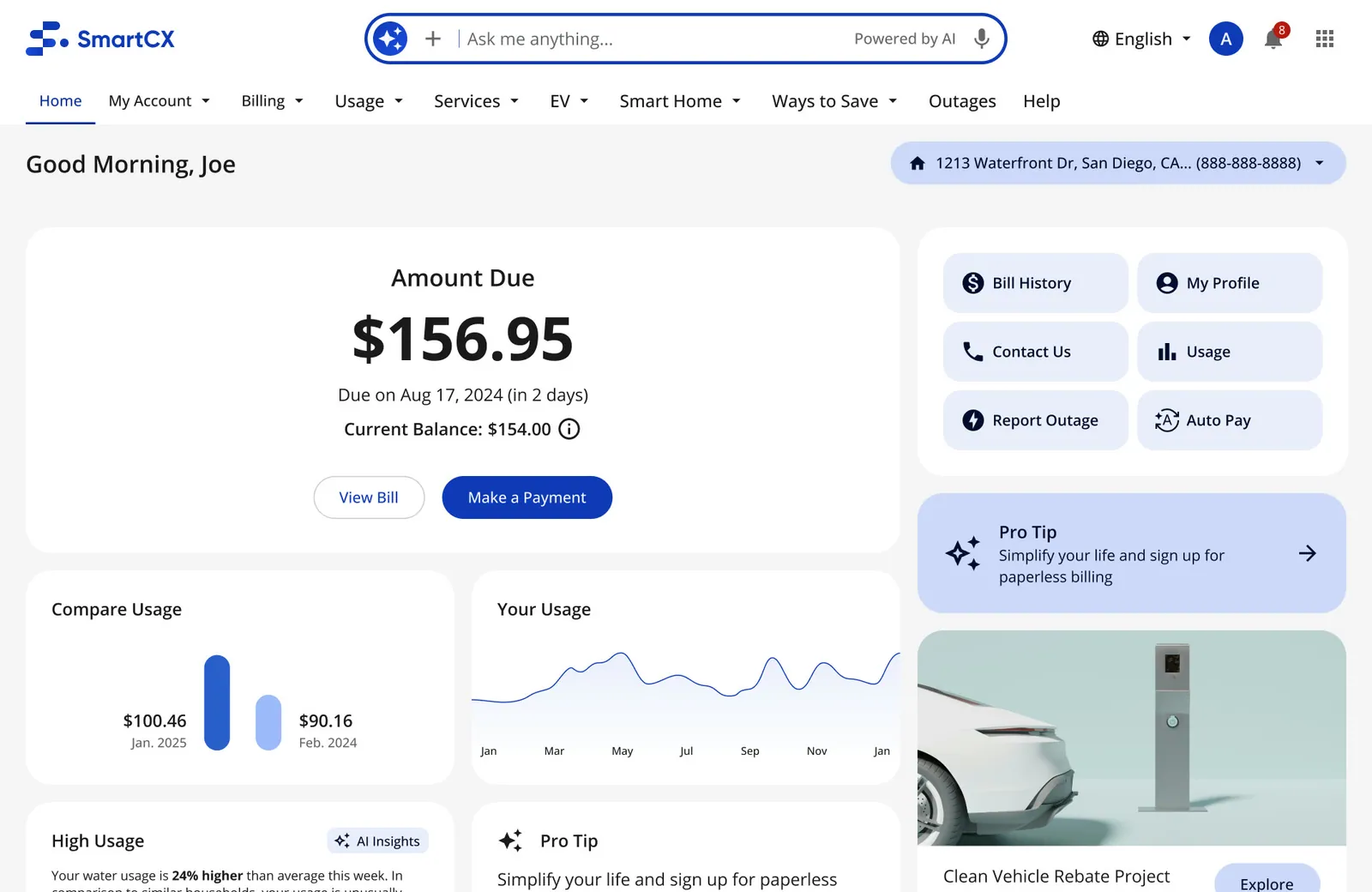
Suggested questions on focus
-
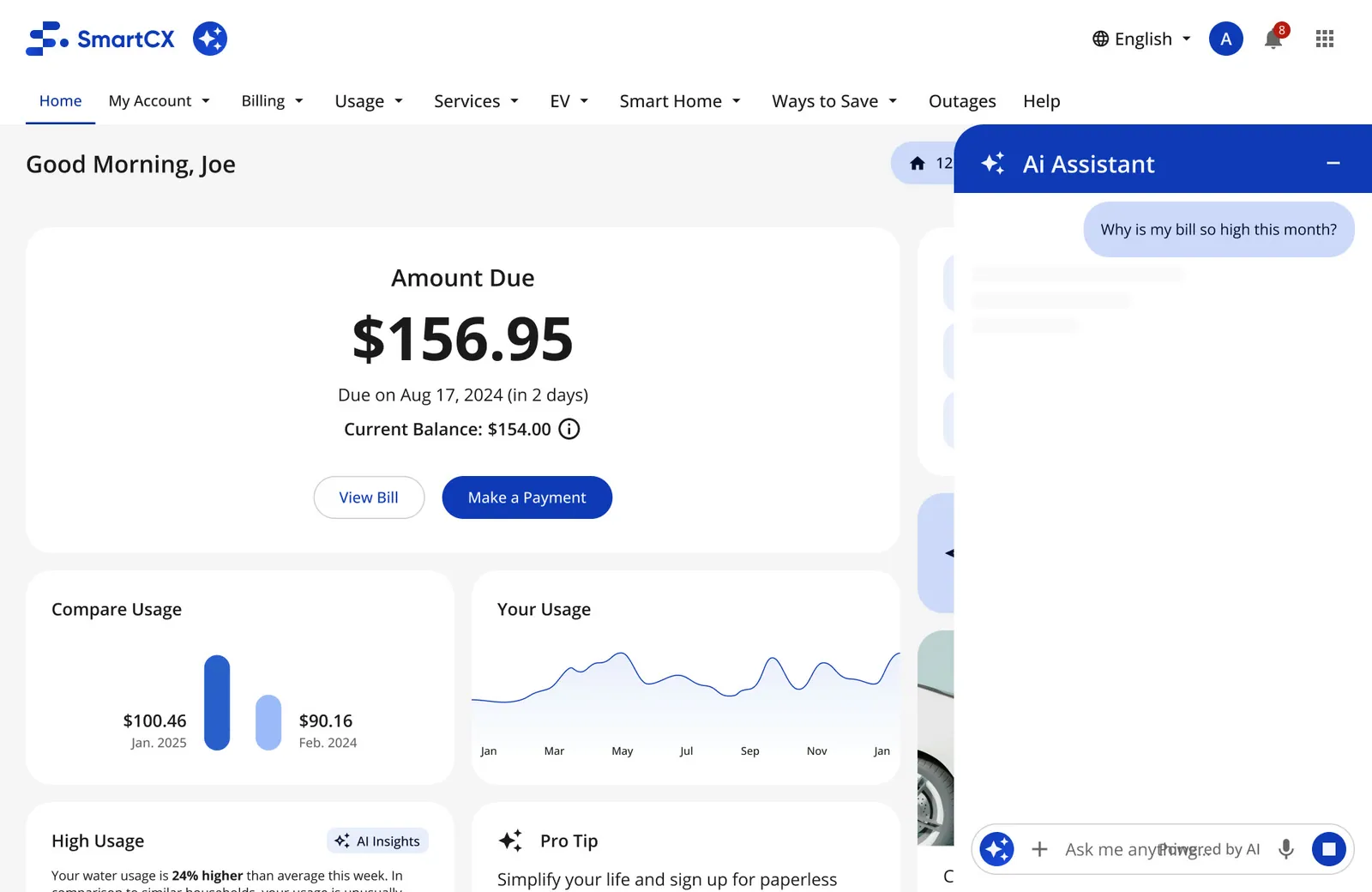
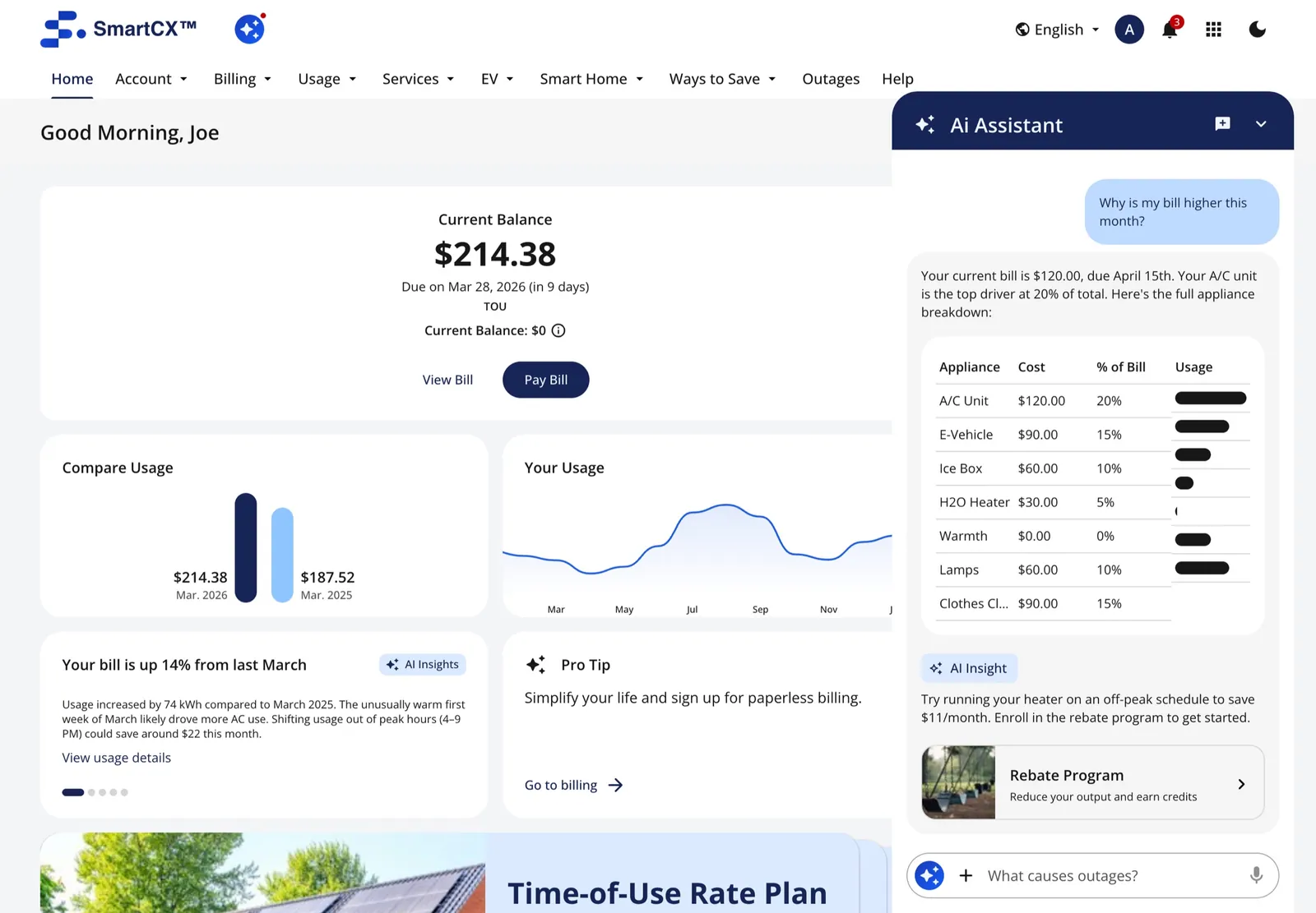
The assistant works in context
-
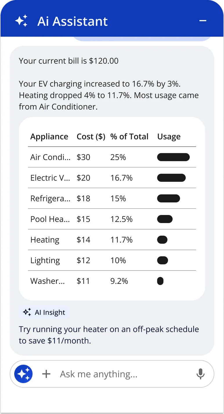
A table, one insight, one action
-
Tap the AI tab
-
Type or pick a question
-
The answer, with one insight
-
Day one: no usage yet · scroll ↕
-
To-dos: Auto Pay, paperless, alerts · scroll ↕
-
To-dos alongside first data · scroll ↕
-
A full month: the regular home · scroll ↕
AI that explains, inside the pages people already use
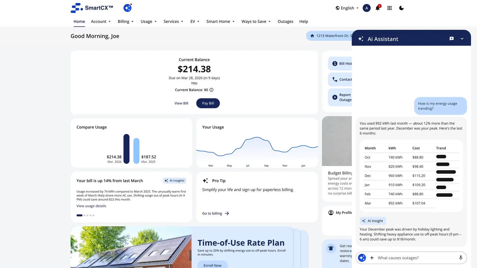
The AI wasn't a separate destination. Insights sat on the usage cards; the "Ask me anything" bar lived in the header on every page; the chat panel opened with the context you were already in.
-
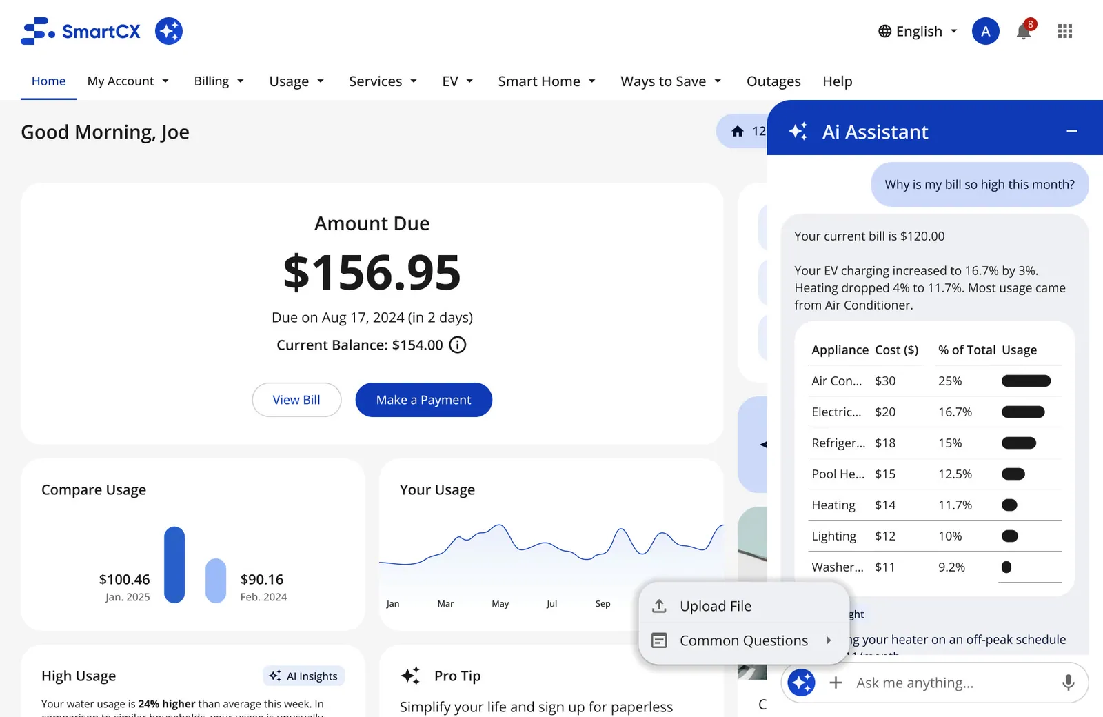
Chat, step by step · An ongoing conversation
-
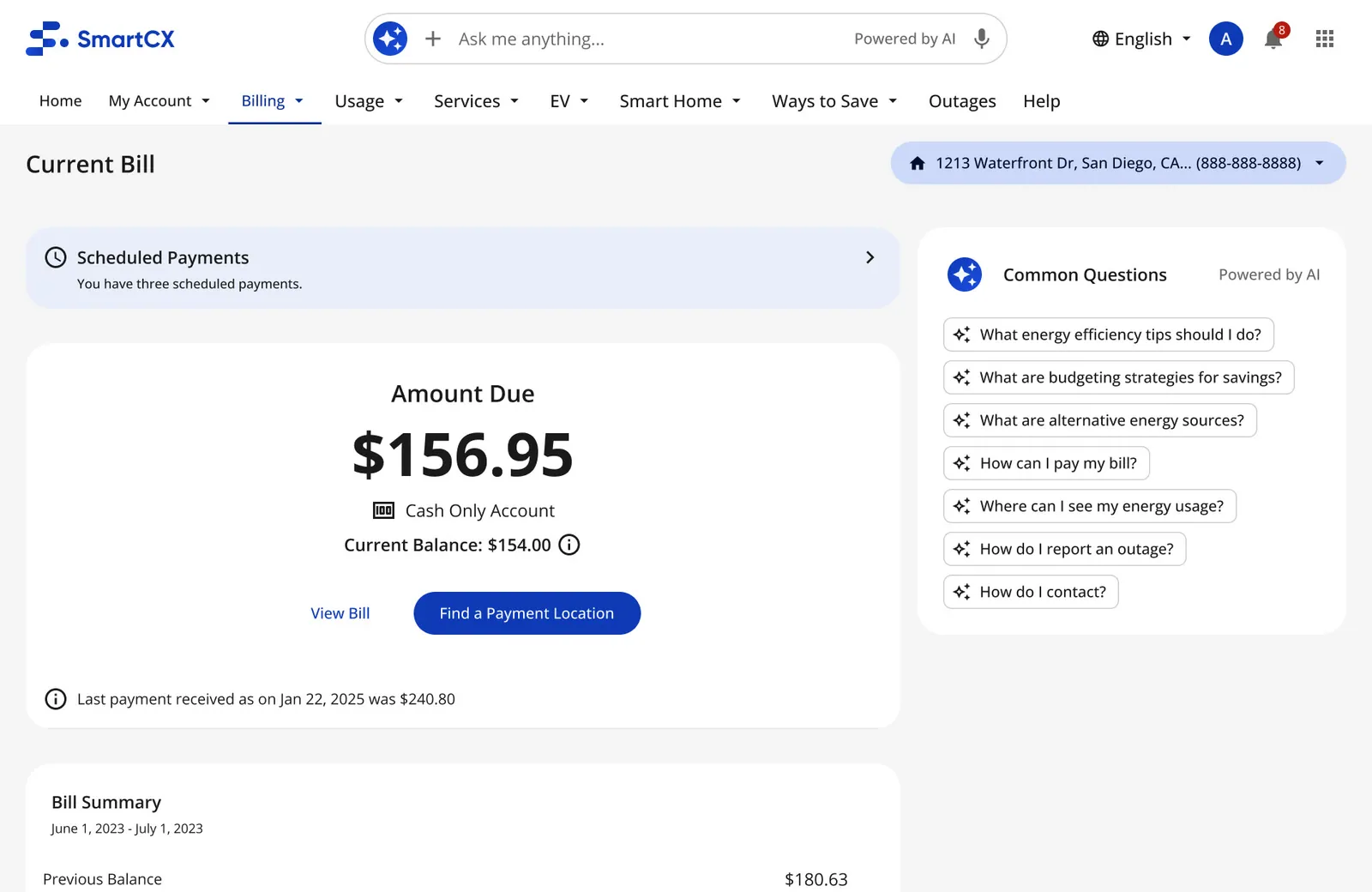
Inside other pages · Chat opened from the Billing page
-
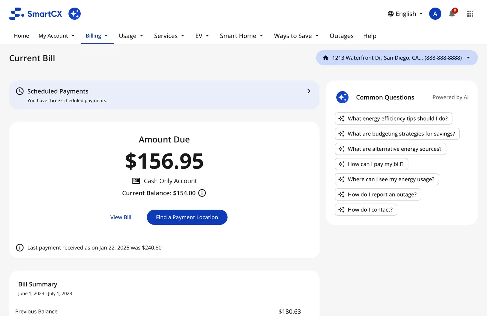
Inside other pages · Billing, answered in context
-
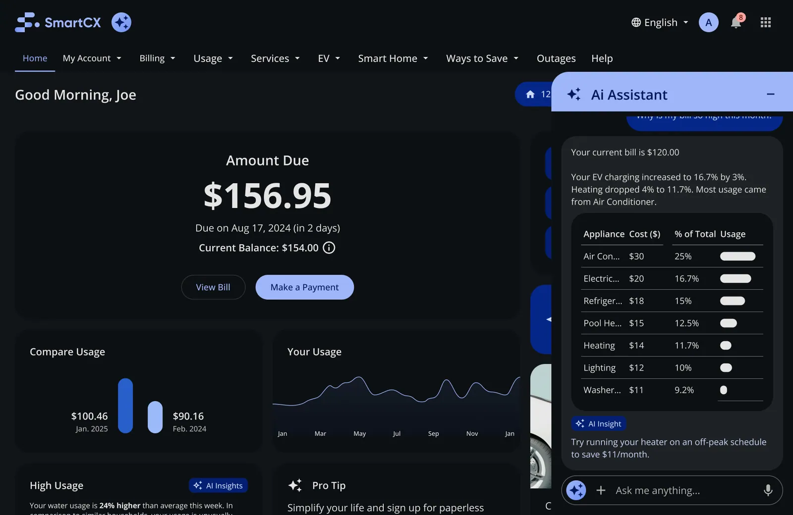
Dark · Dark theme
Same question, different customer
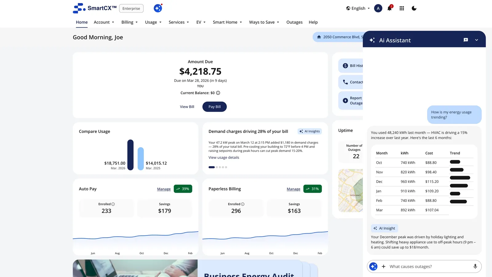
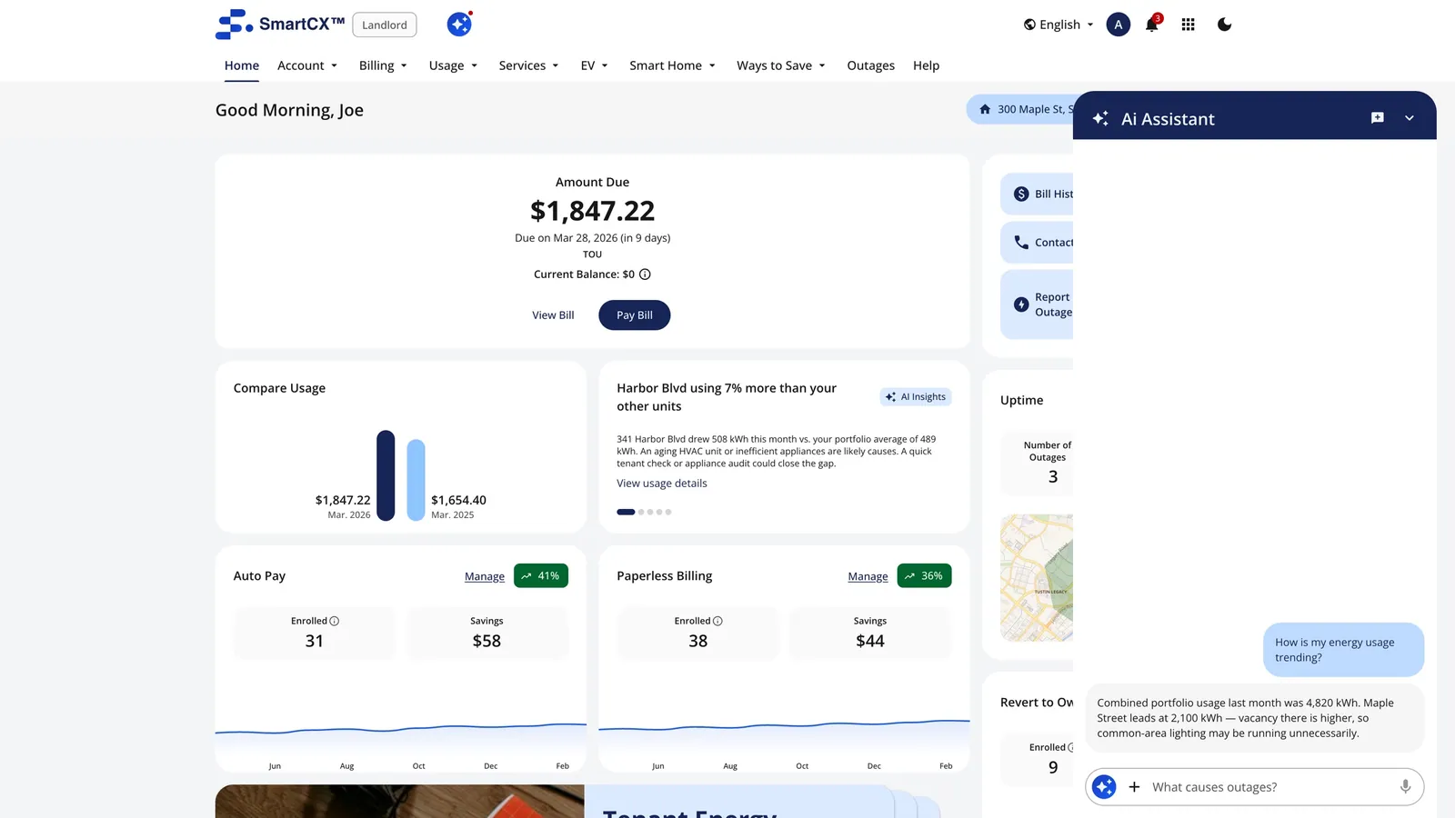
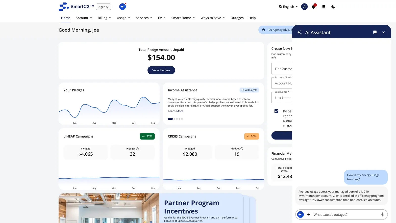
Ask "How is my energy usage trending?" as an enterprise customer, a landlord or a public agency, and the answer adapts to what that customer manages: sites, units or facilities.
Testing the new home with real people
Before committing, I tested the current home against the new one (Jan 22 – Feb 4, 2026): participants compared them, answered a survey and talked through what they saw in recorded sessions. I made the stimuli for web and the app, plus layout variations and AI-chat and split-view sets.
The test · web
- Current
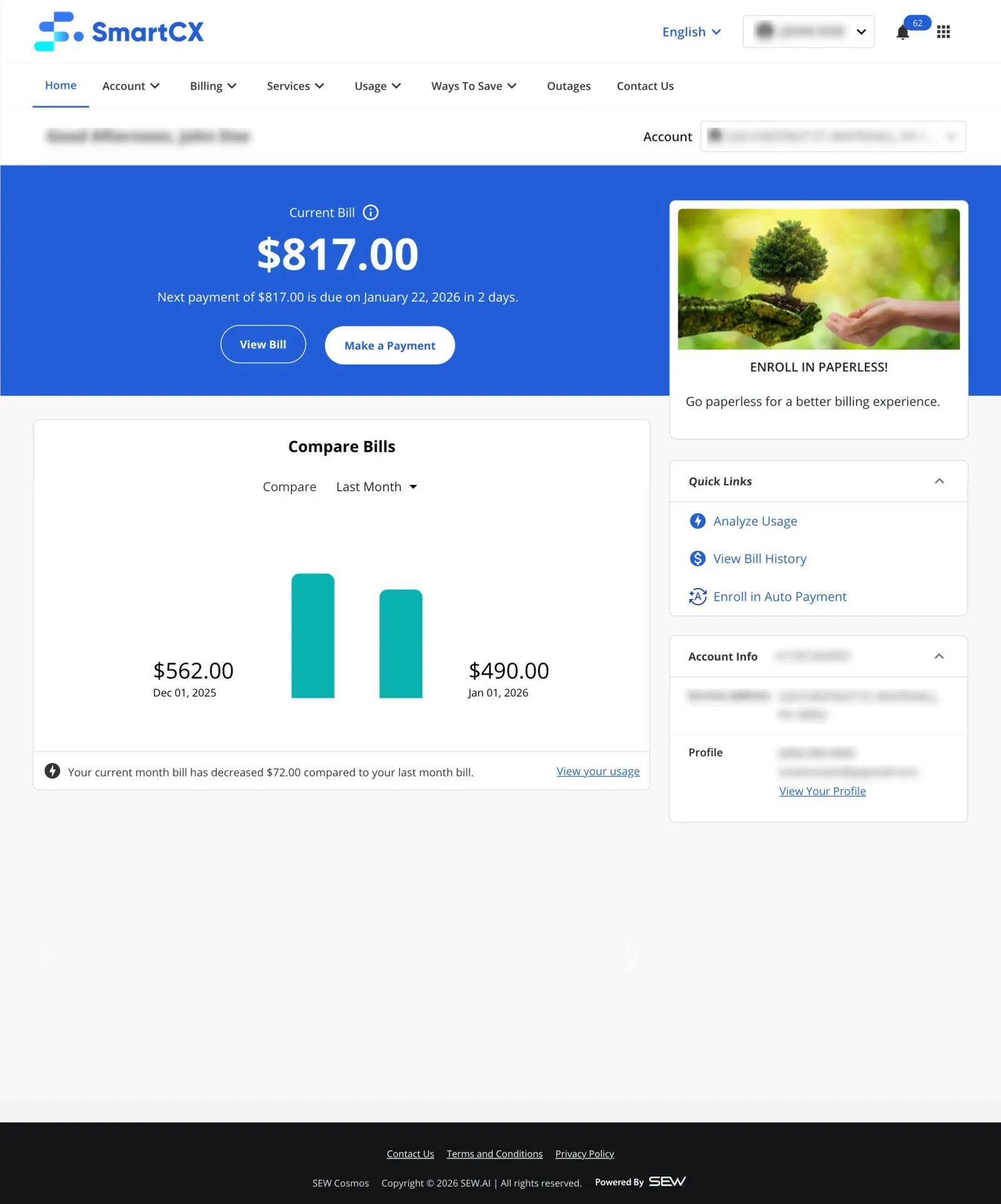
- New
The test · app
- Current
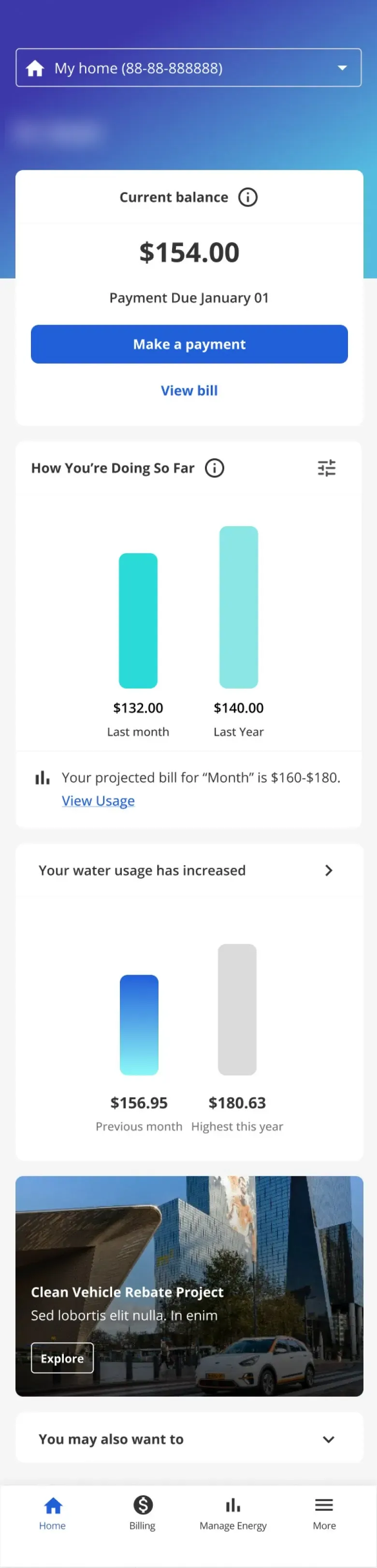
- New
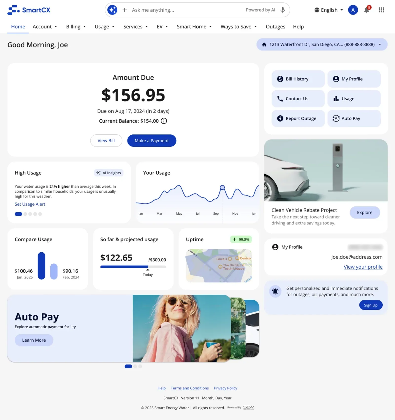
Layout variations
- Variation A
- Variation B
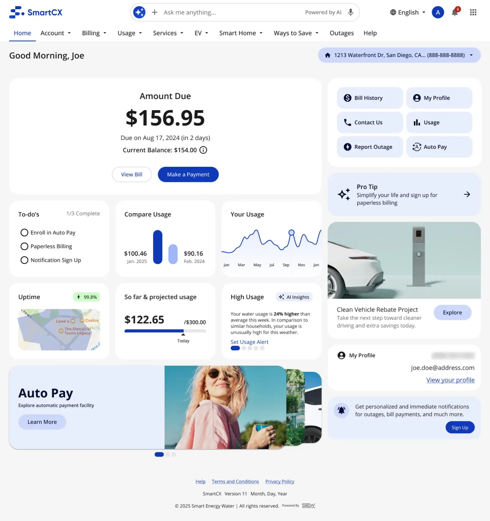
- Modern, organized, "everything on one page at a glance"
- Usage over time, with the high/average/low signal
- Amount due and Pay up front; quick actions
- AI and voice, called out as helpful for accessibility
- Duplicate links (profile in two places), too many blocks
- Stock lifestyle photos that "take up space"
- Promos and pro tips next to their own data
- Some missed the AI chat at first, reading it as a search banner
Participant, recorded session
Participant, survey answer
What it pointed to: fewer, clearer blocks; no duplicate links; data before promotions; a neighborhood comparison (asked for several times); and a more visible AI entry point.
What we tested
Answers whether the new home is clearer than the old one, and which layout to ship.
- Current home vs new home
- Variations A, B and C of the new layout
Answers how much the home can hold before it stops being scannable.
- Split view
- Full-width vs half-width cards
- Multiple cards
- A home survey
Jan 22 – Feb 4, 2026. I made every stimulus.
- Side-by-side comparison
- Survey after each task
- Recorded think-aloud sessions
What we found
The clearest gain was understanding: people could see why a bill changed without leaving the home. The clearest problem was density, so card size and how many cards to show became the Track 2 questions.
Figures marked EST. are my estimates, not tracked numbers.
From one screen to a set of parts any utility can add
The home was modular for a reason: each utility needed a different mix of cards ("one usage card… one compare, one outage, one promo, one an AI insight… based on the implementation and unique needs of every client"). I turned Track 1 into reusable components: the AI insight card, pro tip, compare, AI search, the AI chat set, quick links, stacked cards and empty states. Because they live in the base design system, any utility that buys the upgrade gets them in its own theme, without a per-client redesign. My rule for it: three layers (content, card, chart), and build what's needed, not every permutation.
-
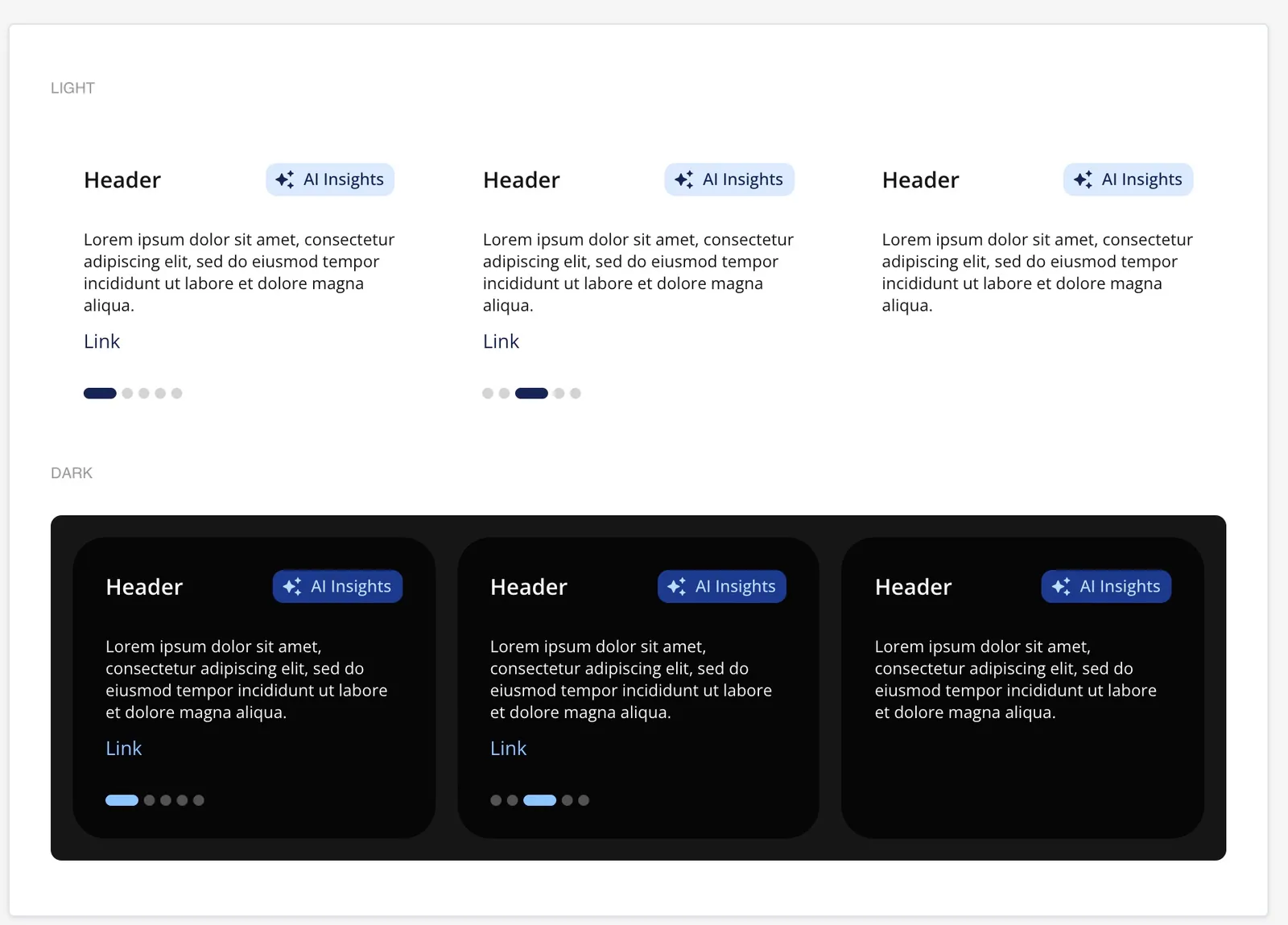
AI insight card: every variant, light and dark
-
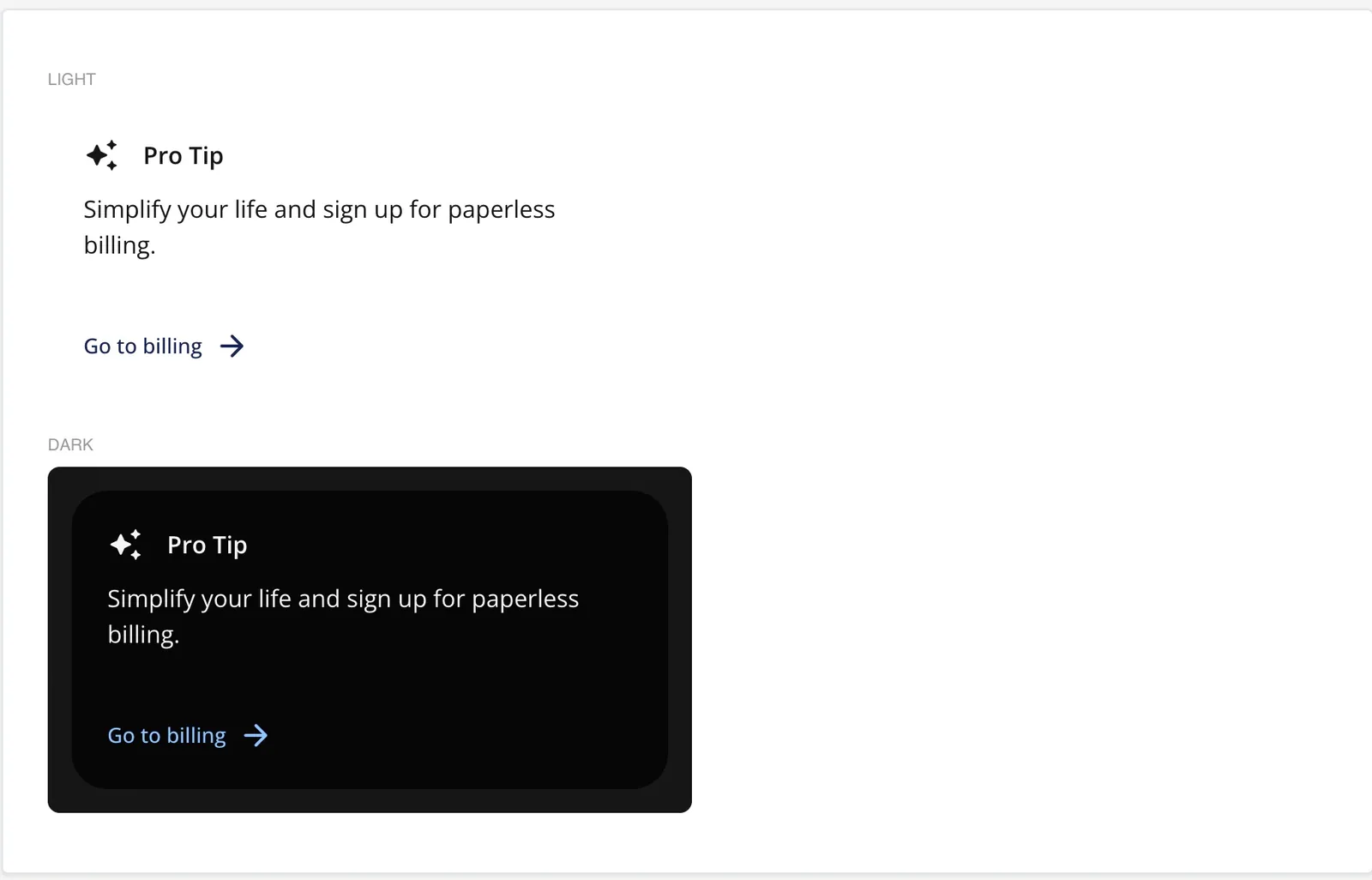
Pro tip, light and dark
-
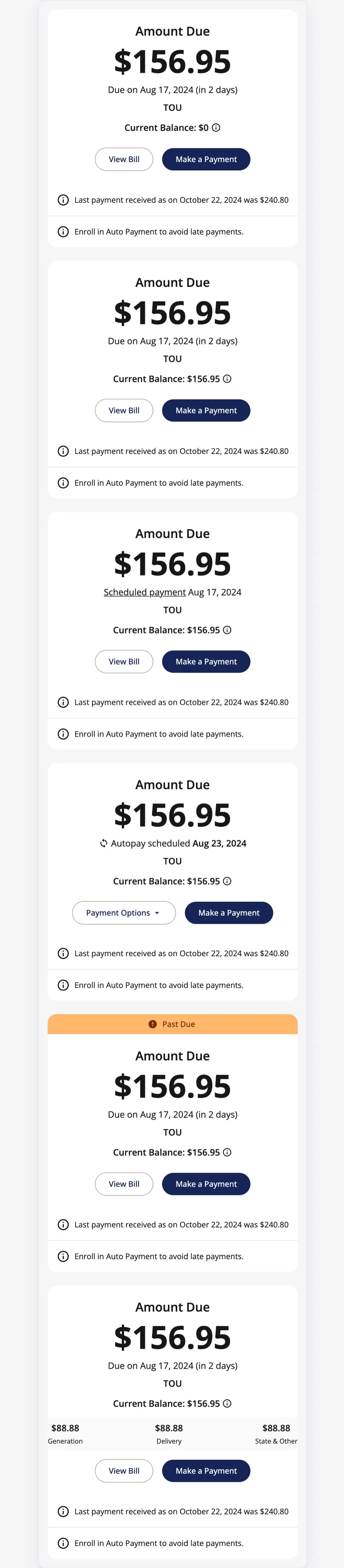
Amount due, all variants · scroll ↕
Hitting WE3 with product, engineering and the executive team
The home had a fixed date: a working build on stage at WE3 in November 2025. Getting there was as much about working with people as about screens.
- The trigger came from sales A client conversation flagged the product as dated (Sep 2025): "Urgency now to update stuff." Product and I kept scope to the home (“dashboard only for now”), and color changes waited.
- Weekly with the executive team I showed progress in weekly syncs with the executive team, including the CEO, to keep the WE3 deadline and make calls quickly.
- Designing for what could ship I annotated constraints for developers (one API for web and native, meter types, smallest screens, dark variables) and designed around them instead of handing over ideals.
- QA in every build From Oct 6 to Dec 2, I reviewed every iOS, Android and web build against the designs, then ran a review board for pre-production.
- The audit set the next scope A January 2026 audit of pre-production vs the designs fed straight into Track 2 planning, and the Track 1 parts went into the shared library.
Who I worked with
Leadership
- CEO and executive team Weekly syncs: progress, trade-offs, and quick calls to hold the WE3 date.
- Leadership Direction on Track 1; the pre-login proposal we worked on together.
decisions ↓progress ↑
- Me · design lead for the home Track 1, every QA round.
specs ↓feedback ↑
Partners
- Sales Flagged the dated UI and the client asks (Sep 2025).
- Product Kept scope to the home; color changes waited.
- Engineering One API for web and native; 7 build rounds reviewed.
needs ↑releases ↓
Utilities and customers
- Utilities Theme the home from one base.
- Customers Usability tests, Jan–Feb 2026.
My own checklist for working with Product and Engineering
- Context first What exists now, the problem, the user story, prior research, who has buy-in, the PRD/TRD and API limits.
- Awareness Sprint and release timing, MVP vs north star, QA builds so design catches UX issues before release, async Figma comments, retros.
- One-to-one Design components map to built components, so design, engineering and product talk about the same thing.
A working build on stage at WE3 2025
- Oct 2025 MVP designs refined for the WE3 build
- Nov 5–7, 2025 Shown at WE3 Summit, Las Vegas, under COSMOS
- Oct 6 – Dec 2, 2025 Seven design-QA cycles across iOS, Android and web; builds reached pre-production by late Nov
- Dec 2025 Post-MVP updates; "Cosmos v2 is next"
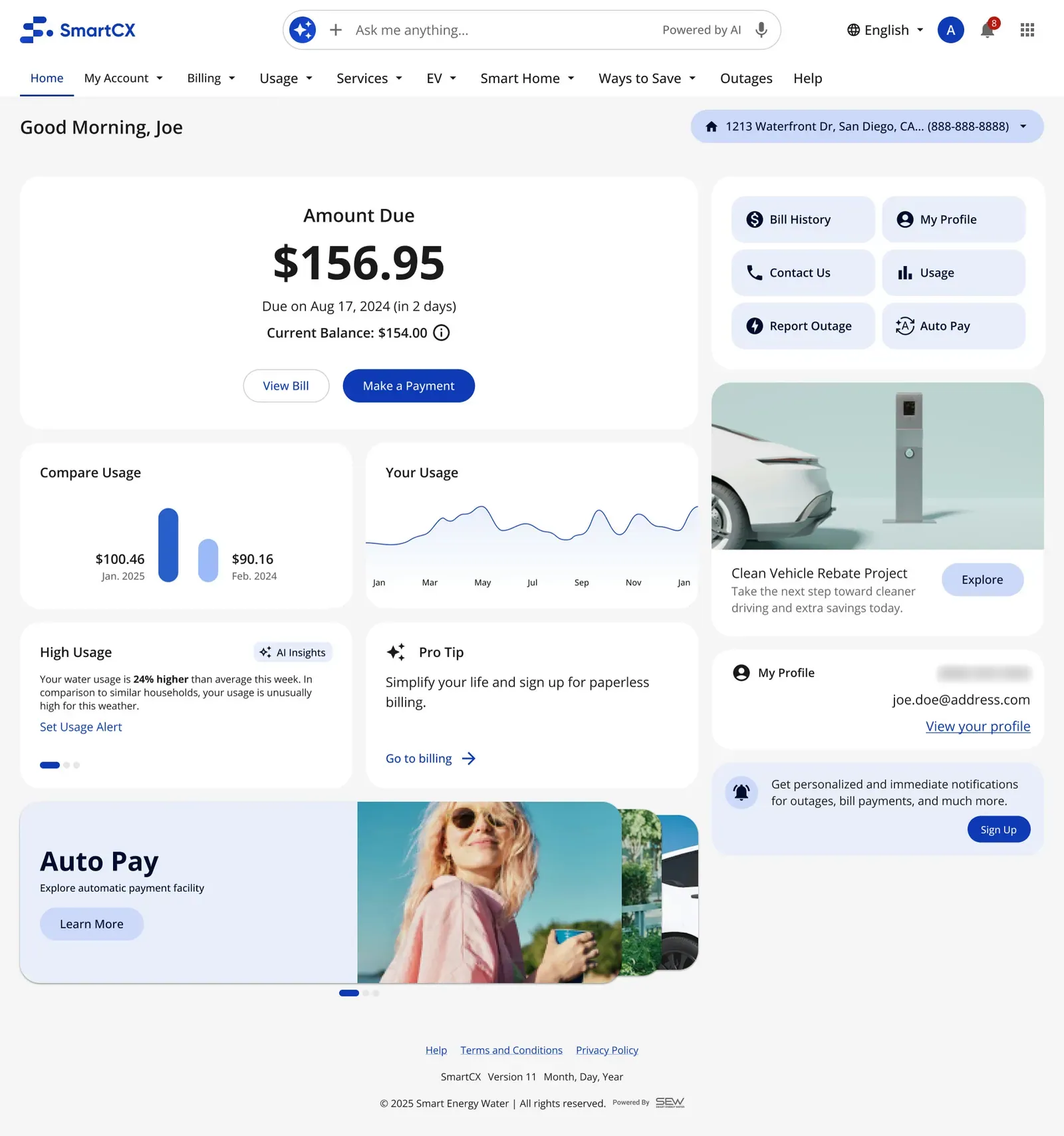
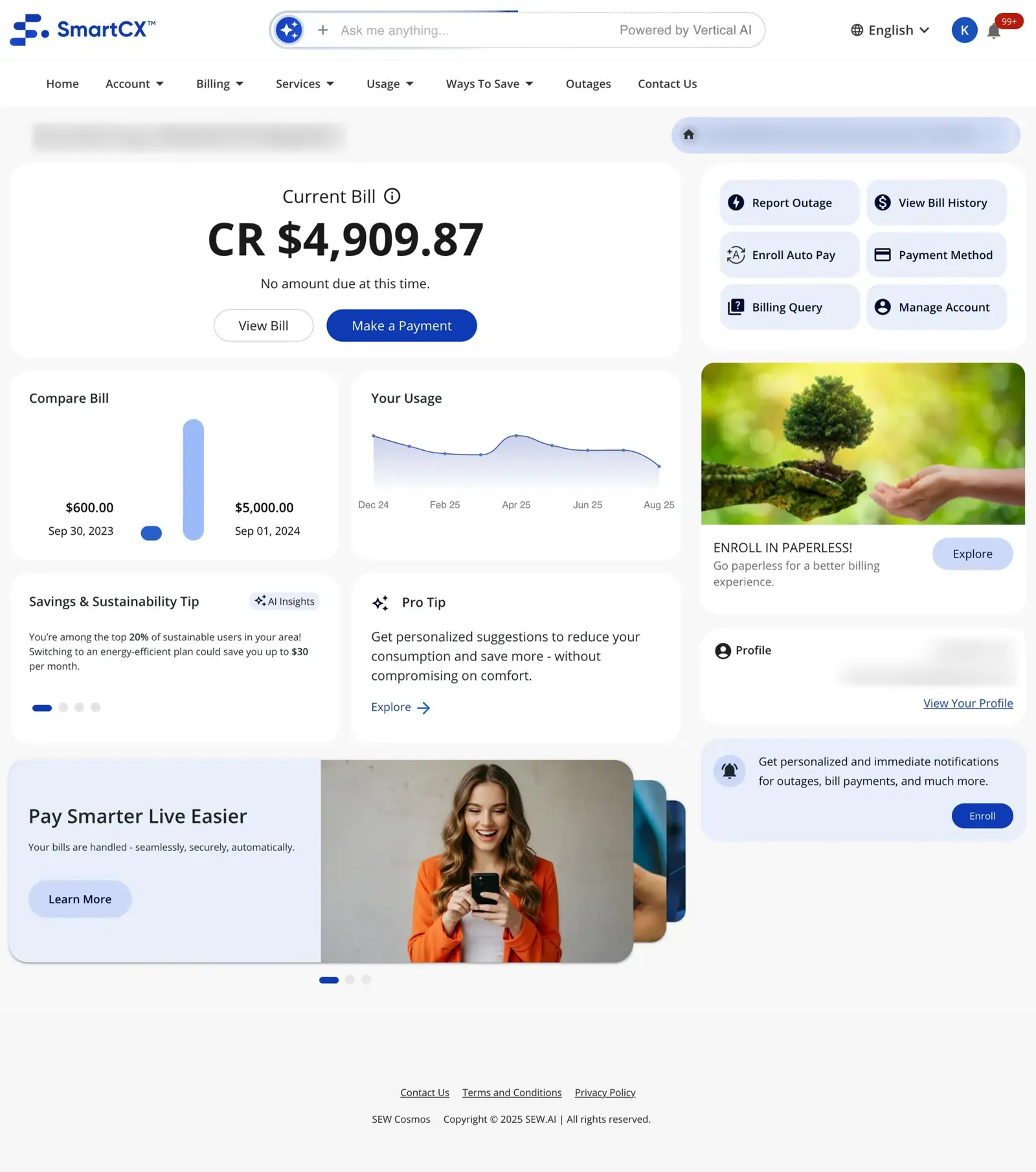
Each design sits next to the build it was checked against. Names, addresses and contact details in the builds are blurred.
The event
Event videos by SEW.AI.
What the files show: builds moved from implementation (Oct 30) to pre-production (Nov 21–26, 2025), with design QA against each build; a Dec 2025 note says chatbot changes were integrated but still needed deploying. There's no record of a production release in my files.
And then the drift. A January 2026 audit found the build had drifted from the designs. Keeping design and code in sync across many utility versions became my next problem, and my next case study.
Track 2: a home that knows where your energy goes
Exploration · not shipped
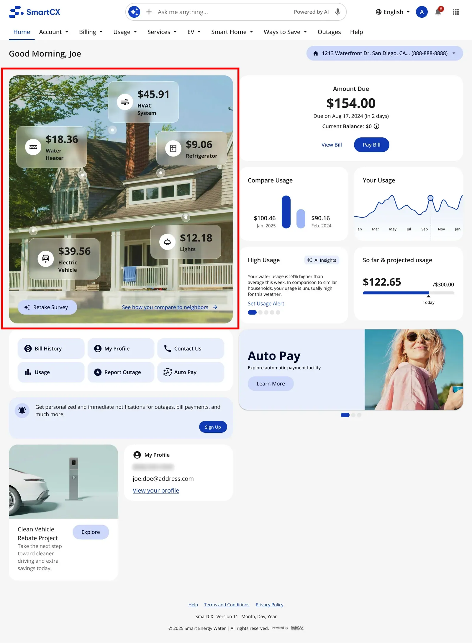
A meter reports one number. Customers want to know what's behind it: the heater, the EV, the water heater. Track 2 set out to show that, and it only works with AI. Designed and tested, never shipped.
- Know the home A short About My Home survey: size, heating, appliances, EV.
- Let AI split the meter Disaggregation: AI works out how energy moves through the home and what each appliance costs.
- Act at the right moment One insight with one action, timed to the moment: a heat wave, an outage, a high bill.
Why AI: no one can type in how their energy moves. The December review set the next step: merge to-dos and pro tips into AI insights and “leverage generative AI to add the disaggregation model”, with engineering starting to investigate it.
-
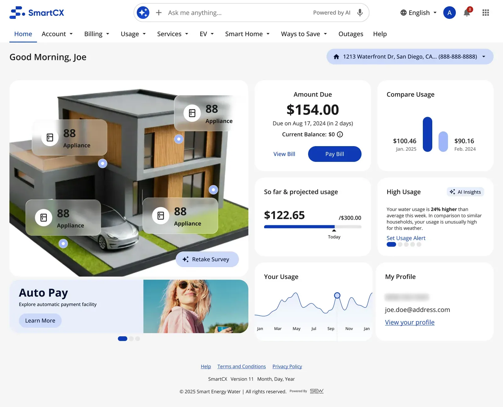
Split view · Split view: the home, broken down by appliance
-
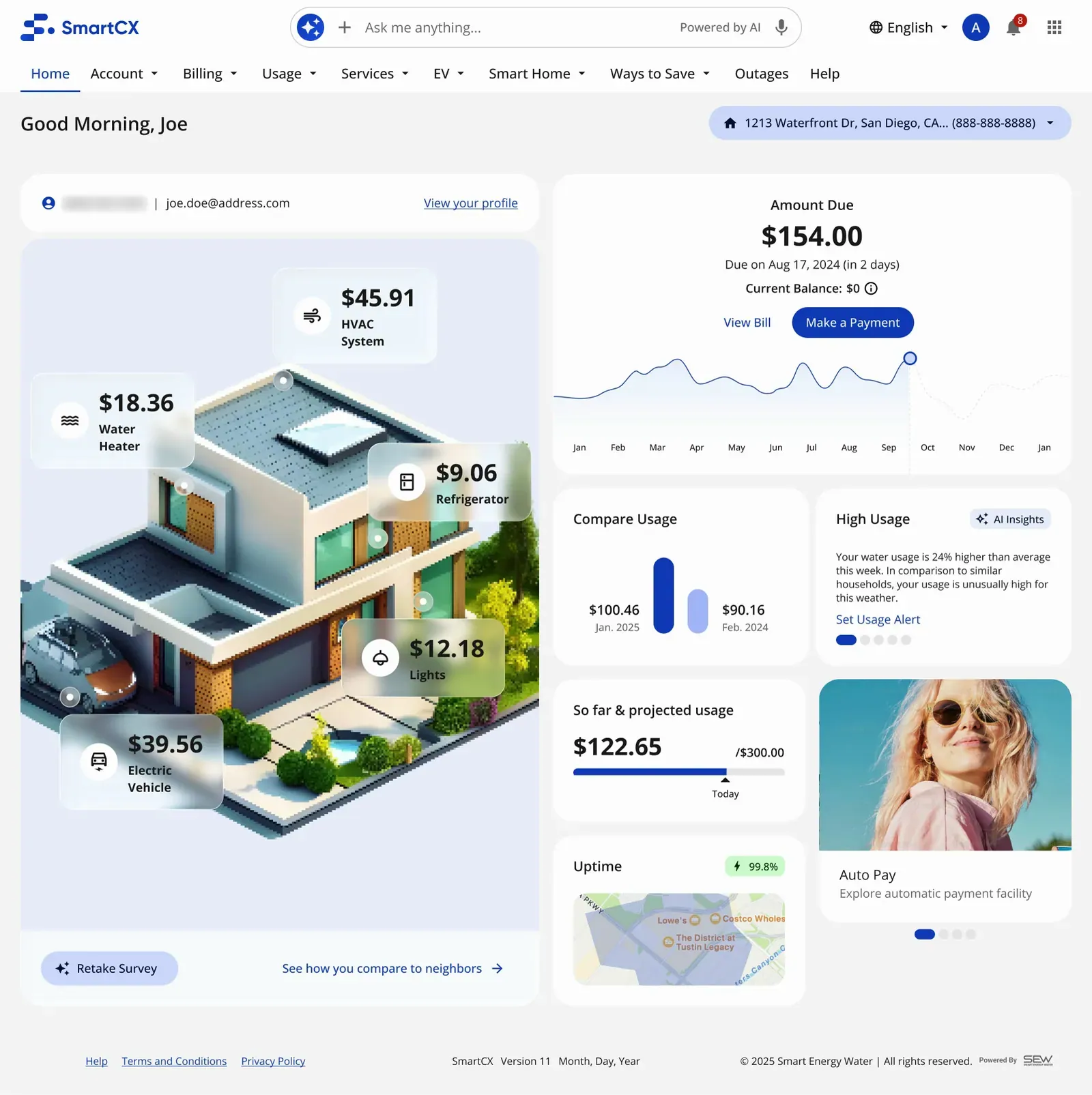
Split view · Split view, cost per appliance
-
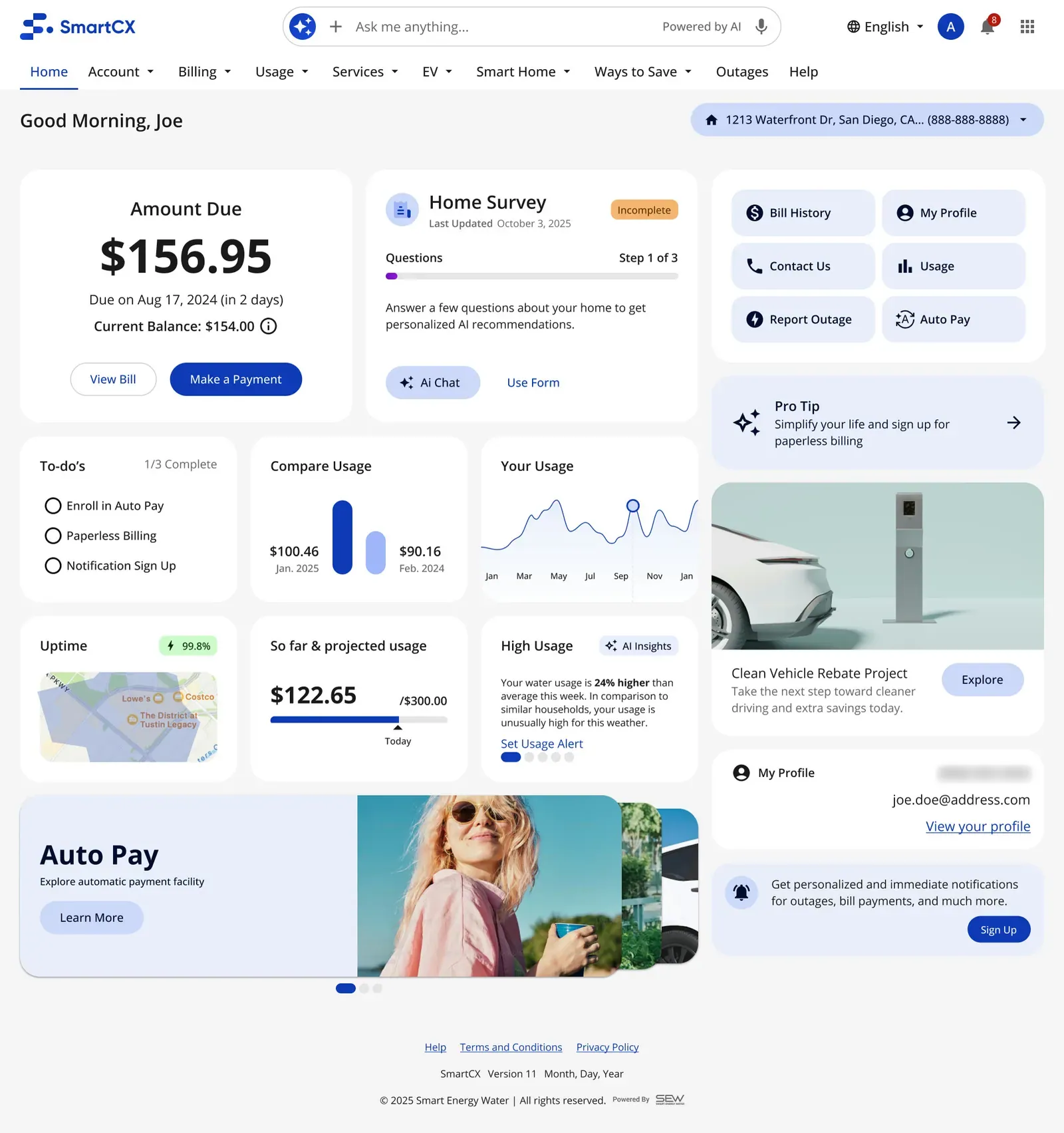
Survey · About My Home: a few questions
-
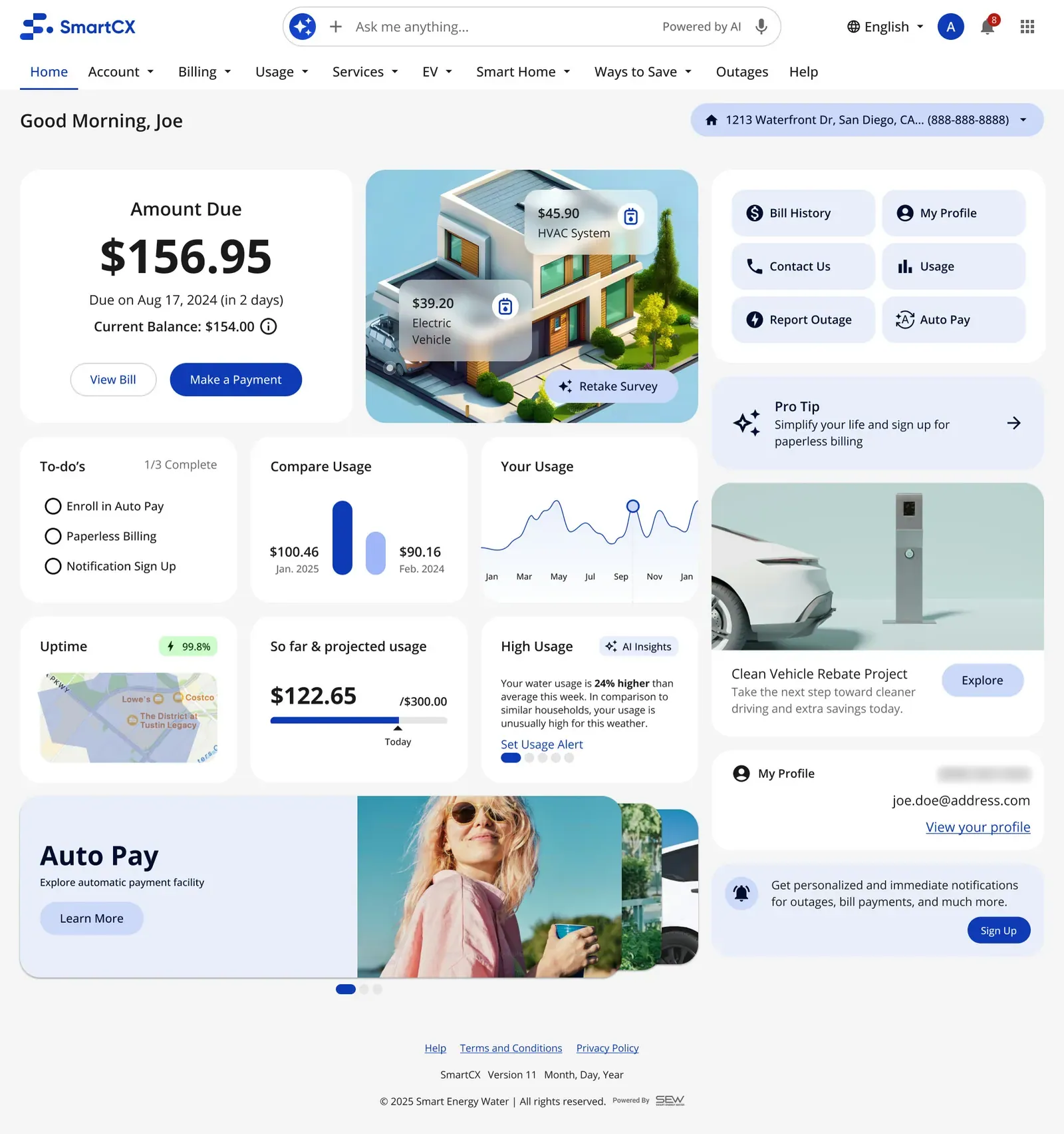
Survey · Answered: the breakdown gets personal
-
Tested · Test variant D1a · scroll ↕
-
Tested · Test variant D2d, half height
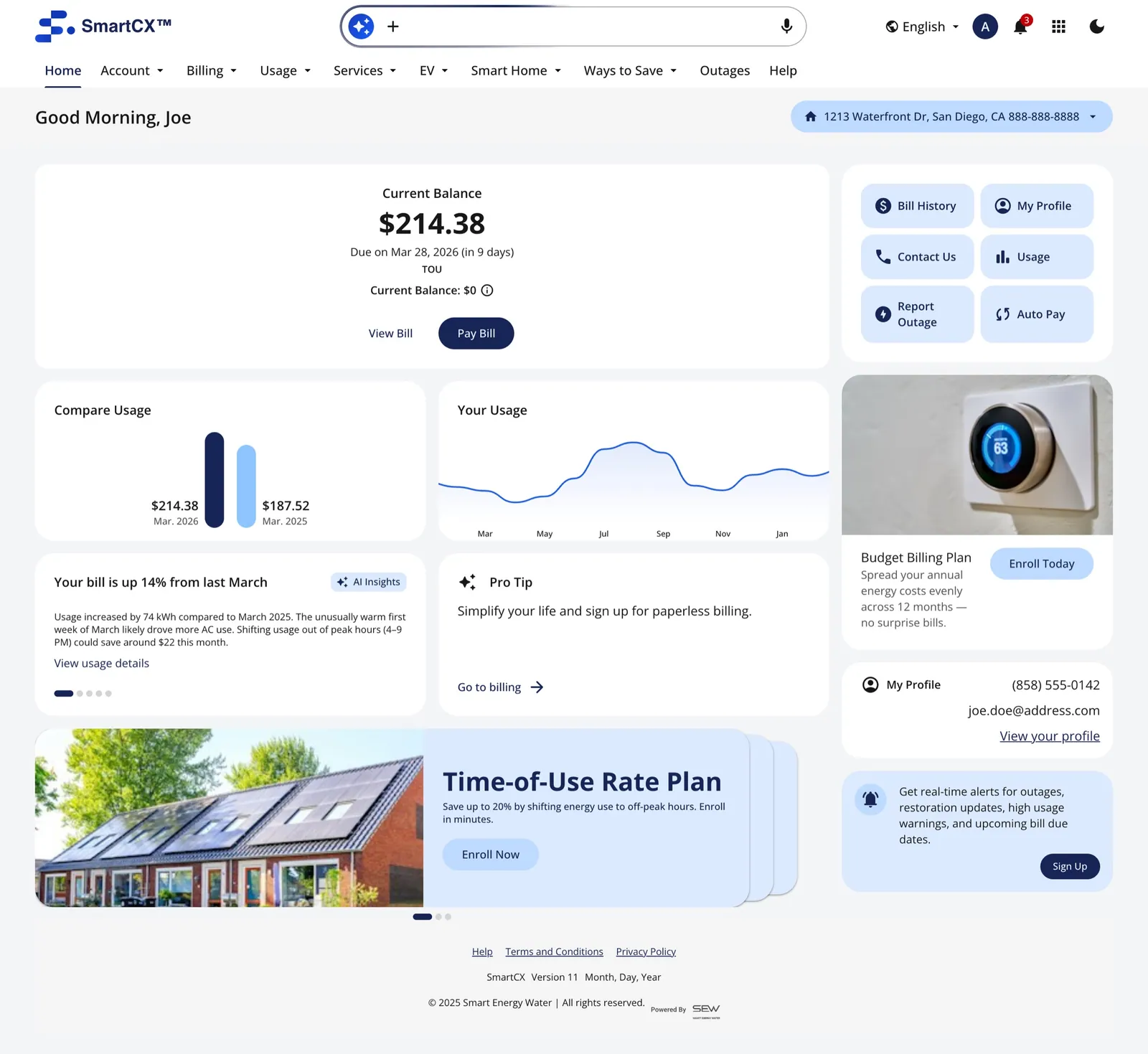
The Track 2 idea taken further in a coded prototype: who you are, crossed with what's happening.
A working version, built on the design system
To test the real interactions, I built SmartCX as a working React app on our component library, with six customer-type homes, account and billing flows, light and dark modes, and an AI chat panel that answers inside the bill, usage and outage context. I used AI (Claude Code) to build it, so the experience could be tested, not just argued.
-
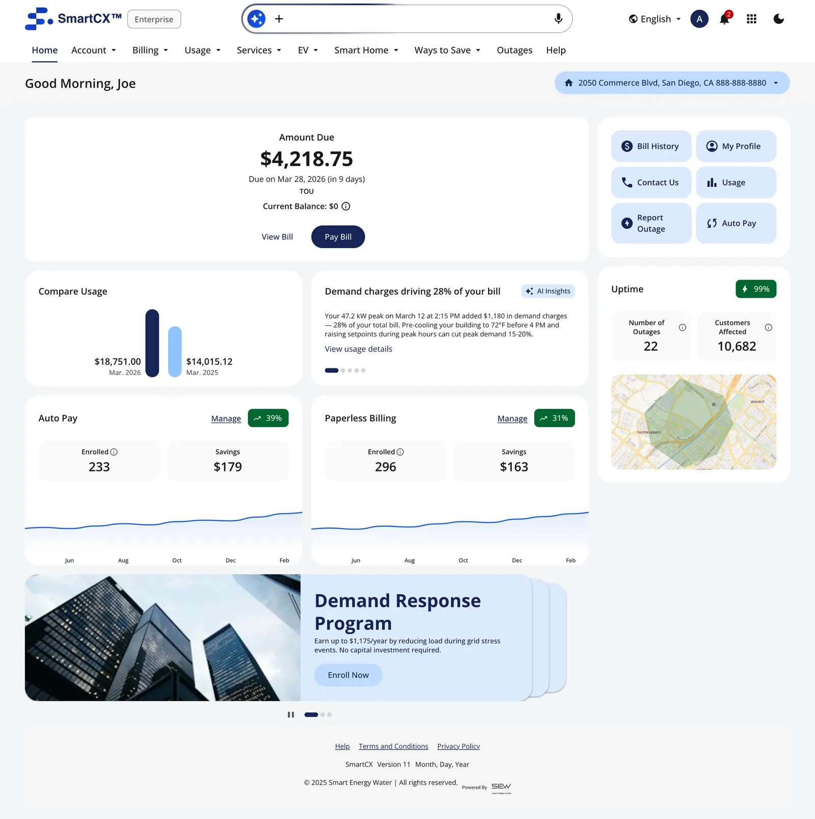
Enterprise home
-
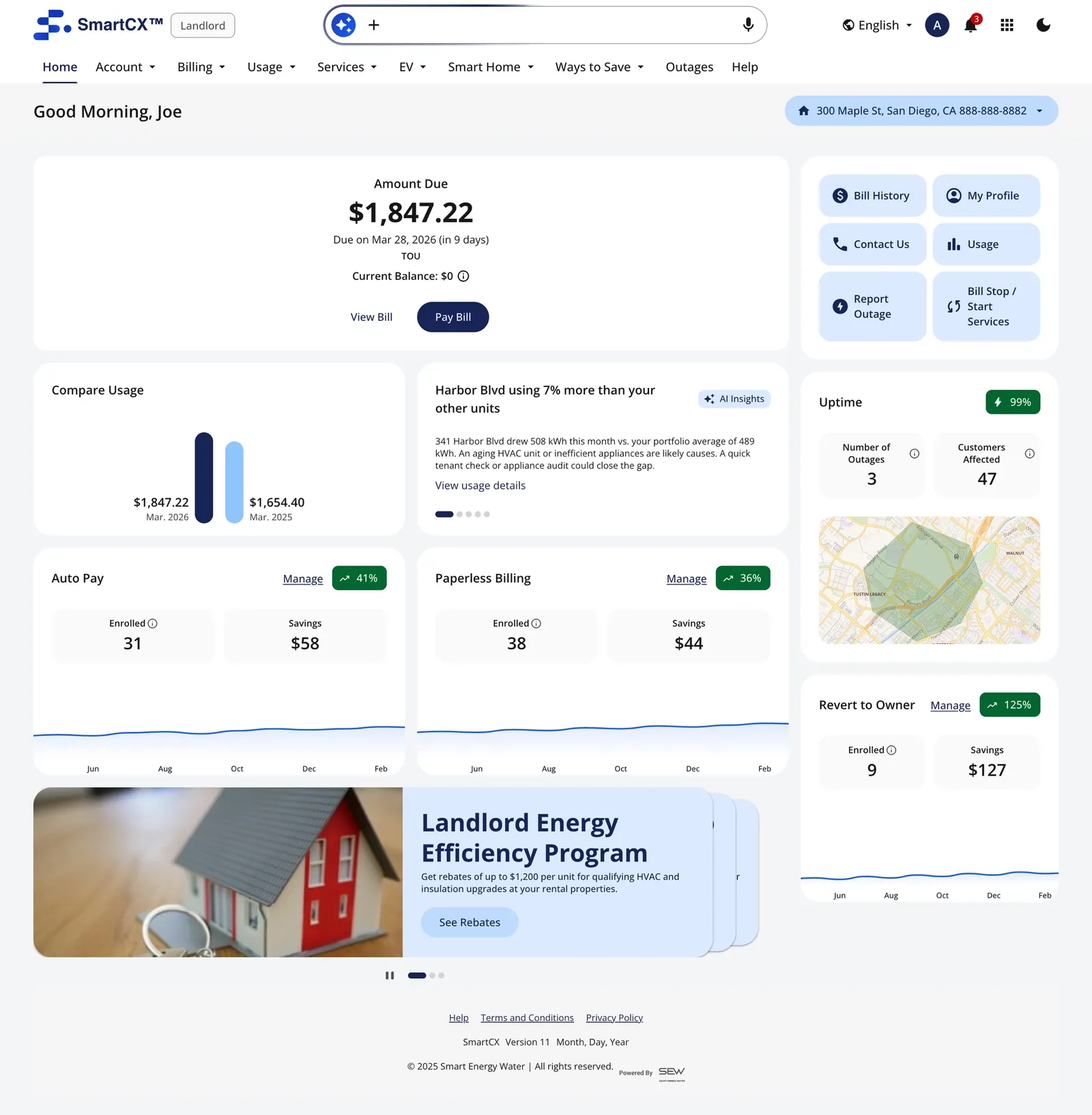
Landlord home
-
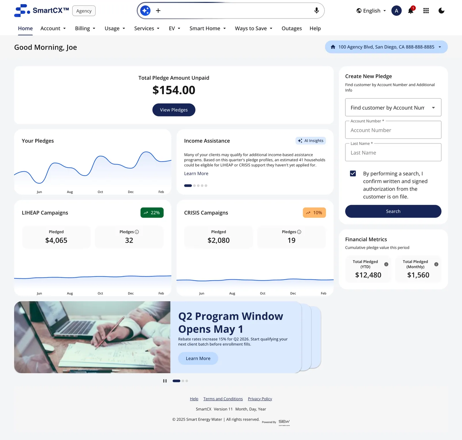
Agency home
The signed-out home
Exploration · not shipped
I gave the signed-out page the same treatment as the signed-in home: nine explorations and two options for hero and sign-in, reviewed side by side. It reached ready for development on Feb 18, 2026, but didn't go to production. The file ran Sep 8, 2025 → Mar 18, 2026; I made 85 of its 87 sessions.
-
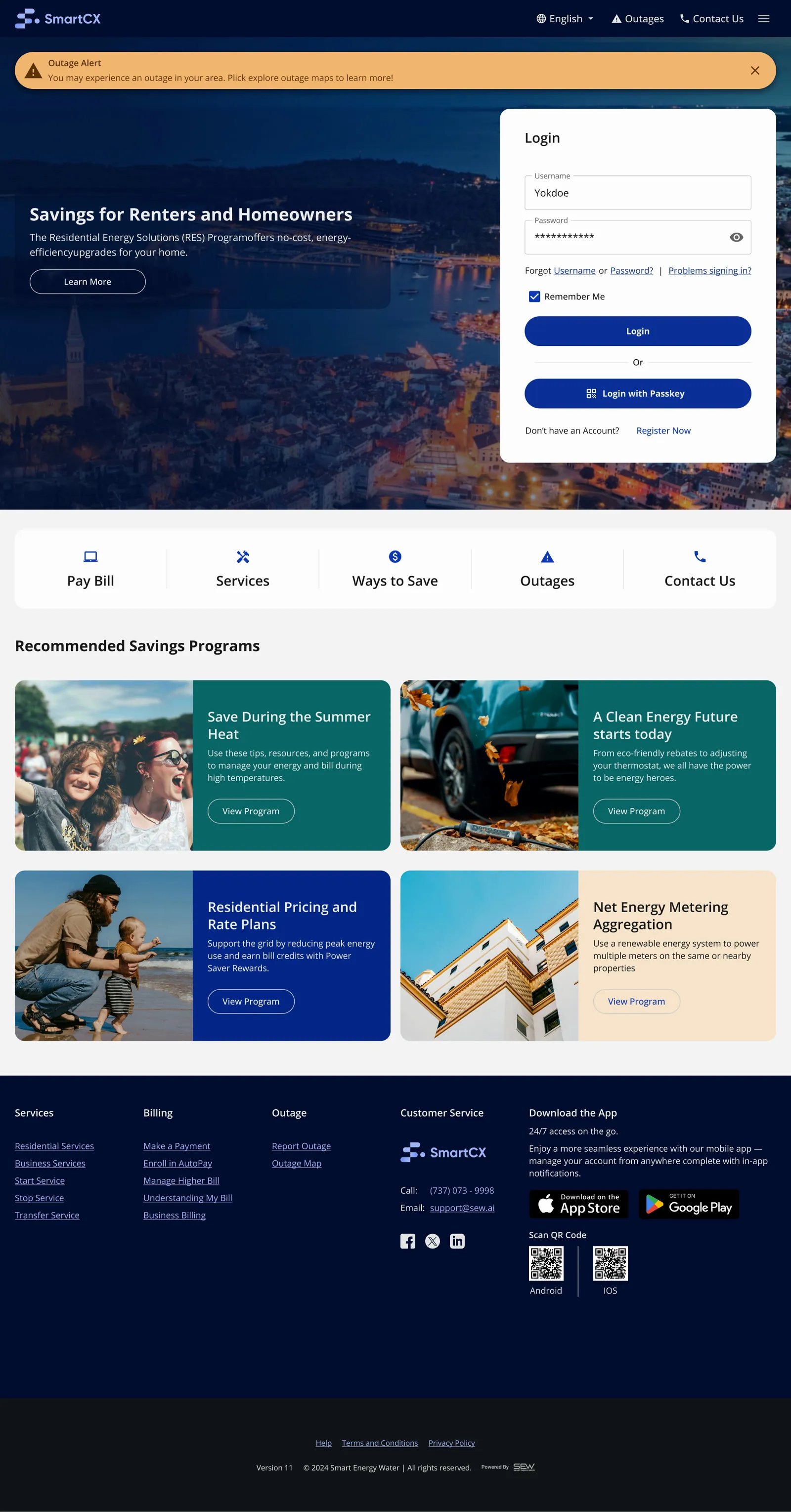
The current signed-out page · scroll ↕
-
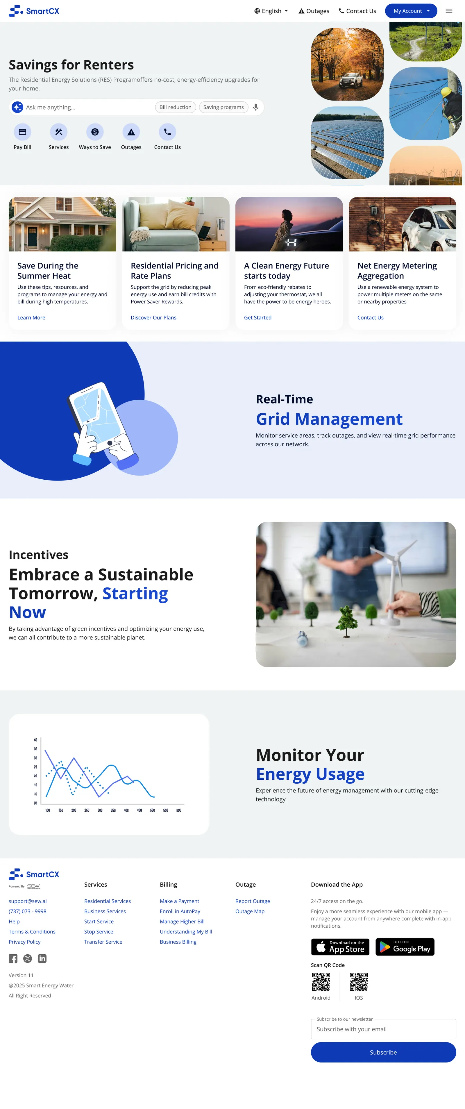
Exploration 1 · scroll ↕
-
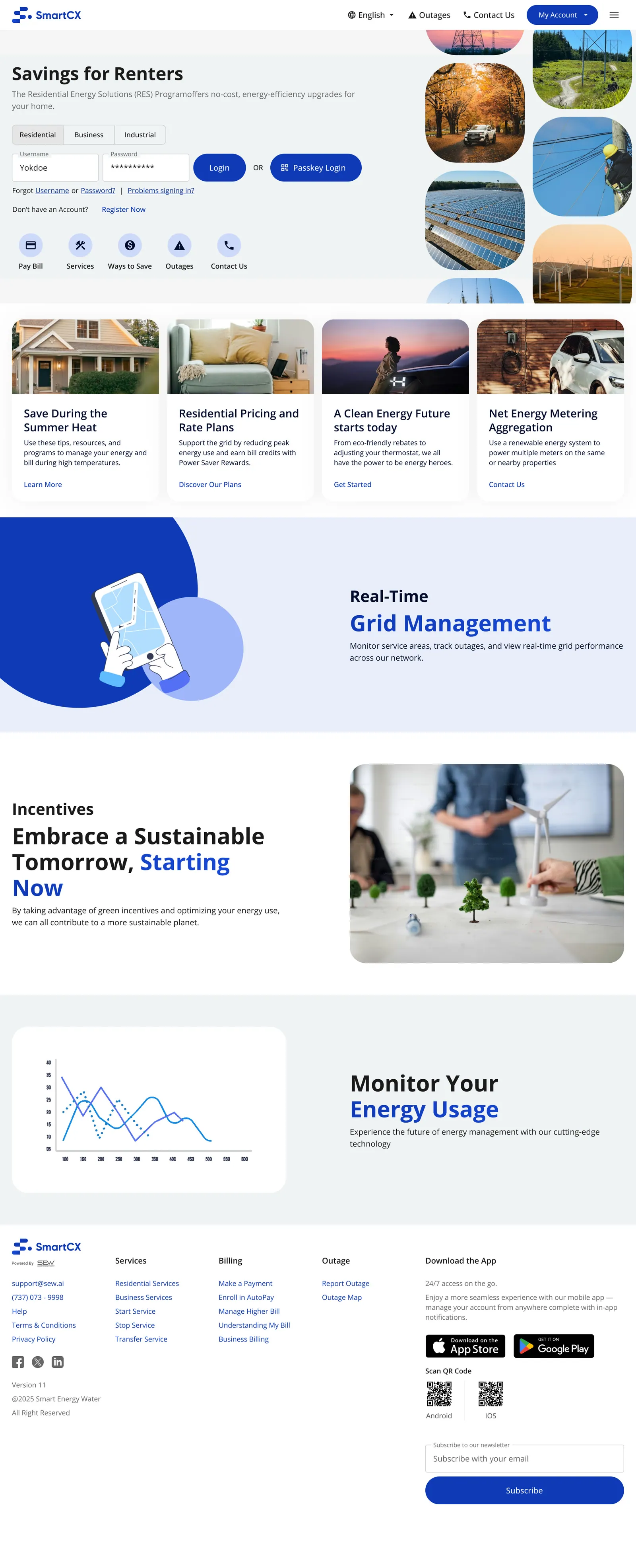
Exploration 2 · scroll ↕
-
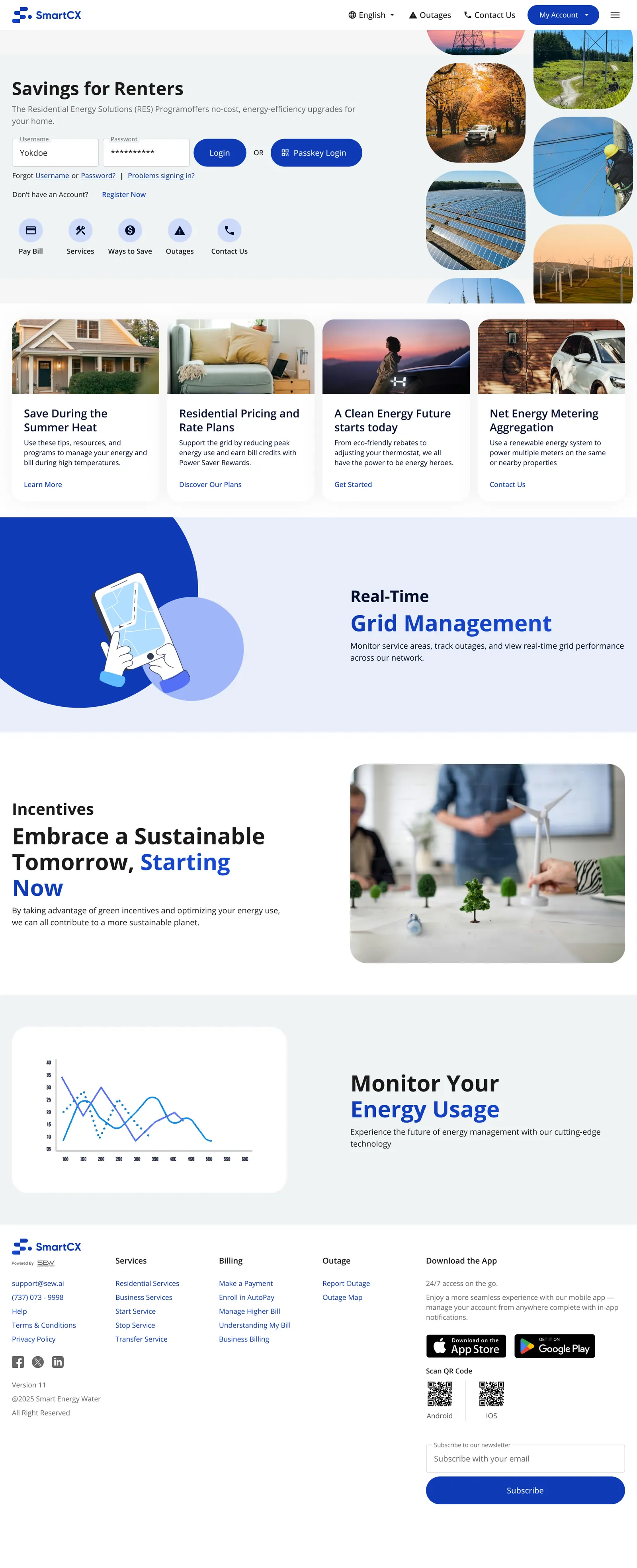
Exploration 3 · scroll ↕
-
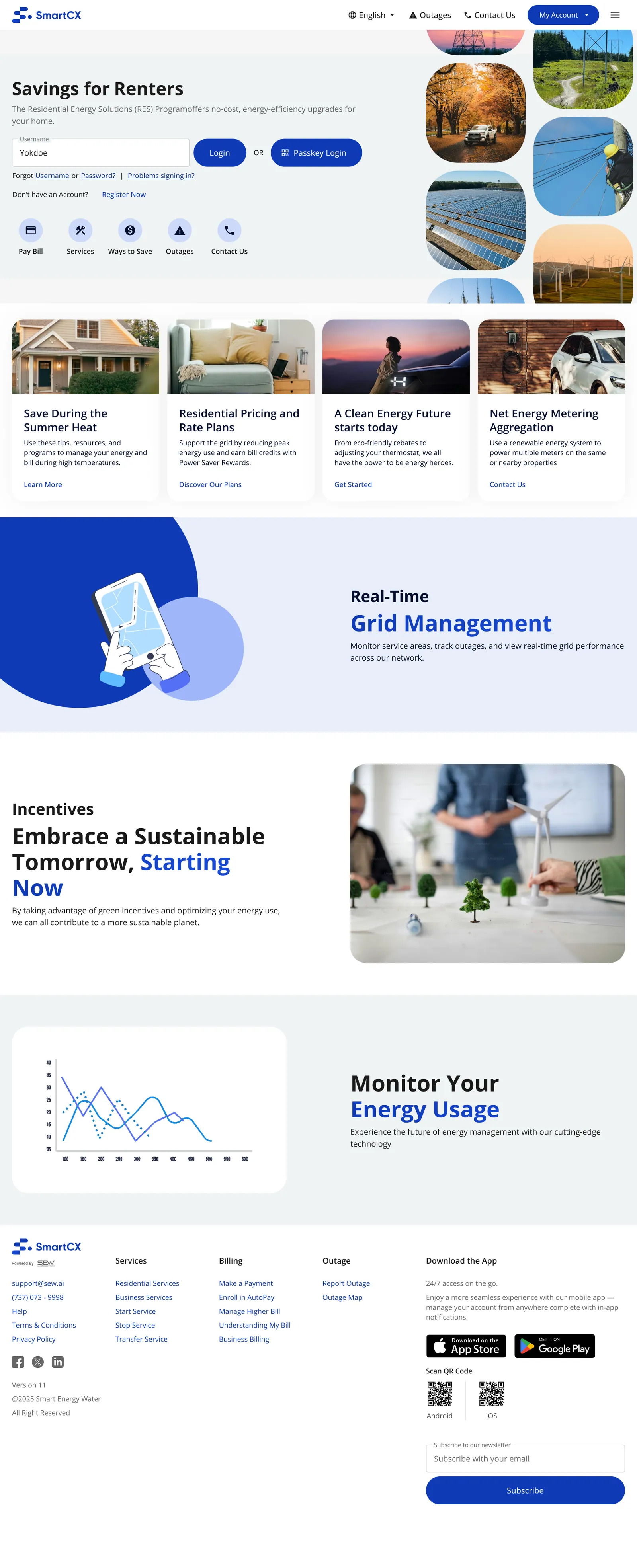
Exploration 4 · scroll ↕
-
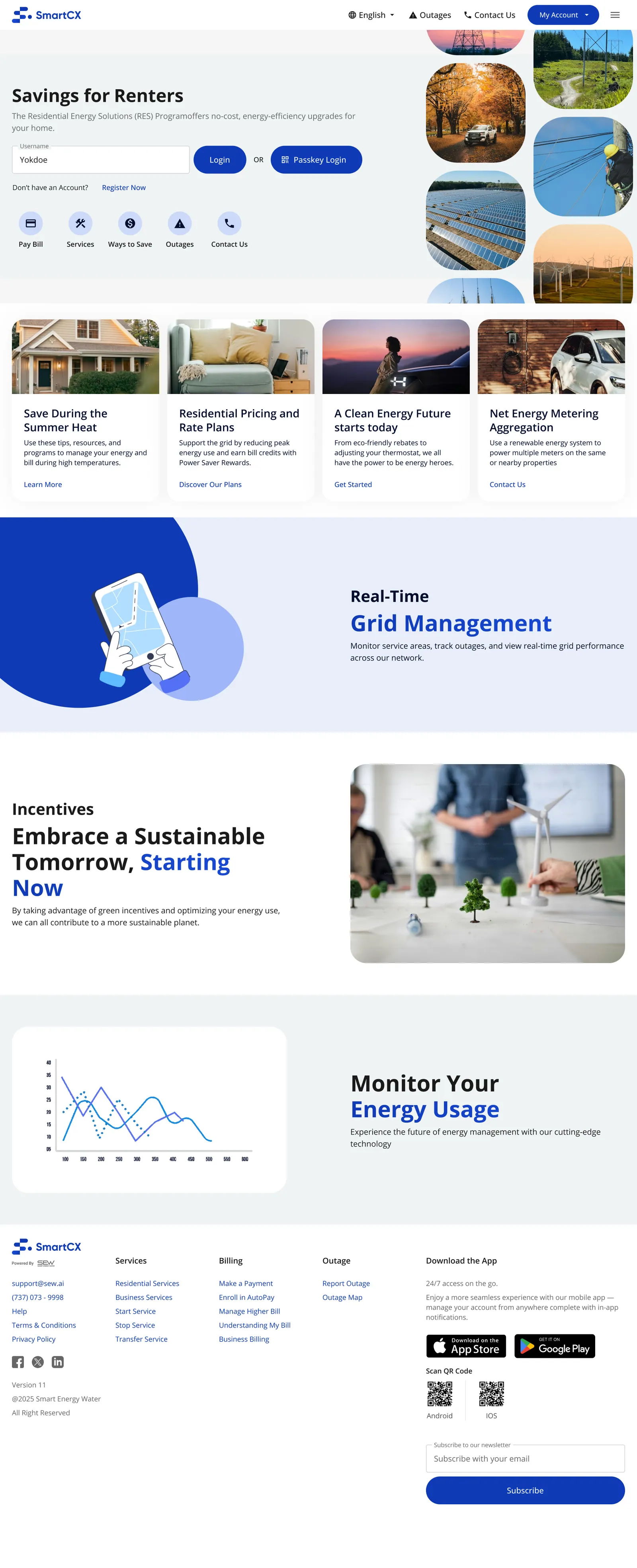
Exploration 5 · scroll ↕
-
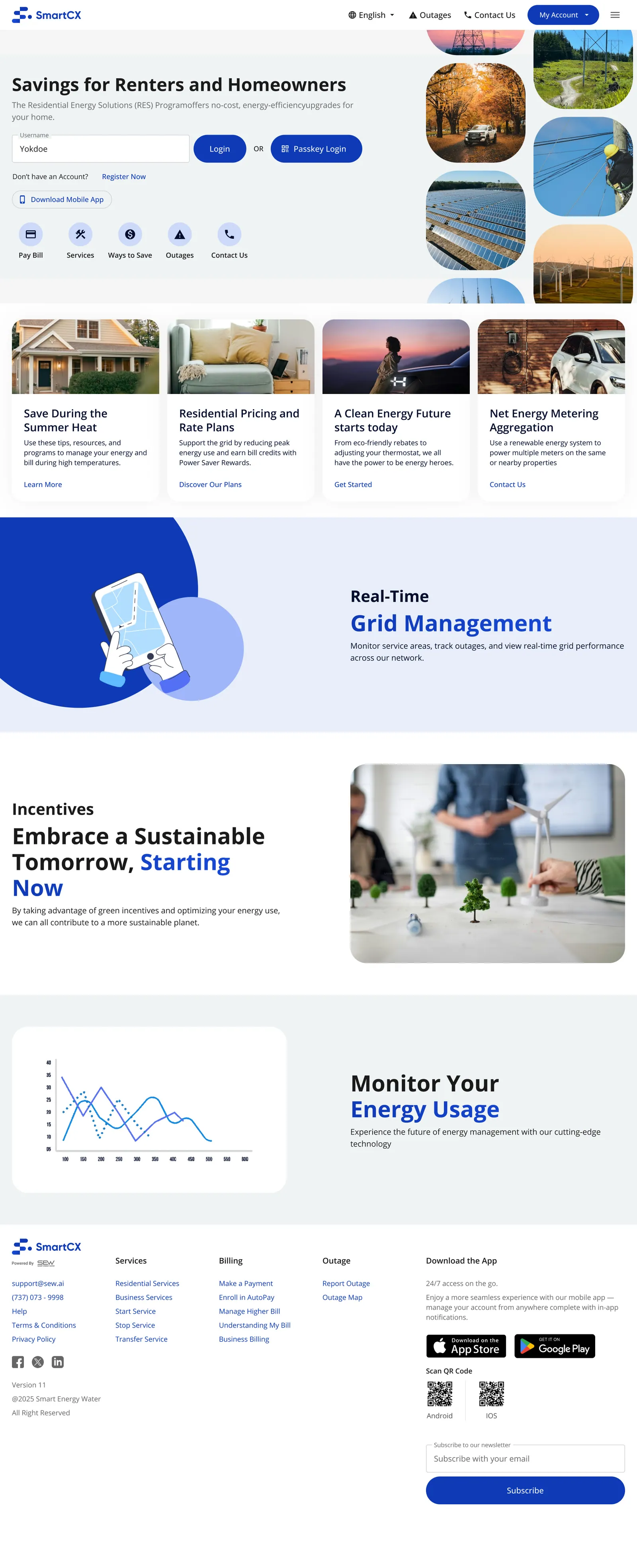
Exploration 6 · scroll ↕
-
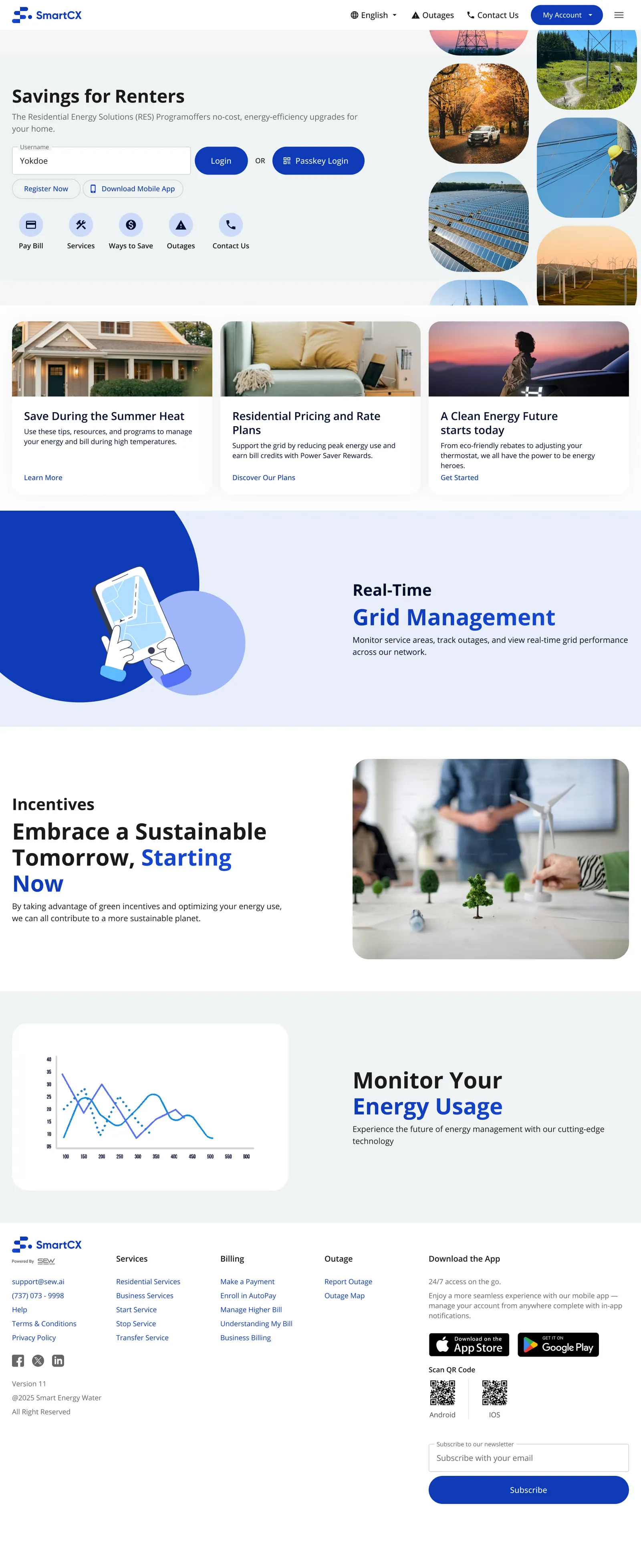
Exploration 7 · scroll ↕
-
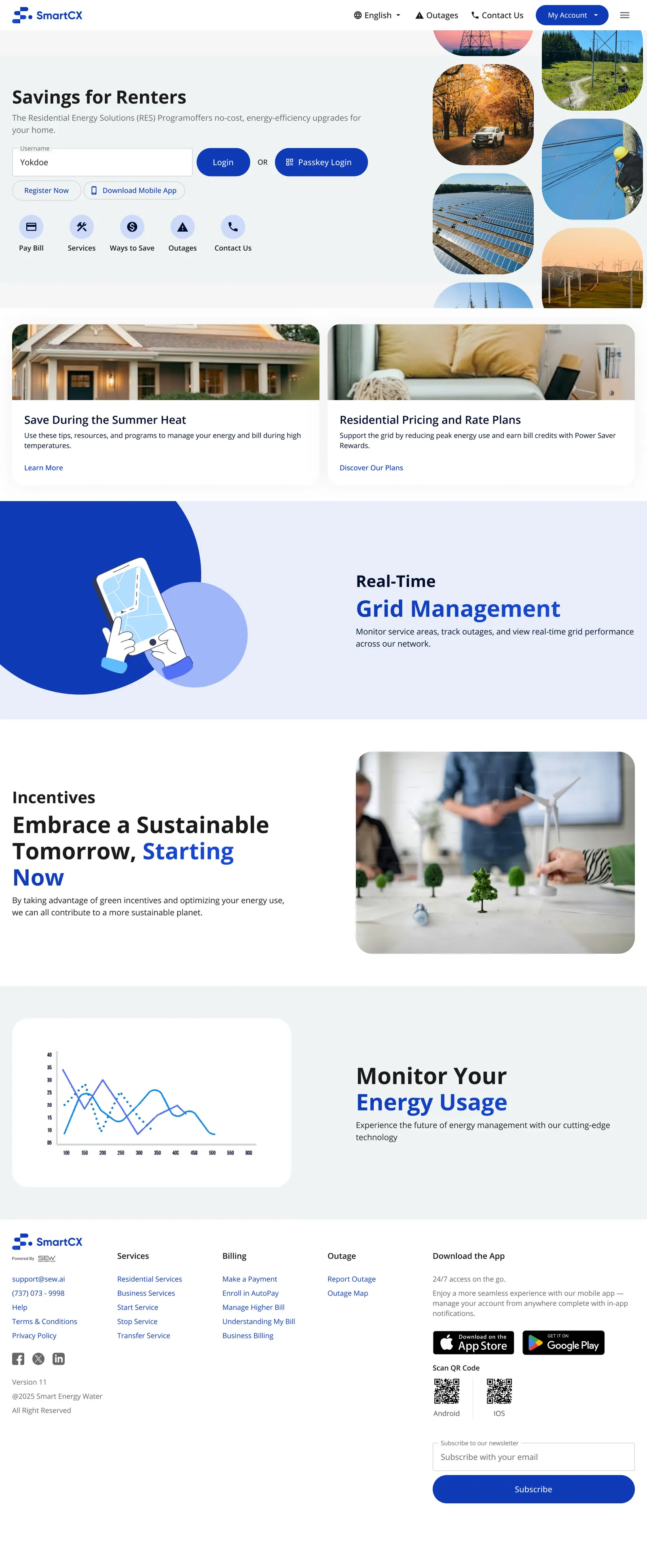
Exploration 8 · scroll ↕
-
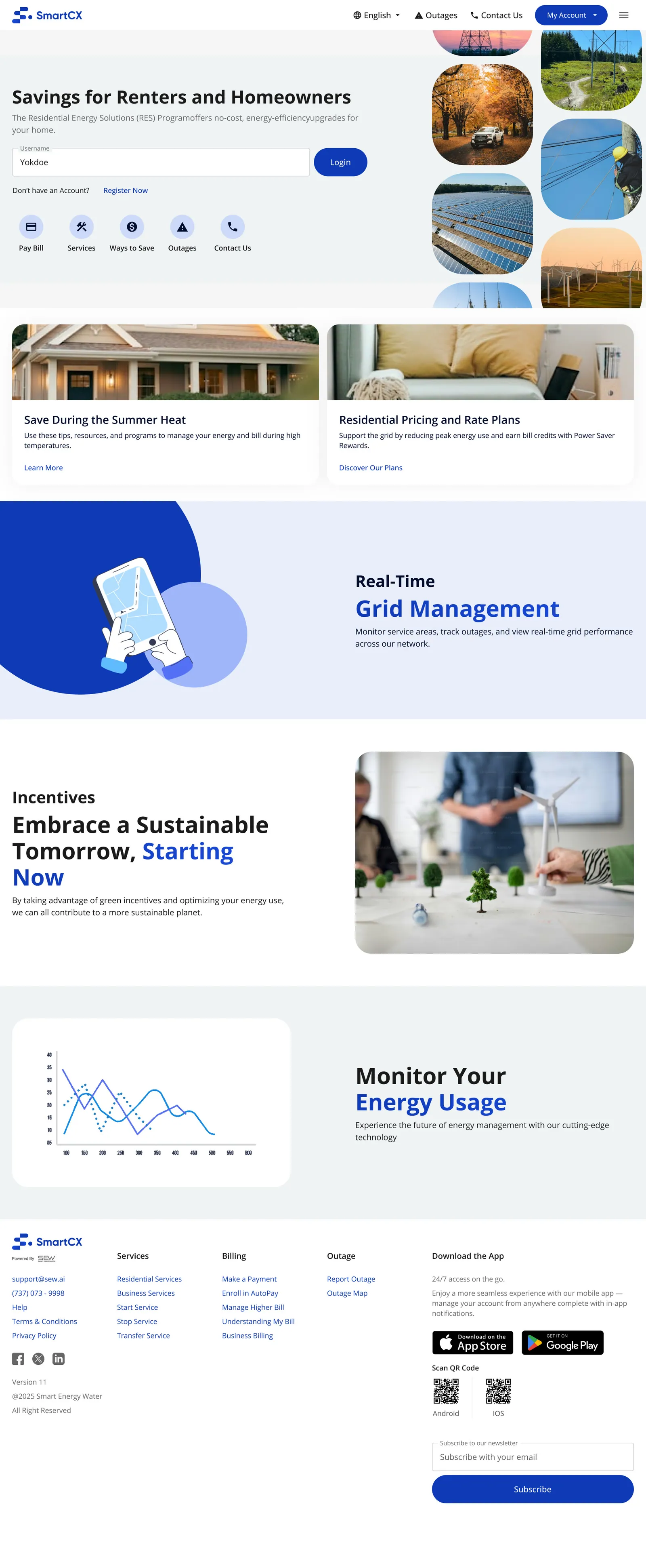
Exploration 9 · scroll ↕
-
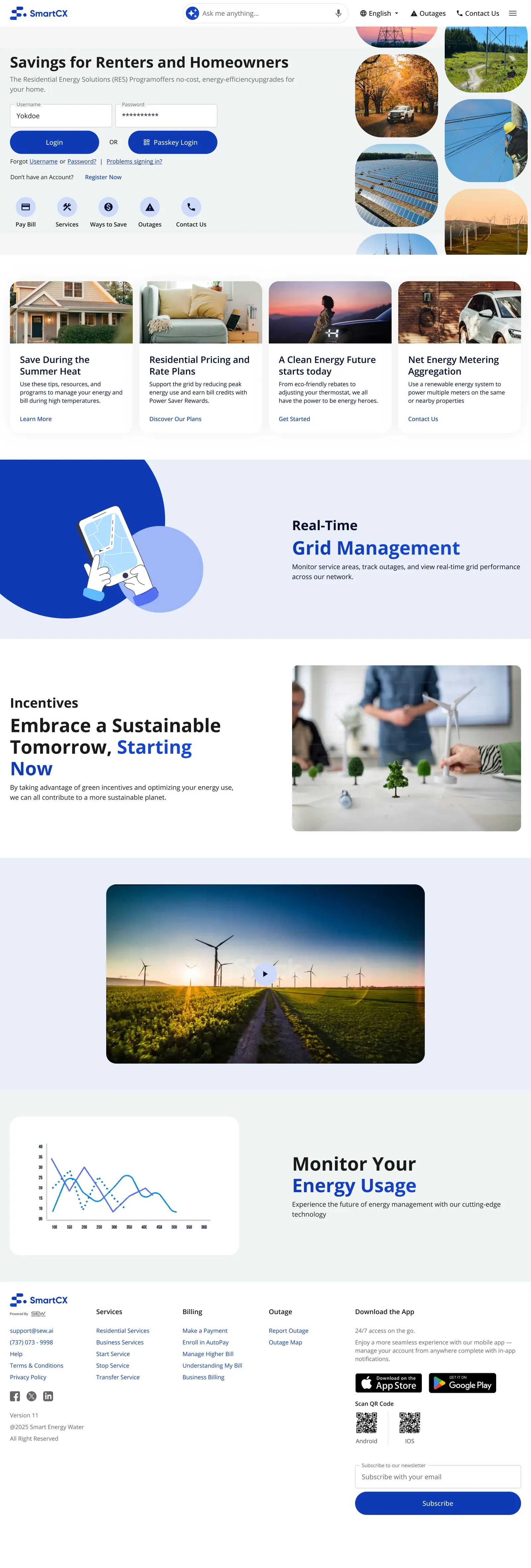
Option A · scroll ↕
-
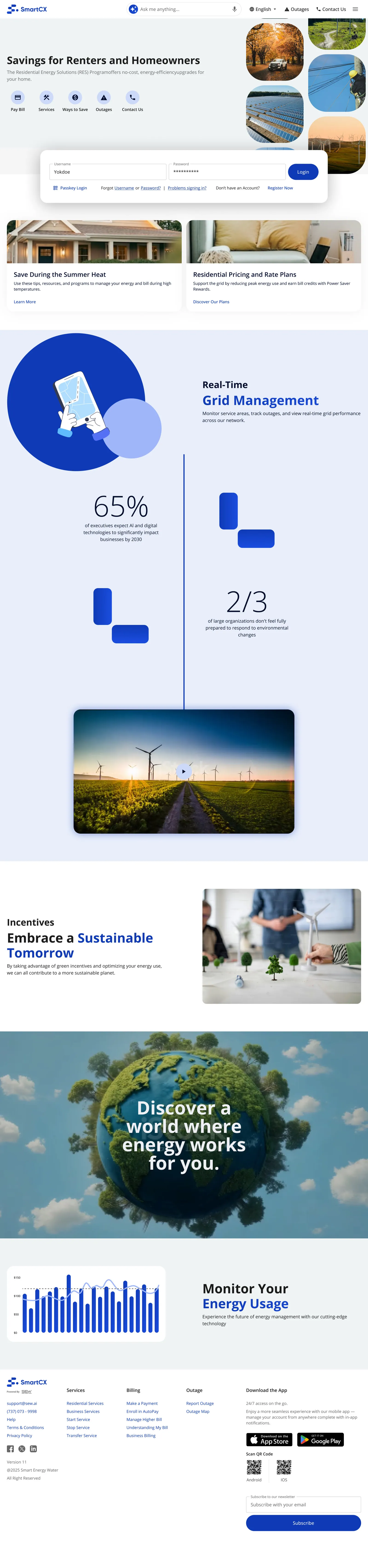
Option C · scroll ↕
-
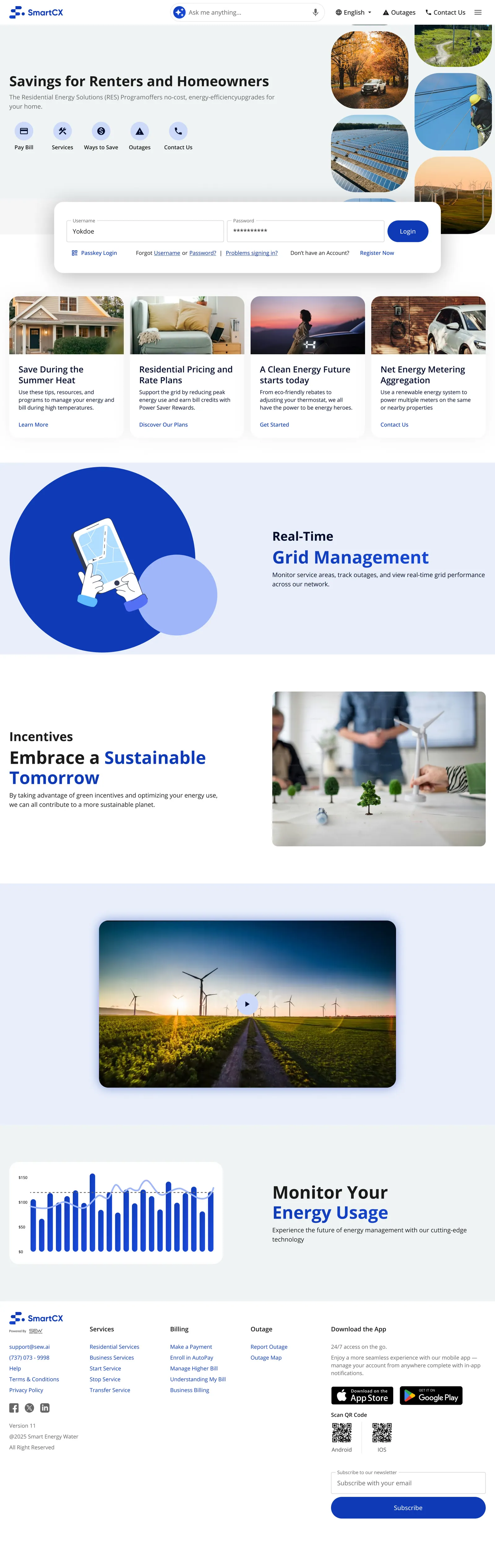
Where it landed (ready for development, Feb 2026) · scroll ↕
-
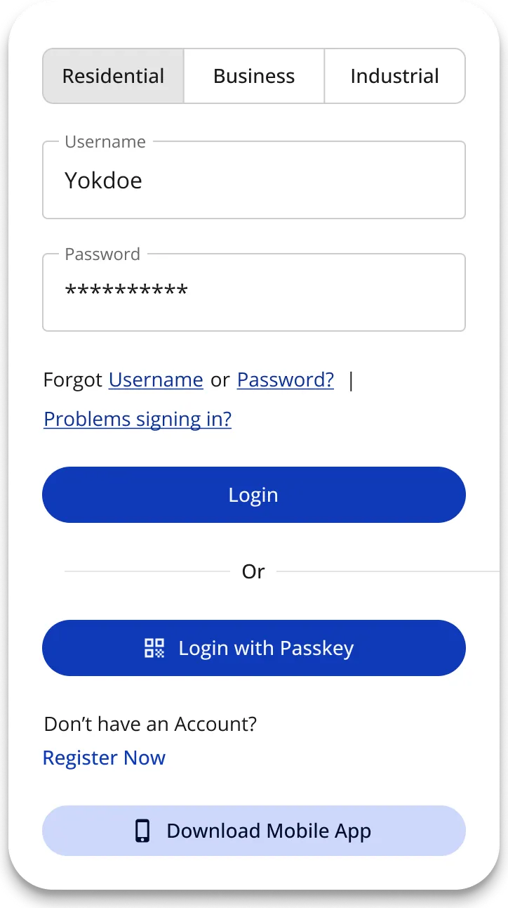
The compact sign-in card
What changed, and what it's worth
- A new customer home, designed end to end and tested with customers (~60% preferred it), shown at WE3 2025 under SEW's COSMOS platform and built to pre-production.
- Its patterns (amount due first, an AI insight with one action, quick actions) appear in SEW's public COSMOS marketing.
- A reusable AI component set (search, chat, insights, pro tips) in the base design system, offered to utilities as an upgrade, and it helped close deals.
- The direction for Track 2, explored, tested and proven in a coded prototype (not shipped).
AI earns its place by explaining. A customer who understands why their bill changed doesn't need to call.
What I learned
- Vision first, then scope down. The vision work made Track 1 fast and focused.
- Design the base, not one brand. Building the cards into the system meant any utility could add them without a redesign.
- Design for the empty state. New customers and non-smart meters have no history; every card needed a fallback.
- AI drafts, I decide. I used Claude to build prototypes, tools and first drafts. The design calls, the logic and the sign-offs are mine.
- Shipping isn't the end. The post-WE3 drift is why my next work was the system that keeps design and code together.