 Smart Energy Water · Dec 2025 – Oct 2026
Designing for what's next: iOS 26, Android sizes and iPhone Duo
- Role
- Senior Product Designer
- Company
- Smart Energy Water
- Timeline
- Dec 2025 – Oct 2026
- Location
- Irvine, CA
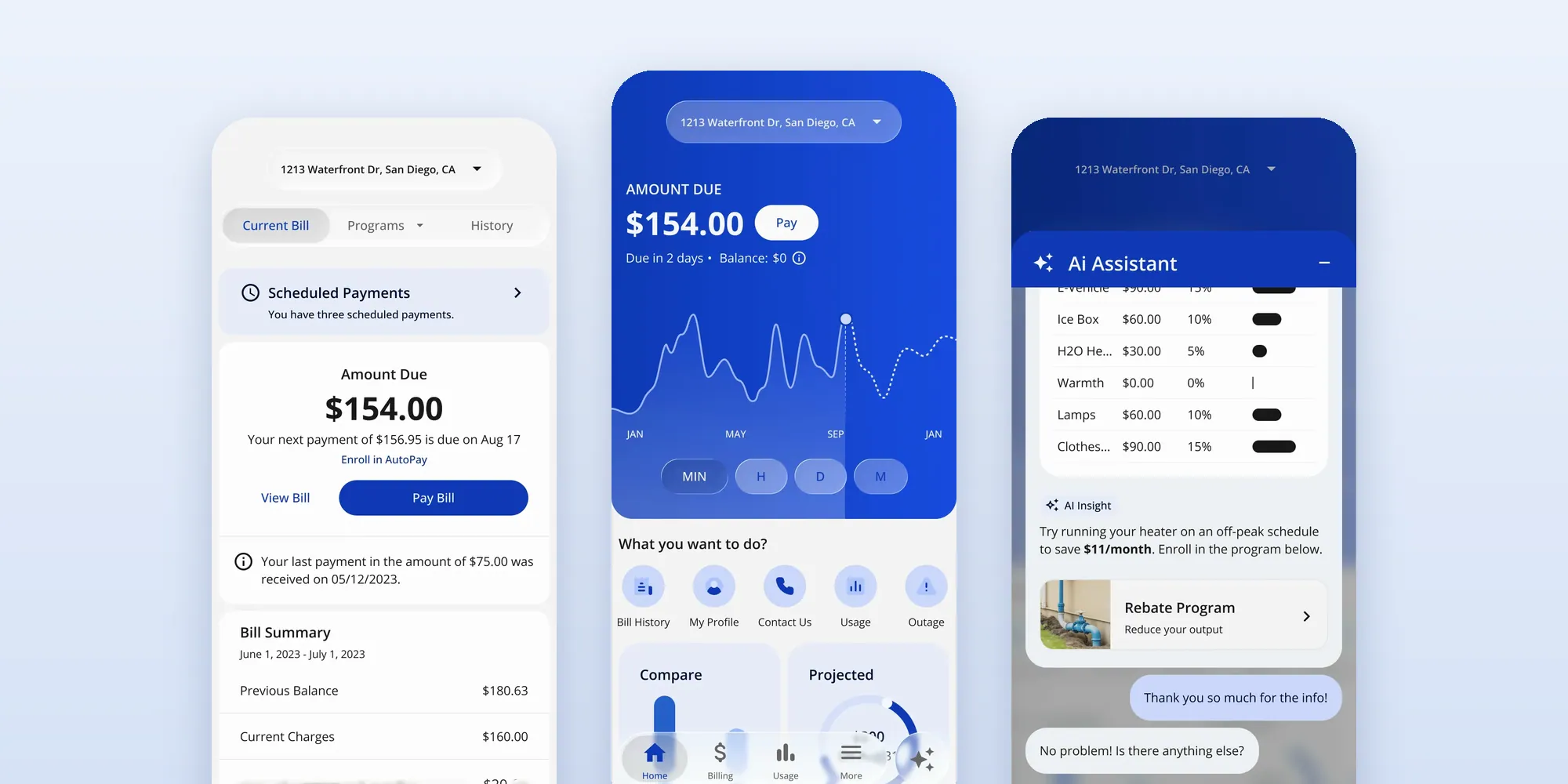
iOS 26 Liquid Glass on the customer app: Current bill, Home and the AI assistant.
Contents
- The problem, and how I worked it
- One platform change multiplies across every utility's app
- iOS 26 Liquid Glass
- Android adaptive layouts
- iPhone Duo
- What it's worth, and what I learned
When Apple and Google changed what phones look like, I got ahead of it for SEW's customer app. I mapped iOS 26's Liquid Glass onto our screens, designed the app across Android's compact, medium and expanded sizes, and reviewed what iPhone Duo, Apple's foldable, would break, with effort and priority for each core screen, so engineering could plan instead of react.
Why it mattered: a platform change lands in every utility's app at the same time. Deciding once, in the base, saves a decision per client.
The problem, and how I worked it
Problem: Apple and Google were changing what phones look like (Liquid Glass, Android's adaptive sizes, Apple's foldable iPhone Duo), and every change would land on every utility's app at once. Our custom navigation and sheets didn't adapt on their own. The goal: decide it once, in the base, before engineering had to react.
- Problem Dec 2025 Custom pieces like the pill nav and the sheets would break across new sizes and materials. Read more
- Research Dec 2025 – Jan 2026 Apple and Google guidance, mapped onto our screens. Apple's own advice: don't overuse Liquid Glass, because it can hide content. Read more
- Design Dec 2025 – Mar 2026 9 screens in Liquid Glass; three Android breakpoints (360, 600 and 1200 dp). Read more
- Test Mar 2026 Built Android's navigation in code to check it across all three breakpoints. Read more
- Ship Feb – Oct 2026 Liquid Glass merged into base 2.0 (Feb); a 7-page foldable impact review, with effort and priority for each core screen (Oct). Read more
- Outcome Engineering could plan instead of react. Read more
One platform change multiplies across every utility's app
SmartCX ships under many brands, so a platform shift lands on all of them at once. And the app had custom pieces (a floating pill nav with a center AI button, custom bottom sheets, a draggable outage sheet) that look great on one phone size but don't adapt on their own.
iOS 26 Liquid Glass
Applied to our screens, with a phased plan
-
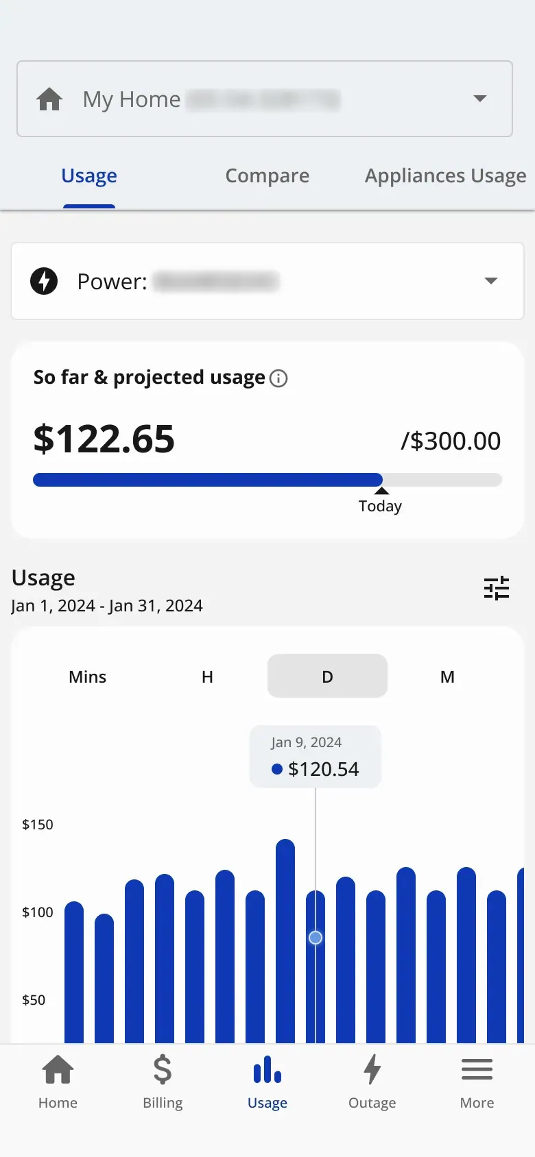
Current · Usage
-
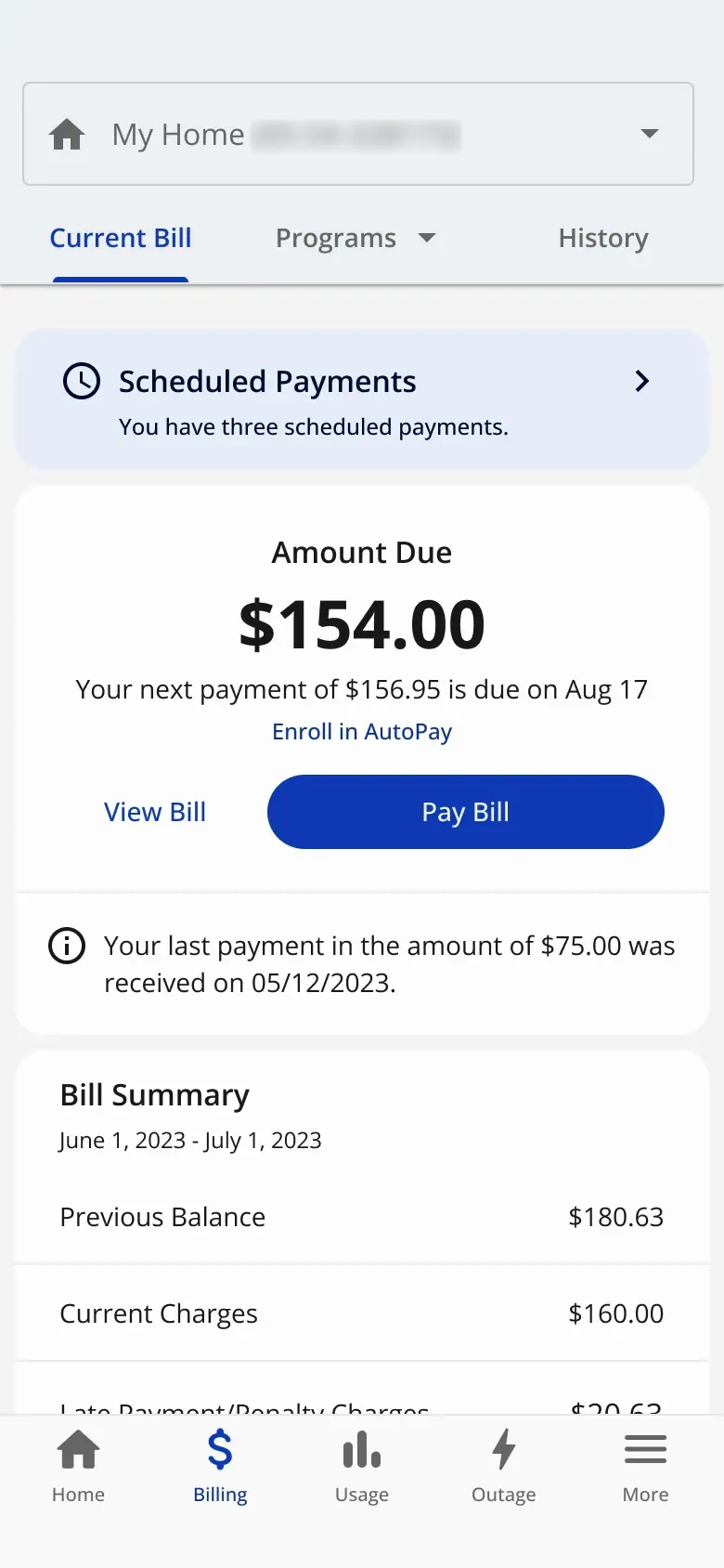
Current · Current bill
-
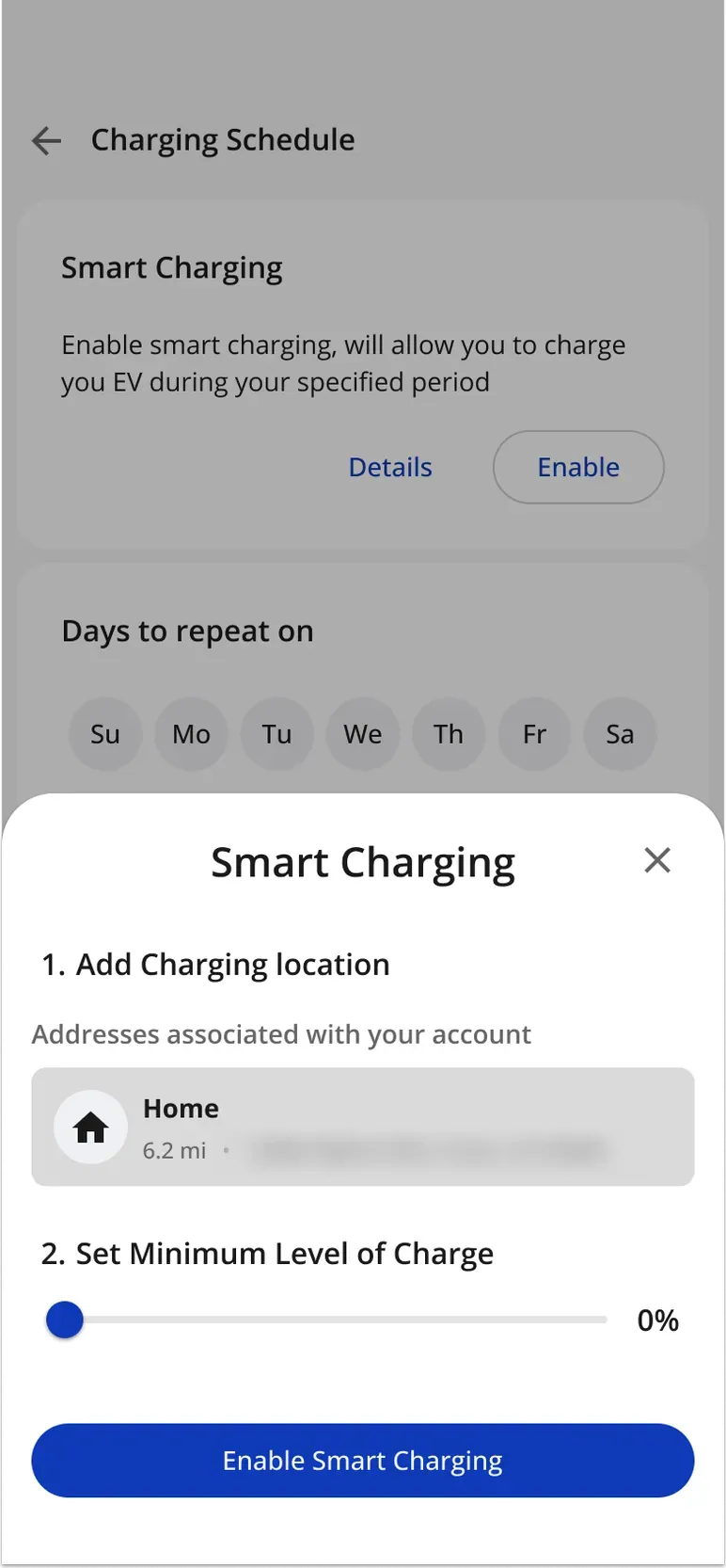
Current · Smart charging
-
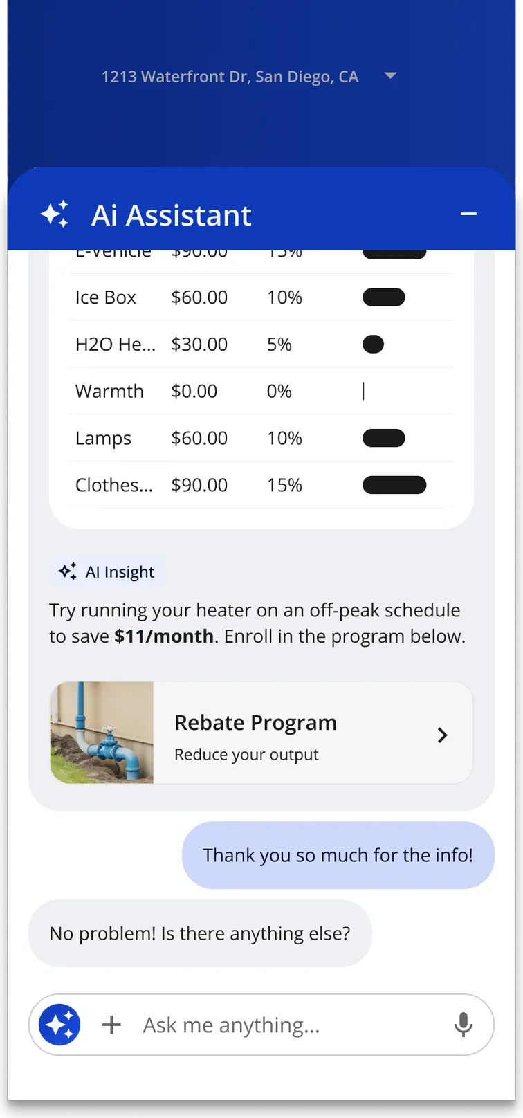
Current · AI search
-
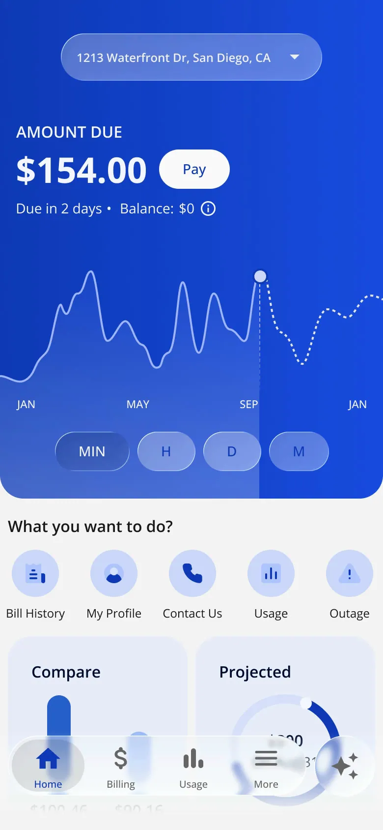
Liquid Glass · Home
-
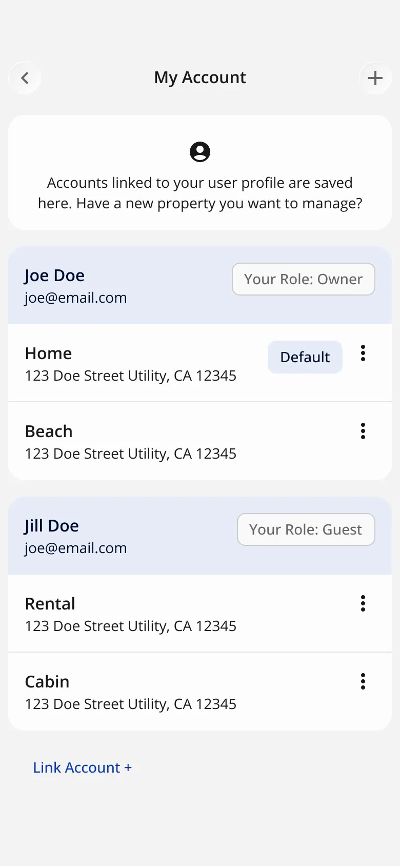
Liquid Glass · My Account
-
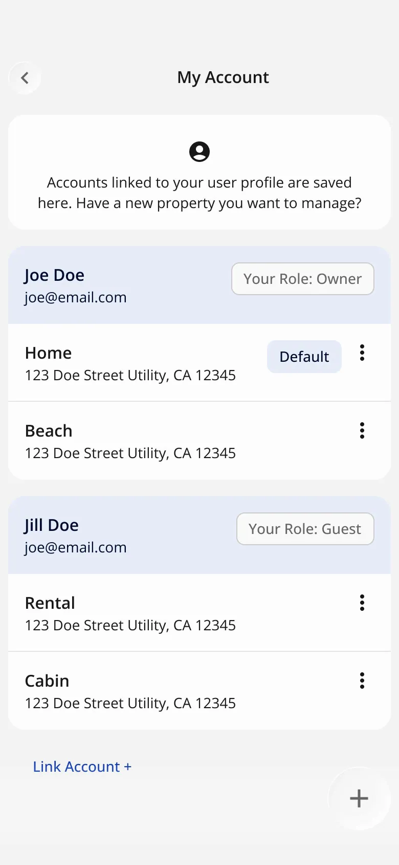
Liquid Glass · My Account, glass button
-
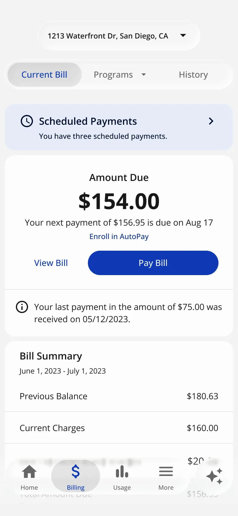
Liquid Glass · Current bill
-
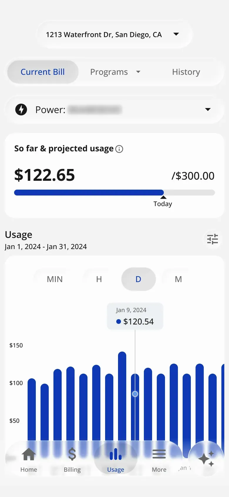
Liquid Glass · Usage
-
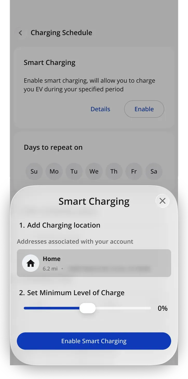
Liquid Glass · Smart charging
-
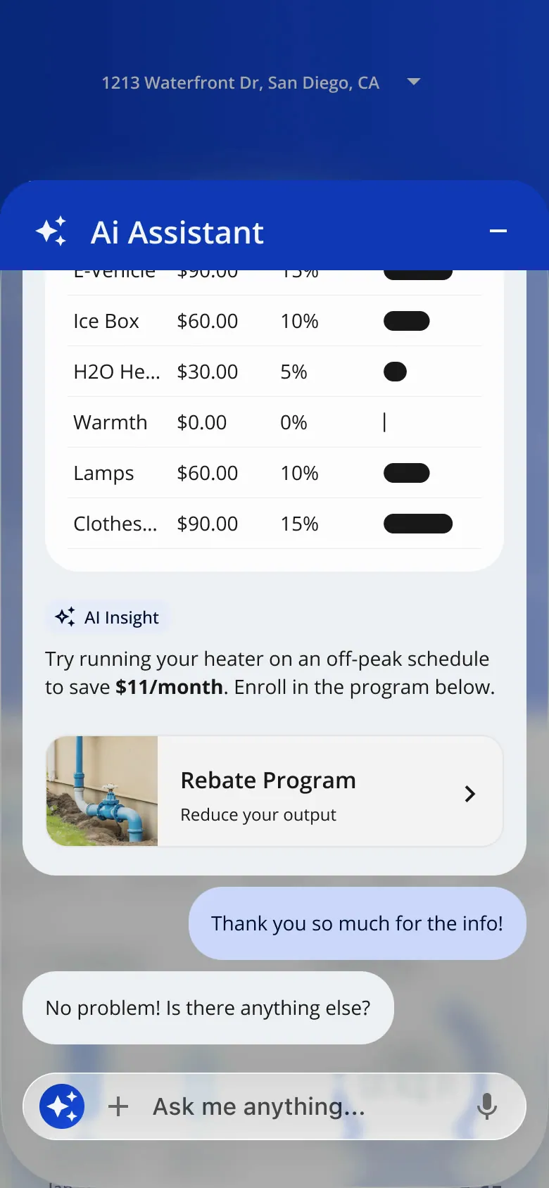
Liquid Glass · AI search
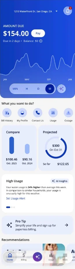
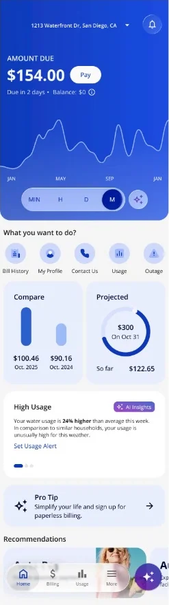
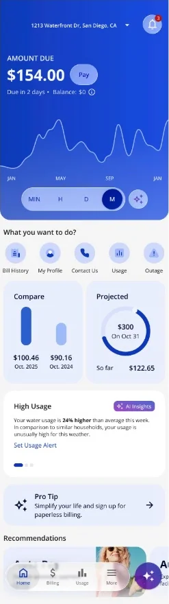
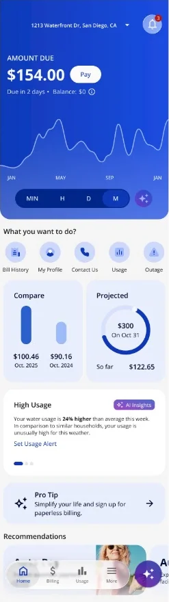
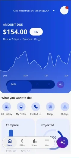
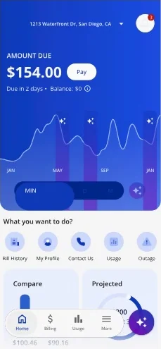
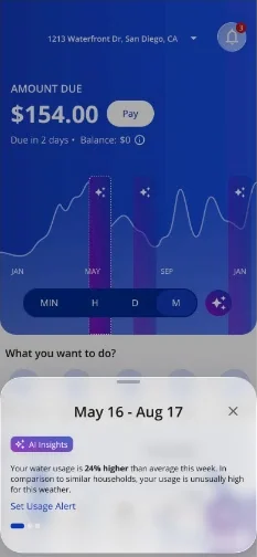
The adoption deck recommended a phased, hybrid move: start with navigation and toolbars, then fields, buttons and controls, keeping the current design language. It named the costs too: glass can obscure content if overused, and extra "glass variants" add design-system maintenance.
Liquid Glass made it into the library
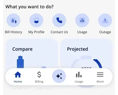
This wasn't only a concept deck. The glass nav bar and its variables were merged into base 2.0, the library every utility's app is themed from. The base 2.0 system tokens also carry Liquid Glass effect settings, so iOS 26 materials come from the same source as everything else.
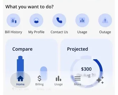
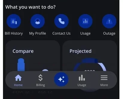
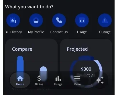
- Nov 26, 2025 First iOS 26 study file.
- Dec 9, 2025 Adoption deck started.
- Dec 16, 2025 Liquid Glass design file started.
- Jan 7–28, 2026 Branch: the customer nav bar with Liquid Glass. Merged into base 2.0.
- Feb 2–6, 2026 Branch: Liquid Glass variables. Merged. Base 2.0 marked ready for development on Feb 6.
Android adaptive layouts
One app at every Android size
The customer home in Material 3 Expressive across compact, medium and expanded windows: navigation moves from a bottom bar to a rail to a drawer, and the home recomposes into 1, 2 or 3 columns at 360, 600 and 1200 dp. Nothing is hidden just because the screen got bigger.
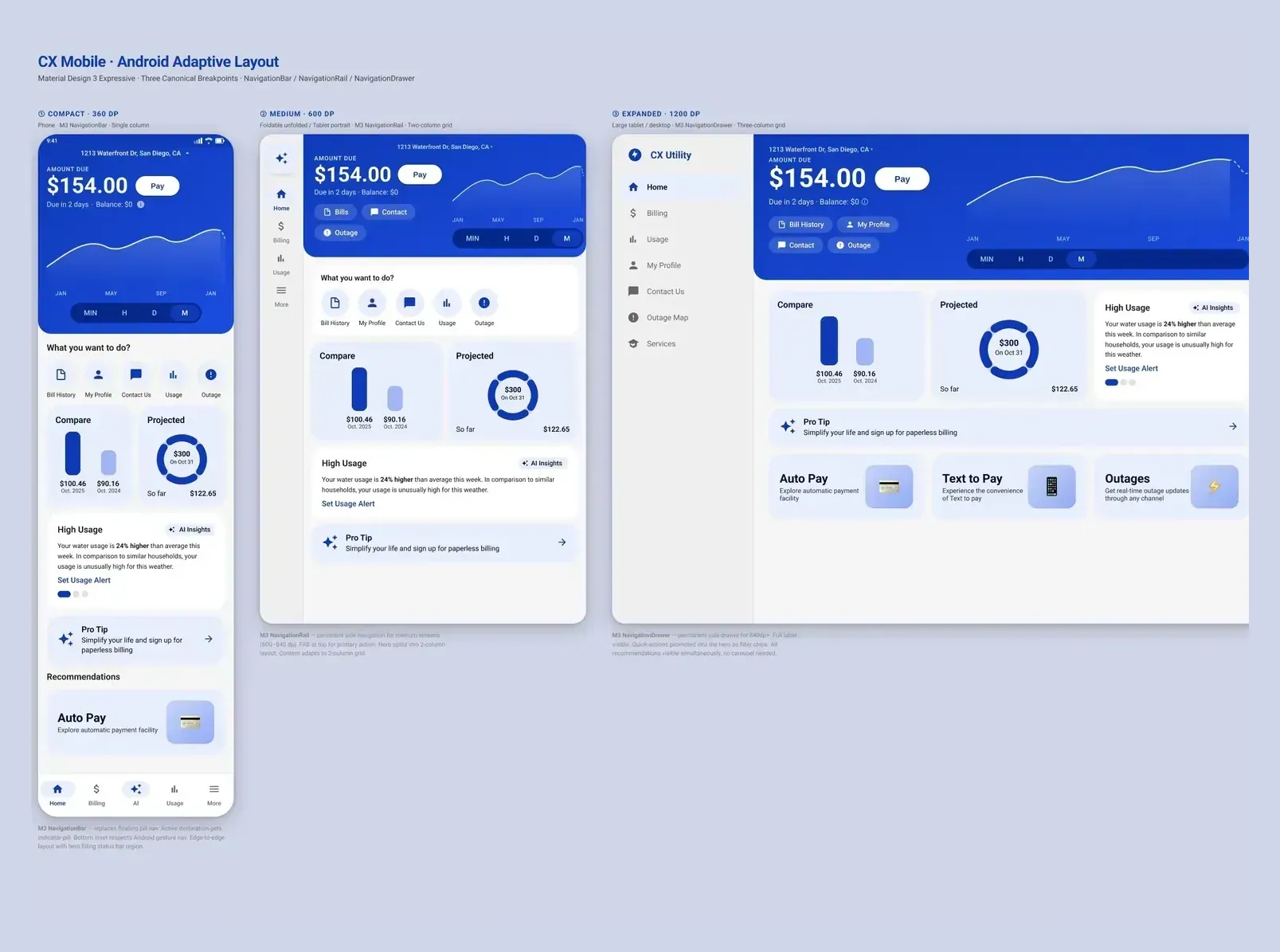
I built the Android adaptive layout as a coded study on Material 3 breakpoints. I drew all three sizes side by side instead of one responsive frame. It's less "real", but every navigation pattern stays visible at once for review. I directed Claude Code with the M3 Expressive guidance and reviewed the variants it generated (Mar 6–13, 2026).
iPhone Duo
What it means for our apps, screen by screen
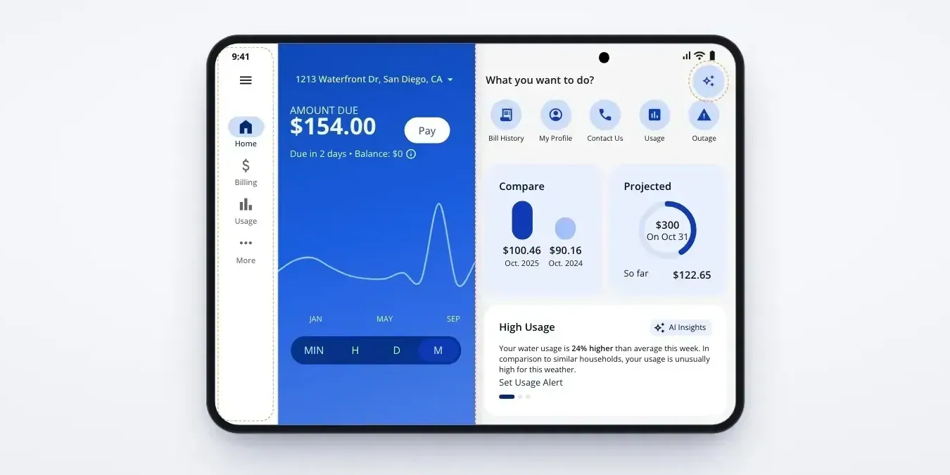
A 7-page review for the team (Oct 7, 2026). A foldable is two screen sizes in one device, with a crease you can't put a button on. Apps that resize well need little work; custom bars and sheets need the most. Its takeaway: design adaptive screens once (compact / medium / expanded, fold-aware) and share them across both platforms, which is exactly what the Android work does.
-
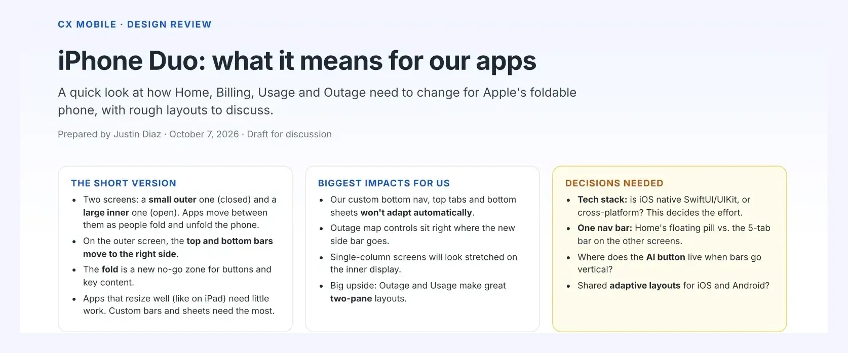
Cover: the short version and the decisions needed.
-
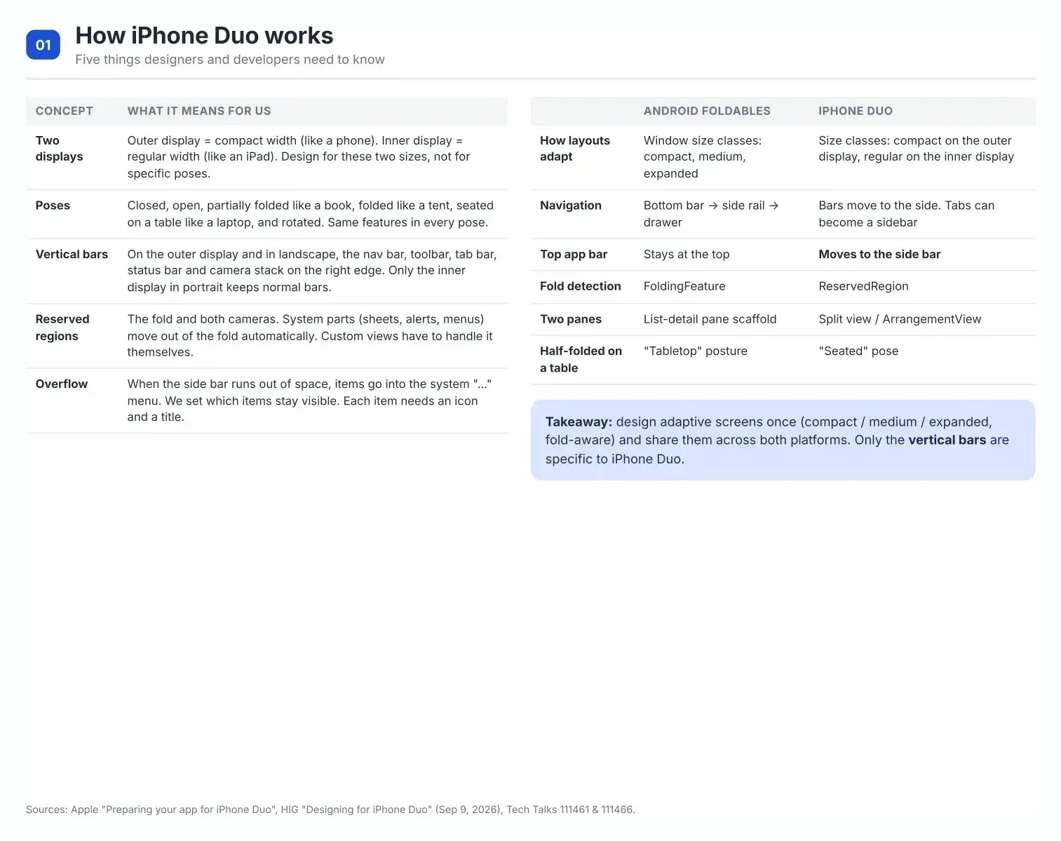
How it works, side by side with Android foldables.
-
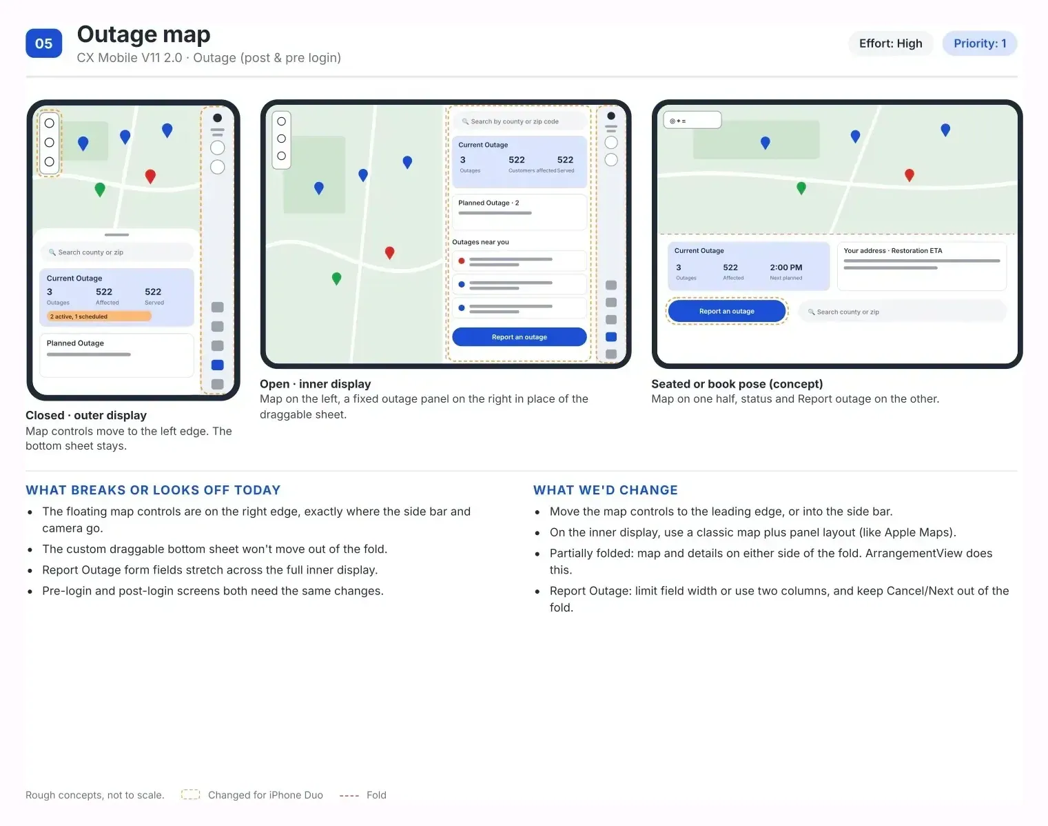
Outage map · priority 1, effort high
-
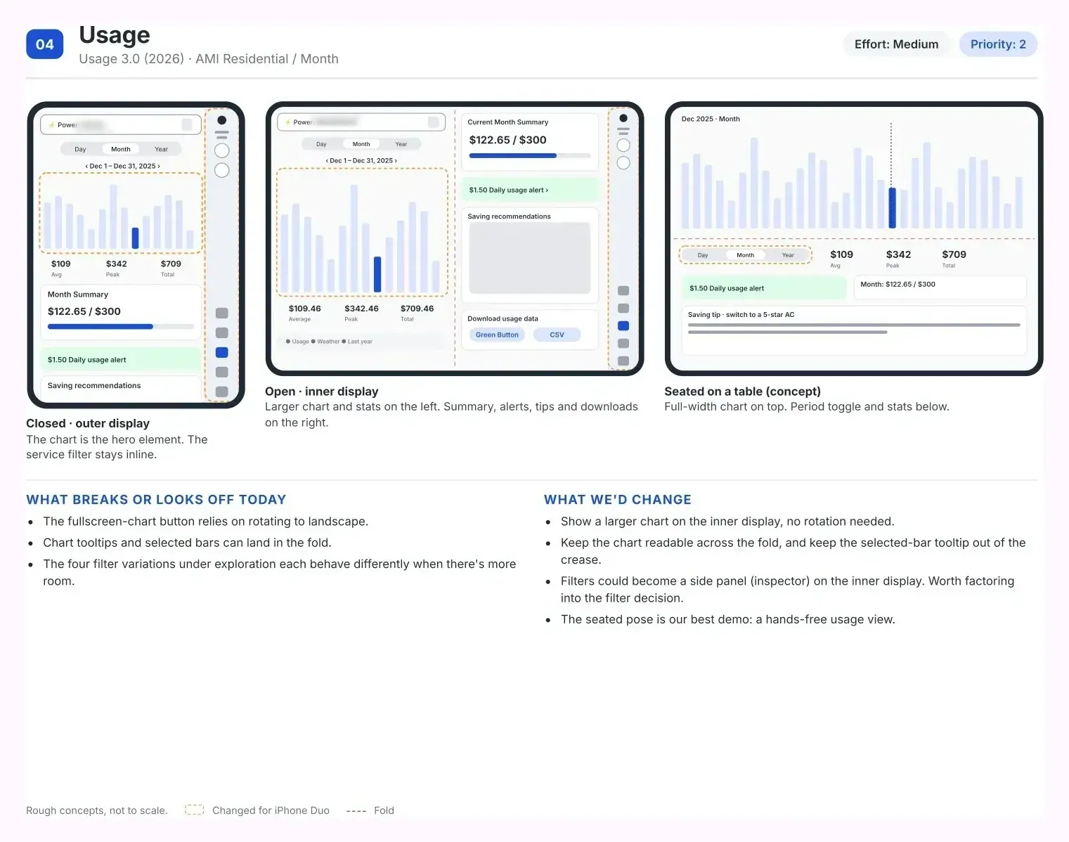
Usage · priority 2, medium
-
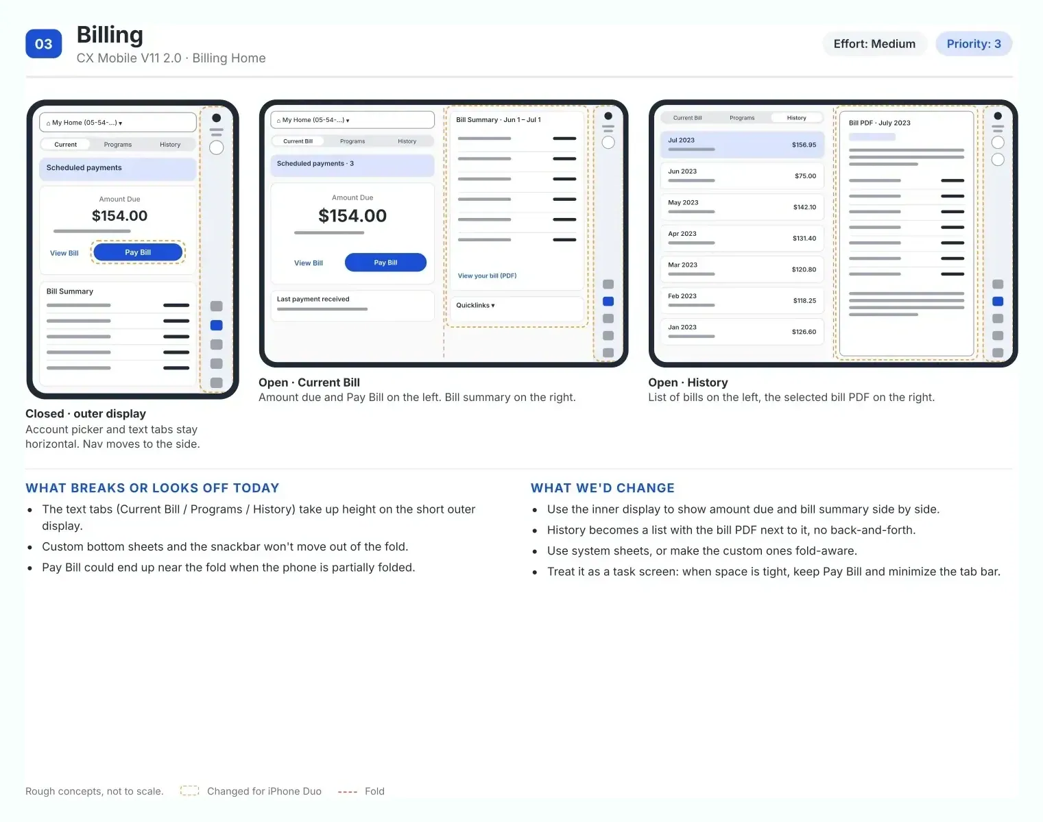
Billing · priority 3, medium
-
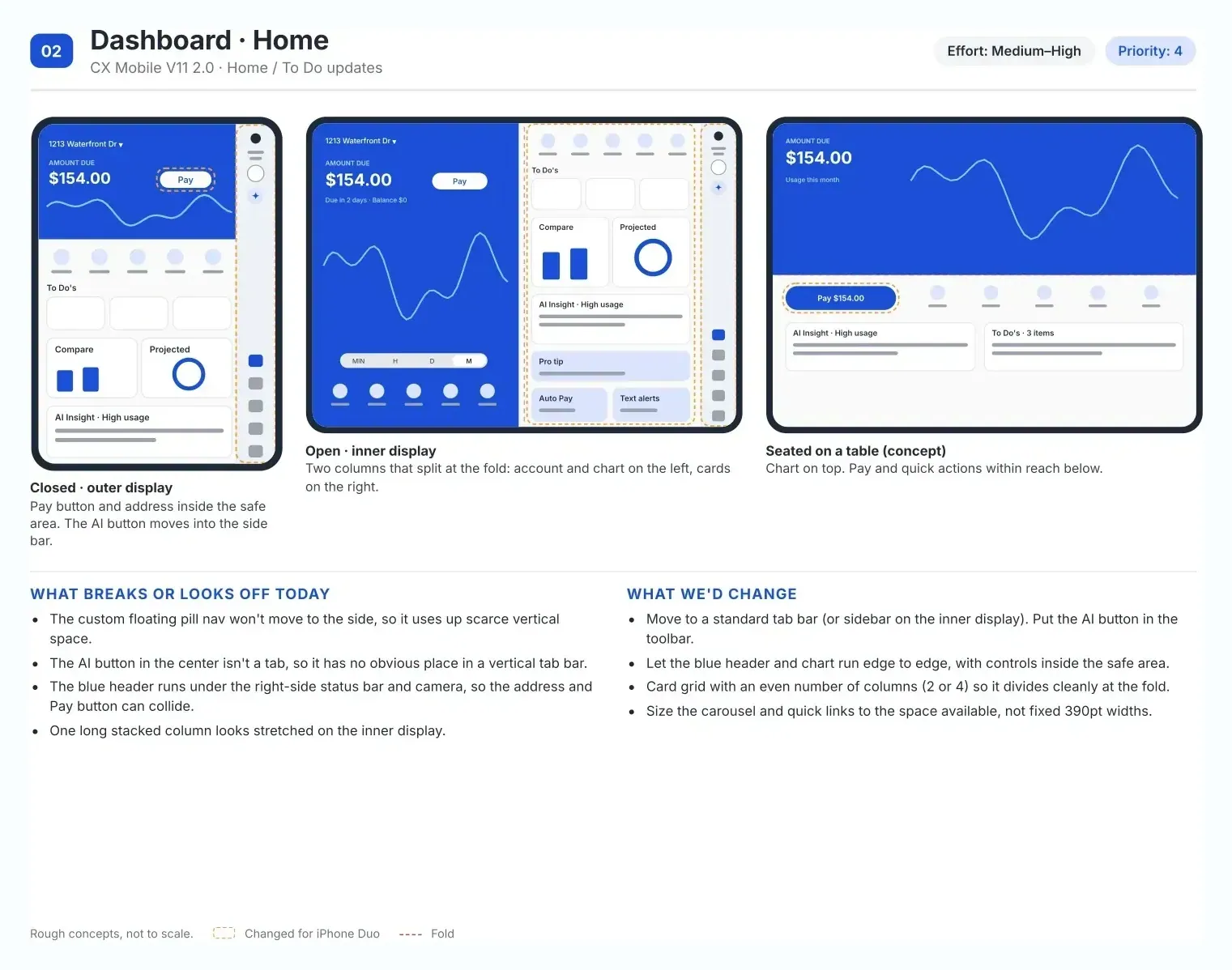
Home · priority 4, medium–high
- Outage map · priority 1, effort high Map controls sit exactly where the new side bar goes; move to a map-plus-panel layout. It's the screen people open when something is wrong.
- Usage · priority 2, medium A larger chart on the inner display, no rotation needed. The seated pose is the best demo: a hands-free usage view.
- Billing · priority 3, medium Amount due and summary side by side; history as a list with the bill next to it.
- Home · priority 4, medium–high The floating pill nav has no place in a vertical bar: a standard tab bar, AI in the toolbar, an even card grid that divides at the fold.
Decisions needed from engineering: native vs cross-platform, one nav bar instead of two, where the AI button lives, and shared adaptive layouts for iOS and Android.
What it's worth, and what I learned
- Design for size classes, not devices. One adaptive system covers tablets, foldables and the next new phone.
- Custom is a cost you pay later. On iPhone Duo, the custom nav and sheets were exactly the parts that broke.
- Prioritize by what people do under stress. Outage came first.
Status, honestly: Liquid Glass reached the base 2.0 library (nav bar and variables, Jan–Feb 2026). The Android and foldable work are ready plans; no adoption is recorded for those yet. Platform facts are from Apple's and Google's public guidance.