 Smart Energy Water · Nov 2023 → Nov 2026
EV charging, end to end
- Role
- Senior Product Designer
- Company
- Smart Energy Water
- Timeline
- Nov 2023 → Nov 2026
- Location
- Irvine, CA
Contents
- The problem
- How I worked it
- The EV app, 2023 → 2026
- Who I worked with, and how
- From the old design system to base 2.0
- What competitors, leadership and the team told me
- The real thing: one base, two utility brands
- The riskiest moments happen at the charger, not in the app
- Charging status on the lock screen
- Starting and stopping a charge, without accidents
- Beyond the phone: the car
- From an EV app to the whole home
- Sign-in, sign-up and the splash
- Usage 2.0: every number derived
- Testing: the scenarios, and what they found
- What changed, and what it's worth
For three years I owned the design of a white-label EV charging app that utilities give their drivers. It changed brands twice and moved to a new design system. Through all of it, the job stayed the same: help a driver find a charger, start a charge with confidence, and know what it cost. This page covers the whole app: charging, with the motion that makes it trustworthy, and the usage screen.
Why it mattered: utilities use the EV app to serve their drivers under their own brand. Whatever the brand, the riskiest moments, starting a charge and trusting the numbers, had to work the same way everywhere.
The problem
Problem: drivers have to trust the app at the moment it matters most, at a busy public charger, starting a session that costs money. And the same app had to ship under three utility brands and two design systems. The goal: make finding, starting and paying for a charge feel certain, in one base app every brand can use.
2023–2024 · One app, many brands
Every utility wanted it to look like theirsThe app changed brands twice, utilities wanted their own colors and content, and screens were split between design system 1.1 and base 2.0.
2024 · Too much to ask
An app getting heavierDrivers most likely won't fill in every detail, and every new feature risked making the app harder to use.
Oct 2024 · At the charger
"Open" chargers that weren'tChargers the app showed as open were taken: a line of three cars, about 20 minutes of waiting, a station that throttled its output, and no sign in the app that the charge had started.
2025 · Away from the phone
Drivers don't watch the appWhile charging, drivers don't stare at their phone, and in the car they can't use it at all.
2025–2026 · One gesture, real money
A swipe that could fire by accidentA swipe started or stopped a paid session. By Jun 2026 the swipe button was nested in 36 places, and only 11 of 261 components came from the EV 2.0 library.
2026 · From EV to the whole home
One app, every kind of homeMost homes have no solar, battery or EV; connected cars each support different data; and the usage screen typed in every number, so one device used more energy than the whole account.
How I worked it
- Research Dec 2023 → Competitor apps, feedback from leadership, design reviews, and a test plan. Read more
- Field visit Oct 2024 At real chargers: “open” chargers were taken, about a 20-minute wait, and no in-progress state. Read more
- Design 2024–2026 Moved to base 2.0, the lock screen, hold-to-start. Read more
- Test 2024–2026 Task-based test plan; Usage 2.0 math proven in a coded prototype before handoff. Read more
- Ship 2025–2026 Native-ready handoffs (SwiftUI, Compose, Lottie). 2 utilities implementing. Read more
- Outcome Nov 2026 Three years, three brands, one app. Read more
The EV app, 2023 → 2026
Who I worked with, and how
Leadership
- Leadership Feedback on the usage screen; reviews of the app, the flows and Usage 2.0.
decisions ↓progress ↑
- Me · the EV app Nov 2023 → Nov 2026, across three brands and two systems.
specs ↓feedback ↑
Partners
- Product Signed off the five Usage 2.0 decisions.
- Engineering iOS and Android; native-ready handoffs.
- Sales and client teams Which utilities were buying, and why.
needs ↑releases ↓
Utilities and drivers
- Utility brand teams Alectra's brand review; 2 utilities implementing by Mar 2025.
- Drivers Field visits at public chargers.
Product
From stories and tickets to signed-off decisionsRequirements came as product stories, like the lock-screen widget. A date-picker ticket became Usage 2.0, with five decisions Product signed off. In 2026 the work ran through 15 platform tickets across Android, iOS and web.
Leadership
Reviews that changed the designLeadership asked for usage drivers could compare, reviewed the app and Usage 2.0, and vetted flows in design reviews: ask drivers for less up front. Coded prototypes gave them something real to review and won buy-in.
Engineering
Handing off behavior, not picturesSwiftUI and Compose reference code for hold to start, a native and Lottie splash so engineering could choose, the Anchor-Dot spec, eight invariant tests for Usage 2.0, and the requirements for the connected car.
Utilities
One base, their brandAlectra's and SMUD's brand reviews shaped their versions of the same base app; two utilities were implementing it by Mar 2025.
From the old design system to base 2.0
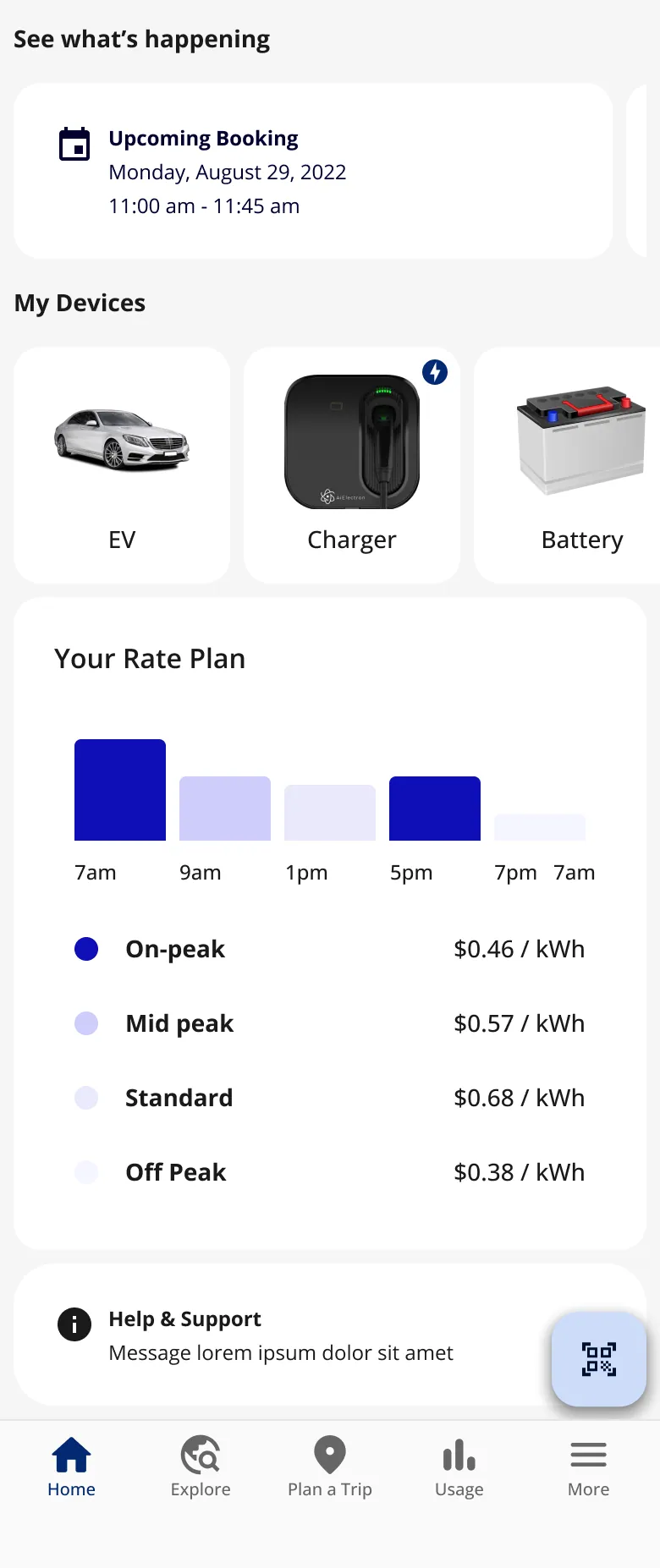
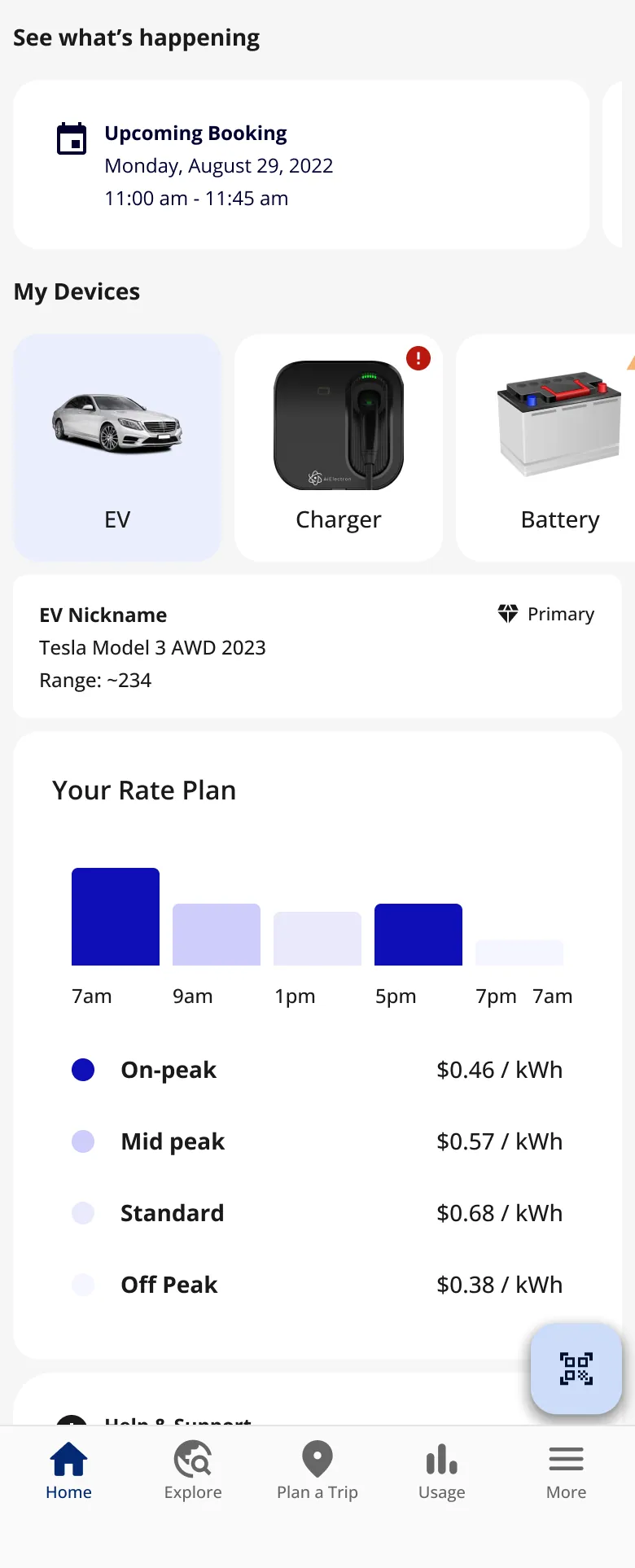
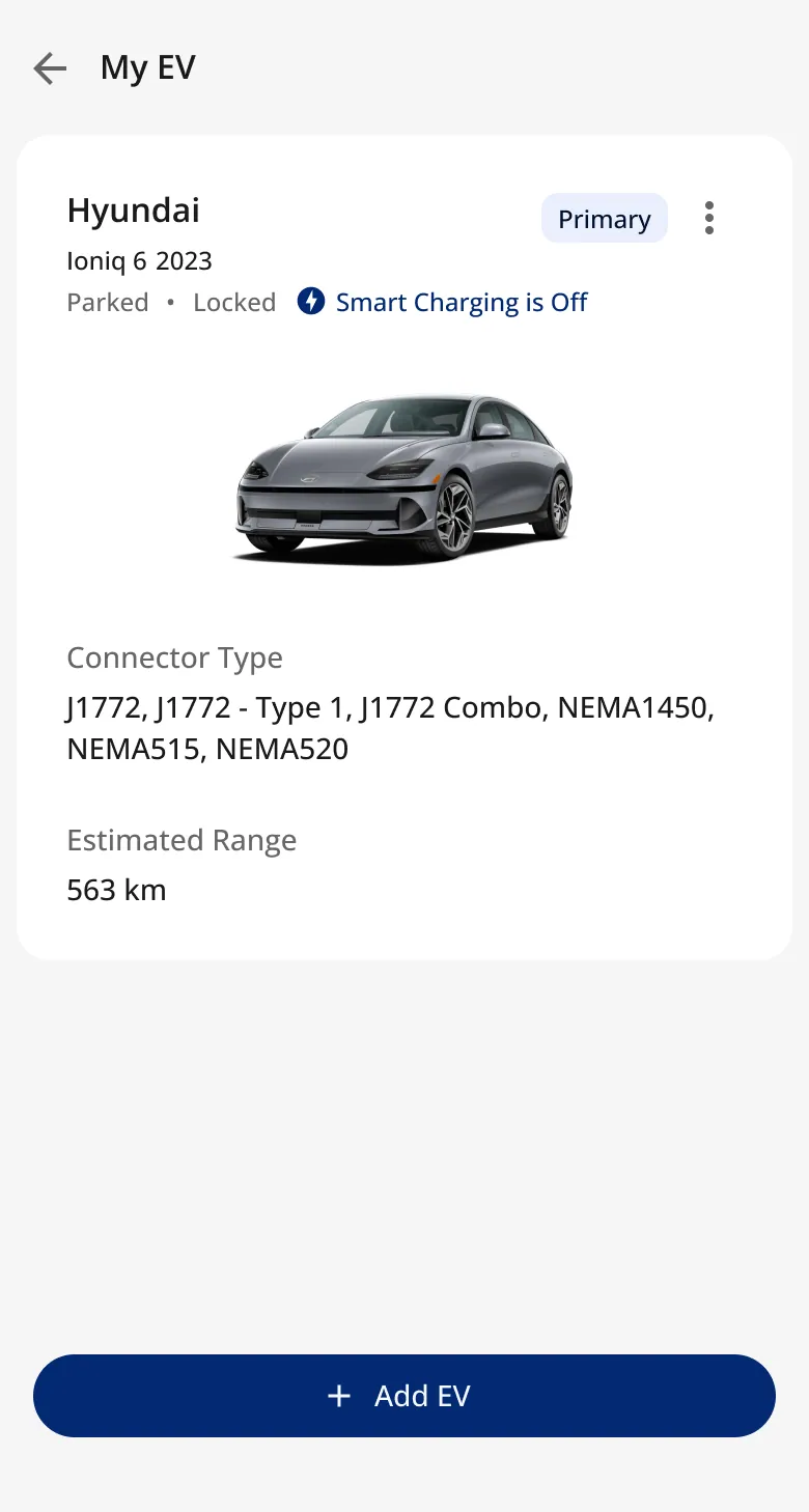
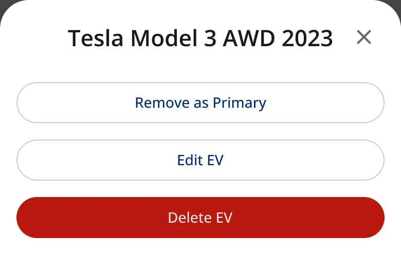
I arrived during the move from design system 1.1 to base 2.0 and ported the app across, screen by screen, contributing EV components (station tiles, charger cards) to the shared system.
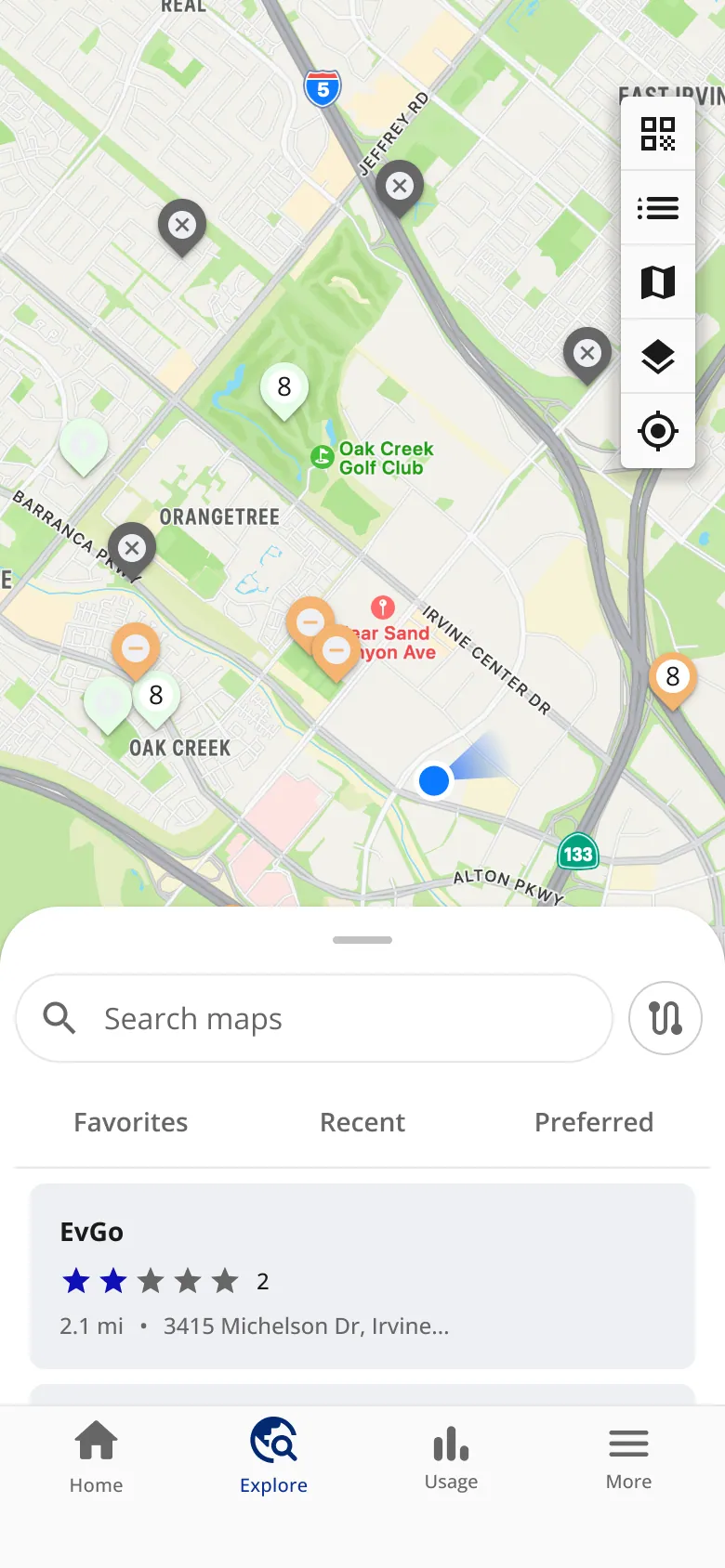
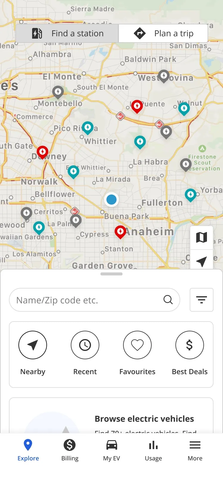
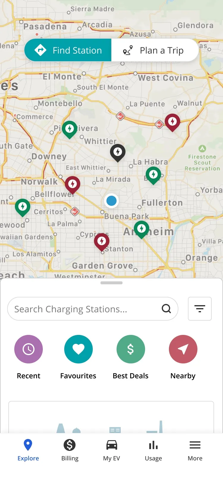
The idea: merge Explore and Plan a trip into one feature, on one page, instead of two.
-
Explore · Explore
-
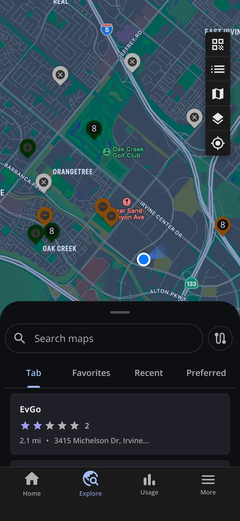
Explore · Explore, dark
-
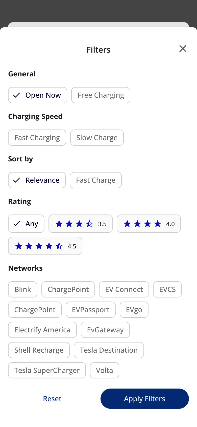
Explore · Filters
-
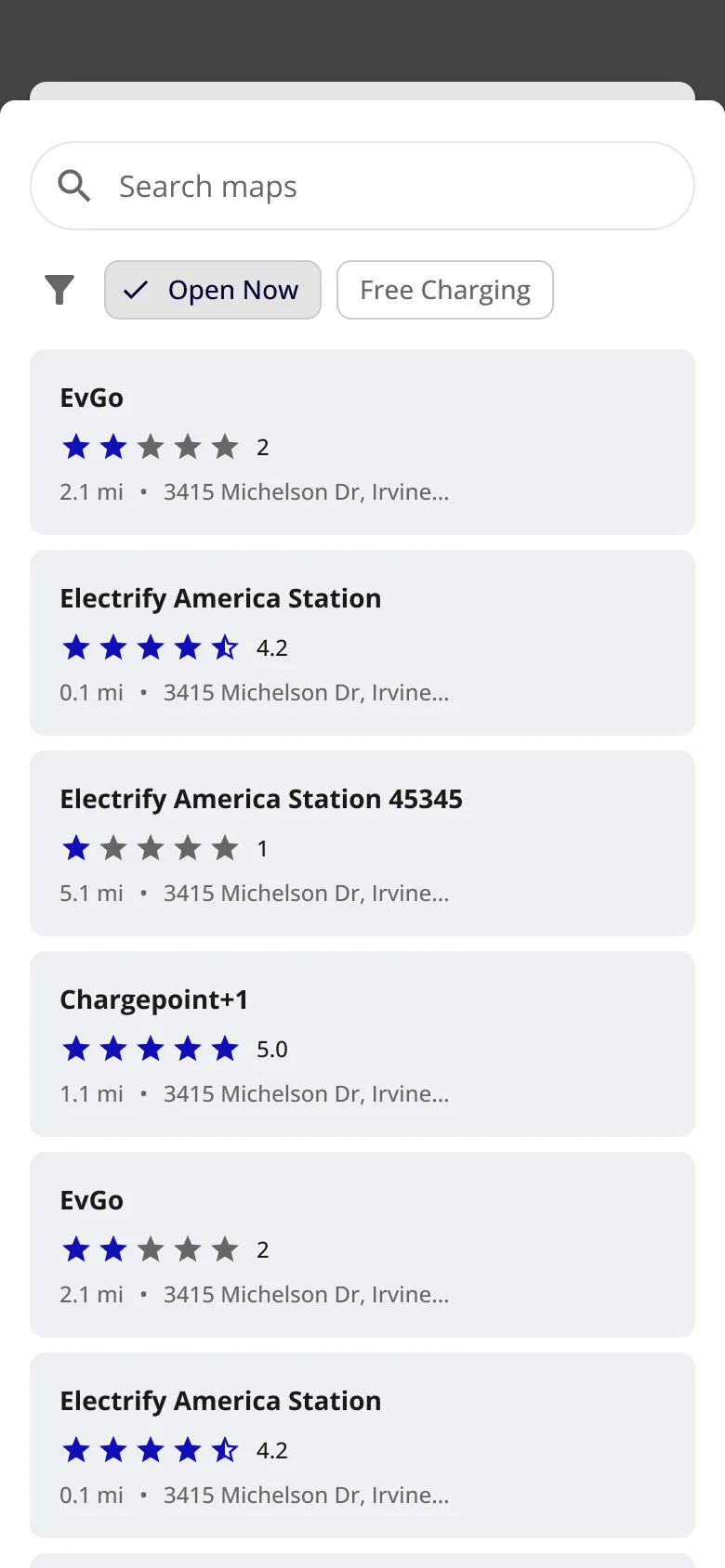
Explore · Filters applied
-
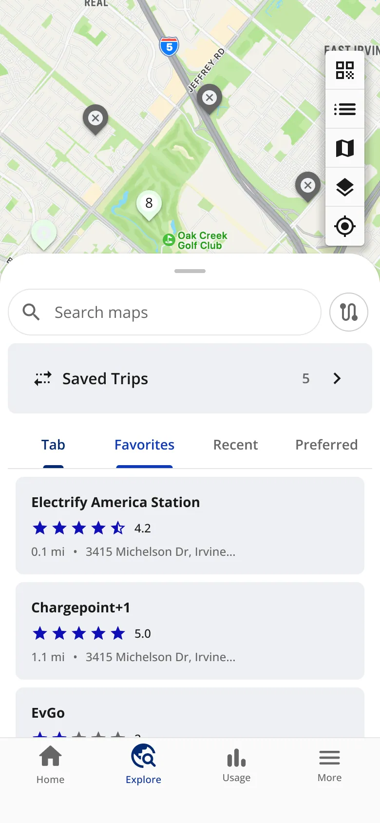
Favorites and saved trips · Favorites
-
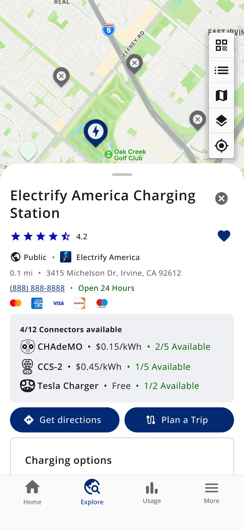
Favorites and saved trips · A station
-
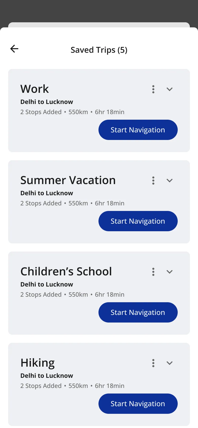
Favorites and saved trips · Saved trips
-
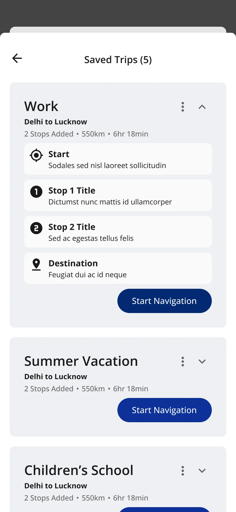
Favorites and saved trips · A saved trip, opened
-
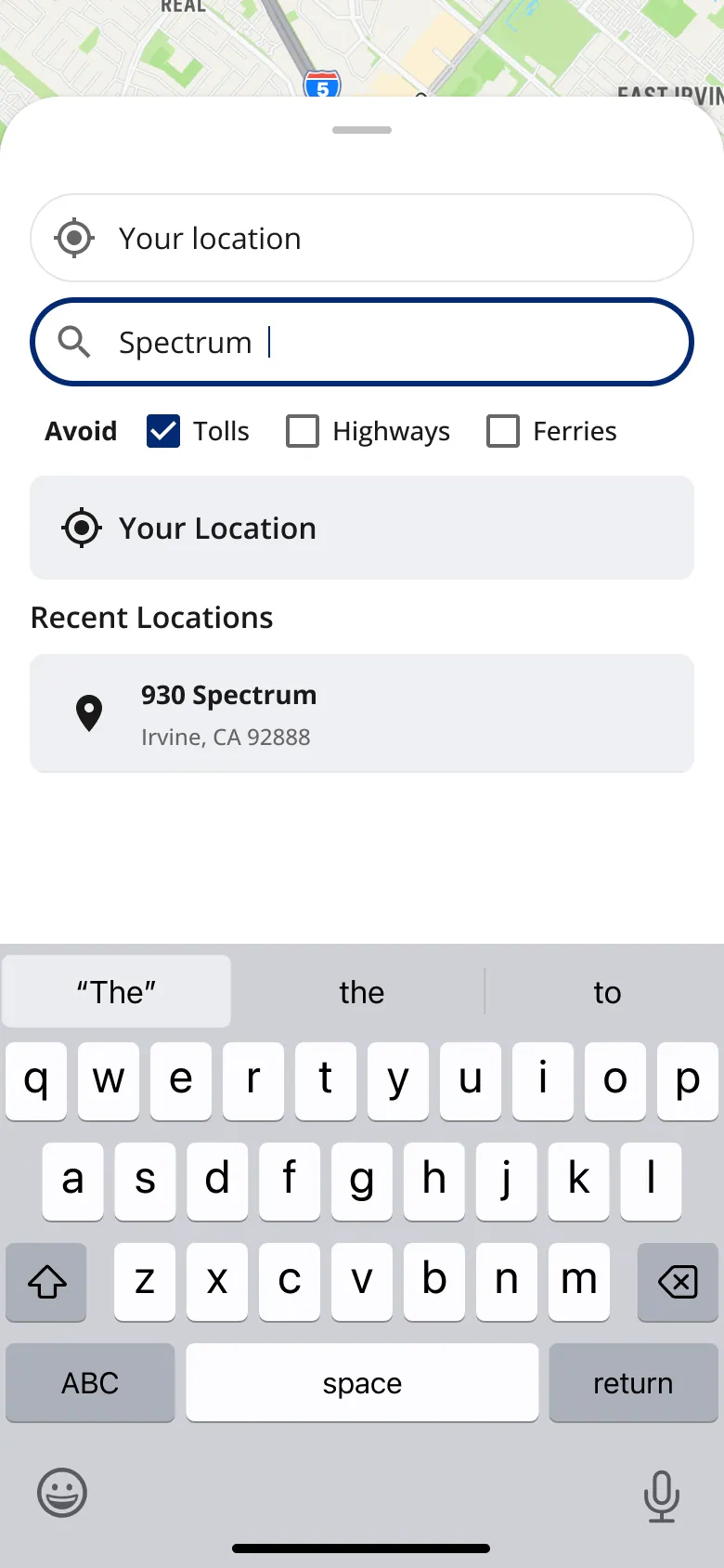
Plan a trip · Choose a destination
-
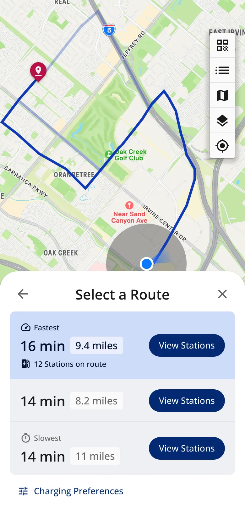
Plan a trip · Select a route
-
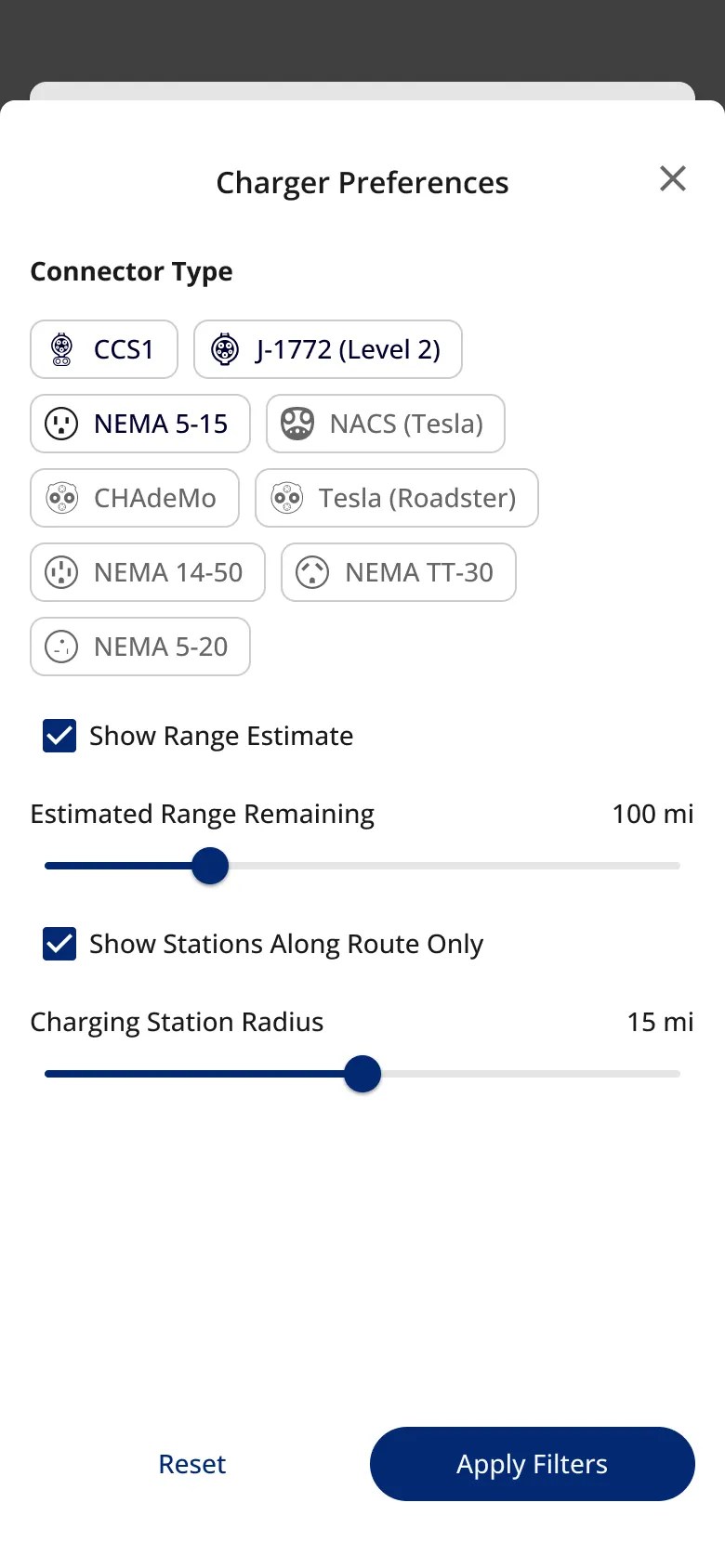
Plan a trip · Charger preferences
-
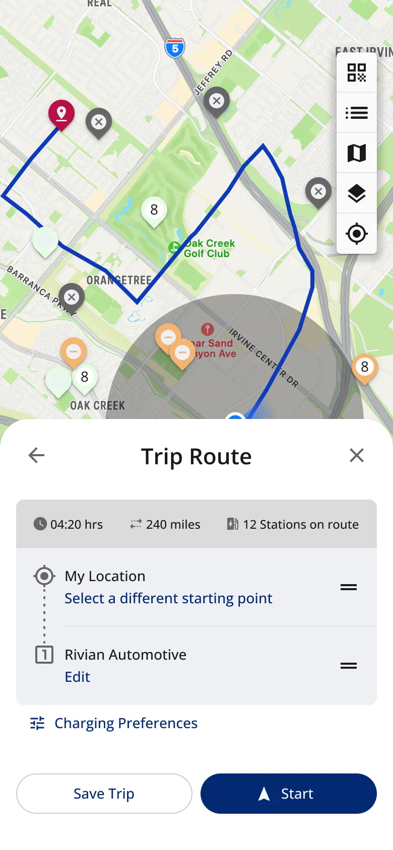
Plan a trip · Trip route
-
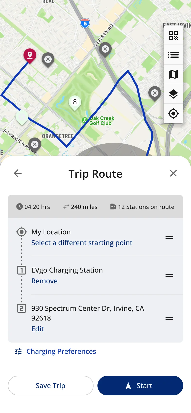
Plan a trip · A charging stop added
-
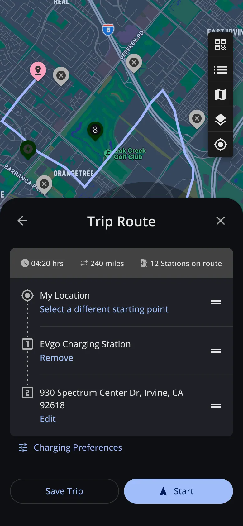
Plan a trip · A charging stop, dark
-
Home · Home · scroll ↕
-
Home · EV selected · scroll ↕
-
My EV · My EV
-
My EV · EV options
-
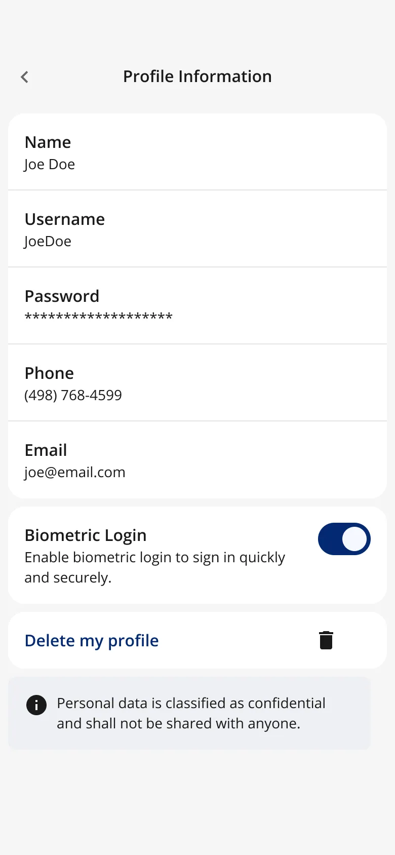
Profile · Profile
What competitors, leadership and the team told me
Research started with competitors, leadership and the team: it shaped what the app shows, and how much it asks of drivers.
Competitors · Dec 2023
How the leaders show costI reviewed EVgo, ChargePoint and Electrify America and walked through their flows. One pattern stood out: they put the rate plan next to the cost of owning the car, so drivers see charging cost in context.
Competitor board and walkthrough recordings
Leadership · Jan 2024
Make usage something drivers compareLeadership's feedback on the usage screen was to let drivers interact more with miles driven, compared with others.
Feedback I logged in Figma, Jan 2024
Design review · 2024
Don’t make drivers fill in everythingFlows were vetted by the design team and leadership. The conclusion: drivers most likely won't fill in every detail, so ask for less up front.
Review notes in the AI Electron microsite file
Test plan · Jul 2024
Is the app getting too heavy?I wrote a task-based test to check for feature bloat: plan a trip, then measure time to complete and satisfaction for each task, with a separate test case for the More tab.
My planning notes, Jul 2024
Risk I raised · Jan 2025
Swipe to charge, and fat fingersA swipe to start or stop a paid session can fire by accident. The answer I prototyped and handed off: hold to start.
Usage concept notes, Jan 2025
I also charged with the leading networks' apps and recorded each step, to see how they handle the same moments: is a charger free, has the session started, and what is it costing.
-
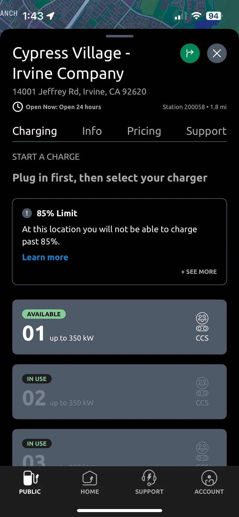
Electrify America · Plug in first; an 85% limit; chargers in use
-
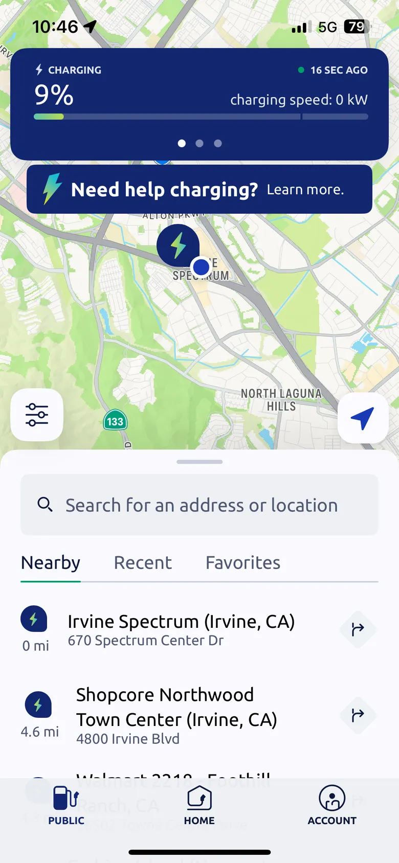
Electrify America · The session stays on top of the map
-
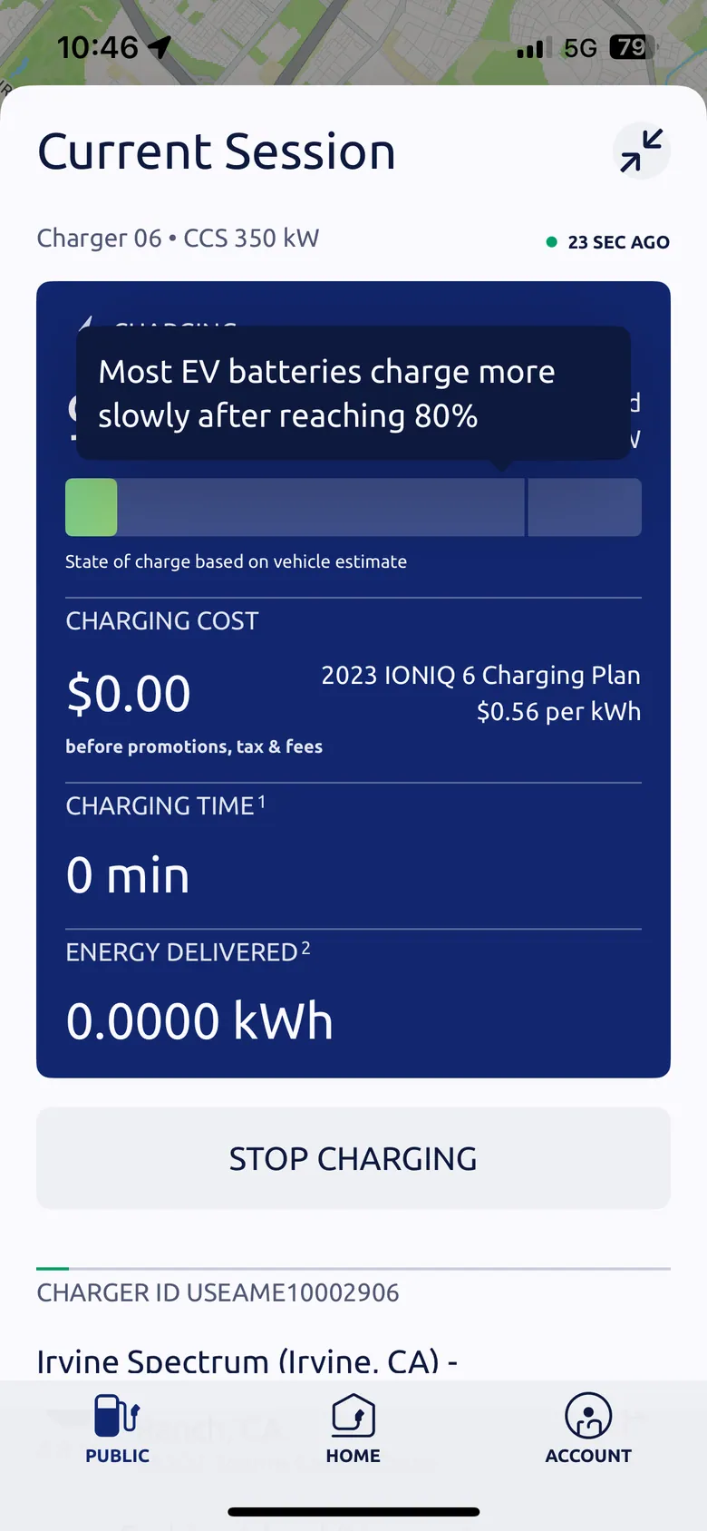
Electrify America · Current session: cost, time and energy
-
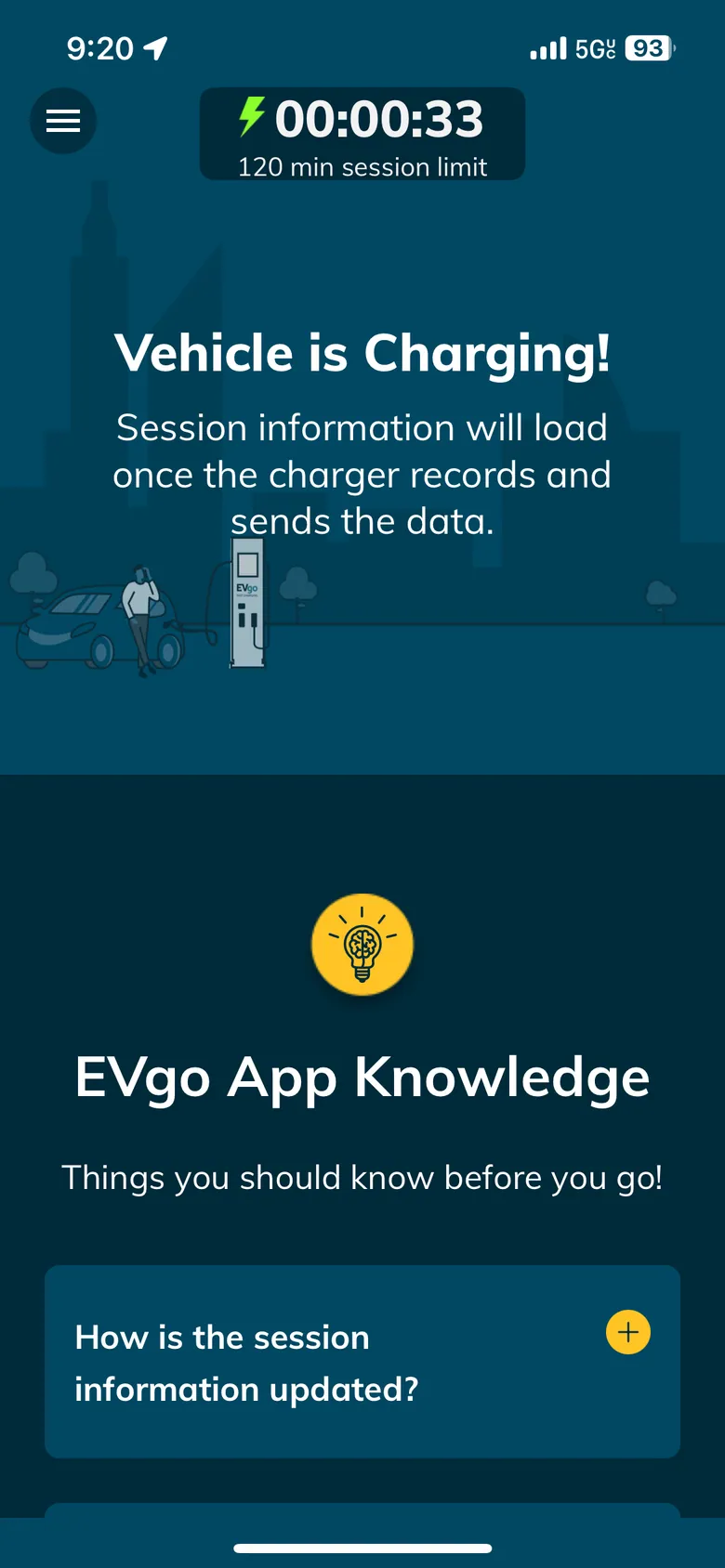
EVgo · "Session information will load"
-
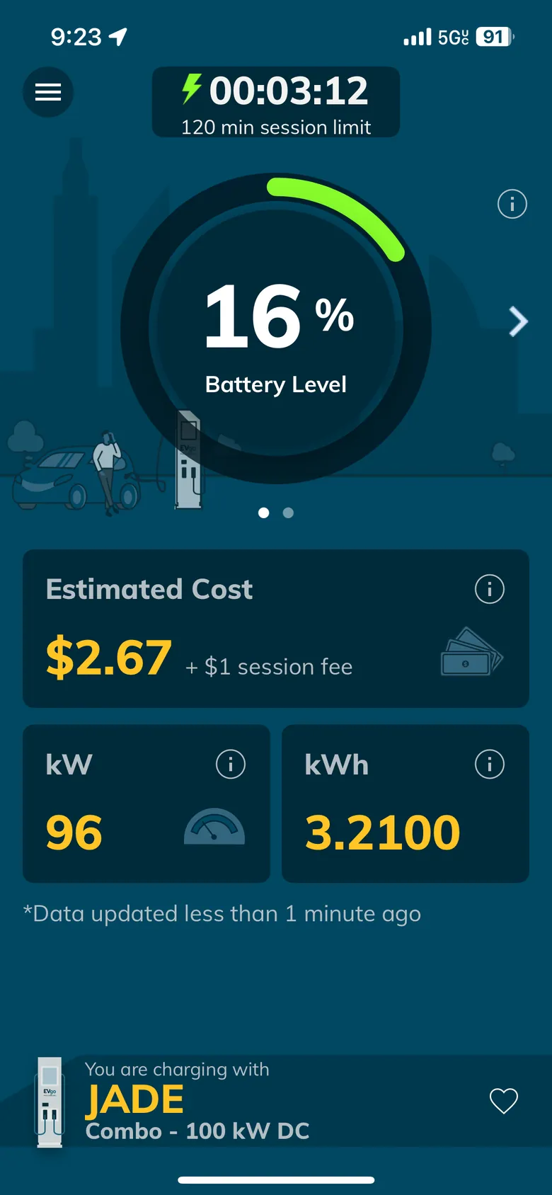
EVgo · Battery dial, estimated cost, kW and kWh
-
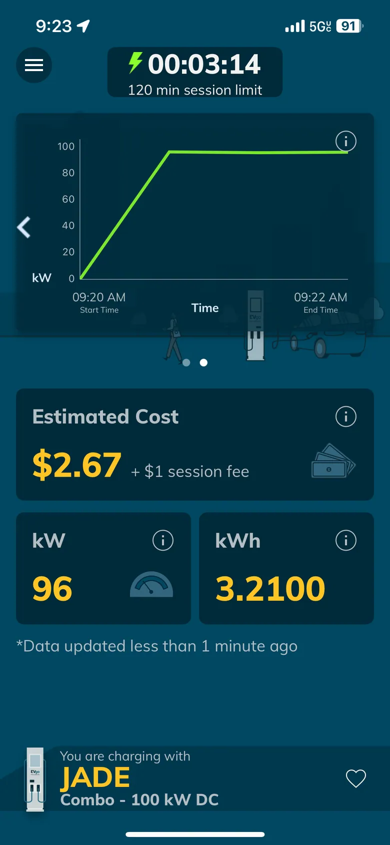
EVgo · A power graph over time
-
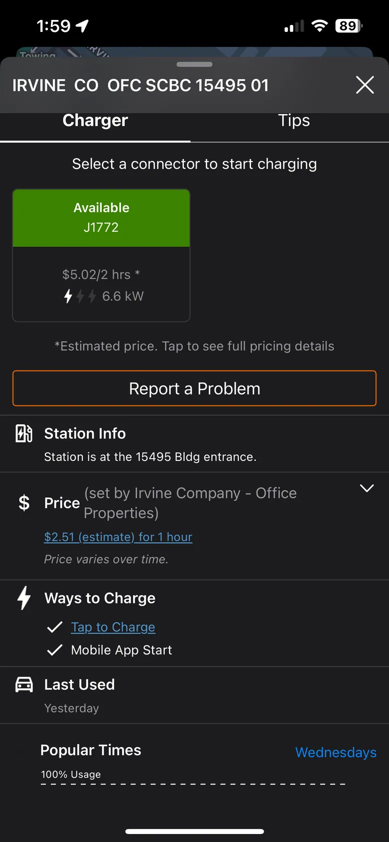
ChargePoint · Pick a connector; an estimated price
-
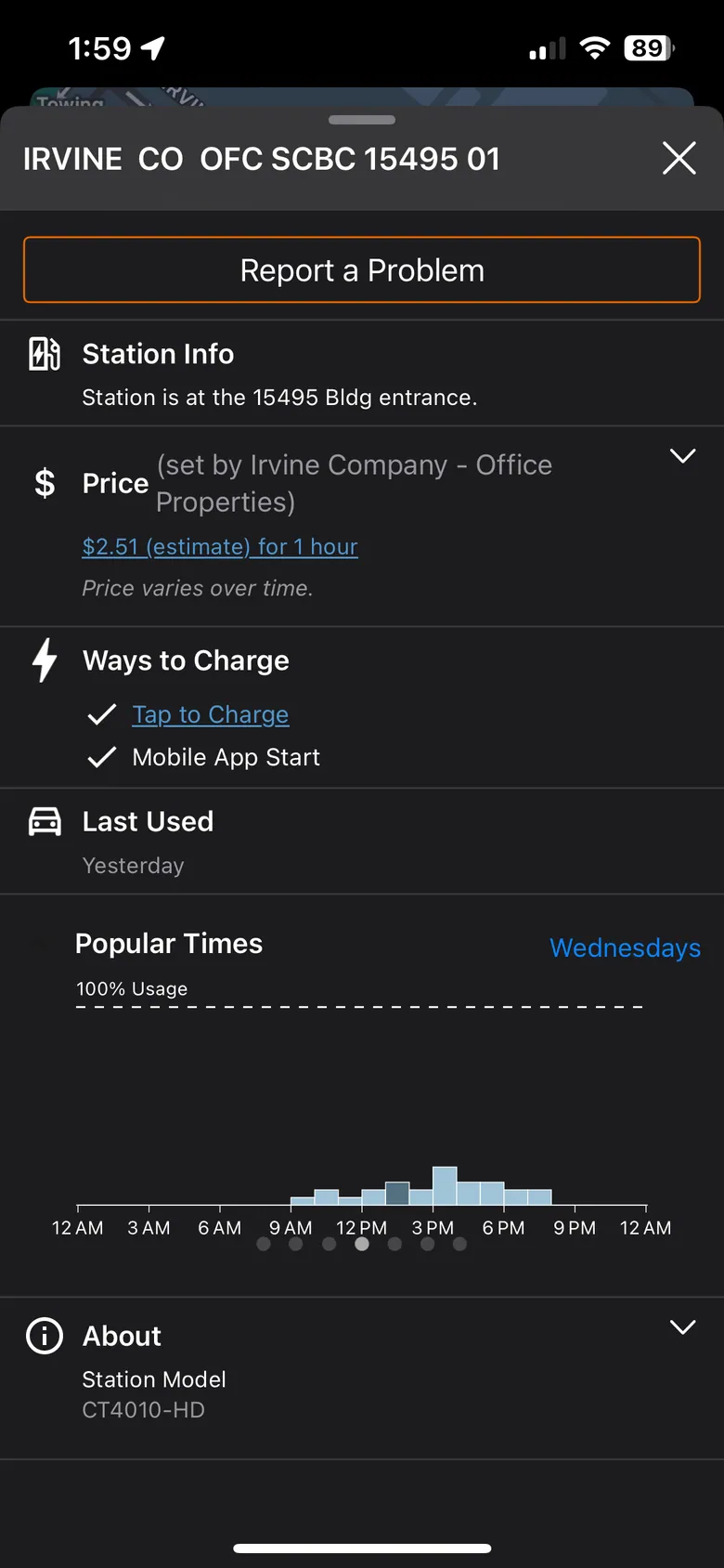
ChargePoint · Popular times: when a charger is likely free
The real thing: one base, two utility brands
The EV app's first screen, built from the same components, in SMUD's brand and Alectra's. Each utility chose different colors and different content, on one set of components.
-

Same first screen · SMUD · scroll ↕
-
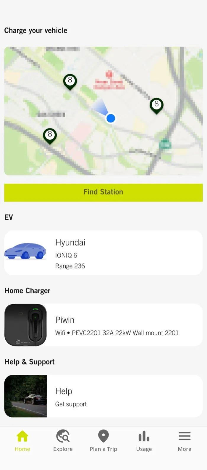
Same first screen · Alectra
-

SMUD · Light · Home, charging as a guest · scroll ↕
-
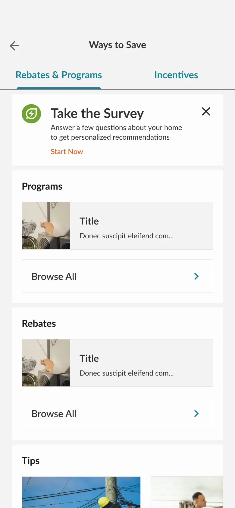
SMUD · Light · Ways to Save: rebates
-
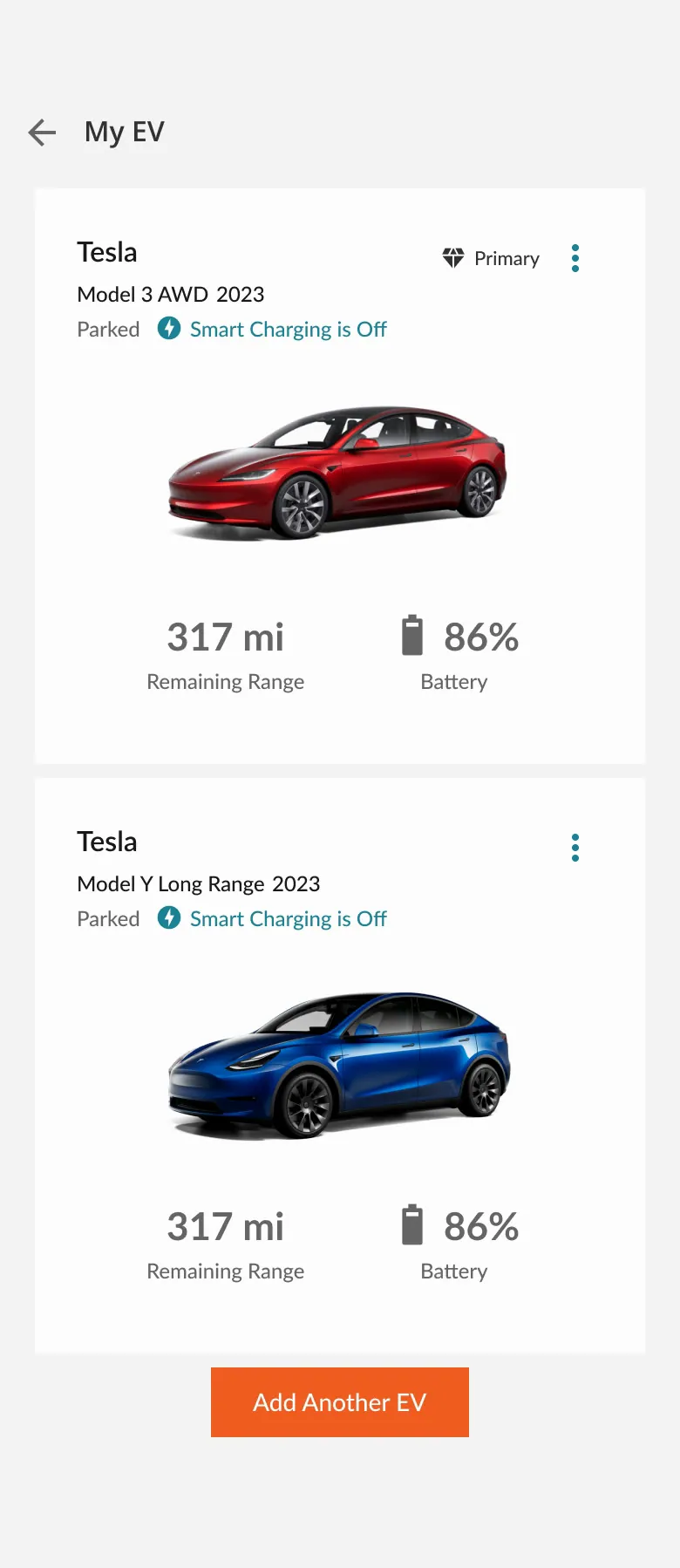
SMUD · Light · My EV, two vehicles
-

SMUD · Dark · Home, charging as a guest · scroll ↕
-
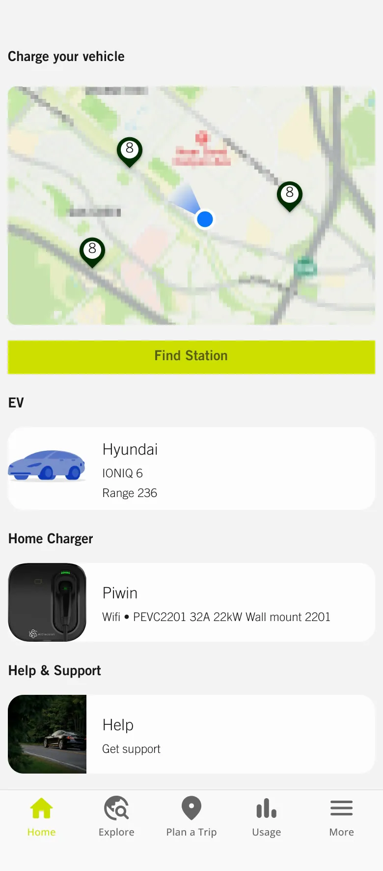
Alectra · Light · Home
-
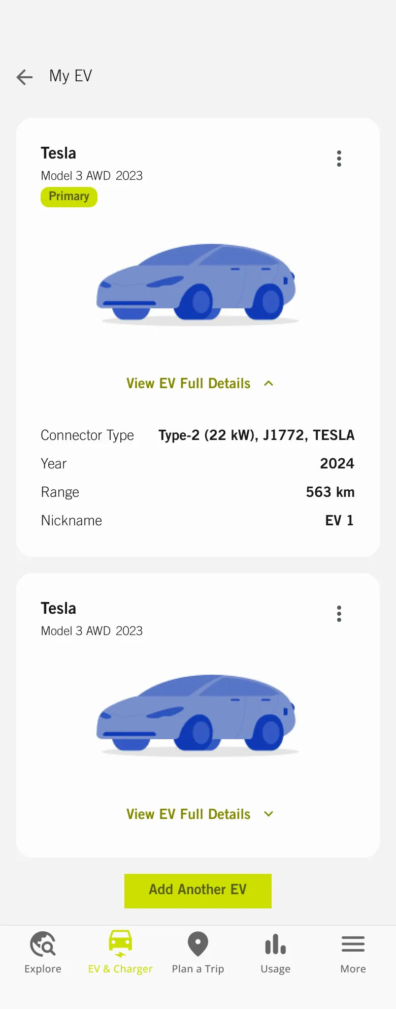
Alectra · Light · My EV · scroll ↕
-
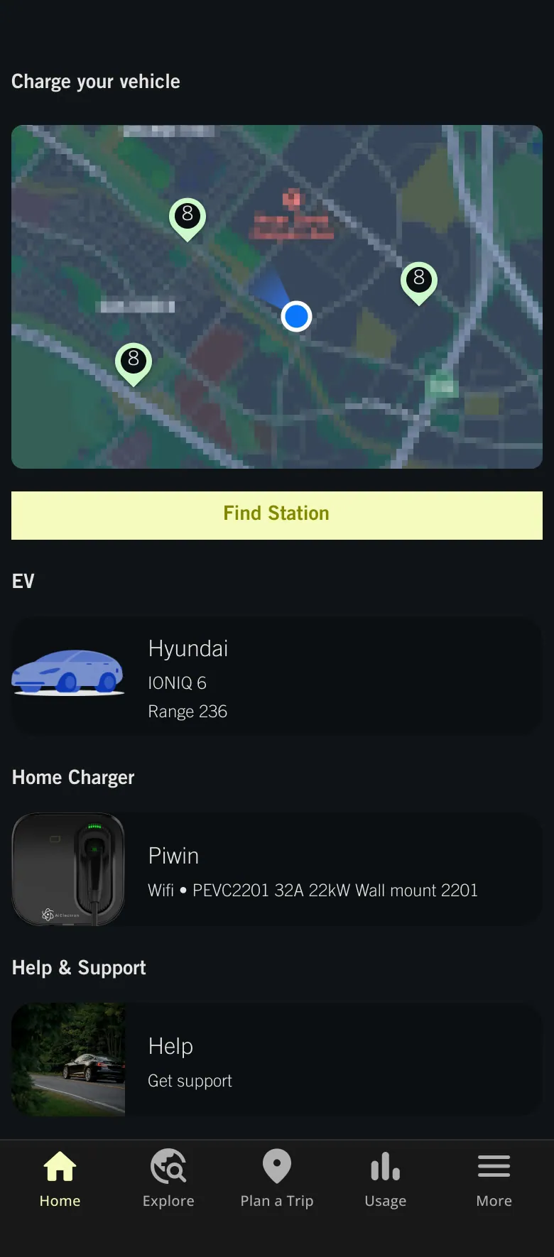
Alectra · Dark · Home
Alectra was the first client port (May 2024) and the longest-running: the EV app, plus a web microsite with a savings calculator, rate plans, incentives and a charger guide.
-
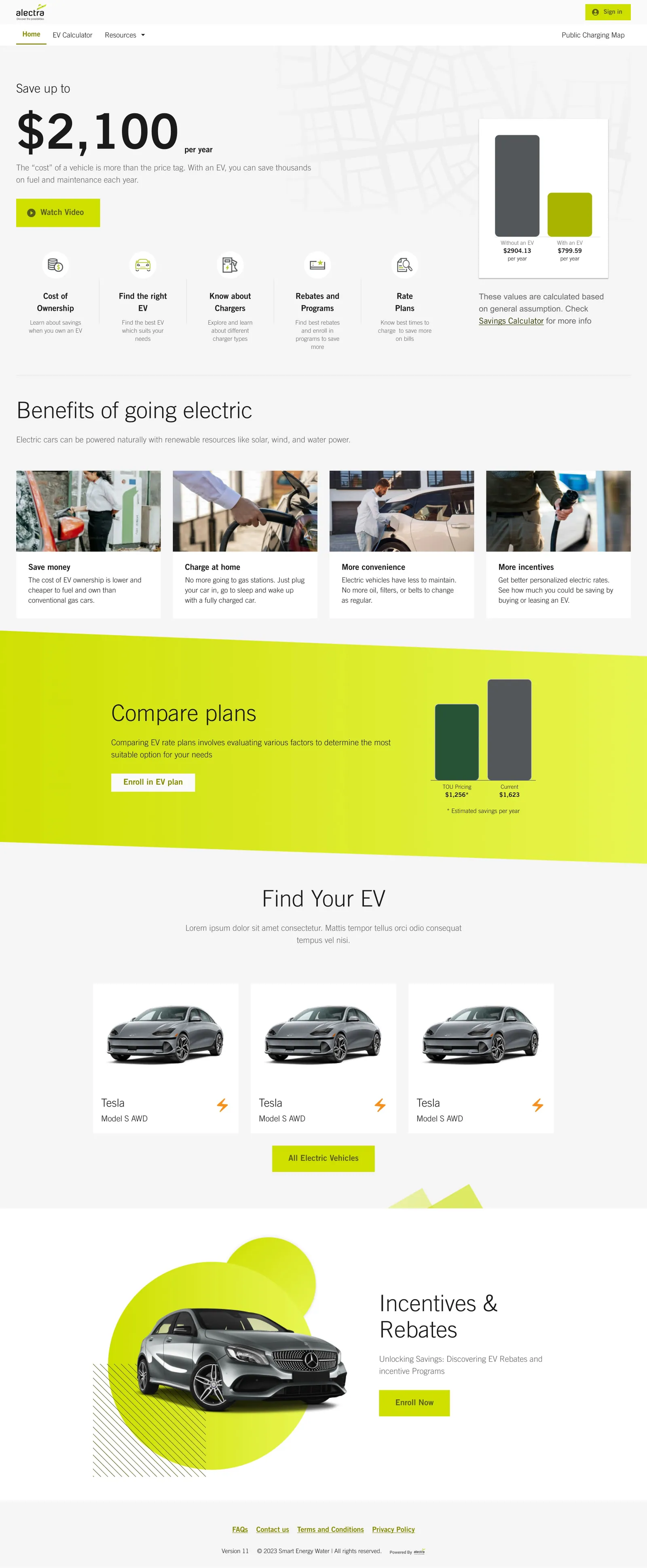
Microsite · Landing page · scroll ↕
-
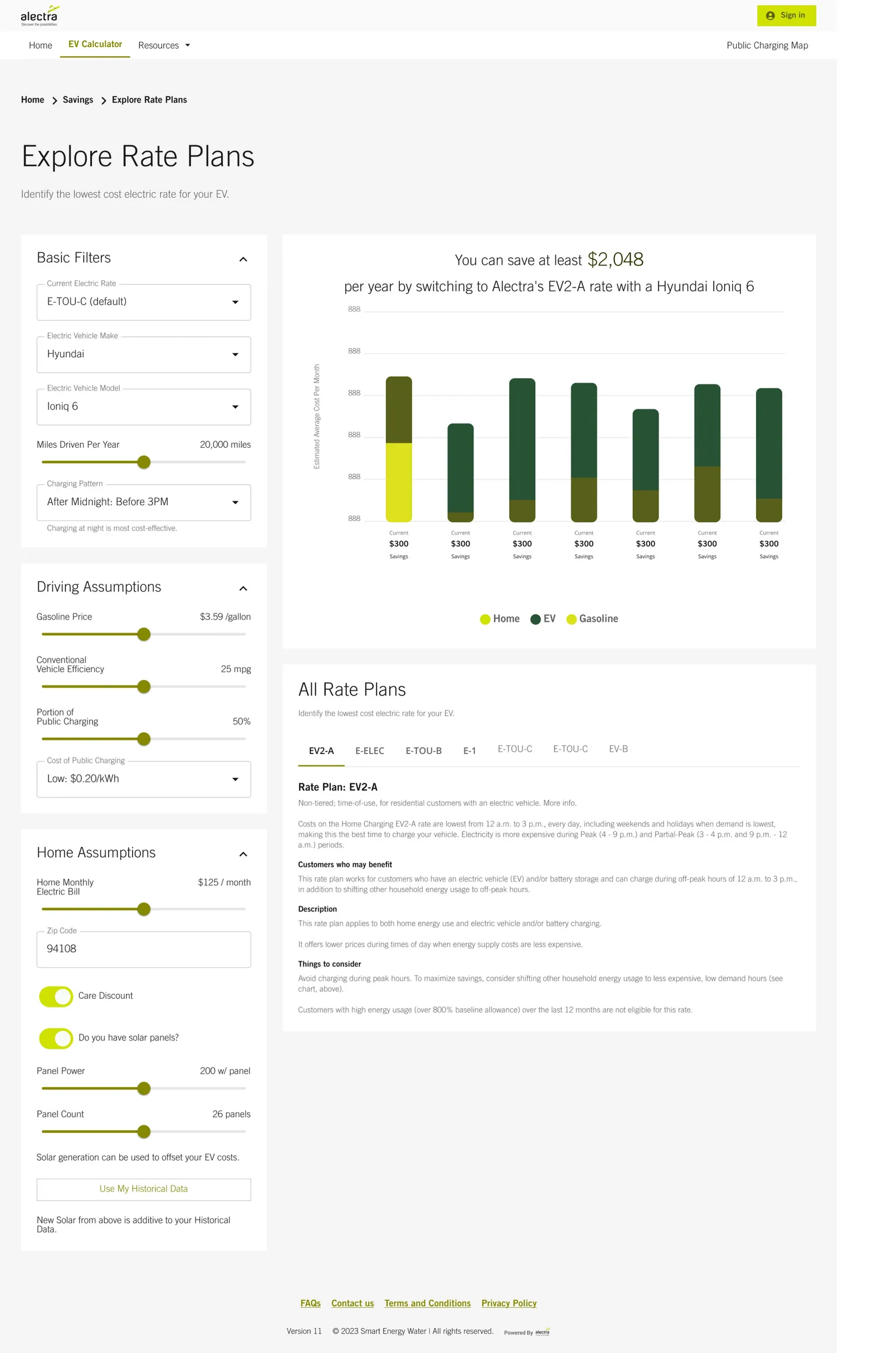
Microsite · Explore rate plans · scroll ↕
-
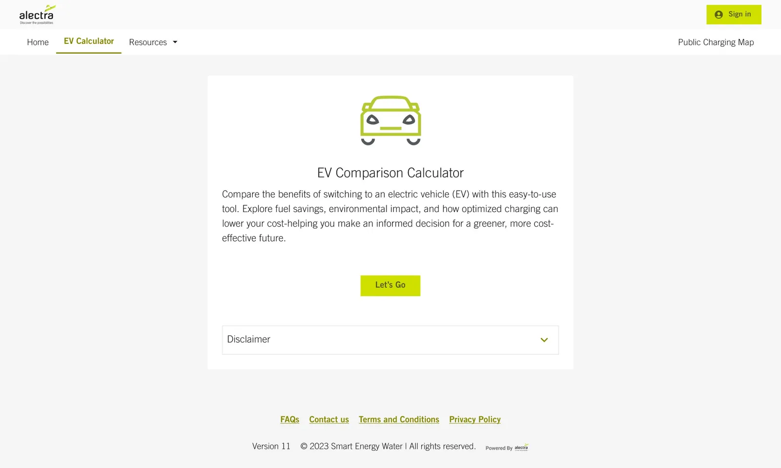
Savings calculator · Savings calculator: start
The riskiest moments happen at the charger, not in the app
Then I went where the riskiest moments happen: I drove to public chargers and recorded what happened (Oct 2024). The app said chargers were open, but "by the time you get to said location a charging spot is mostly taken". There was a line of three cars and about 20 minutes of waiting, the station throttled its output, and the app's in-progress state didn't show. I stopped at 80%.
-
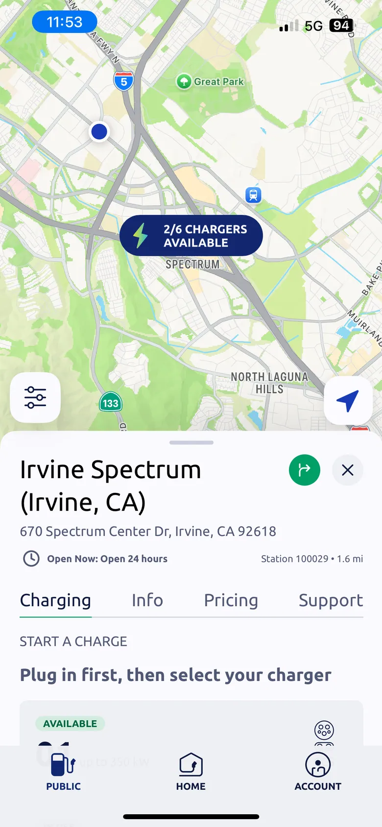
Getting there · Before leaving: "2/6 chargers available"
-
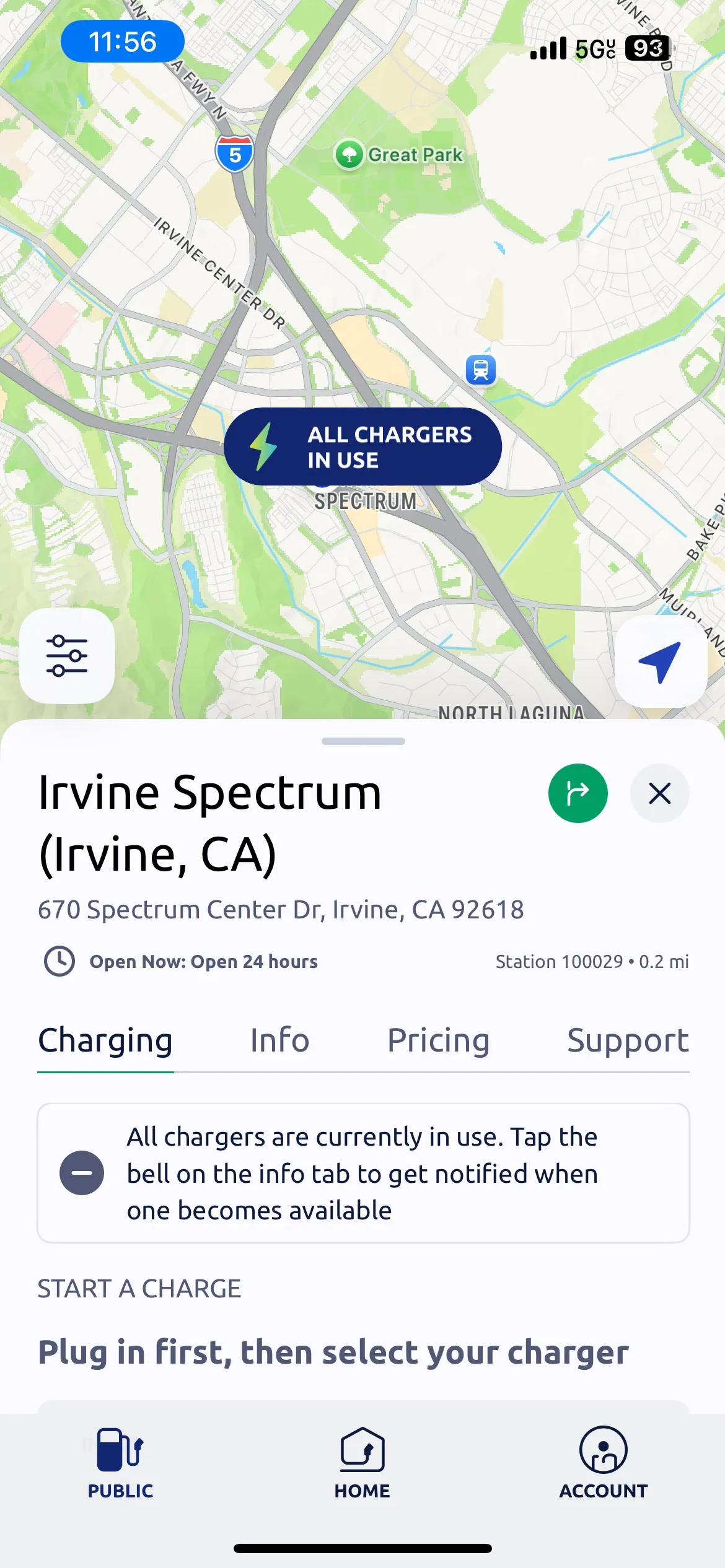
Getting there · Three minutes later: "All chargers in use"
-
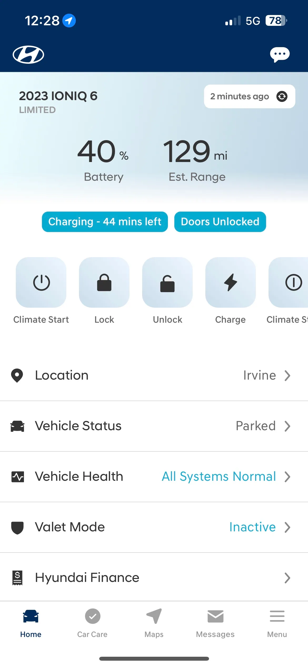
Charging · Charging at last, at 40%
-
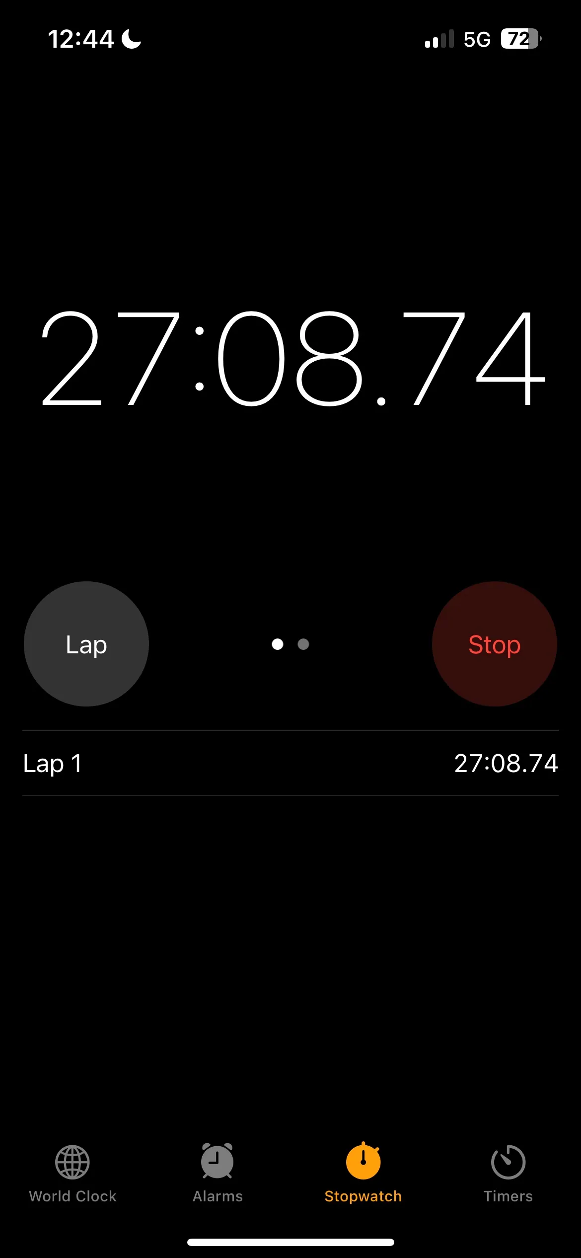
Charging · Timing the charge: 27 minutes in
-
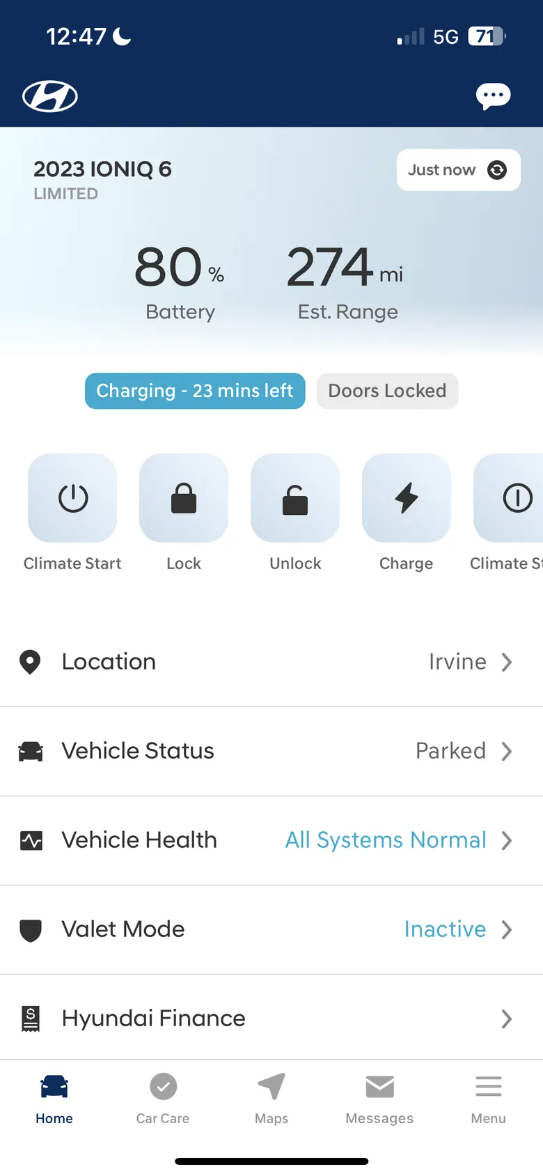
Charging · I stopped at 80%
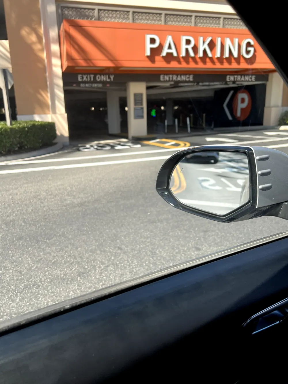
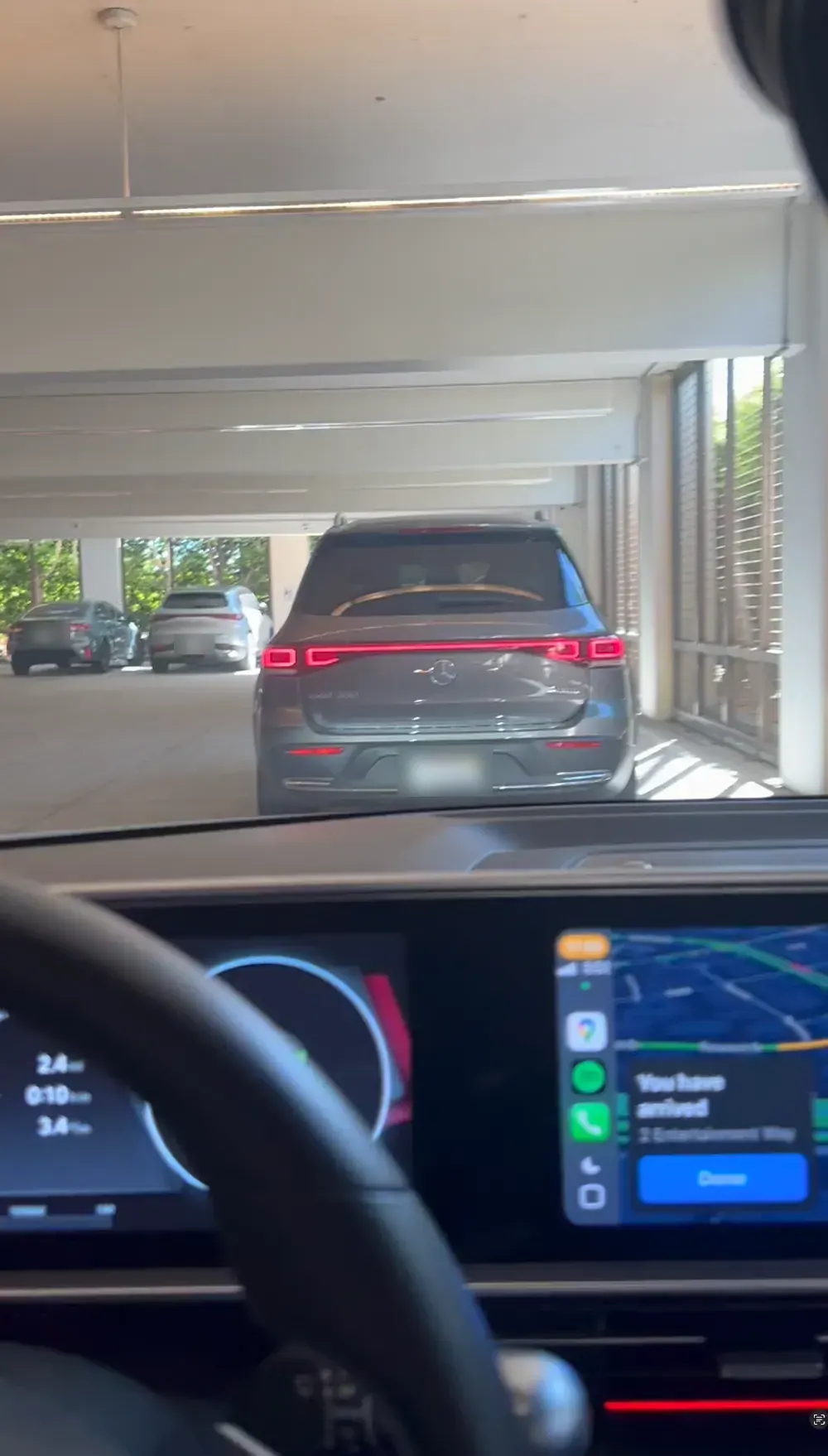
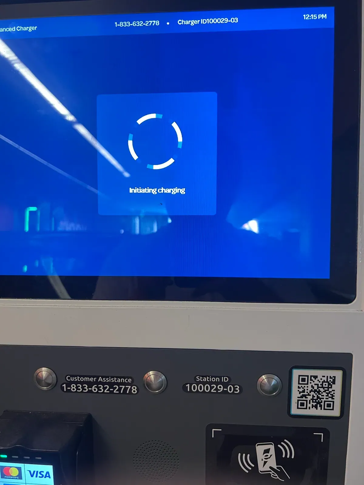
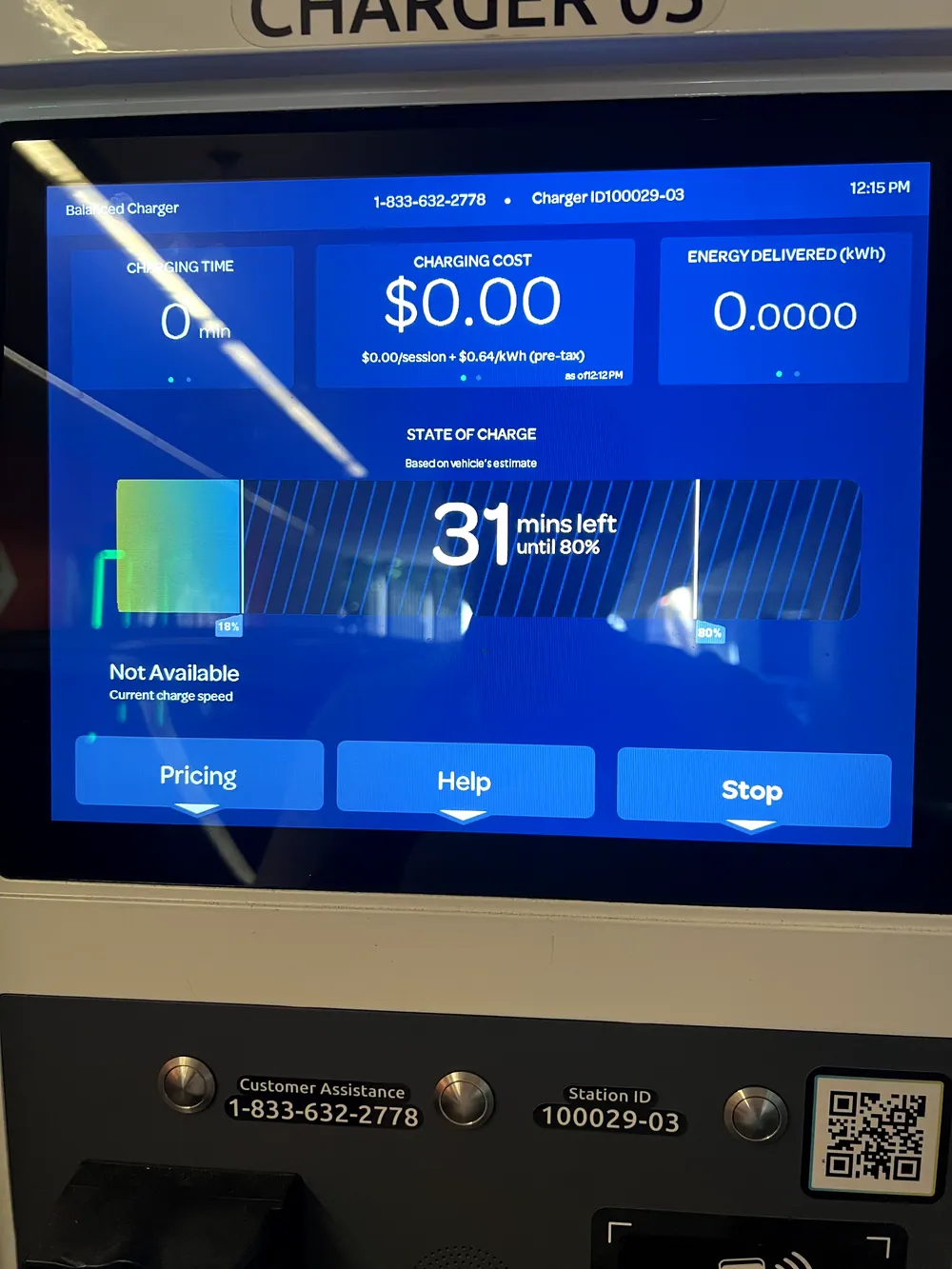
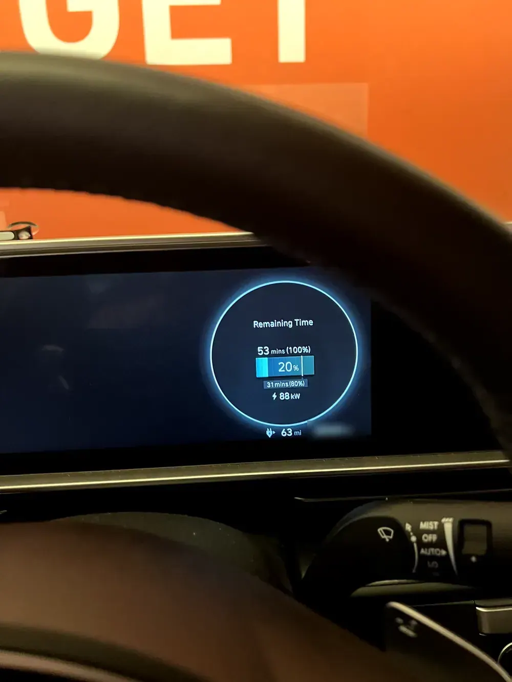
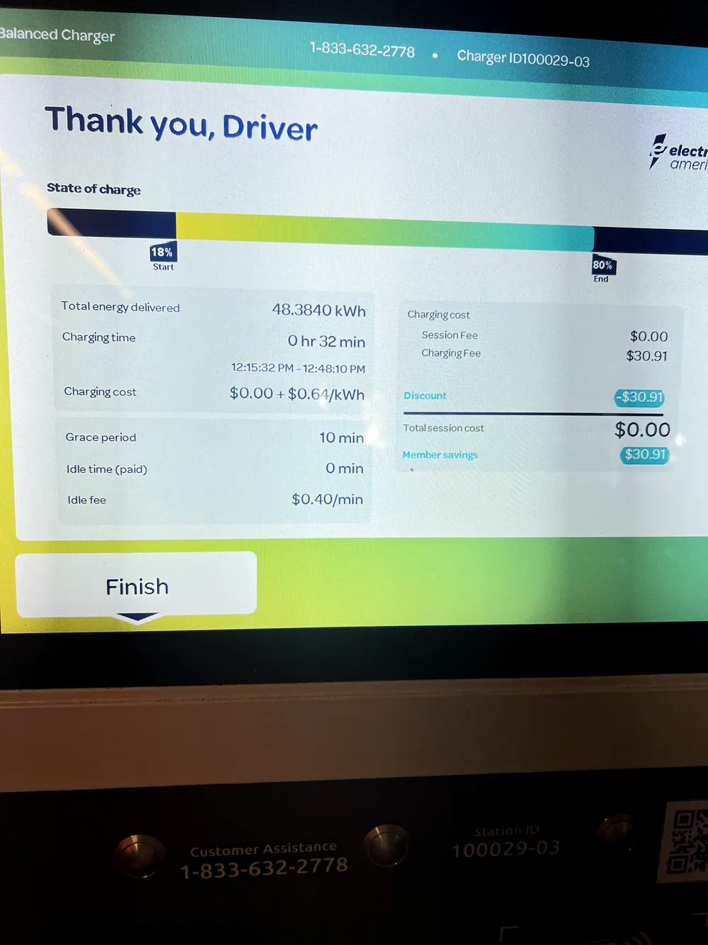
The charger and the car both showed the session; the app didn't. From my FigJam walkthrough of the visit.
Charging status on the lock screen
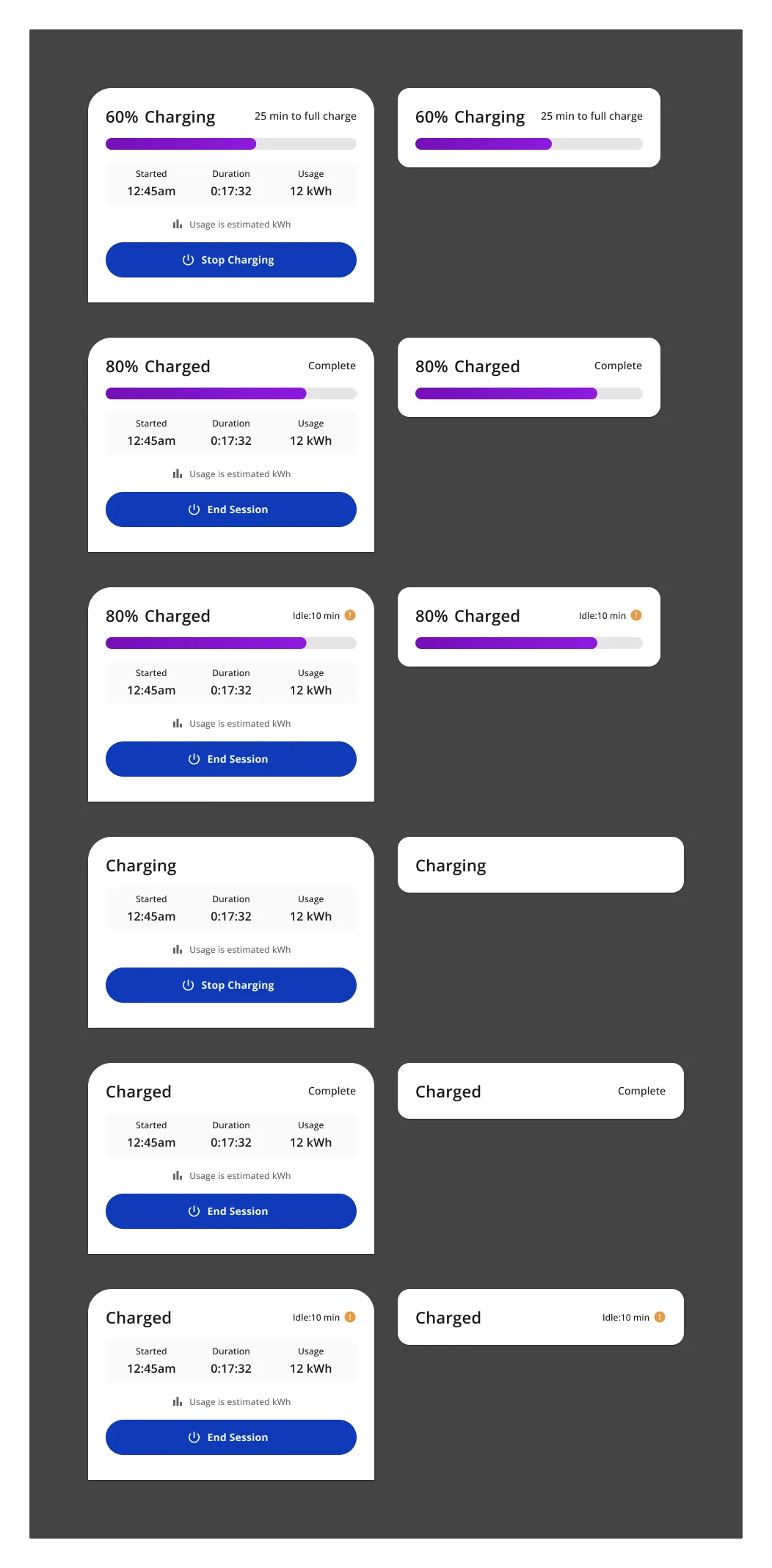
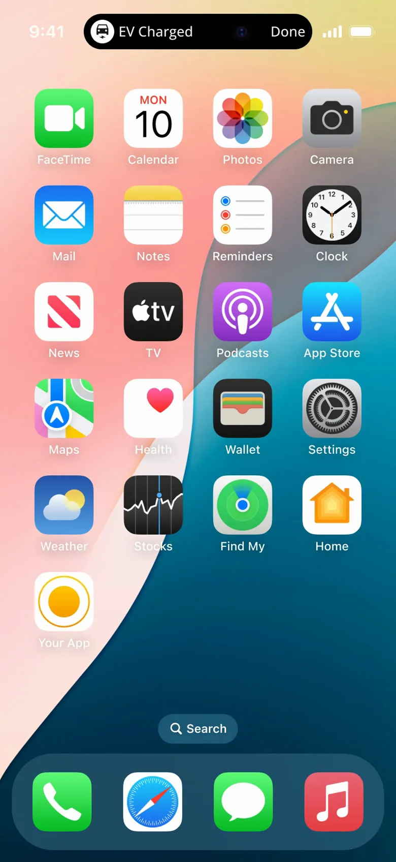
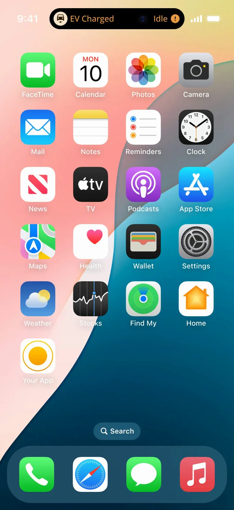
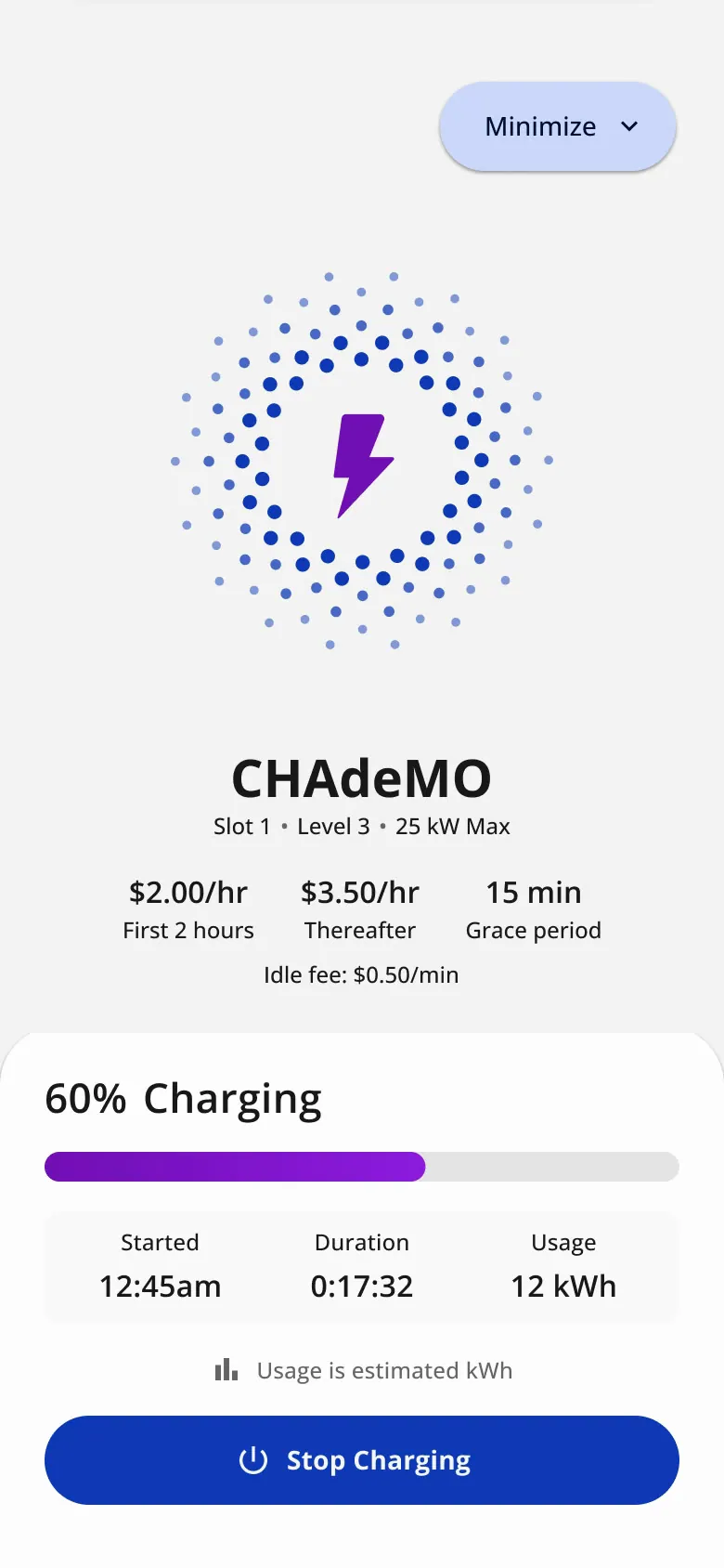
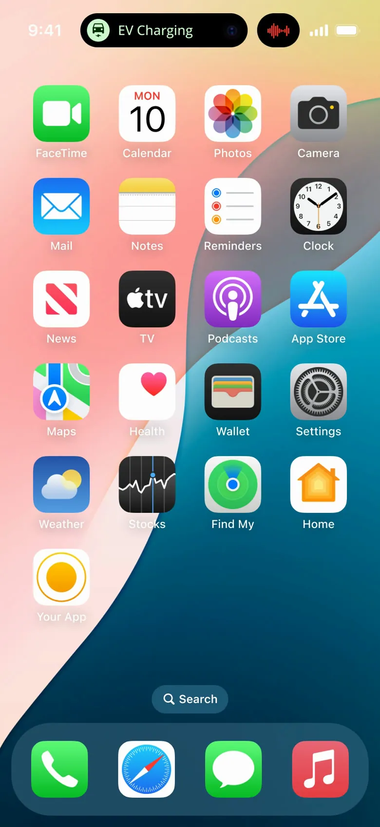
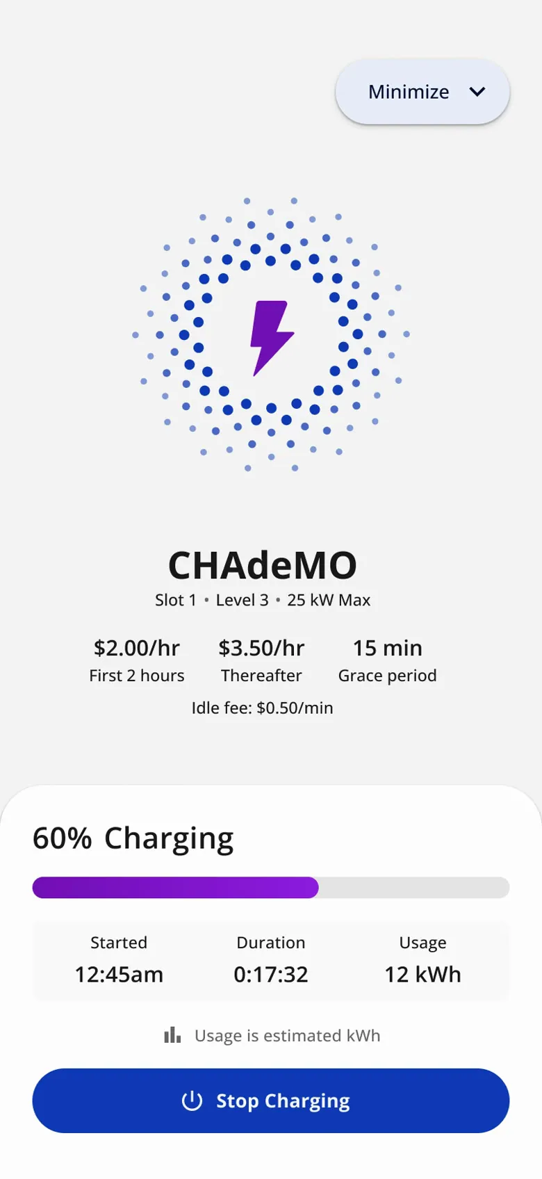
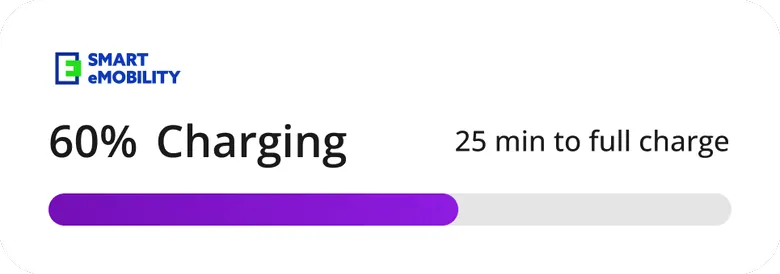
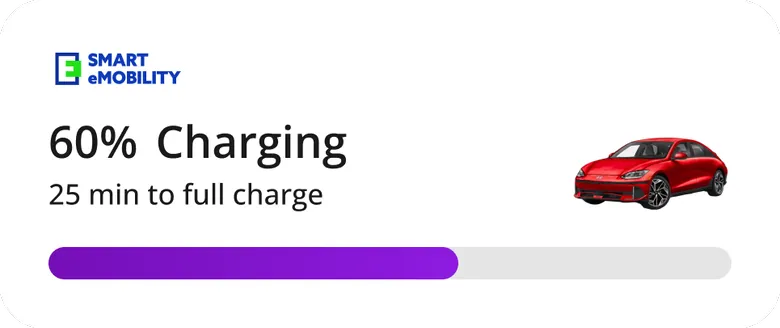
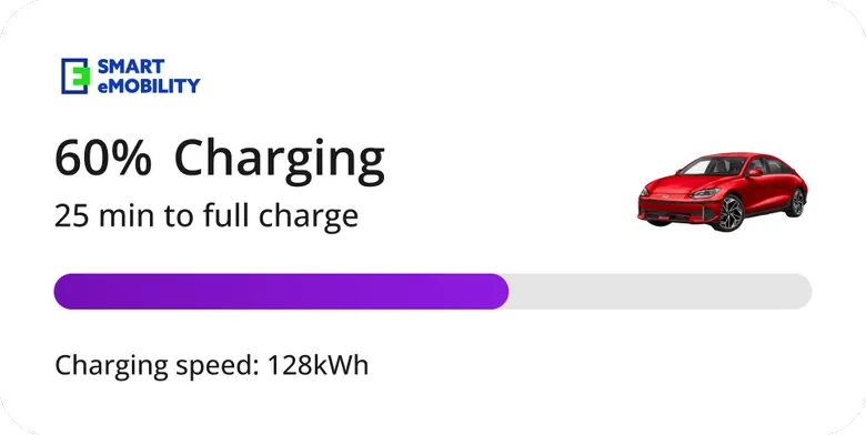
At the charger, the app never showed that the session had started. And drivers don't stare at their phone while charging anyway. The requirement, from the product story: "As a user, I want to see a home widget of the app on my lock screen… for any ongoing charging". I designed a Live Activity and Dynamic Island states (charging, charged, idle), plus CarPlay and Android Auto views.
-
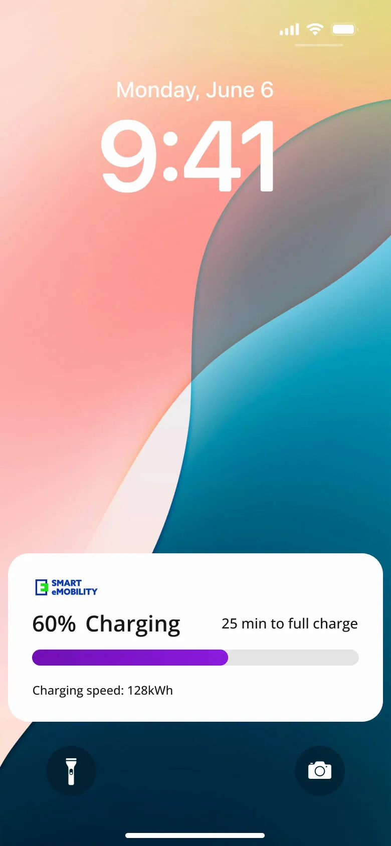
Lock screen · Charging, on the lock screen
-
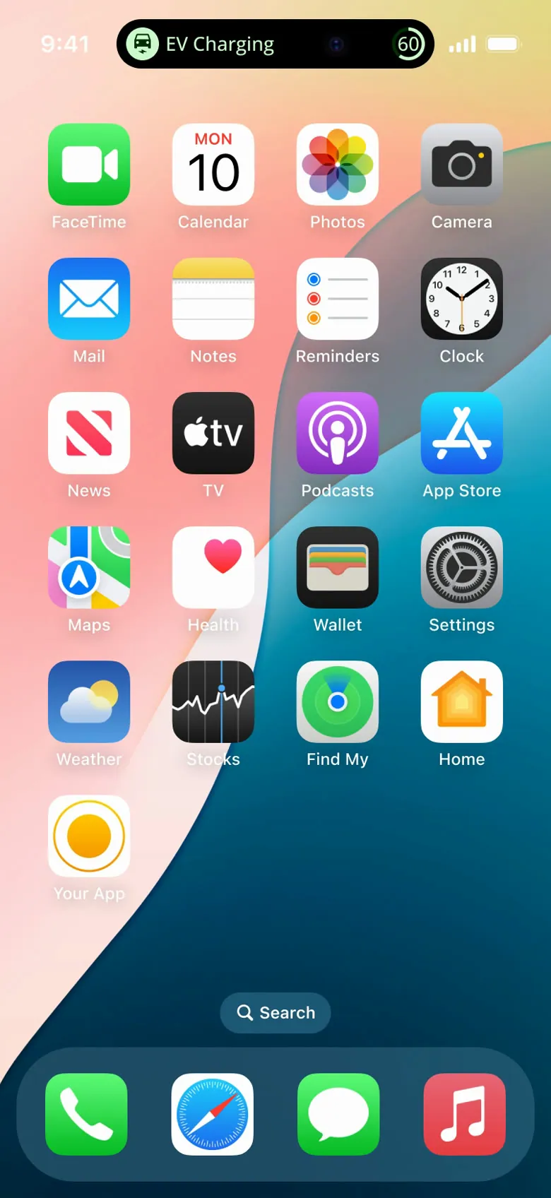
Dynamic Island · Charging
-
Dynamic Island · Charged
-
Dynamic Island · Idle
-
Lock screen · Tap through to the session
-
Dynamic Island · Minimal: charging
-
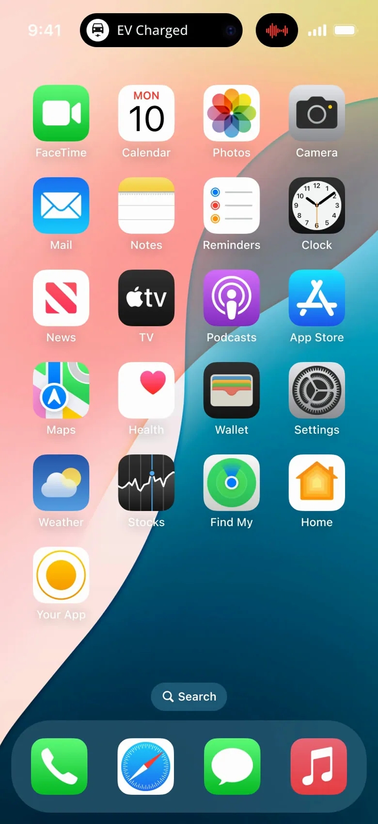
Dynamic Island · Minimal: charged
-
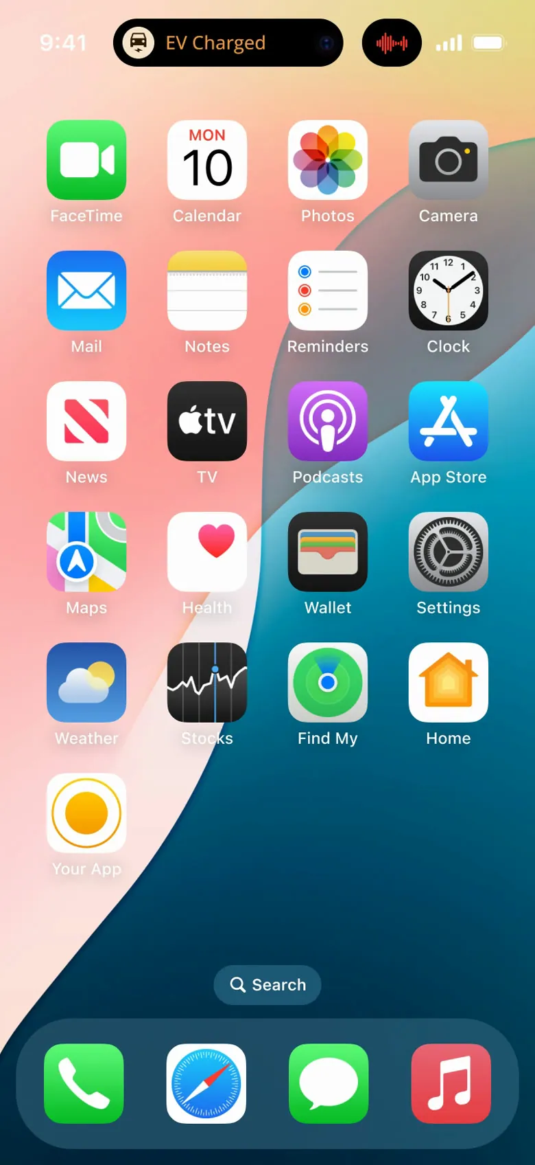
Dynamic Island · Minimal: idle
-
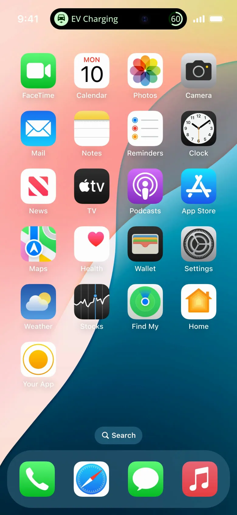
Dynamic Island · Expanded: charging
-
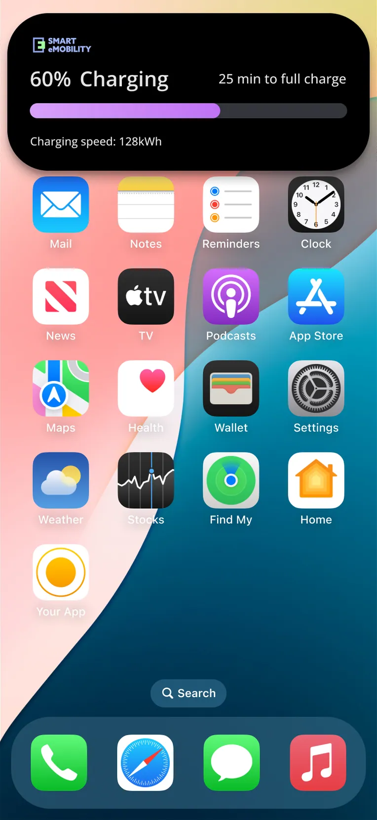
Dynamic Island · Expanded: another layout
-
Dynamic Island · Expanded, into the app
-
Live Activity sizes · Smallest
-
Live Activity sizes · With the car
-
Live Activity sizes · Car and time to full
-
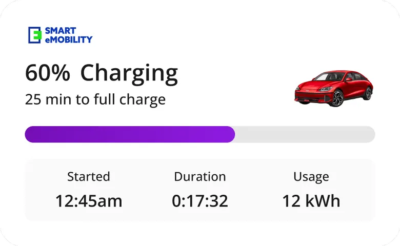
Live Activity sizes · Car, power and cost
-
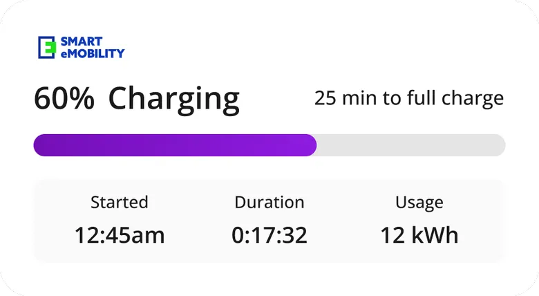
Live Activity sizes · Full details
-
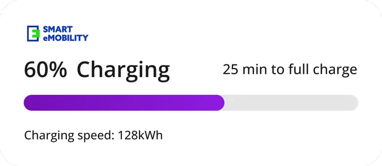
Live Activity sizes · Text only
-
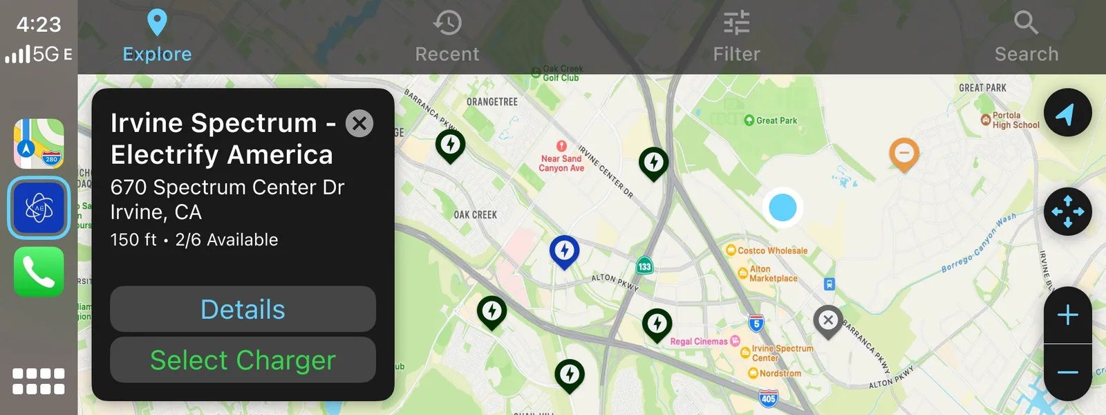
CarPlay · A station picked on the map
-
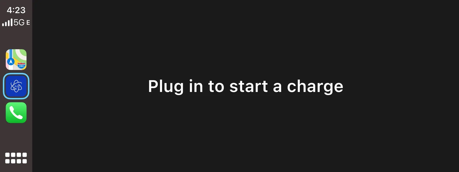
CarPlay · Plug in to start
-
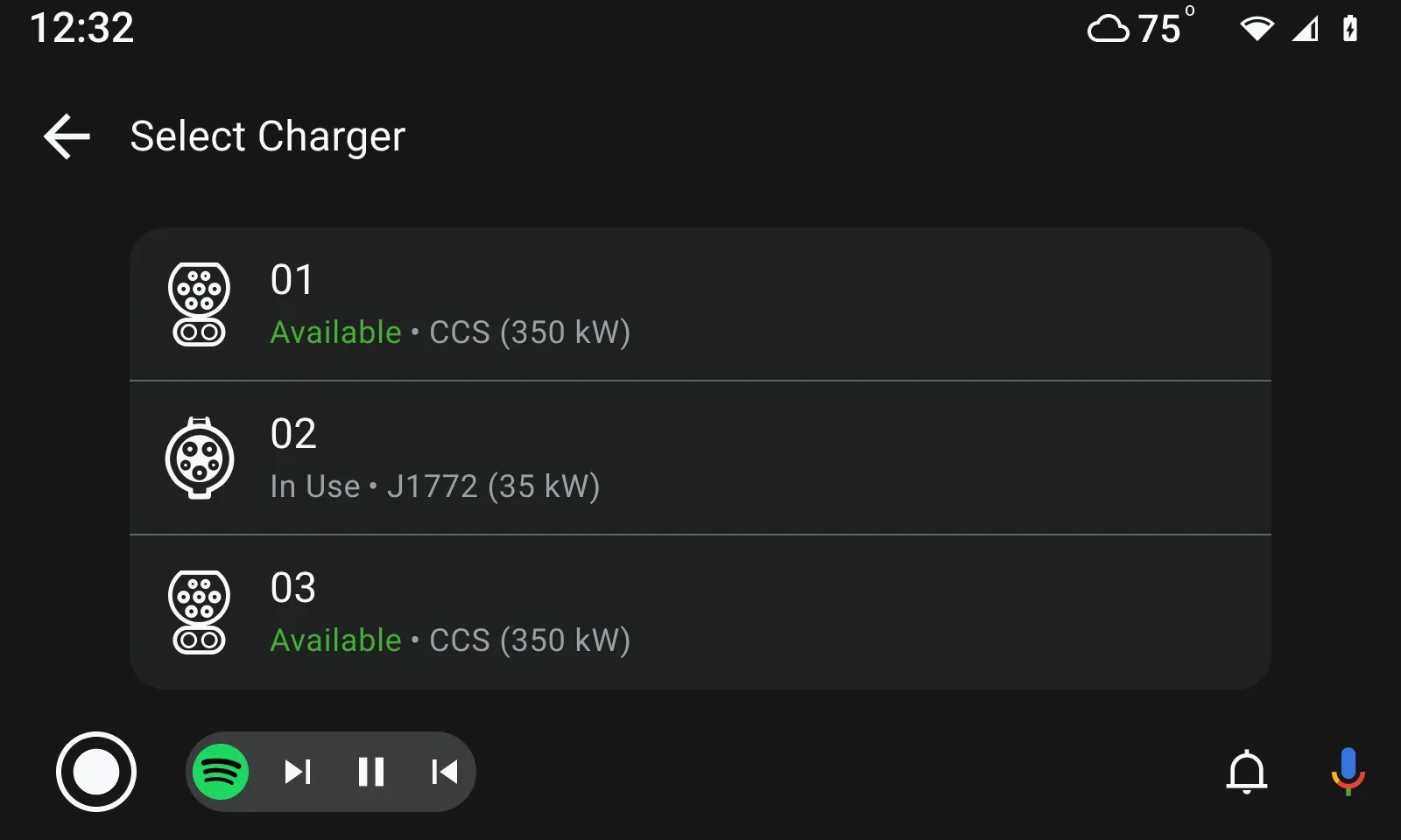
Android Auto · Choose a free charger
-
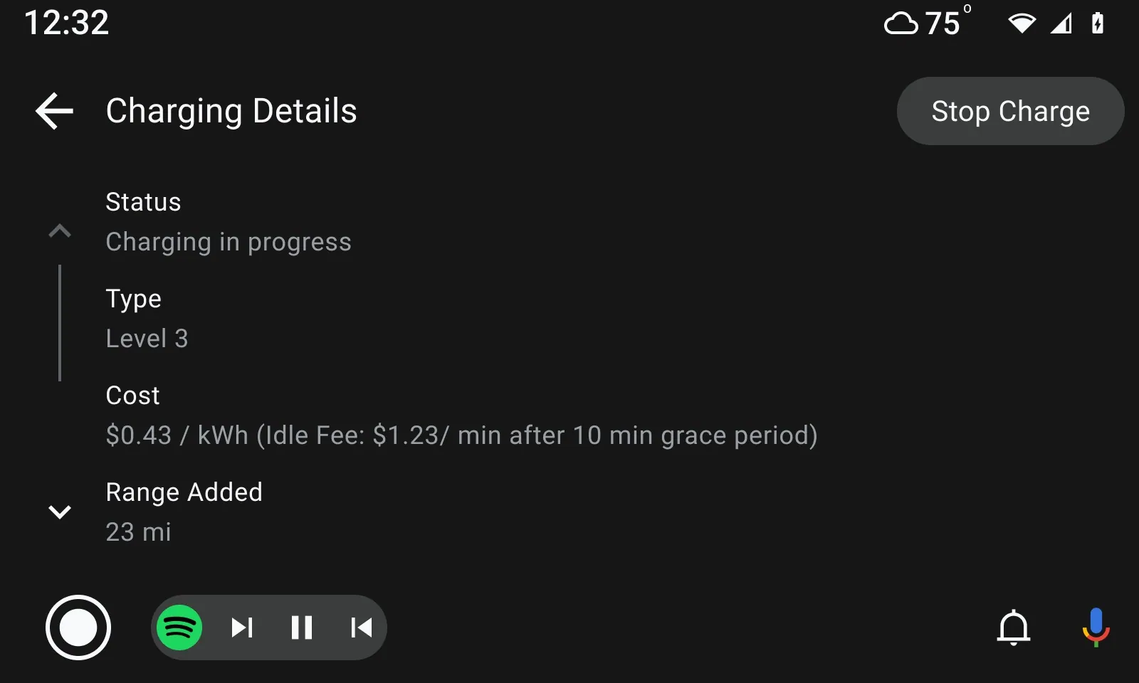
Android Auto · Charging
In the car, I made 41 of the 43 sessions in the CarPlay and Android Auto file, between Apr 7 and 16, 2025: find a station on the map, pick a charger, and watch the session without touching the phone. Figma has no record of it shipping, so it stays a design here.
Starting and stopping a charge, without accidents
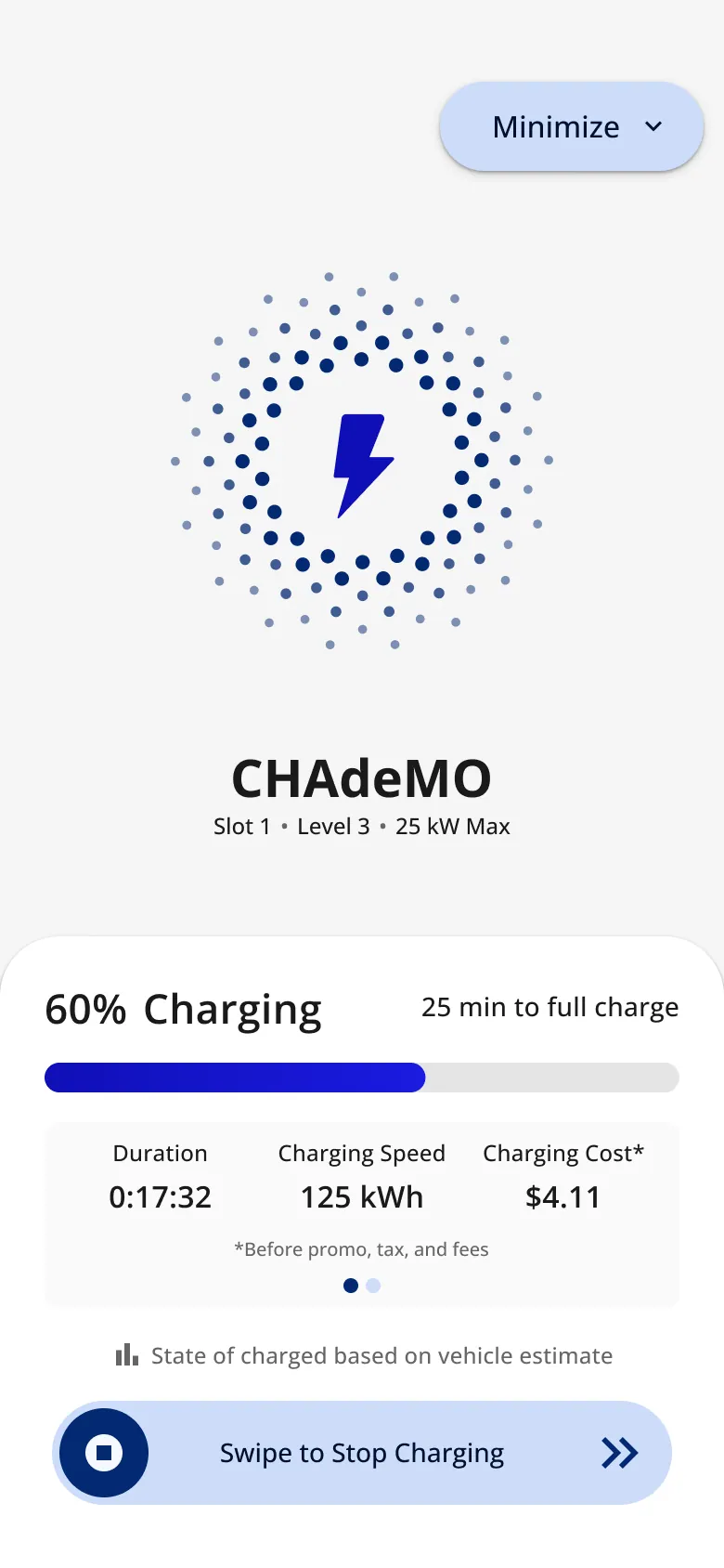
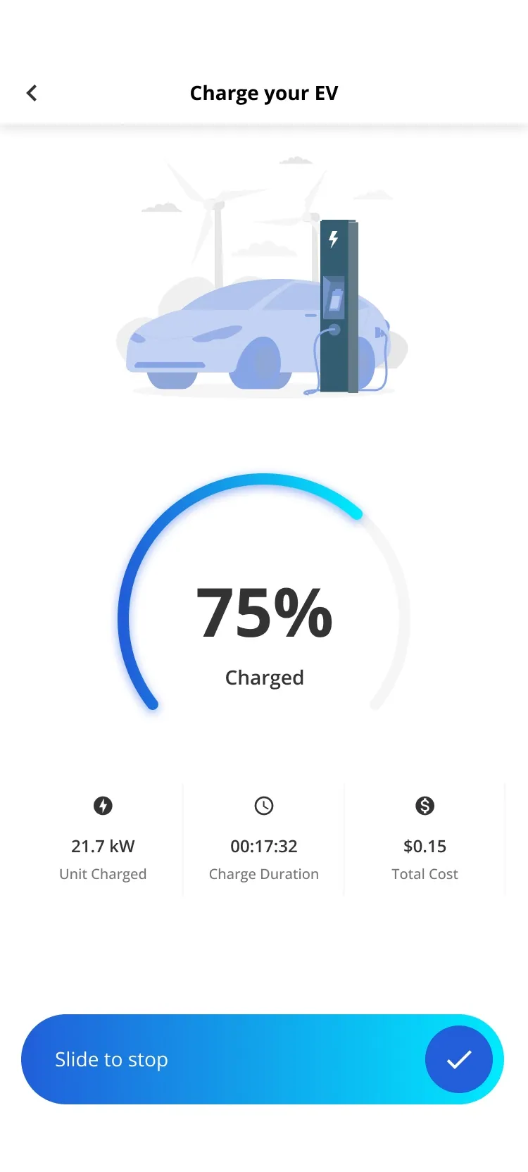
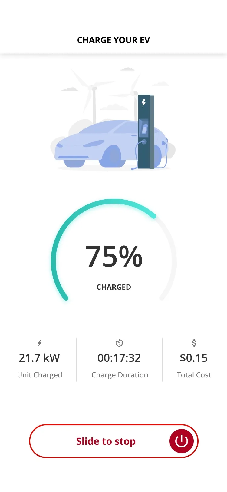
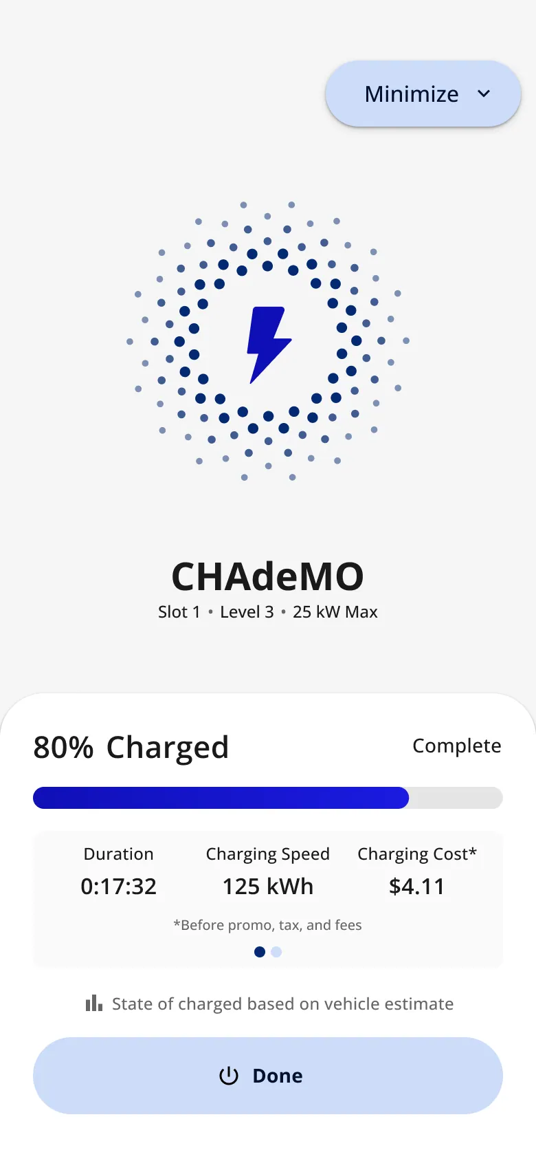
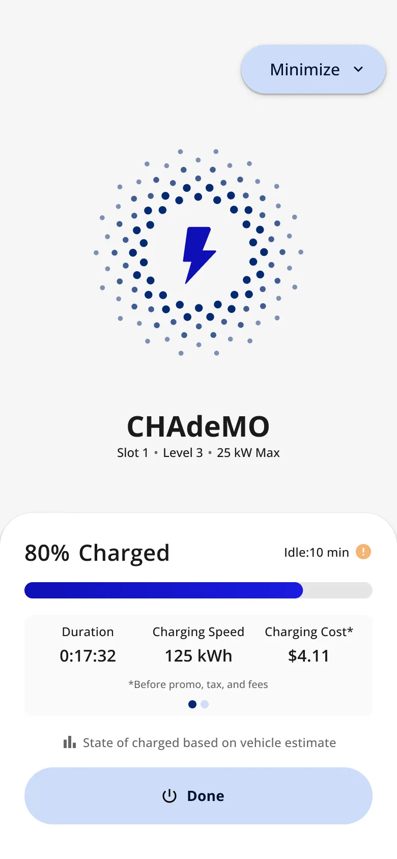
The other finding: a single gesture starts or stops a paid session. The control evolved over three years: slide to stop → a Stop Charging button → swipe to start → hold to start, hold to stop (Jul 2026). "A short, deliberate hold prevents an accidental tap from starting or interrupting a session. While the user holds, a progress indicator fills; releasing early cancels and rewinds."
-

A session · Starting
-
A session · Charging
-
A session · Charged
-
A session · Charged, idle
-
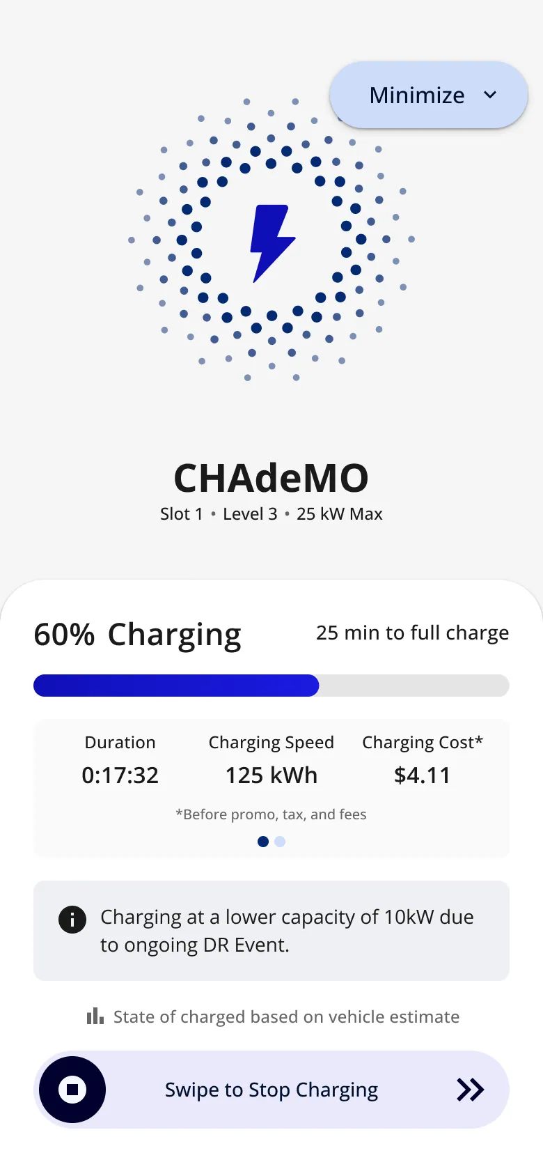
Variations · Demand-response event
-
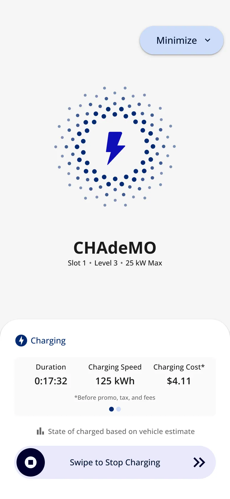
Variations · No percentage available
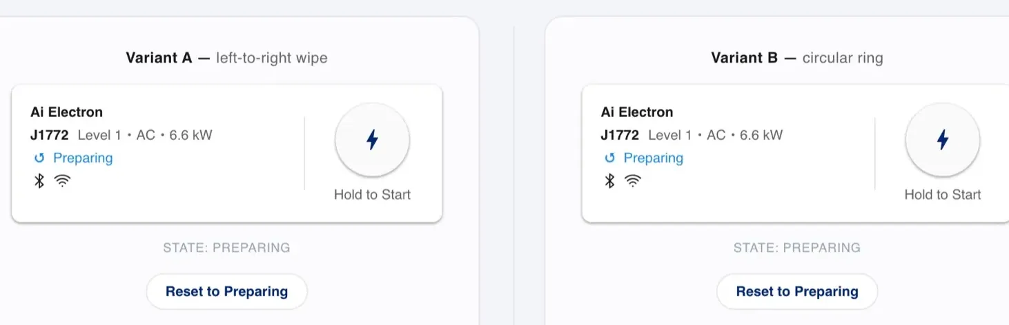
The hold-to-start prototype: two variants (a card wipe and a ring), handed off with SwiftUI and Compose reference code, with tokens as the source of truth. "A GIF can only look like the interaction; it can't be it."
Beyond the phone: the car
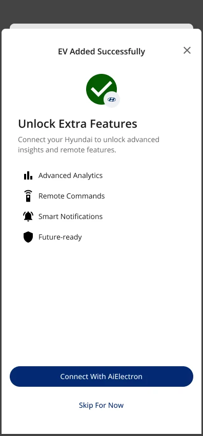
My EV, from the car itself (Jul 2026). I wrote the requirements for connecting the app to a connected-vehicle service: 16 vehicle signals (battery, charge rate, location, tire pressure and more) and 7 remote commands (start and stop charging, charge limit, lock, climate) mapped to app sections. Each has its own consent and a pending → confirmed state. The rule: support varies by car, so treat every data point as optional and degrade gracefully.
-
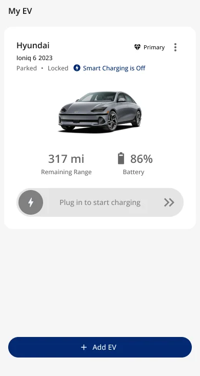
Figma · My EV
-
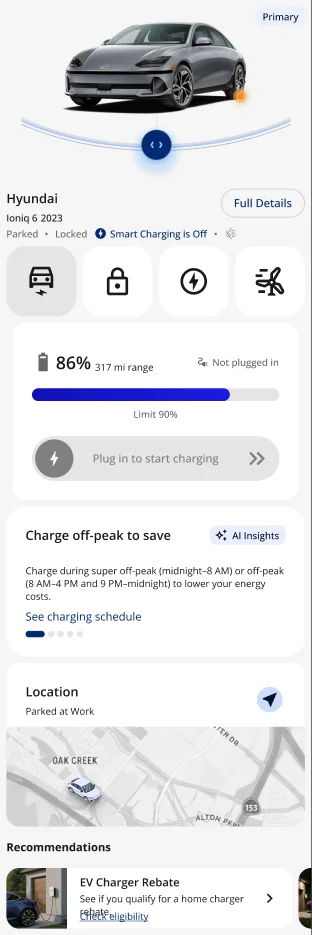
Figma · Overview · scroll ↕
-
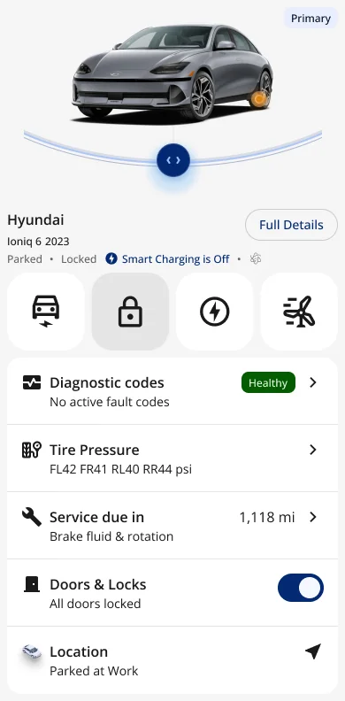
Figma · Health and security
-
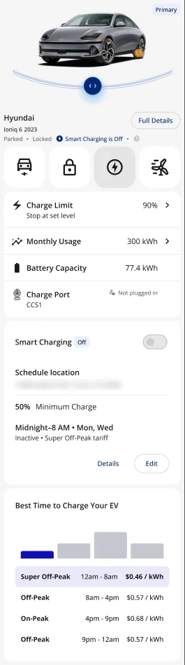
Figma · Charging and rates · scroll ↕
-
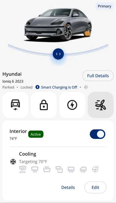
Figma · Climate
-
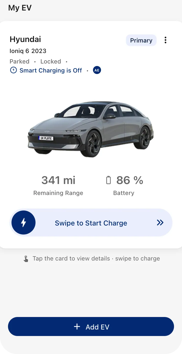
Prototype · My EV
-
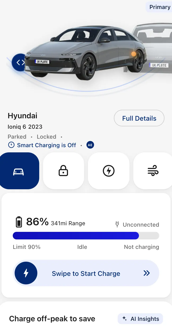
Prototype · Vehicle
-
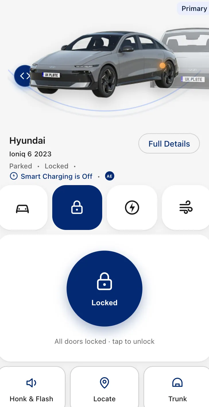
Prototype · Lock
-
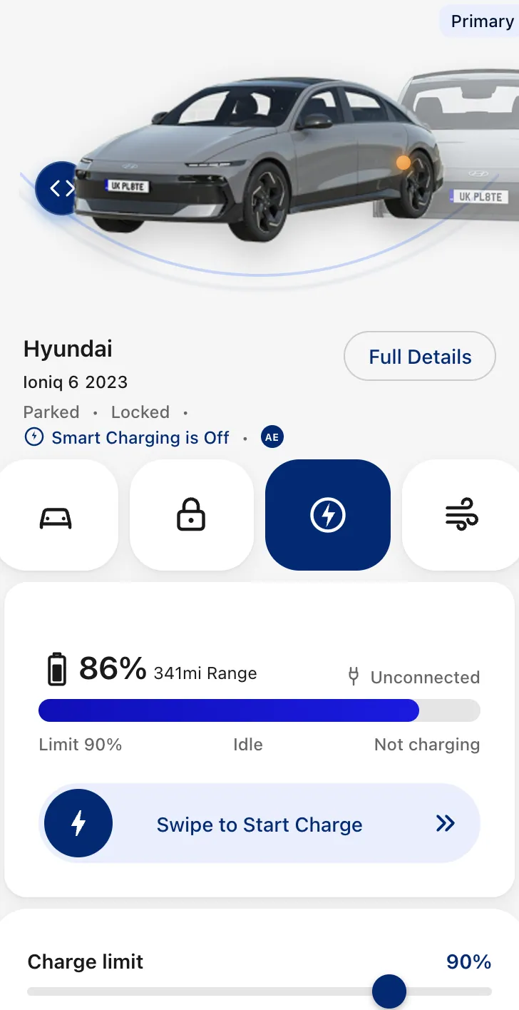
Prototype · Charging
-
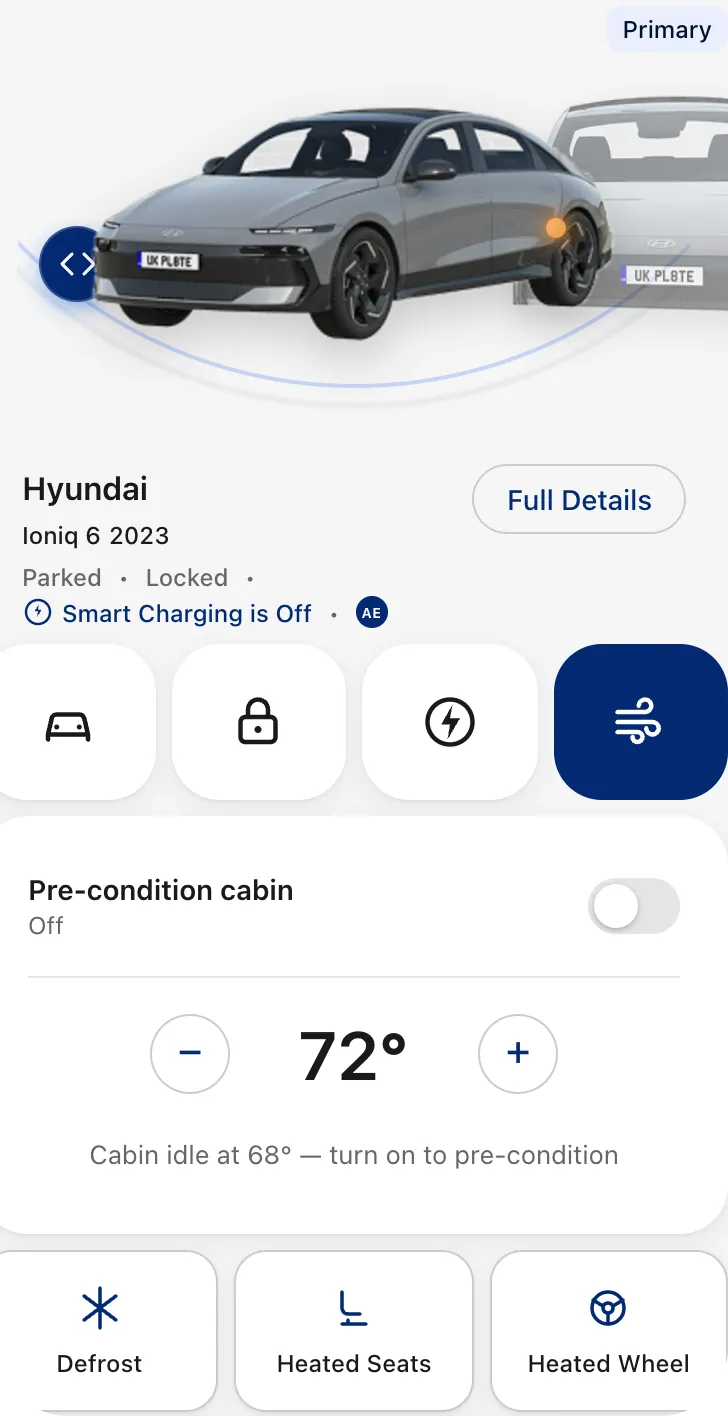
Prototype · Climate
-
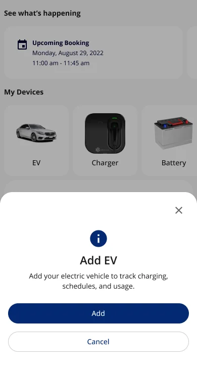
1 · The prompt
-
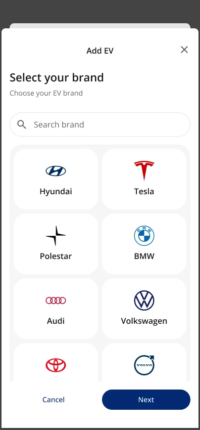
2 · Pick a brand
-
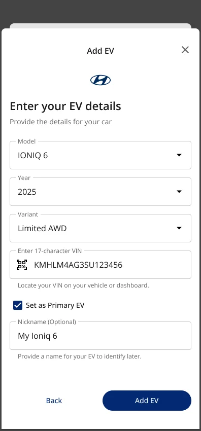
3 · The car’s details
-
4 · Connect the car for more
From an EV app to the whole home
AI Electron kept growing as a product over the years. It started as an app for charging an EV; by 2026 it covered the whole home, and the EV became one device among several.
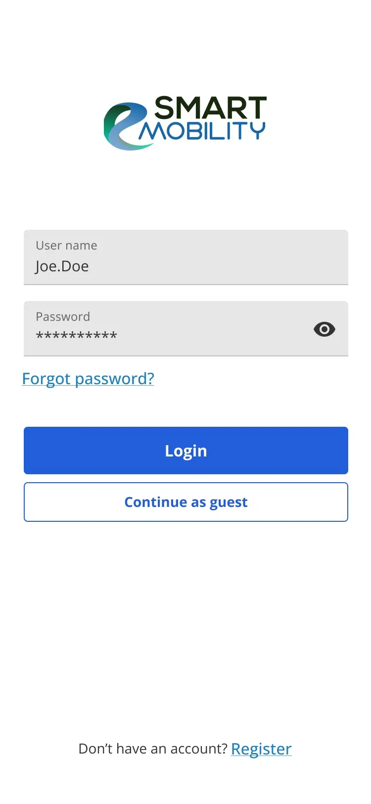
- Smart Mobility 2023 An EV charging app: find a station, charge, and see what it cost.
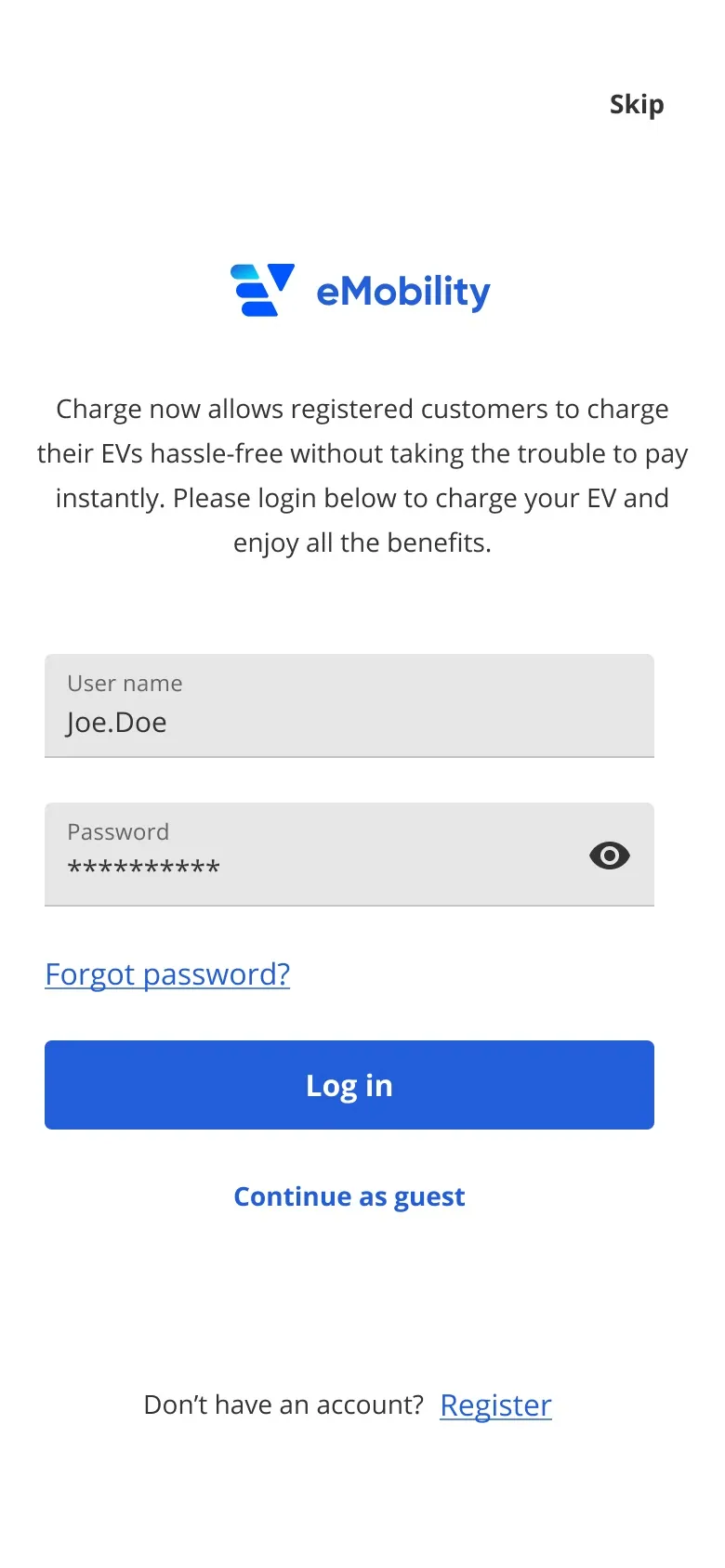
- eMobility 2024 A new brand on base 2.0, with My EV, rate plans and utility brands like SMUD and Alectra.
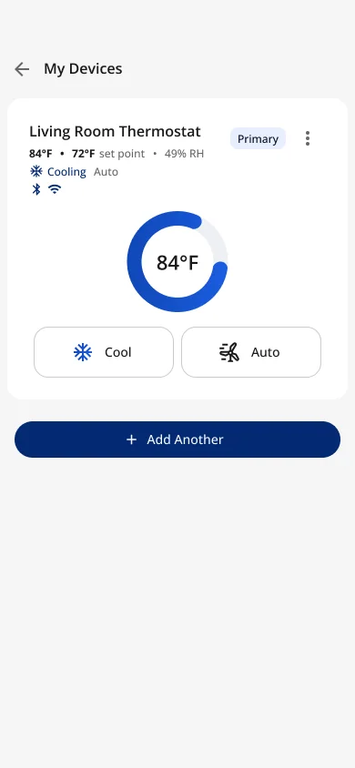
- AI Electron 2026 The whole home: My Devices, the thermostat, solar and battery, AI insights, and usage split by EV, solar, battery, HVAC and pool pump.
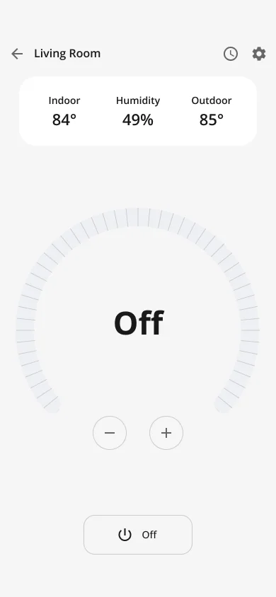
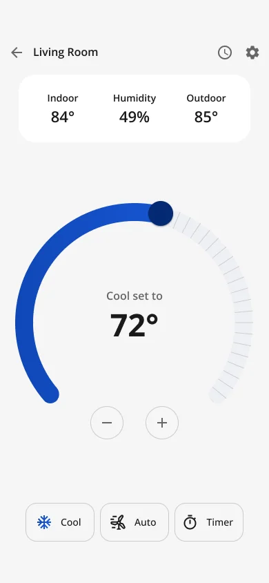
As the product grew, so did my work: I designed the AI Electron home, with smart-home devices like the thermostat, home solar, and a home insights page.
A home scene that fits the home. "A single hero image would have been wrong for most customers, who do not have solar, a battery and an EV." So the scene is layered, with 10 device combinations rendered.
-
Devices · My Devices
-
Modes · Off
-
Modes · Cool
-
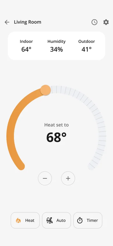
Modes · Heat
-
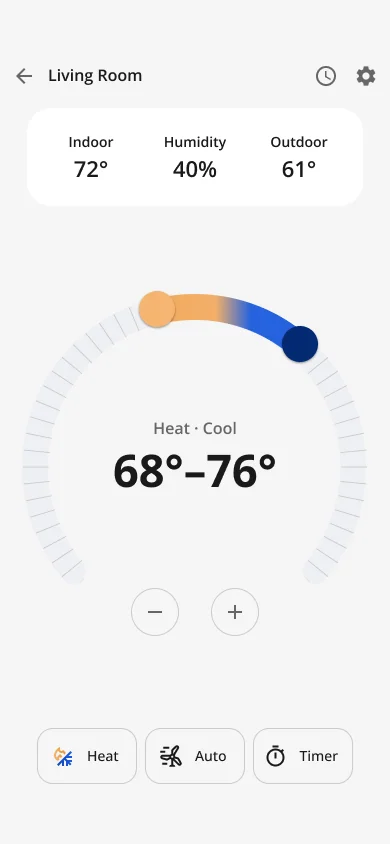
Modes · Heat · Cool range
-
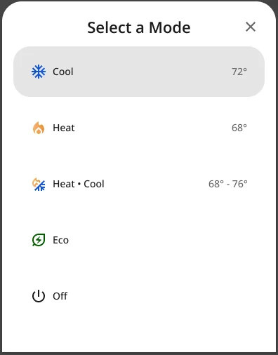
Sheets · Select a mode
-
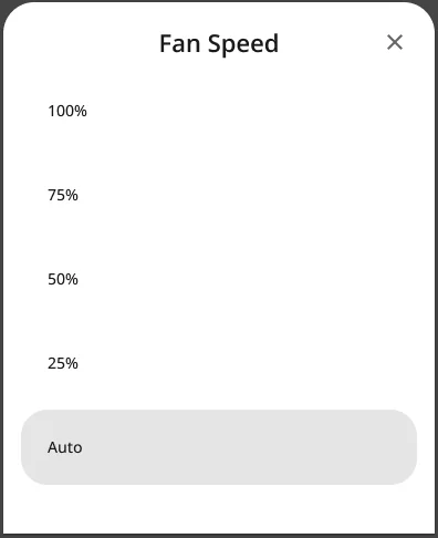
Sheets · Fan speed
-
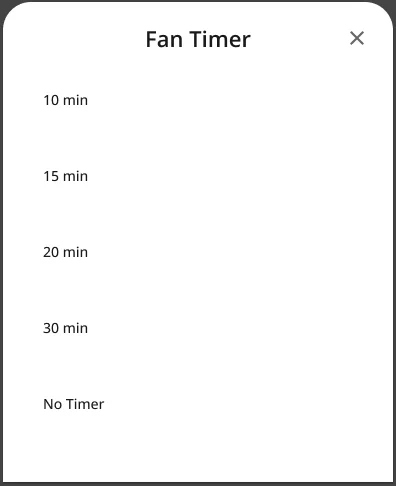
Sheets · Fan timer
-
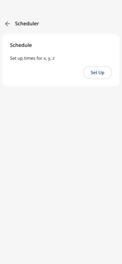
Scheduler · Scheduler: empty
-
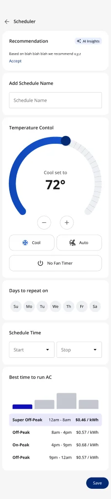
Scheduler · Setting up a schedule, with the best time to run the AC · scroll ↕
-
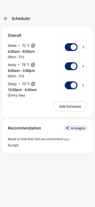
Scheduler · Schedules set
-
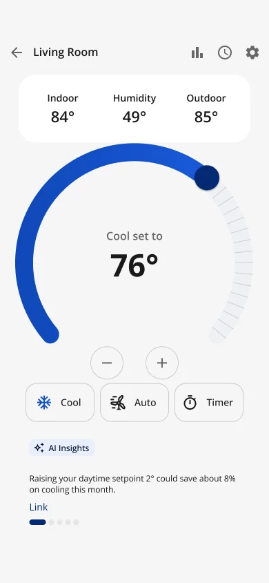
Below the dial · Under the controls, with a link
-
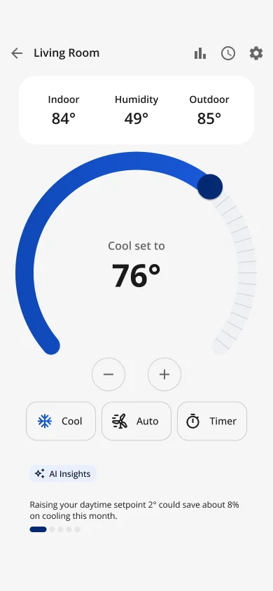
Below the dial · Under the controls, with a pager
-
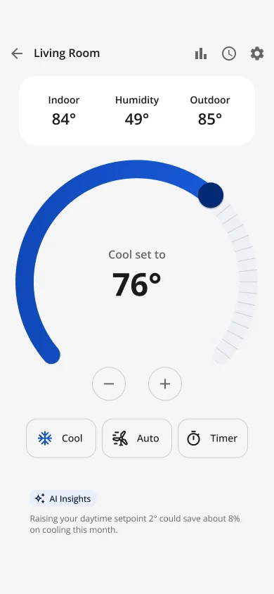
Below the dial · Under the controls, text only
-
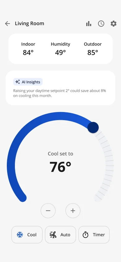
Above the dial · In a card, above the dial
-
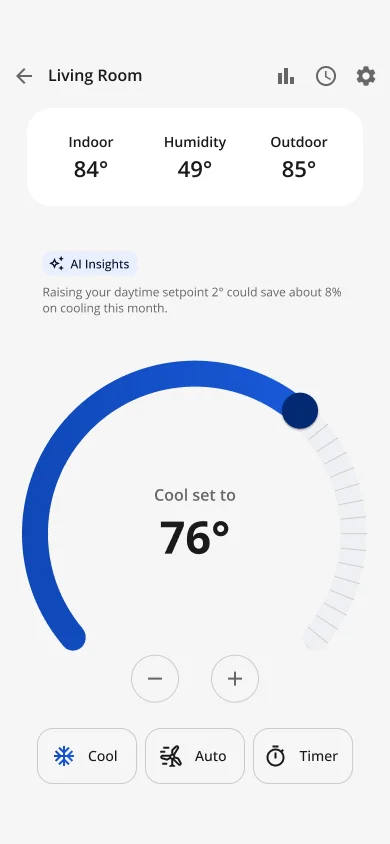
Above the dial · As text, above the dial
-
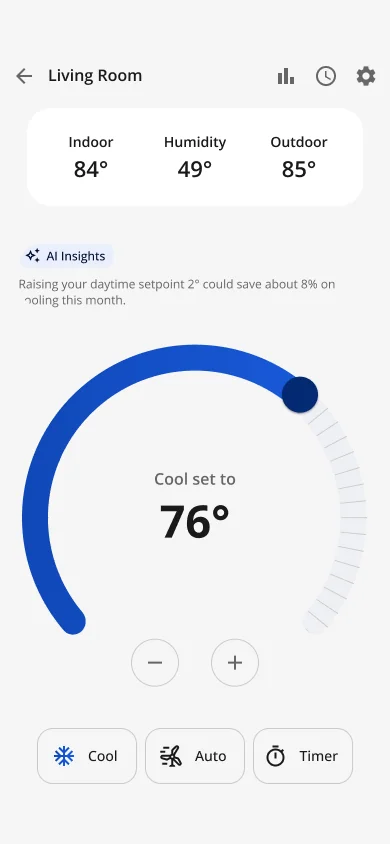
Above the dial · Compact, above the dial
Scale of the 2026 EV work: 17 interactive HTML prototypes and 15 platform tickets across Android, iOS and web. The SwiftUI and Compose code was handed over labeled as "a starting point, not drop-in production code", and the splash came with a Lottie version so engineering could choose.
Sign-in, sign-up and the splash


-
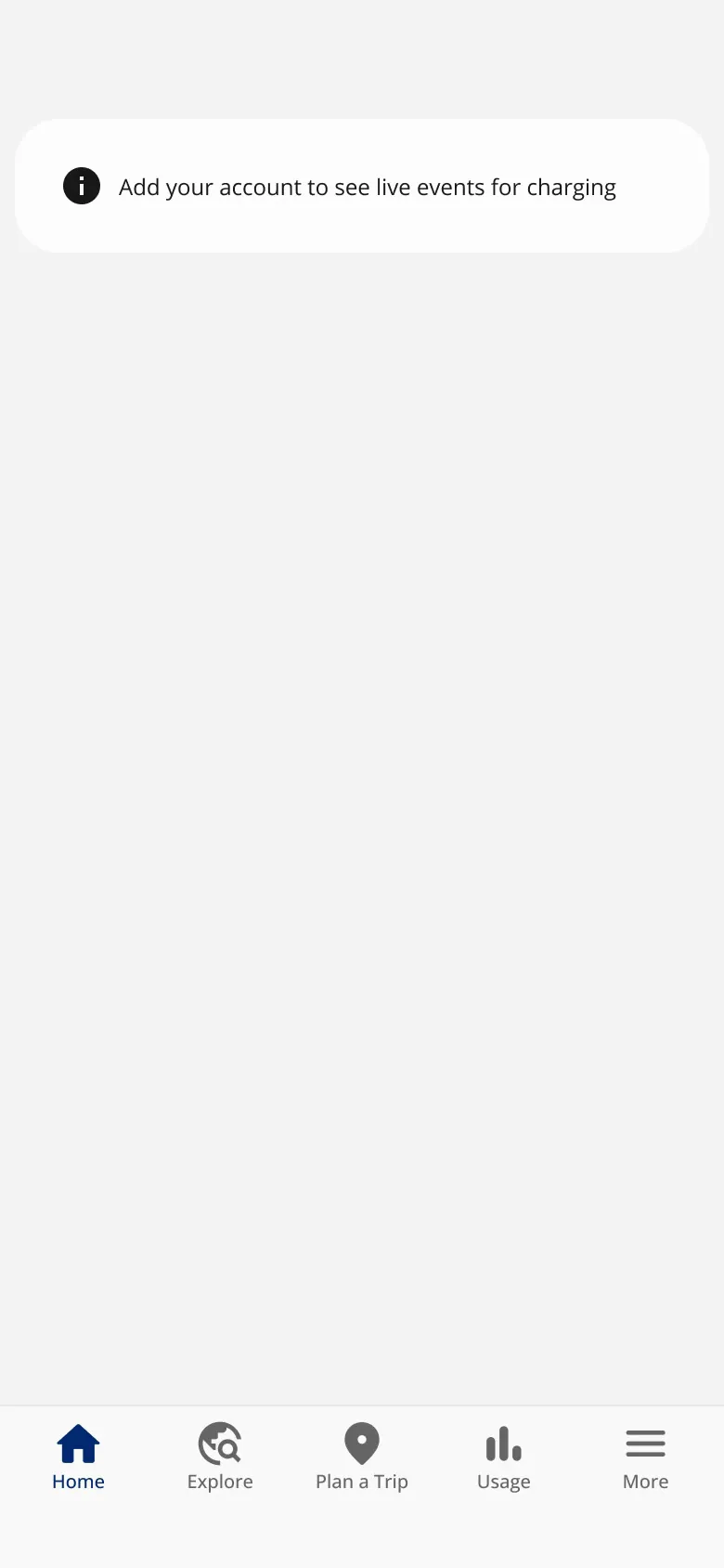
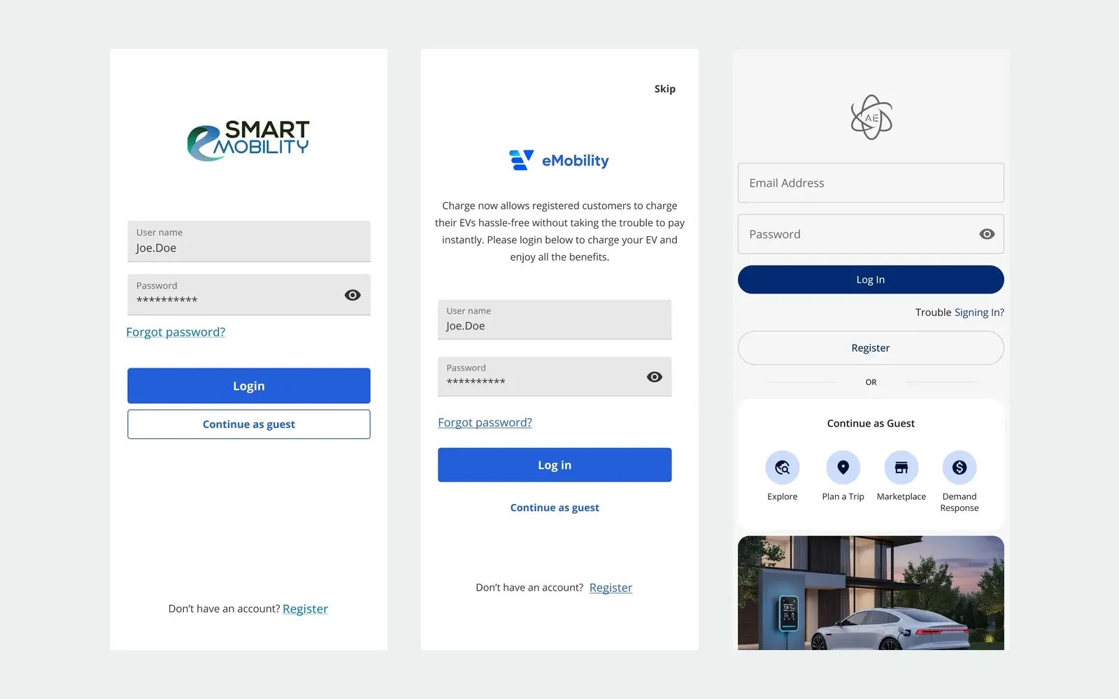
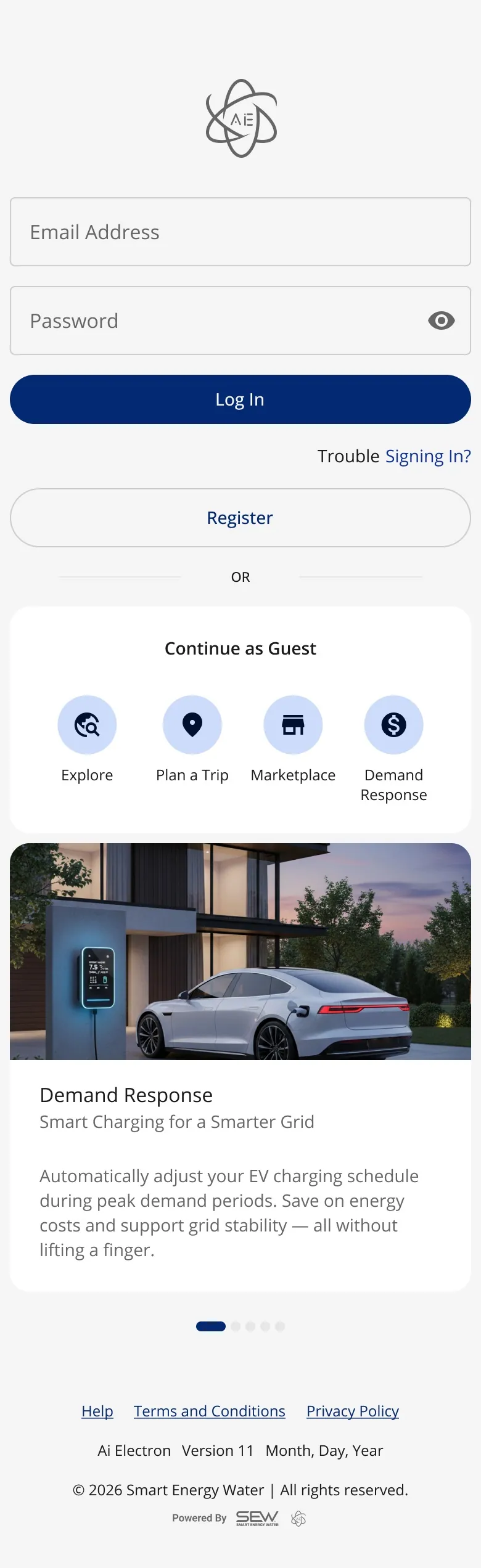
Guest · Browsing as a guest
-
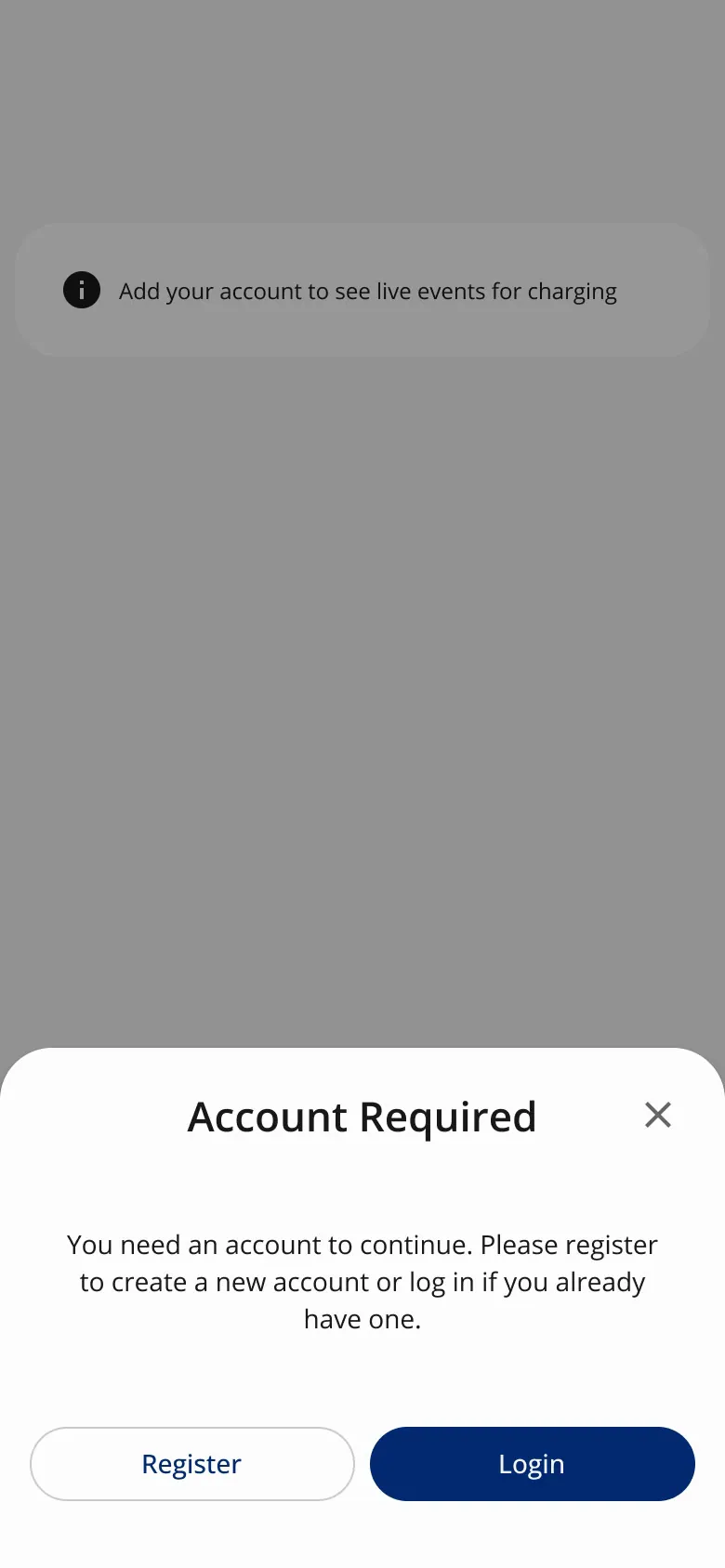
Guest · Account required
-
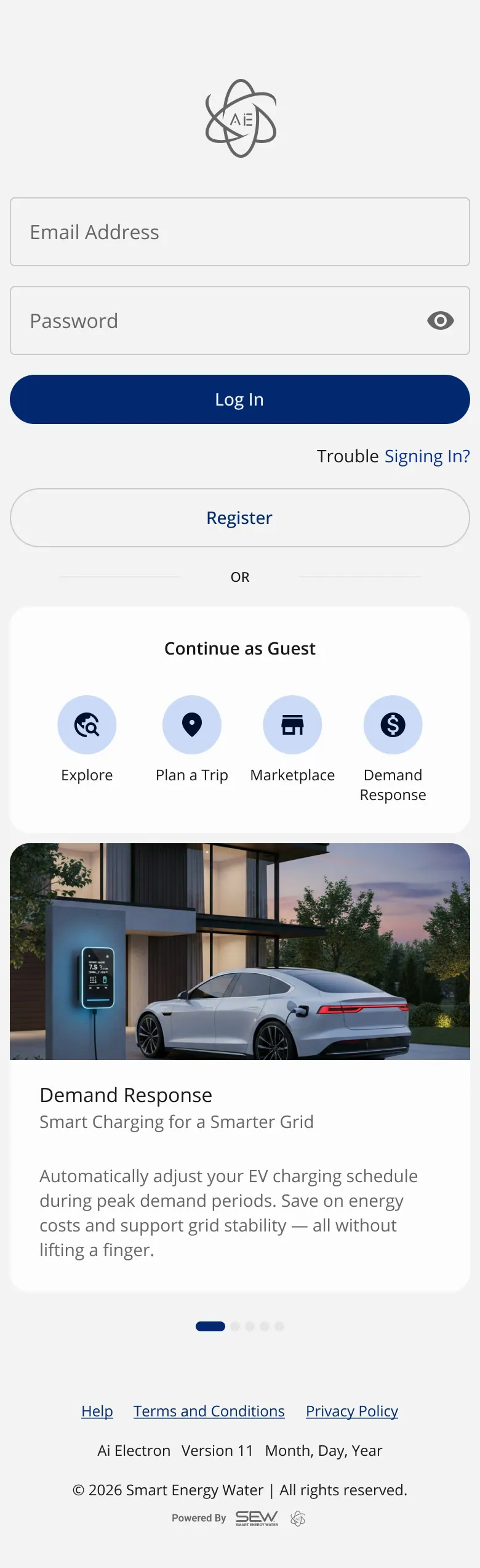
Sign in and sign up · Sign in · scroll ↕
-
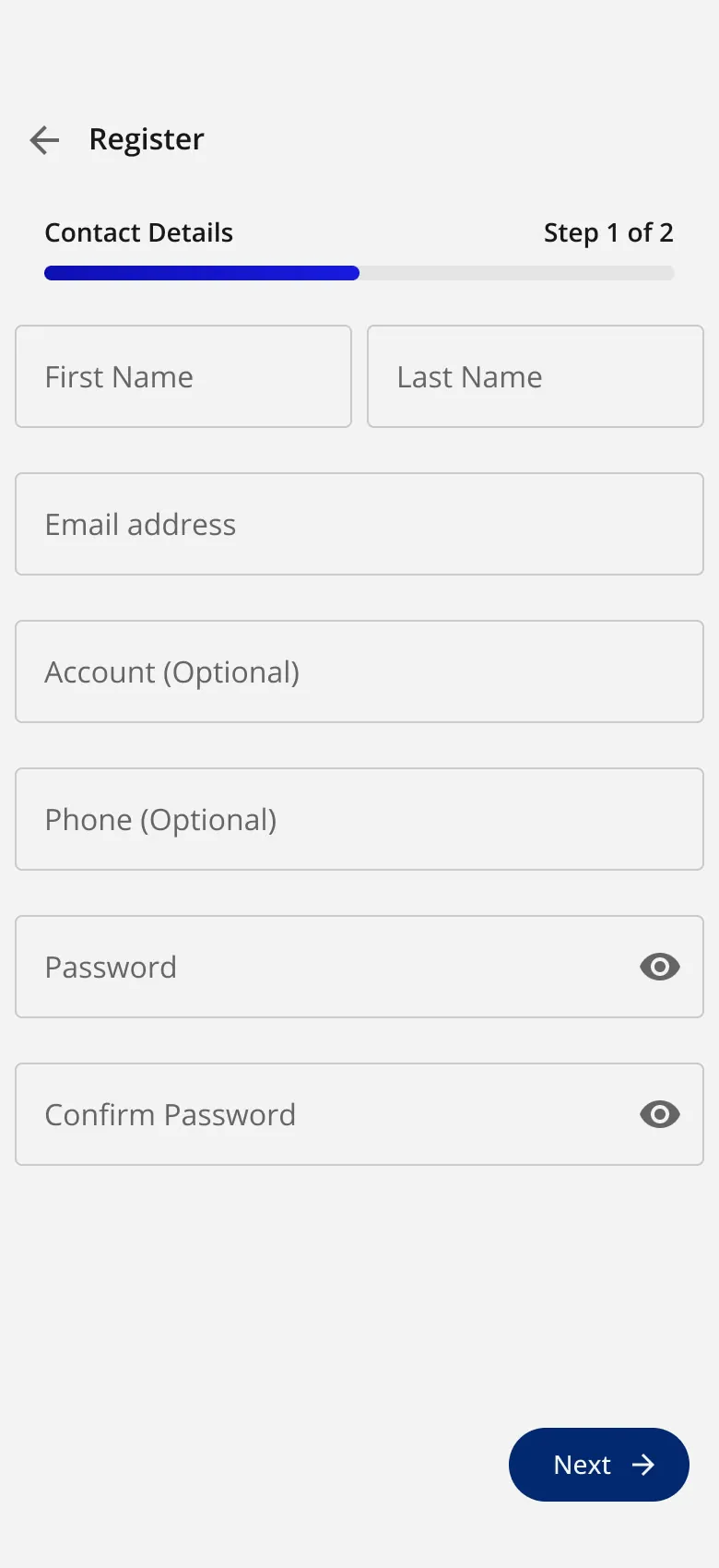
Sign in and sign up · Register, step 1
-
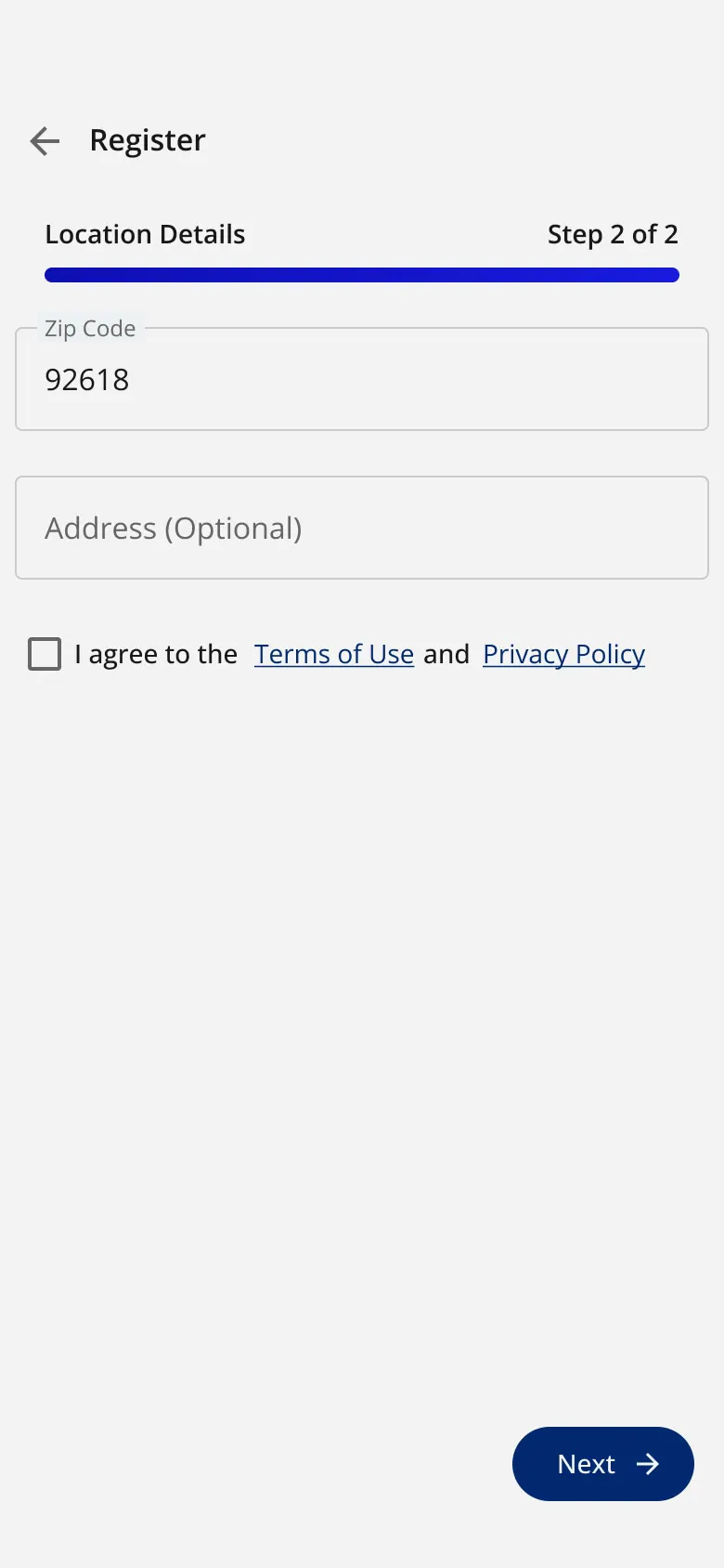
Sign in and sign up · Register, step 2
-
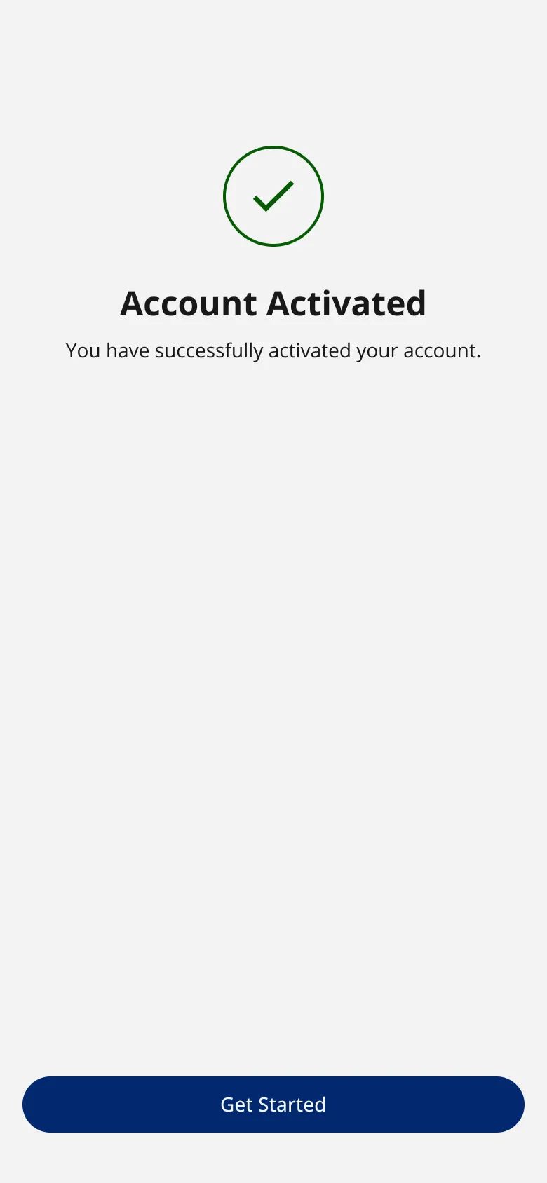
Sign in and sign up · Activated
-

Splash, light · 1 · In
-

Splash, light · 2 · Settle
-

Splash, light · 3 · Hold
-
Splash, light · Final
-

Splash, dark · 1 · In
-

Splash, dark · 2 · Settle
-

Splash, dark · 3 · Hold
-

Splash, dark · Final
The splash handoff, frame by frame in light and dark, with the native code and Lottie package: open the splash handoff ⤢
SwiftUI and Compose reference code for the hold-to-start button, a native + Lottie splash package, invariant tests for Usage 2.0.
-
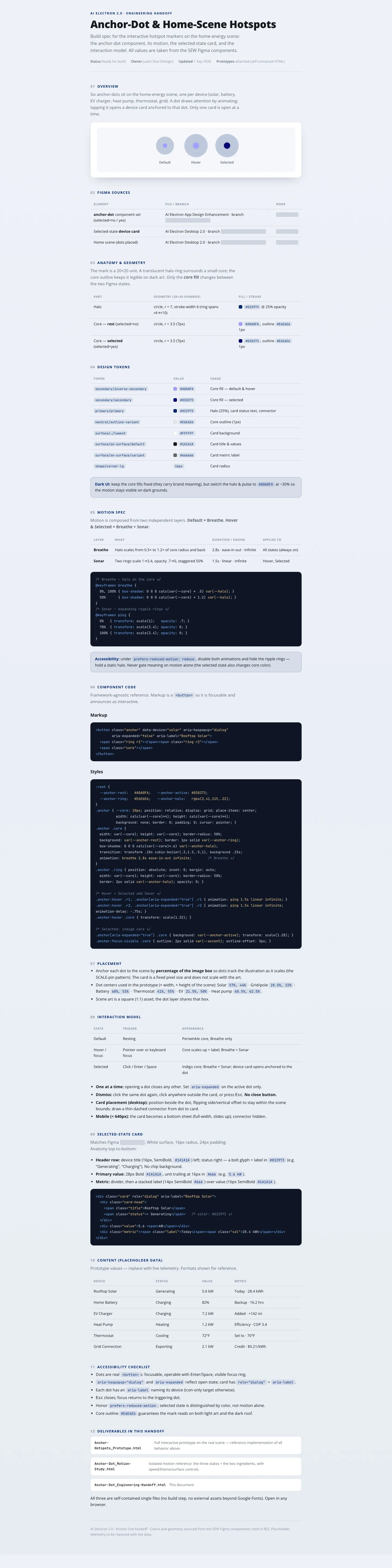
A handoff I'm proud of: the Anchor-Dot hotspots, with a motion spec, reduced-motion behavior and accessibility notes. · scroll ↕
Usage 2.0: every number derived
The same app's usage screen, rebuilt so that no figure is typed in by hand.
When a design problem is really a math problem
A ticket asked me to tweak the date selector and the Compare feature on the EV app's usage screen. When I traced every number, the screen contradicted itself. I rebuilt it on one data model where every figure is derived, proved it with a working prototype, and gave Product five decisions and Engineering a set of tests to keep it true (Jul–Aug 2026: 11 prototype versions in 3 days).
-
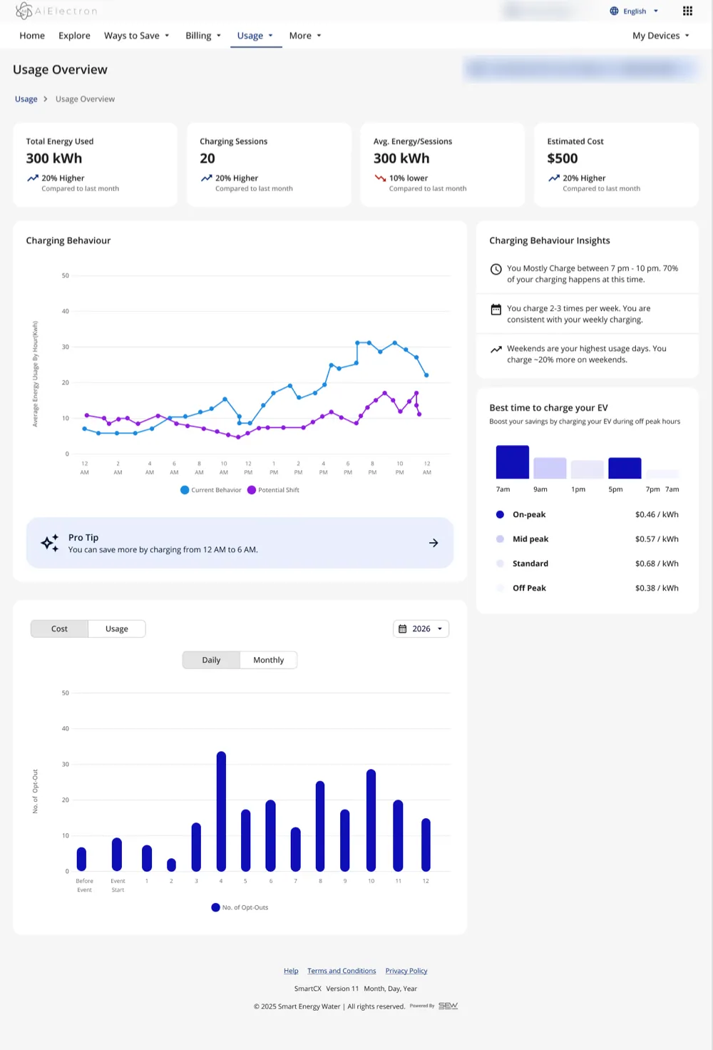
Before · Before: the old usage screen. 300 kWh in total, yet 300 kWh per session across 20 sessions. · scroll ↕
-
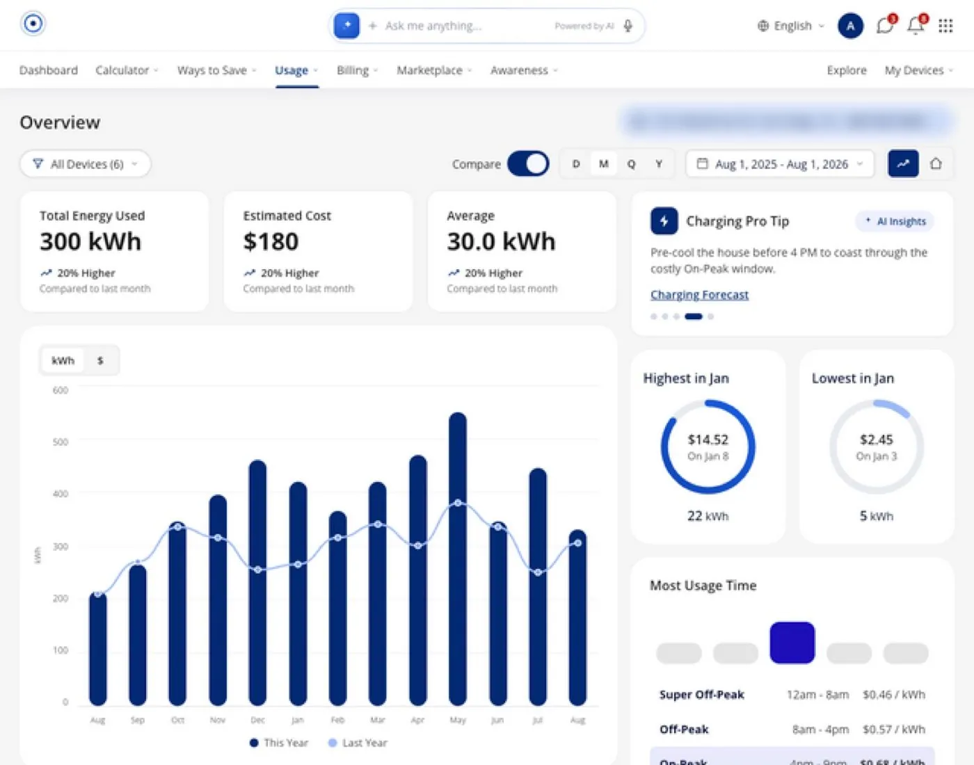
Iterations · An early version from the Aug 4–6, 2026 iterations
-
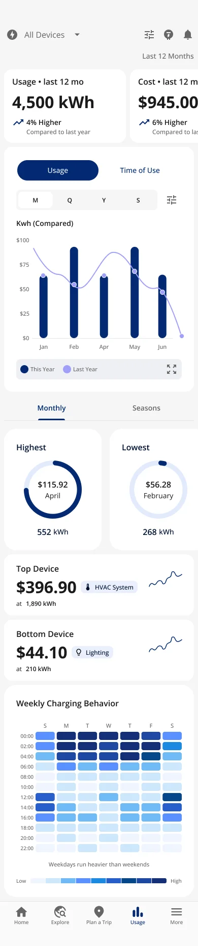
Filter in the header · Filter in the header: monthly · scroll ↕
-
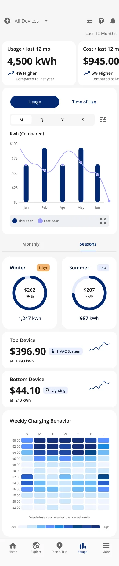
Filter in the header · Filter in the header: seasons · scroll ↕
-
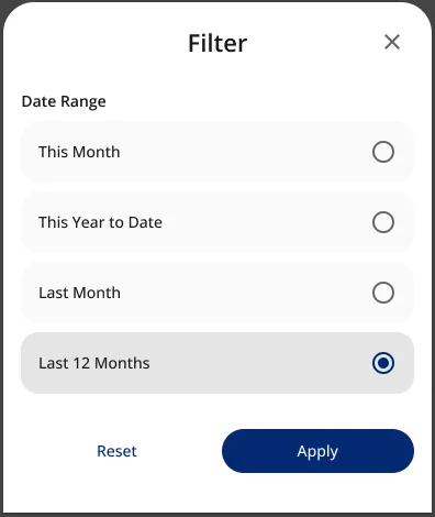
Filter in the header · The filter sheet
-
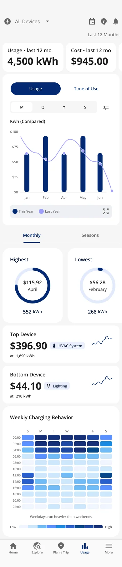
Filter in the chart · Filter in the chart only · scroll ↕
-
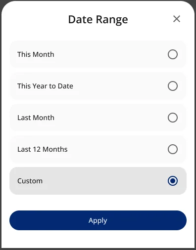
Filter in the chart · Date range, with custom
-
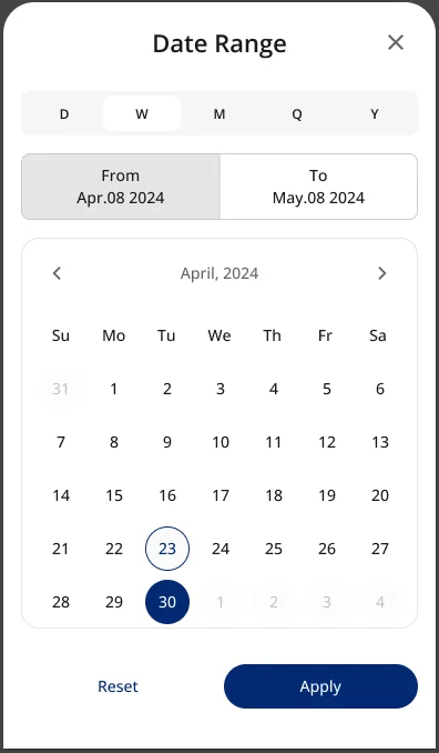
Filter in the chart · A custom range
-
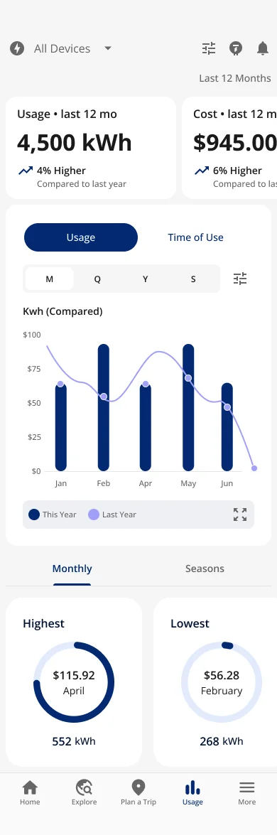
Simple · A simpler version · scroll ↕
Every number had been typed in separately, so nothing had to agree
One device appeared to use more energy than the whole account.
The $/kWh rate changed from tile to tile.
A "$8,888" placeholder (SEW's standard dummy number) and a "12.3 Kwh" unit typo made it into the design.
Compare appeared on the chart and in the tiles, with different baselines.
The date selector looked global, but only some things moved.
And because this screen ships under every utility's brand, wrong math is wrong for every utility's customers, and a usage screen that disagrees with the bill erodes trust in the utility, not just the app.
Nothing on the screen is typed in by hand
"Nothing on this screen is an independently-typed number. Every value is derived from a single base series and a single rate."
Make the logic explicit, then get it signed off
- Two control scopes Range and Device change the whole page; View-by, Units and chart type change only their own chart, and sit in that chart's header.
- In progress vs complete "This month" shows "so far" plus a Projected tile; "Last month" shows actuals only.
- One comparison, ramp-up gated Year-over-year appears only after 12 months of history; before that, it compares what exists and says so.
- One rate, one model It's now impossible for a device to exceed the account, or for two tiles to disagree.
- Devices partition the account Pick EV and the whole page rescales to EV's share; shares always sum to 100%.
A working prototype and tests for engineering
A prototype where every control works and every number reconciles, plus a review tool that shows it at phone, tablet and desktop side by side with synced clicks and scroll. For Engineering: tests that keep the rule true against live data, such as cost = kWh × rate everywhere, device ≤ account, parts sum to the whole, and "Projected" only on in-progress ranges.
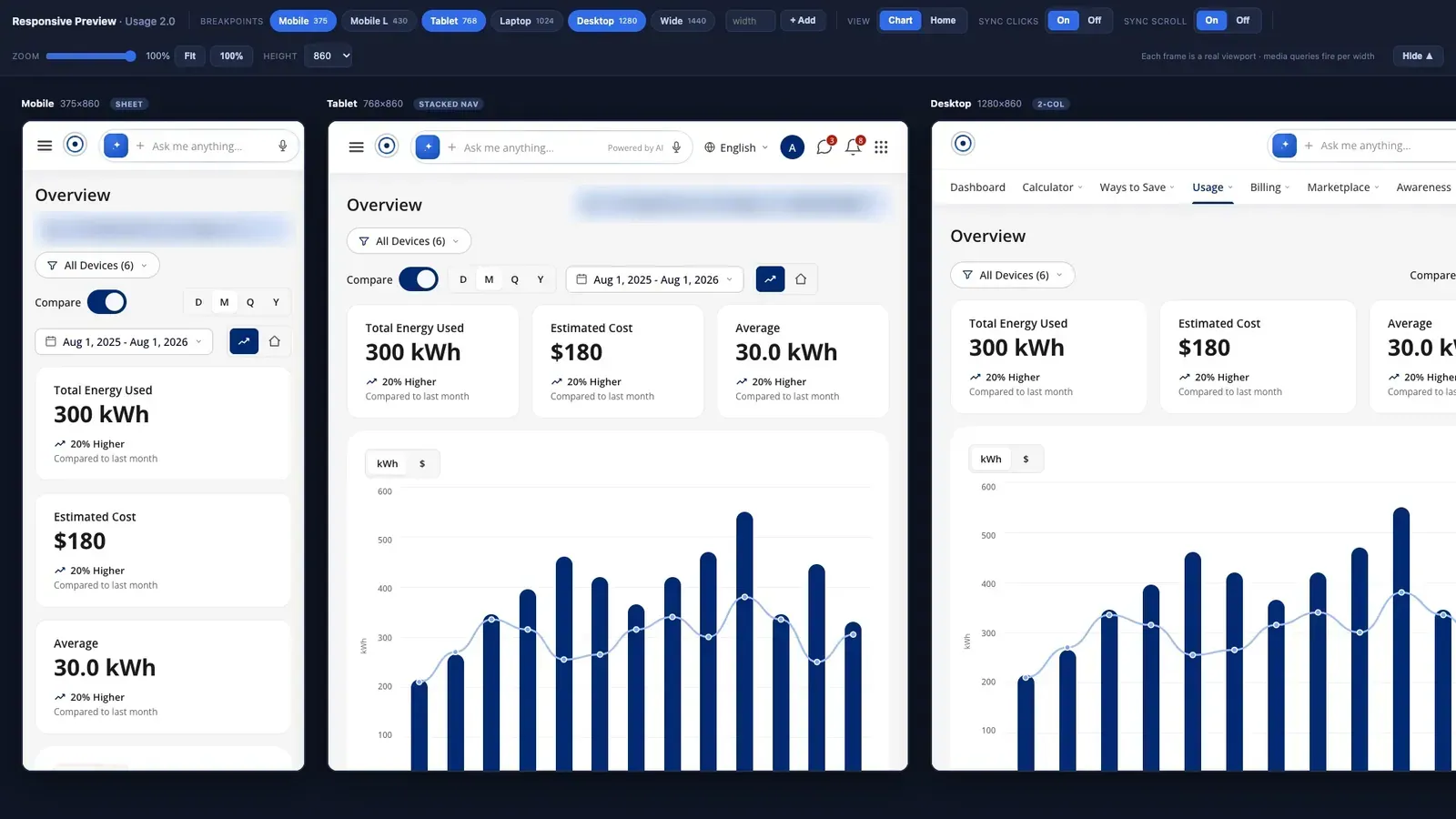
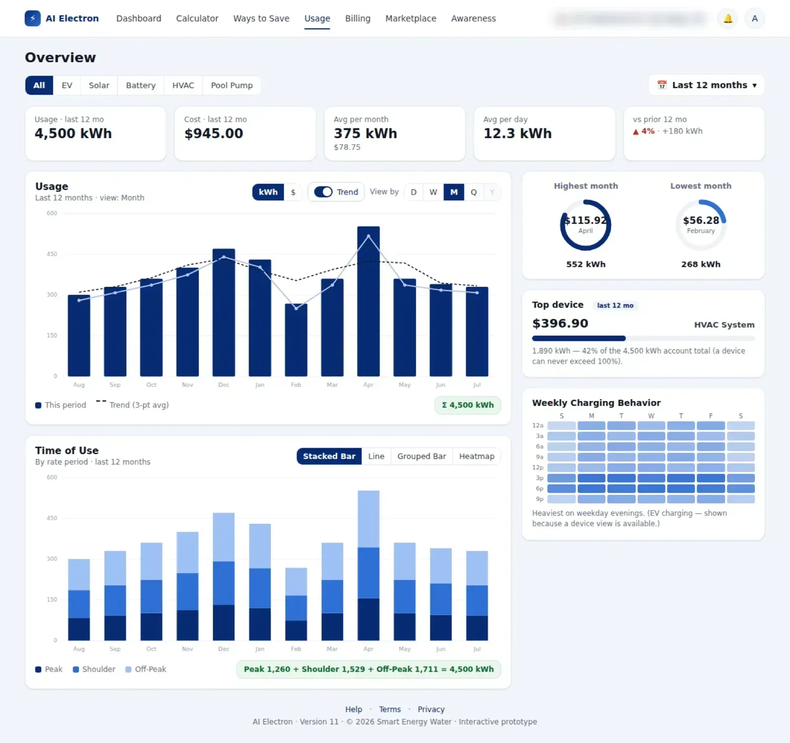
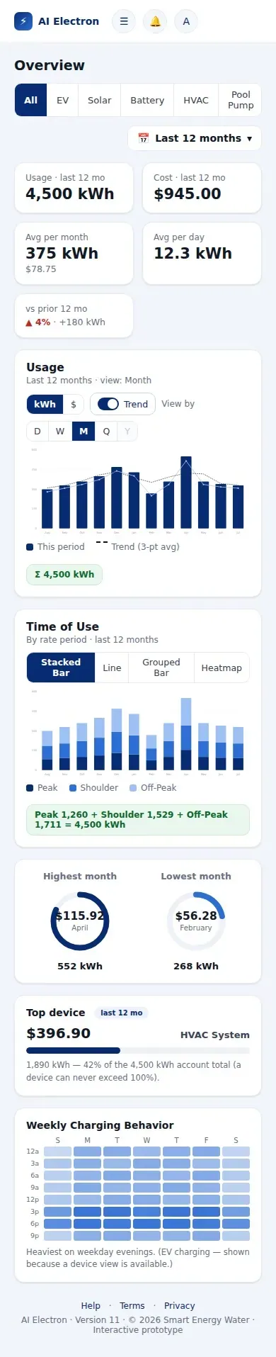
I used AI (Claude Code) to build the prototype so the math could be tested, not argued. A ±1 kWh rounding artifact remained and was flagged for exact-sum rounding before ship.
I mostly used prototyping to make sure the math was logical and to see how the filters would really work. The coded prototype also won buy-in: it set the general look and feel, and gave Product and Engineering something real to review. AI helped me explore chart types; I designed the mobile and web variants myself, around the smart-home devices the app had added: EV, solar, battery, HVAC and pool pump. It was also the first project where I used the prototyping tools I built.
Testing: the scenarios, and what they found
Each risky moment got its own test, from a real charger to the math behind the usage screen.
Field test · Oct 2024
Charge at a real public stationFind an open charger, wait, start a session and watch it. Found: "open" chargers were taken, about a 20-minute wait, and no in-progress state.
Field research photos and notes
Task-based test plan · Jul 2024
Is the app getting too heavy?Plan a trip, then measure time to complete and satisfaction for each task, with a separate test case for the More tab.
My planning notes, Jul 2024
Prototype · Jul 2026
Can a paid session start by accident?Hold to start, two ways: a card wipe and a ring. Releasing early cancels and rewinds, so an accidental tap does nothing.
Hold-to-start prototype and handoff
Coded prototype · Aug 2026
Does every number on the usage screen agree?Change the range, the device and the view, and check every figure. Found: "View by" looked like a page control but only re-grouped one chart, "which is why it felt broken". Each control now says what it changes.
GitHub record, captured Nov 7, 2026
Responsive review · Aug 2026
Does it hold at every size?The same prototype at phone, tablet and desktop side by side, with synced clicks and scroll.
The responsive review tool
Eight rules the numbers must always obey, handed to Engineering as tests: cost = kWh × rate everywhere; a device never exceeds the account; parts sum to the whole; "Projected" only on in-progress ranges; the base series adds up to the total; the monthly average is the total ÷ 12; time-of-use parts add up to each bucket; and re-grouping by day, week or month never changes the sum.
What changed, and what it's worth
2023–2024 · One base app
Ported to base 2.0I owned the EV app's design across three brands and two design systems, ported it to base 2.0 screen by screen, and added EV components (station tiles, charger cards) to the shared system.
2024–2025 · Utilities on board
From no clients to about fiveAlectra was the first client port (May 2024), with a reusable microsite ready for development on Jun 26, 2024. Two utilities were implementing the app by Mar 2025, and one publicly says it adopted SEW's eMobility platform. When I started, the EV app had no utility clients; after the redesign it had about five.
2024–2025 · Out of the app
Charging you can see without opening itA Live Activity and Dynamic Island states for charging, charged and idle, plus CarPlay and Android Auto views: I made 41 of the 43 sessions in that file in Apr 2025.
2026 · A safer control
Hold to start, handed off as codeHold to start and stop replaced the swipe, handed off with SwiftUI and Compose reference code; the splash was handed off as a native and Lottie package.
2026 · The whole home
From an EV app to AI ElectronRequirements for the connected car (16 signals, 7 commands), a home scene with 10 device combinations, thermostat concepts, 17 interactive HTML prototypes and 15 platform tickets.
Jul–Aug 2026 · Usage 2.0
Every number derivedOne data model, five decisions signed off by Product, eight invariant tests for Engineering, and 11 prototype versions in 3 days.
What I learned
- Trace it before you draw it. Usage 2.0 started as a date-picker ticket and turned out to be a math problem.
- Prototype the logic, not just the pixels. Working prototypes end arguments faster than mockups.
- Research the moment, not just the screen. Standing at a real charger showed that the riskiest interaction is a single gesture.
- The control is the brand. The look changed three times; starting a charge is what drivers remember.
- Hand off behavior, not pictures. Reference code made the hold interaction buildable exactly as designed.