 Smart Energy Water · 2023–2026
The design system team we didn't have
- Role
- Senior Product Designer
- Company
- Smart Energy Water
- Timeline
- 2023–2026
- Location
- Irvine, CA
Contents
- Tools for designers: Prototype Studio
- How I worked it
- Build the system
- Tools for keeping Figma honest
- Design ops: running it with no system team
- A component library that stays in sync with Figma
- No design system of our own in code
- Only 66 of 379 Figma components had a coded match
- From Figma branches to a versioned library
- A replica of production, built in GitHub with Claude
- Drift, measured
- The proof is in the pipeline
- Pull requests that say what's still open
- AI as the accelerator, not the designer
- Where it was heading: one library for design, engineering and every brand
- What it's worth, and what I learned
SEW sells one product suite to 470+ utilities, and each one ships it under its own brand. That's the white-label function: a shared base, themed per utility, never copied. With no design-system team, I built what makes it work: tokens and a brand generator, a versioned component library kept in sync with Figma, drift checks, and Prototype Studio so designers build on the real system.
I maintained the system with my manager. About a quarter of my timeEST. (estimate), in between projects, went to building tools that elevate the other designers.
Problem: copying files for each client turns one product into many. The goal: let each utility change its brand without forking the base, and keep design and code in sync.
Senior Product Designer, taking on design-system and design-ops work alongside product design
Figma libraries, React library + Storybook, docs site, audits and CI, governance, designer tools
Tools for designers: Prototype Studio
Featured tool · Beta
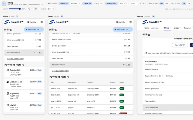
Designers describe a screen and get a working prototype on the real library, reviewed at every screen size and shared as one file.
Prototype Studio put the component library in every designer's hands, so internal prototypes and designs were built on the same components engineering was meant to consume. Why that mattered ↓
Watch it work: one sentence to a published prototype
Two tools, a terminal, and prototypes that fell behind
Designers showed mockups; the real components lived in code.
A prototypes repo to build on the real system, then a preview tool to review every size. Both needed a terminal.
"Only a small select of us can use Claude", so the tool had to work for people who'd never opened a terminal.
- Author a prototype on one shared design system
- Review it at every breakpoint in a single view
- Share it as one offline file that opens with a double-click
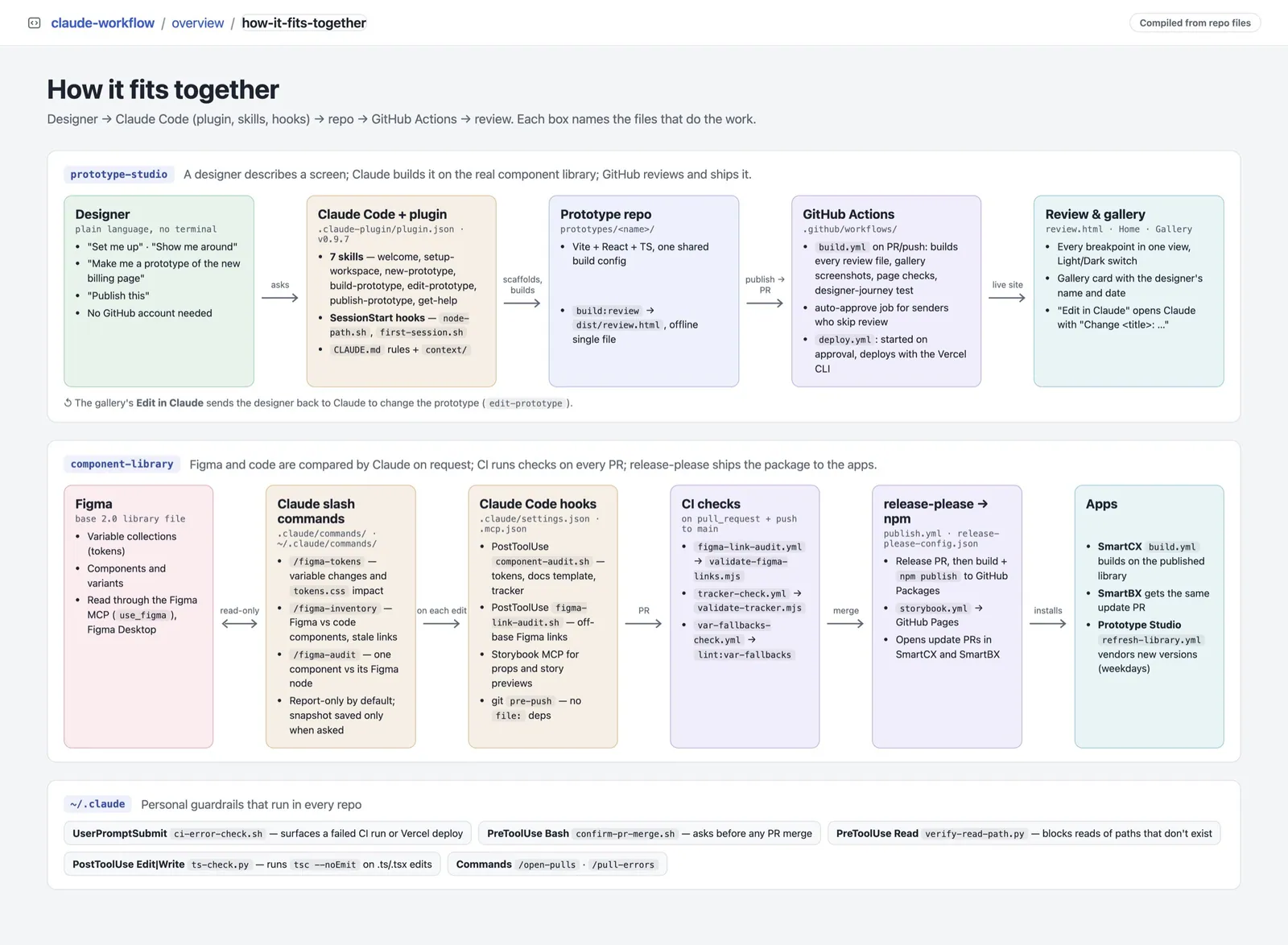
Where a non-technical user gives up, I designed first
-
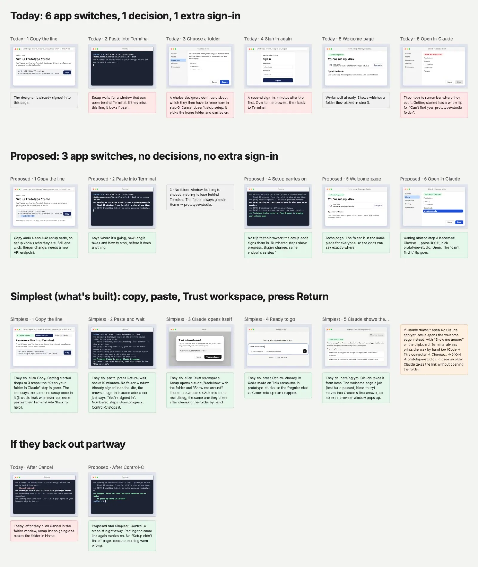
Setup-flow study (Nov 2): today vs proposed vs built, counting app switches, decisions and sign-ins. Today: 6 switches, 1 decision, 1 extra sign-in. Built: copy, paste, trust, press Return. · scroll ↕
-
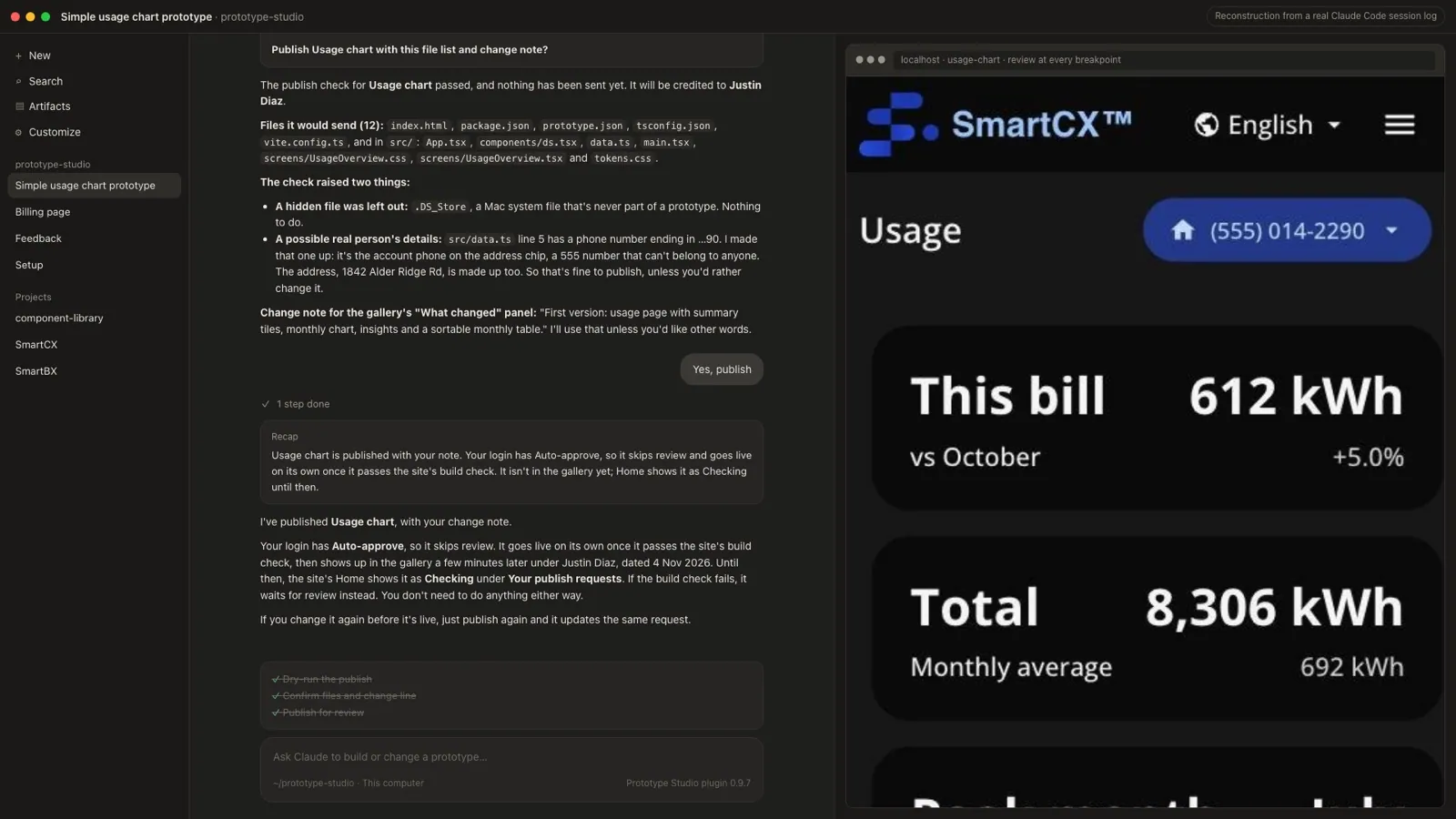
The guardrail working: before publishing, the check flags "a possible real person's details" (a phone number), explains it's an invented 555 number, and leaves out a hidden Mac file. Then it publishes.
- Sample data only. Invented people; the publish check flags emails, phone and account numbers.
- New components are flagged, not hidden, so the design system hears about gaps.
- Stuck? Claude fixes what it can and records the problem for the admin, never with passwords or customer details.
- Light-touch usage data: counted once a day, kept 90 days, no times, locations or browsers.
The beta pilot, in real numbers
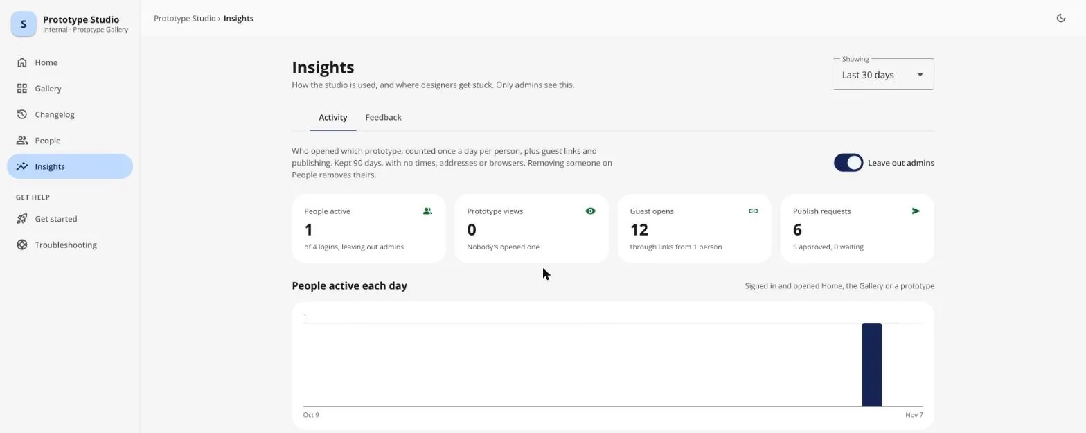
The admin Insights page I designed is honest about where the pilot stands. Over the last 30 days (admins left out): 4 designer logins, of which 1 was active; 6 publish requests, 5 approved, covering 4 different prototypes (one by another designer); and 12 opens of one prototype through a shared guest link. It also shows 0 prototype views by signed-in teammates. Adoption beyond the pilot is still the open question.
How I worked it
- Problem 2024 A client brand review: off-brand corners, pricing colors set by the regulator, and accessibility failures. Read more
- Research 2025–2026 An audit found 66 of 379 Figma components matched in my coded library (Oct 2026); drift reports showed where the copies had drifted. Read more
- Design 2024–2026 Tokens, the Brand Generator, and the move from 1.1 to base 2.0. Read more
- Leadership Sep–Oct 2026 “Joined at the system”: an agreement on who owns what, taken to engineering and leadership. Read more
- Test Ongoing Drift checks on every change: 1,729 automated runs, plus a pilot of Prototype Studio. Read more
- Outcome Nov 4, 2026 0 token mismatches between Figma and code. A new utility theme in about 2 days, down from about 2 weeksEST. (estimate). Read more
Figures marked EST. are my estimates, not tracked numbers.
Every tool I built, and why
With no team to hand the repetitive work to, every tool started as a problem the team kept hitting. Here they all are, grouped by that problem, each linked to where it shows up on this page.
Designers couldn't use the coded system
Prototype on the real library
1.1 and 2.0 mixed by accident
No system team
Run the system as a process, not a person
Builds didn't match the designs
AI that guesses
Put AI to work, with guardrails
Dev environments were never stable
A replica of production, built in GitHub with Claude
Build the system
Base 2.0 in Figma, then the same components in code, with one rule: override, don't fork.
Five principles for one base, many brands
- Base app UX is ours Utilities change how it looks; the base owns how it works. Flows, states and logic stay the same in every brand. Where it shows up
- Extend, don't edit When a utility needs something different, it becomes a new token or an option on the base, never an edit to a copy. Where it shows up
- Override, don't fork Brands override values; nobody forks components. One fix in the base reaches every utility. Where it shows up
- Some values aren't anyone's to change Regulator-set pricing colors, accessible contrast and text size are locked, whatever the brand. Where it shows up
- One source of truth, in code The product is assembled from the system, not rebuilt from a picture of it: adopt and contribute, never fork and diverge. Where it shows up
Every utility wants it to look like theirs
The easy answer is to copy the files and change them for each client. Do that a few times and you're maintaining a few products instead of one: when the base improves, the copies don't get it, and when a client gets something good, the base never learns from it.
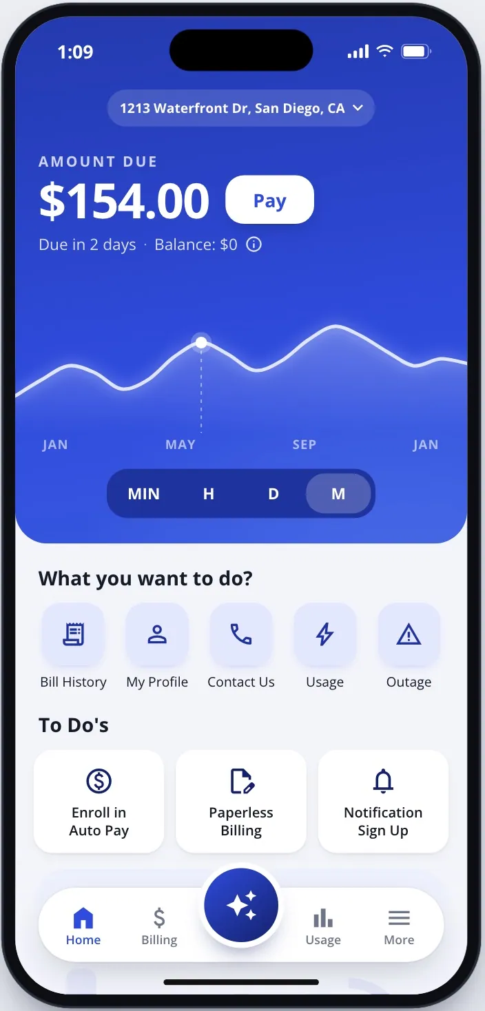
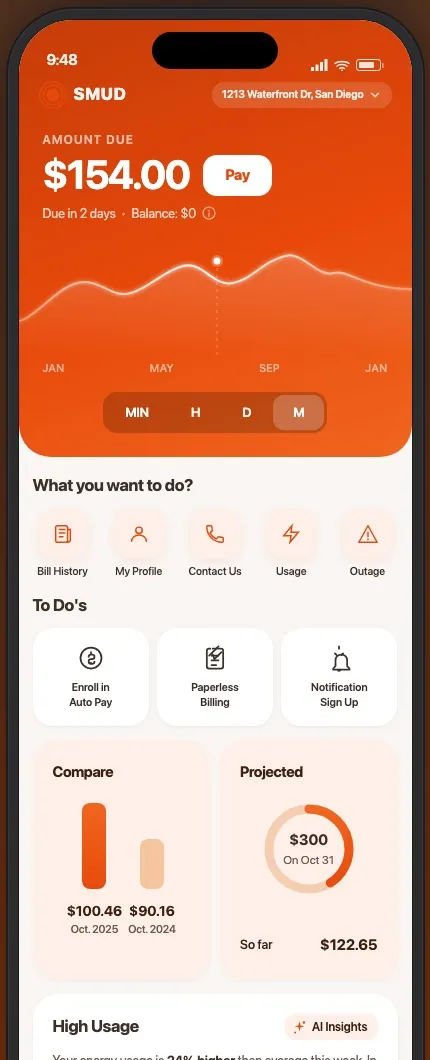
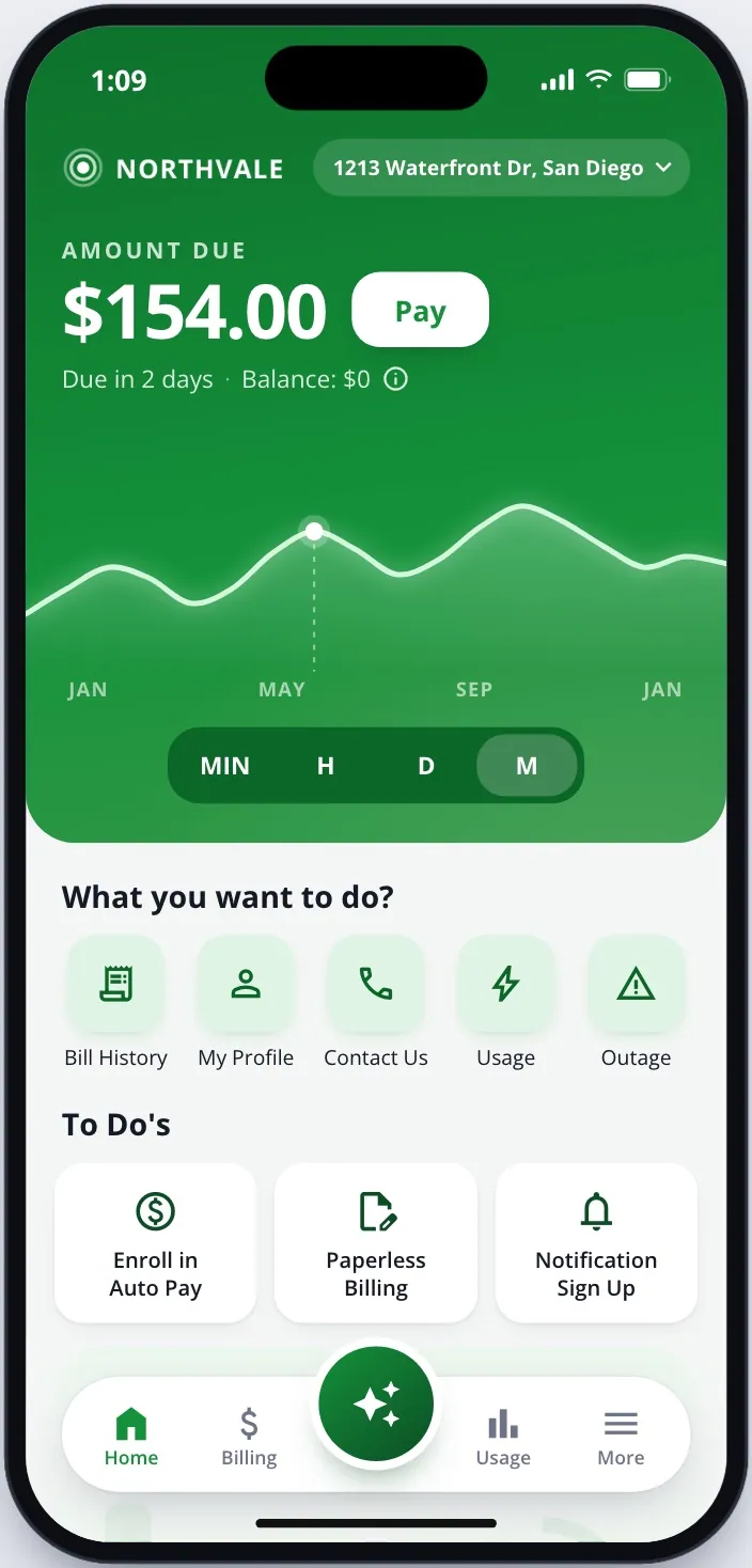
Not every value is the client's to change
When Alectra's brand team reviewed our EV designs, three different kinds of rule showed up at once. Rounded cards weren't on-brand; they wanted sharp, 90-degree corners. The time-of-use pricing colors couldn't change at all, because the provincial energy regulator sets them. And several light greens and yellows failed the province's accessibility law. A white-label theme isn't just "swap the primary color".
Make the base flex without breaking it
- Extend, don't edit (2024). When a client needed its own colors, I added stops to the base color ramps instead of changing existing ones ("instead of modifying the red-10, I would create red-5… just add"), so every existing screen kept working.
- Shape tokens (2025). Corner radius was the clearest thing that changed per brand: sharp for one utility, rounded for another, 16 → 32 for a third. I proposed
card-shape,input-shape,tile-shapeandform-shape, so a theme sets shape once instead of every component being redrawn. In code it became a semantic--corner-*layer.
The white-label build-out, by date
Figma's history shows how fast the base turned into client brands once the libraries were set up to be swapped.
See the six dates and my Figma note
- May 16, 2024 First client port (Alectra), as a proof of concept: a new primary color merged to test whether swapping libraries worked.
- Sep 10, 2024 Alectra's base 2.1 copy created.
- Sep 27, 2024 Revisions from Alectra's brand and site review: variables, buttons, tabs, navigation, sliders and chips.
- Nov 12, 2024 A client request (trip-planner "avoid" options) published back into the shared EV library for everyone.
- Dec 19–20, 2024 SMUD's full set of six libraries (base, brand, EV, charts, icons, custom icons) created in two days.
- May 9–15, 2025 Shape tokens shipped in SMUD's library: square buttons, card and tile shape variables, and SMUD's own error and success colors.
"renamed the former value property to value-0 and hid the newly added value options so current usage of the component does not get impacted"
That note is the rule the whole system ran on: extend a shared component, never break the brands already using it.
A whole brand from one color: the Brand Generator plugin
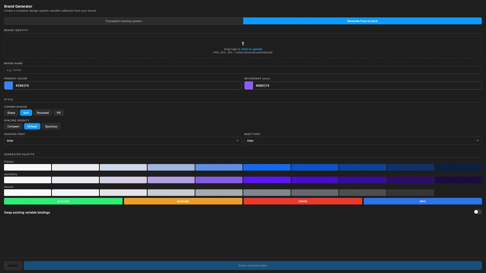
Re-skinning for a new utility used to mean hand-editing hundreds of color variables. I built a Figma plugin that does it in one pass: give it a brand color and it generates a full scale (50–900), tinted neutrals and success, warning, error and info colors. Or it moves an existing theme onto new brand hues, leaving the semantic colors alone, then rebinds every layer in the file. Corner radius, density and fonts are options too.
Tools for keeping Figma honest
Two design systems, mixed by accident
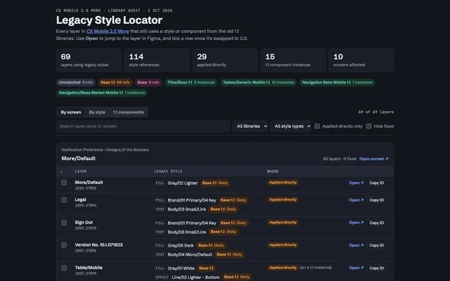
Design systems were getting mixed by accident: 1.1 styles and components kept turning up in base 2.0 work, and client copies of the base drifted on their own. So I built tools to find the mix-ups and fix them.
The system
Two design systems at onceDesign system 1.1 was still in use while the new base 2.0 was being built: the new base file was “70% done… not ready to use yet” (Dec 2023).
Weekly design check-in notes, Dec 2023
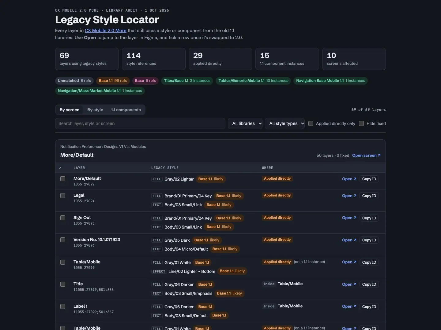
Eight Figma plugins
Alongside the library I built 8 Figma plugins, about 6,300 lines in all, each for a job the team kept doing by hand:
See all eight plugins
- 01Component Update Manager
Finds every instance that drifted from its main component and sorts the changes into major and minor. Accept resets it; Revert restores from a saved snapshot, so the undo works even after the file is closed.
- 02Library Scanner
Shows which of the many enabled libraries a file actually uses, and which nothing uses.
- 03Brand Generator
Builds a full theme from one brand color. More ↑
- 04Data Replacer
Fills mockups with real data through Claude, which can only return 5 kinds of edit; the designer previews before anything changes. More ↓
- 05Reset Text Styles
Resets text-style overrides inside instances without touching anything else.
- 06Consolidate to One Page
Gathers every page's content onto one page for review, with undo.
- 07Section Line Height
Sets one line height across selected sections.
- 08TTF Icon Exporter
Turns icon layers into an icon font for engineering.
These ran as development plugins inside SEW; they weren't published, and there's no usage data.
Design ops: running it with no system team
Built in branches
Between 2023 and 2026 I created 282 of the 286 Figma branches merged into our libraries, 104 of them on base 2.0. My 1,022 sessions are a quarter of all work in the base 2.0 file. On a team this small, 254 of those merges were my own: the process was documented and tracked, but most changes had no second reviewer. That gap is what the code pipeline later closed.
Three years of output, counted from Figma, GitHub and Claude Code: 6,133 Figma sessions, 874 change notes, 286 merged branches, then 1,016 commits and 229 pull requests in 2026.
Docs, guides and a backlog anyone could follow
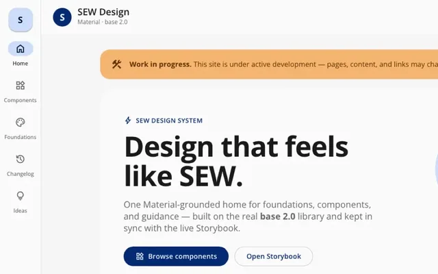
A docs site structured like Material 3 and painted with SEW's real base 2.0 tokens, with component pages that embed the live Storybook. Five guides: Token Cascade, Code Connect, Precedents in the Wild, the Figma File Cleanup Playbook and the Figma Playbook (on hold).
-
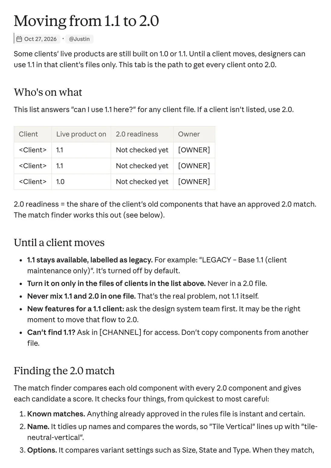
"Can I use 1.1?" answered once: who's on what, the rules until a client moves, and how the match finder scores old → new components. Client names removed. · scroll ↕
-
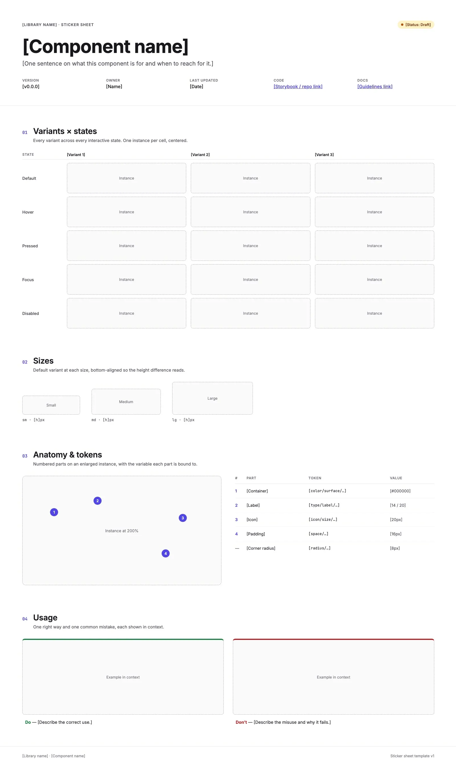
Sticker sheet template: variants × states, anatomy, tokens, do/don't, so every component is documented the same way. · scroll ↕
-
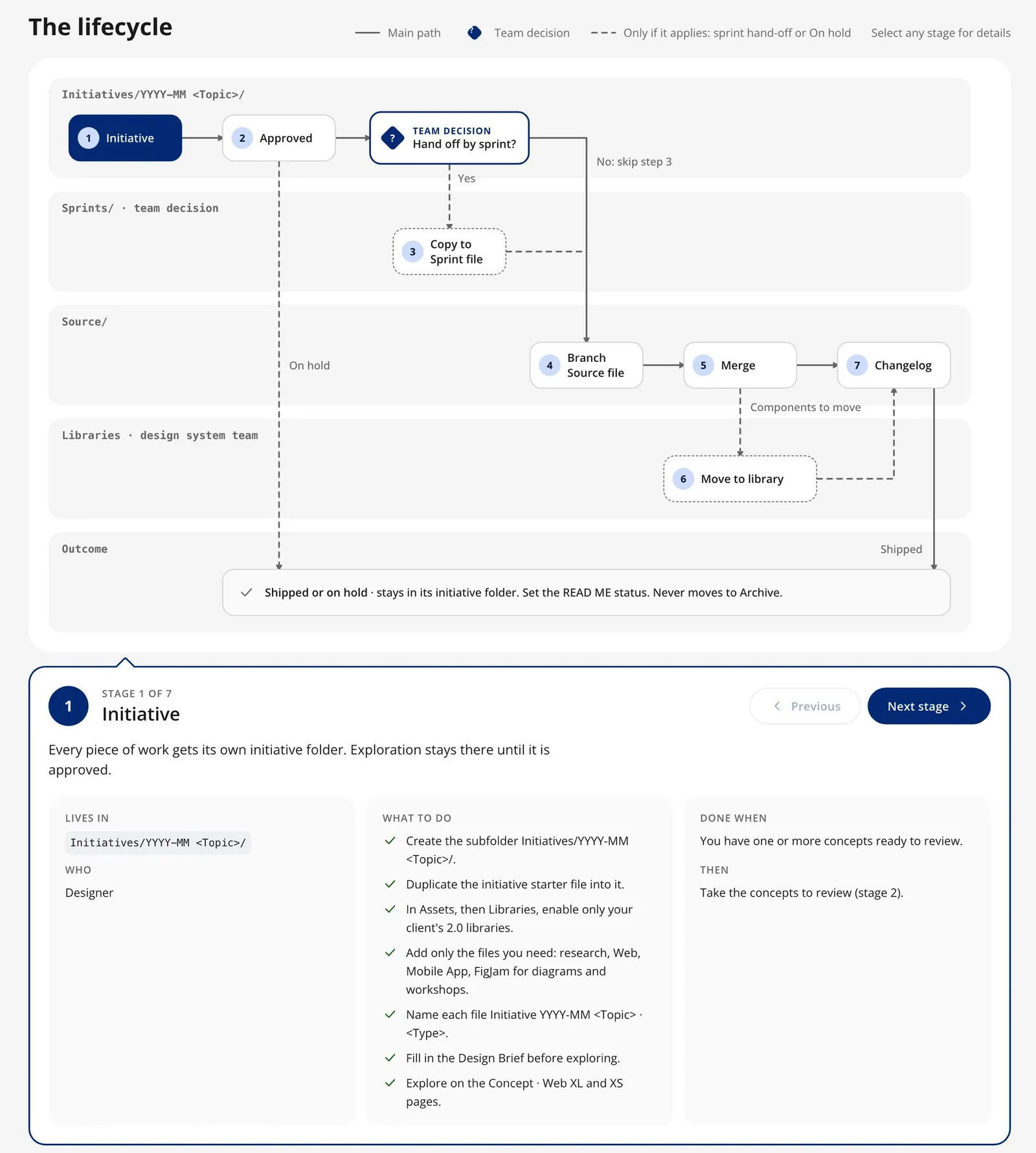
The fix, written as a rule: a file lifecycle where components move into a shared library. · scroll ↕
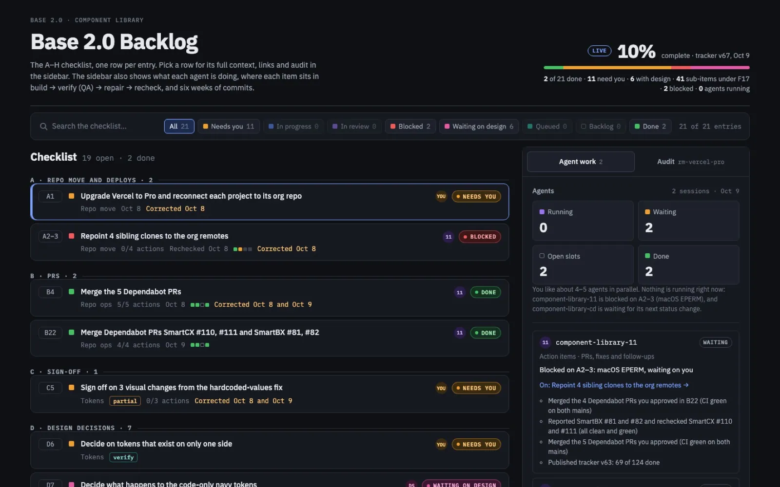
The backlog audit tracker: a checklist, an agent sidebar (build → verify → repair → recheck), a QA queue and six weeks of commits. Agents did the legwork; every change was checked before it went on the page.
See the backlog tracker
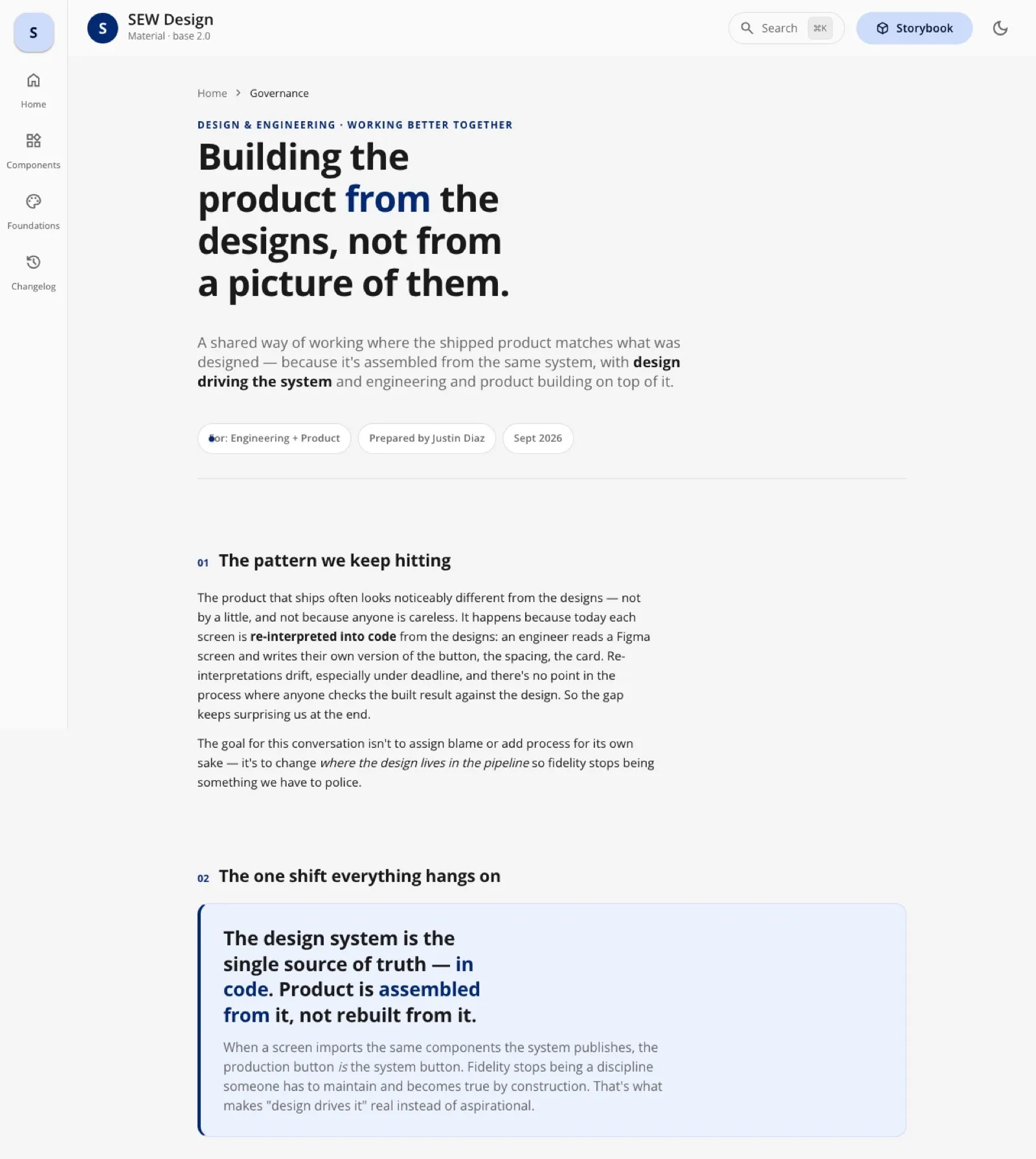
"Joined at the system": a proposal for design and engineering to share one source
Fork & diverge
Fork & diverge
Copy the component, tweak it locally to fit, and quietly start the drift all over again.
Adopt & contribute
Adopt & contribute
Change it in the shared library instead, so every consumer gets the improvement and the system stays one thing.
The proposal: the design system is the single source of truth in code, not just in Figma. Design owns tokens and patterns; Engineering owns how they're built and can change internals freely; Product makes room for the work. Start small: one shared tokens source, then a versioned package, then a design-parity check, piloted on the Button.
Who I worked with
Leadership
- Leadership Why one base matters to the business; design reviews; backing for the system work.
decisions ↓progress ↑
- Me · the system, with no system team Tokens, library, drift checks, Prototype Studio.
specs ↓feedback ↑
Partners
- Engineering Owns the implementation.
- Product Makes room for system work in the roadmap.
- Designers Build on the real library with Prototype Studio.
A component library that stays in sync with Figma
No design system of our own in code
Engineering had no component library of its own: they built on a third-party UI kit and reshaped its components project by project. So SEW had no design system of its own in code, and design had no control over what shipped. That's why builds never looked like the designs and clients kept running into QA issues (the customer home alone took seven design-vs-build review rounds). My manager and I uncovered this together, and it needed fixing.
The component library I built with Claude was the answer: the source for our internal prototypes and designs, which engineering could consume and adapt instead of reshaping the kit each time.
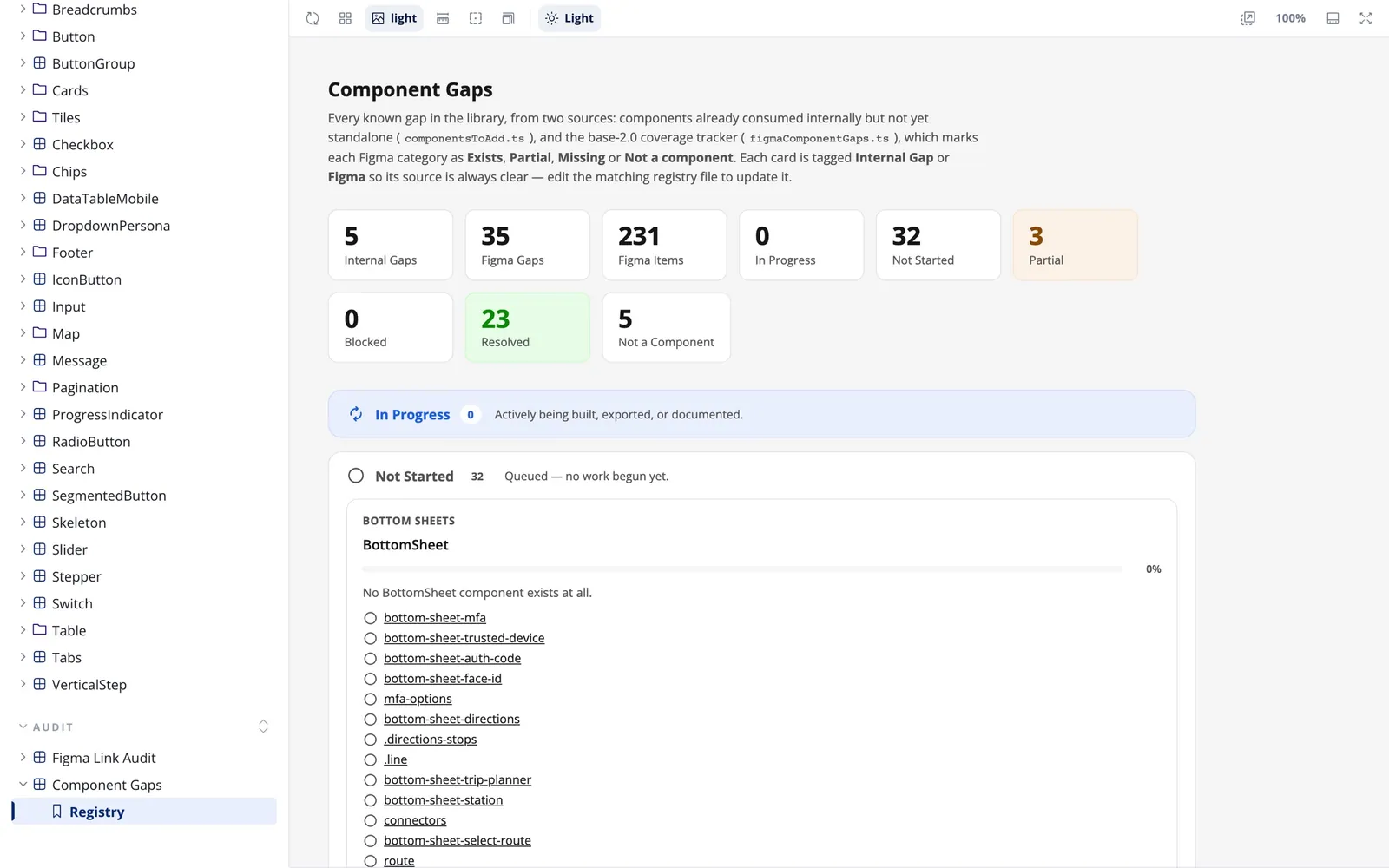
Only 66 of 379 Figma components had a coded match
Design said one thing, code said another, and nobody's job was to notice. So I made it mine.
Component snapshot, Oct 6, 2026. Compares my library with Figma; engineering's product was built on a third-party UI kit.
From Figma branches to a versioned library
I built base 2.0 components through Figma branches (documented, added to the sticker sheet, merged, published), then put the system into code: Figma → React component with Storybook docs → CI publishes a versioned package and updates the coded apps.
A replica of production, built in GitHub with Claude
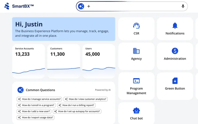
Our dev environments were never stable: logins changed, and sometimes we couldn't see the actual product at all. So I built a replica of production myself with Claude, entirely in GitHub: coded SmartCX and SmartBX apps on the library, running on mock APIs. It's all connected. The library publishes a new version, the apps and Prototype Studio pick it up on their own, and the drift check compares it all with Figma.
Drift, measured
The System Tokens in Figma compared against the coded library, both light and dark modes:
The 13 left after the first sync were deliberate skips, listed as open findings. By v1.11.0 (Nov 4, 2026), none were left.
Fix only what's safe. The fixer tags each finding "auto" or "human" and writes only the auto ones, then type-checks and restores the file if anything fails. The first live run changed just 5 values, and I caught one wrong proposal in review. Drift kept coming back as Figma moved (0 on Oct 6, 19 on Oct 29, 72 on Nov 4), and one command brought it back to 0 each time. Drift is continuous, so the check has to be cheap.
Syncing tokens from Figma didn't only fix code. It caught mistakes in Figma:
See the three mistakes it caught
- A contrast check on every chart token found that two dark-mode danger colors had become identical (contrast 3.41 → 1.93), so the chart series could no longer be told apart (Oct 5).
- A pure-black dark surface was held back as "looks like a Figma mistake" until someone decided (Oct 29).
- A warning progress fill turned out not to be bound to the gradient variables at all (Oct 30).
The proof is in the pipeline
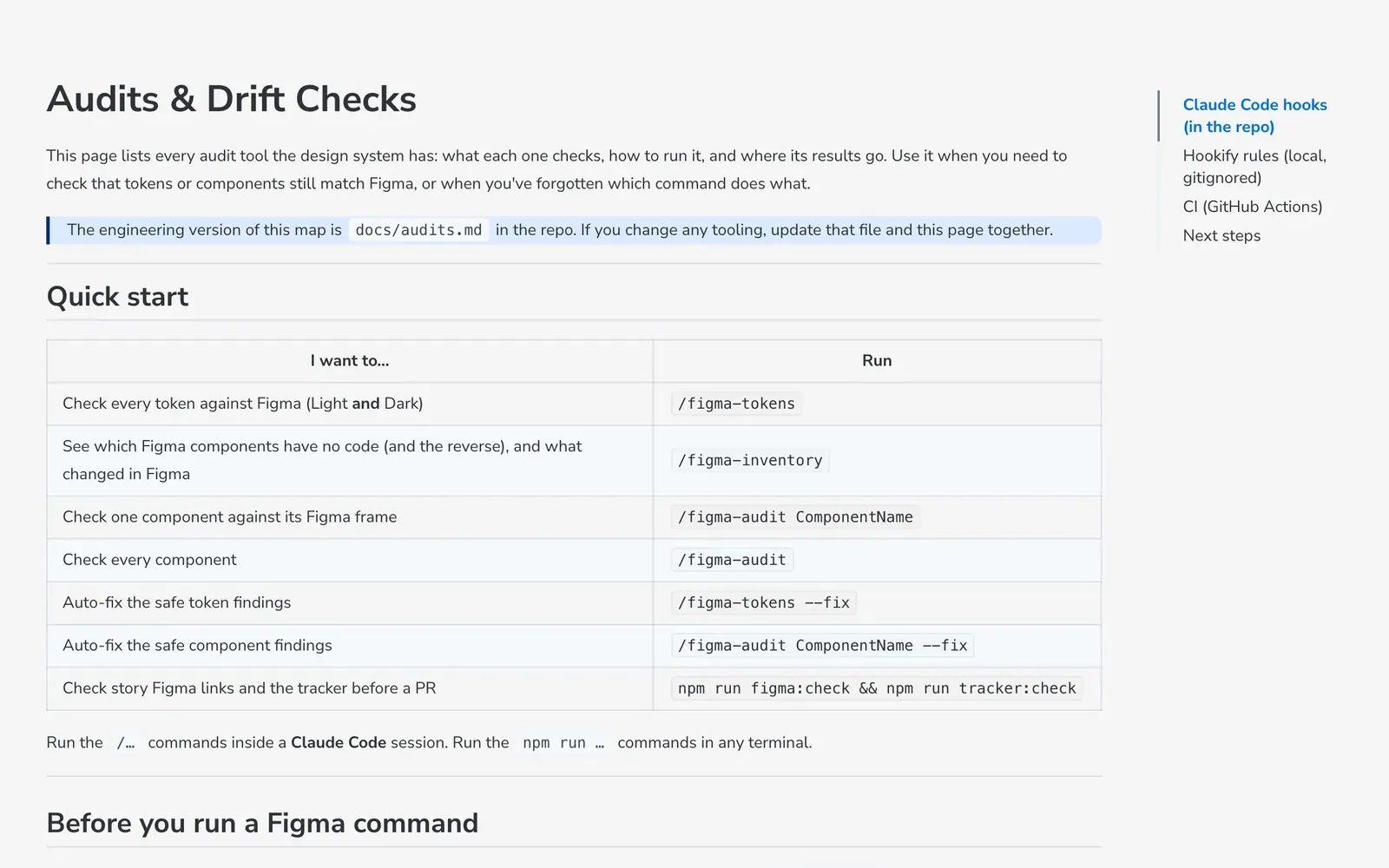
A design system nobody can check is a rumor. Every claim in this library is backed by a job that runs on its own, so drift shows up as a failed check instead of a surprise in a review.
- Noise to signal. An early auto-bump script produced 98 meaningless "bump version" commits. I moved releases to release-please, so every version now comes with a real changelog, and the publish job opens library-update pull requests in the SmartCX and SmartBX apps on its own.
- Hidden gaps. A sweep found 48 tokens that existed only as silent fallbacks in the CSS. They were invisible in review, so I added a check that fails the build when a token has no real value.
Before
20 releases behind
Prototypes sat on library v1.0.1 from Aug 19 until a manual jump on Oct 23.
After
The same day
A weekday auto-update PR (Oct 26): v1.10.1 reached prototypes the same day it shipped (Nov 4). 67 automatic update PRs into the coded apps (57 merged).
Pull requests that say what's still open
My pull requests end with two honest lists: "Not in this PR (needs a decision)" and "⚠️ not visually checked yet: please review X in light and dark". It's the same principle as showing open questions in a design review, applied to code.
AI as the accelerator, not the designer
"The only thing you ever do manually is share the Figma URL and push the component."
Claude Code wrote much of the code; I designed the architecture, rules and decisions and reviewed everything.
- Data Replacer: AI with guardrails. My Data Replacer plugin sends Claude a screenshot and the frame's layer tree. Claude can only answer with 5 kinds of edit (set text, set color, show or hide, set a property, repeat a row), aimed at layers it was given. The designer previews every change, and model output is never run as code.
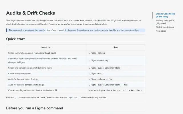
- Skills and commands. My own Claude Code skills and commands: figma-data-replacer, figma-table-fill, /figma-tokens, /figma-inventory, /figma-audit. With /figma-tokens, one command reads every Figma variable and reports what was added, removed, changed or renamed against code.
- An audit that runs itself. After every edit to a component, a hook checks its CSS token mapping, the Storybook docs template and component tracking.
- The real system for agents. I also gave coding agents the real system to read: a Storybook MCP server and component manifests, "so coding agents query real props and stories instead of guessing" (Oct 12, 2026).
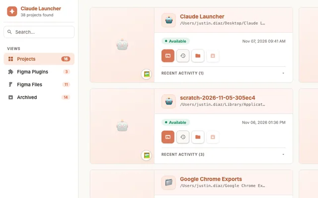
- Claude Launcher. Working this way produced a lot of Claude Code projects, skills and notes, so I built a home screen for them: projects, Figma plugins and files, memory, skills, commands and work history in one place, reskinned from the base 2.0 Figma file. One file, no dependencies, built Mar 13 → Jun 23, 2026, and it has backed everything up daily since. When the tooling gets in the way, build the tool.
Where it was heading: one library for design, engineering and every brand
I left SEW just as engineering was starting to build on the library. So I set it up to keep working without me: everything a new owner needs is in the repo, not in my head.
White-labeling on the engineering side still worked the way it had since the company started: even a basic re-brand was an engineering project that took months. The proposal and the library were about cutting that time down: real, working demos in a utility's own brand, and production-ready products that didn't need much custom implementation.
The plan was one library at the center: engineering building the live apps on it, Prototype Studio running on it, and each utility's brand as a theme on top. A new utility would be a theme, not a fork.
Design
- Figma base 2.0 Tokens, components and usage rules. Running.
- Brand Generator A utility's theme from one brand color. Running in Figma.
tokens + components ↓drift reports ↑
- One shared component library A versioned React package on base 2.0 tokens, with Storybook docs and drift checks in CI.
releases + update PRs ↓gaps + contributions ↑
Built on it
- Prototype Studio Designers prototype on the real components. Running.
- Live apps Engineering consumes and adapts it instead of reshaping a UI kit. Starting when I left.
- Product Reviews working prototypes that match what will ship. Planned.
themes ↓brand rules ↑
Every utility
- Base (SmartCX) The default theme.
- Alectra, SMUD, Northvale… Each one a theme on the same components, never a copy. Planned.
What it's worth, and what I learned
The clearest sign it was working: in Oct 2026, engineering asked to “align our system closer to yours.” Production still runs on a third-party UI kit, so that's the next step, not a finished adoption.
- Measure the gap before you argue about it. 66 of 379 made the problem concrete.
- Make the right path the easy path. Auto-PRs, token sync and a prototyping tool beat asking people to follow rules.
- The business model is the design brief. In a white-label product, the system is the product decision.
- Know which values belong to whom. Brand, regulation and the base UX are three different kinds of constraint.
- Design systems end at the shipped product, not at the Figma library. That's why I learned to work in code.
- Never invent a component; flag it. If the system doesn't have it, say so and propose it, so the system doesn't quietly fork.
- Write the decisions down. Decision records and a governance draft gave people something to react to.